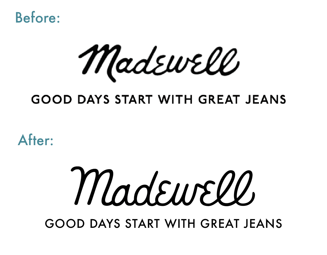
Madewell
Madewell is a clothing company known for their high-quality denim (it's owned by none other than J. Crew)! I am a huge fan of Madewell, especially since they use neat words like "artful" and "effortless" to describe their brand (so fun, right?).
After watching Jessica's Logotype Masterclass, I started thinking of logotypes that possibly needed some retouching and refining. Madewell immediately came to mind.
I printed out the logo, and started critiquing. The main issue I saw was the lack of consistency in the letterform weights.
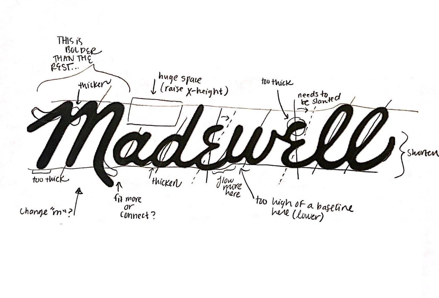
After looking at some issues with the baseline, legibility, letter width, letter height, and so on, I decided to start drafting. Here are some (very) rough drafts below.
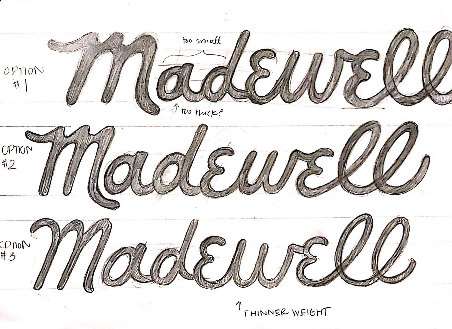
I played around with the weight, and also with the "M" of the logotype. I wanted to make the word flow more, and look more script-like.
I vectorized the second and third option, mostly to see if I wanted to keep the "M" funky, or change it to look more traditional.
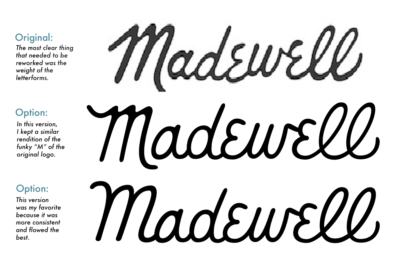
The third option seemed to be the most consistent out of the drafts, and so I went with it!