Exercises
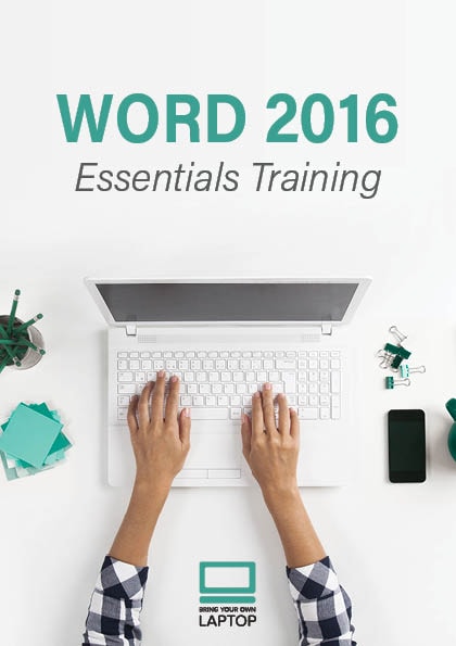
Looking back at this design, it makes it seem like it's a guidebook, instead of an ad for a course. Word for Nitwits, 2016 edition. Still, I love how it's turned out.
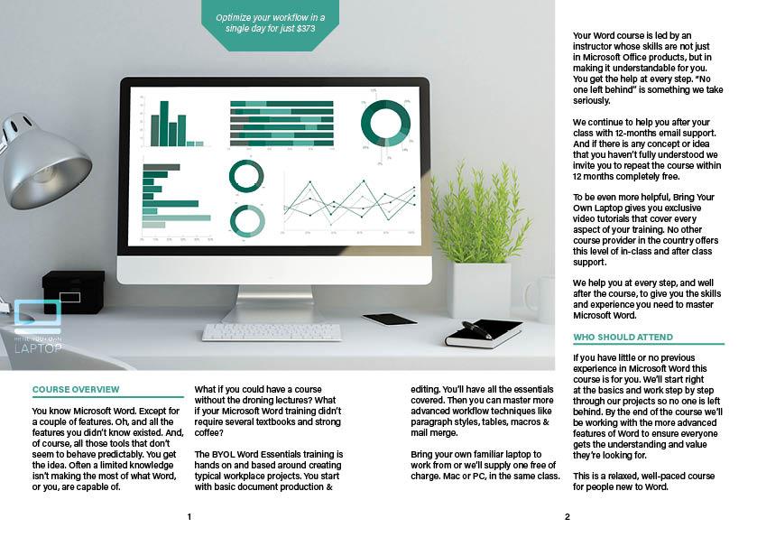
This is the centre spread. I like big pictures...

I bet this would look a lot better printed and folded. The JPEG conversion didn't do the color of the picture any justice.
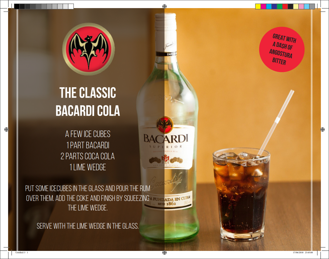
This was the first thing I created for the course. I combined the first exercise of the InDesign Course with my love of something else. Looking back, I would've done used three collumns; One for the ingredients and a two-collumn wide textbox for the description. Would've produced a cleaner look in my opinion.