Cats and Coffee
From the resources provided for the Art Nouveau class by Liz, I chose the gourd leaf and flower pattern from the Smithsonian Library illustrations and a cat illustration from the Flickr Commons to add to my inspiration board and practice, including a coffee mug from a photo I took at a favorite restaurant; the board is a mess, but still organized my ideas and possible palette. It's also more than one layer; my eyes need bigger pictures.
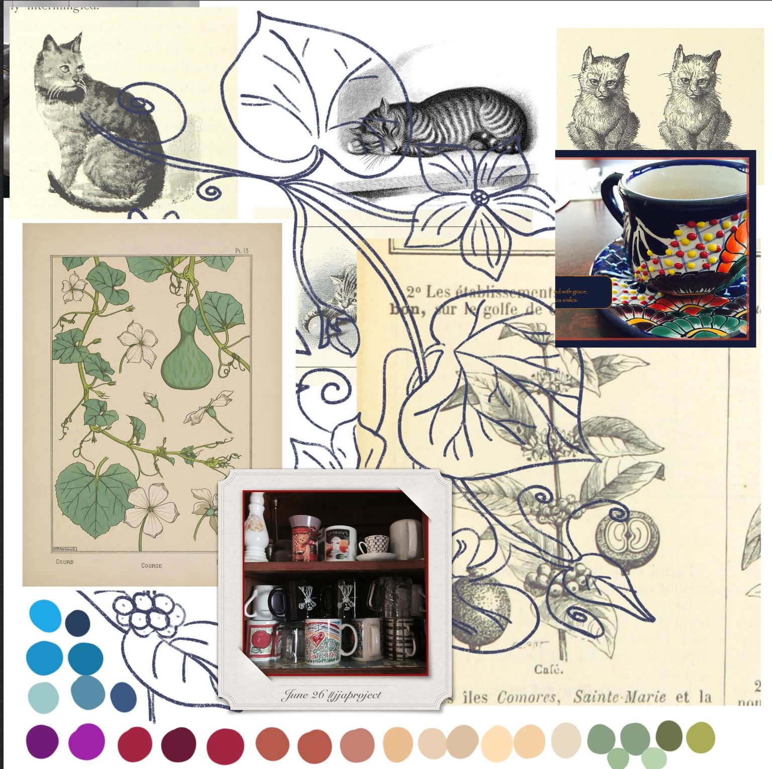
I struggle with color; I have my favorites [blue, yellow, green, orange], but am unsure what works in a particular setting or theme. I started with an orange cat, because brown seems so dull. And the brightest, prettiest color on my palette was a plum/purple.
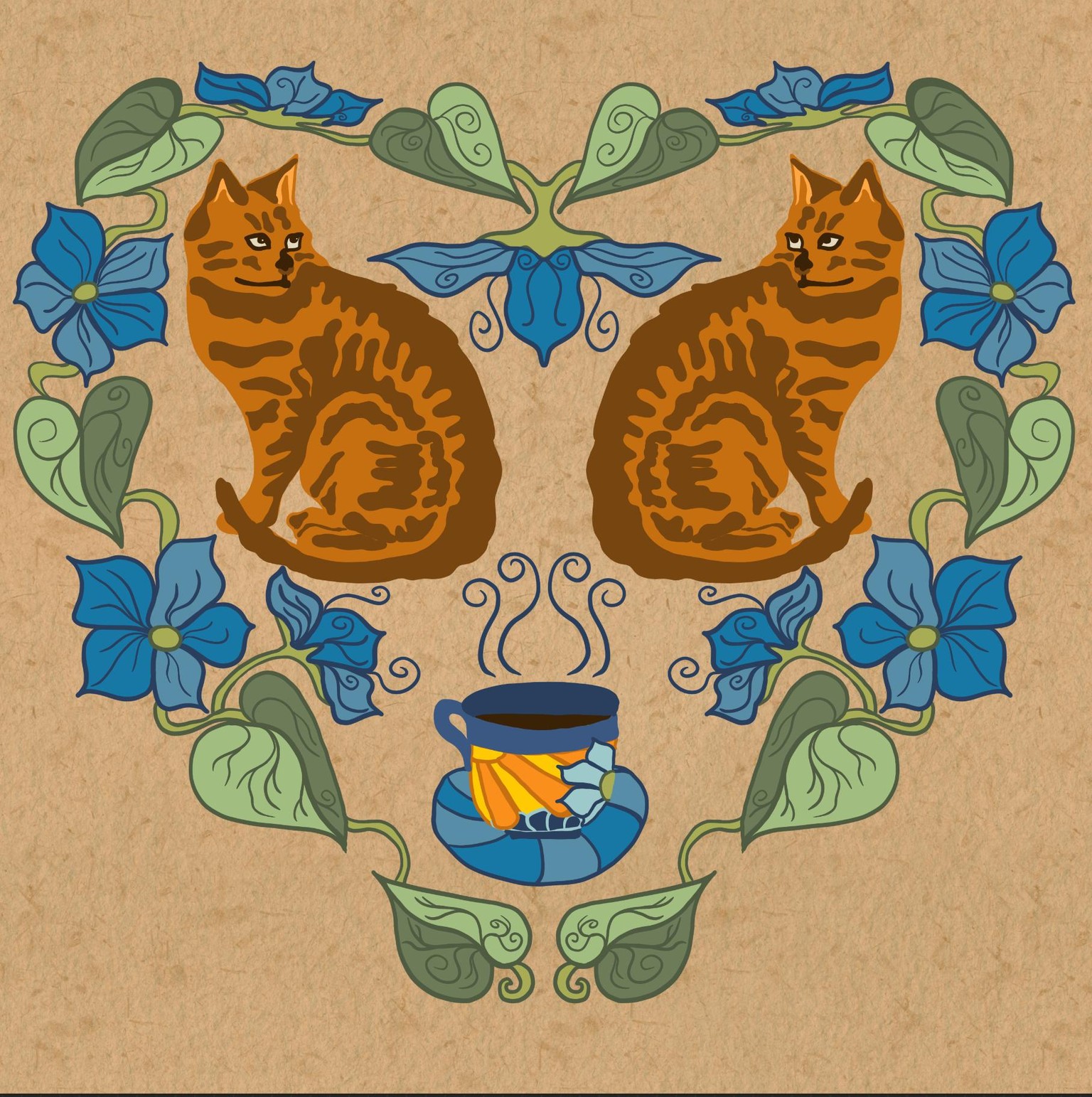
I could see that I could change the orange to a tan and the rusty brown to a brown and the cat would look like my current wild one. Luckily, Liz taught us how to change colors or outlines with alpha block and filling in with a reference layer.
So I recolored my cats and the background layers. I also added textures to the two cat colors in this one:
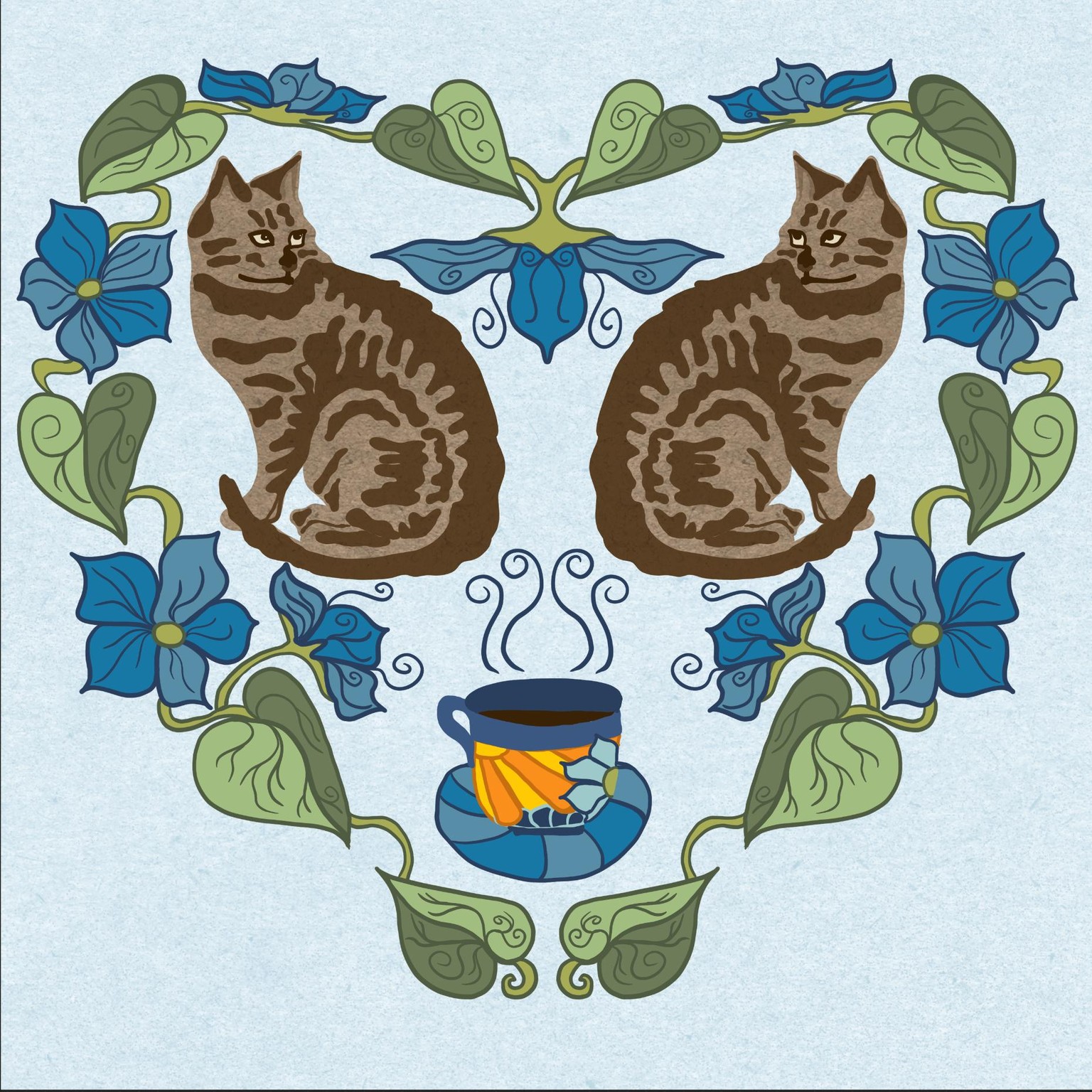
I imagine I could fill in more, but I tend to get too cluttery. So I stopped at this point, waiting for a little inspiration, such as a vine under the cup and around the cats.
Project 2: Rectangle Folk Art
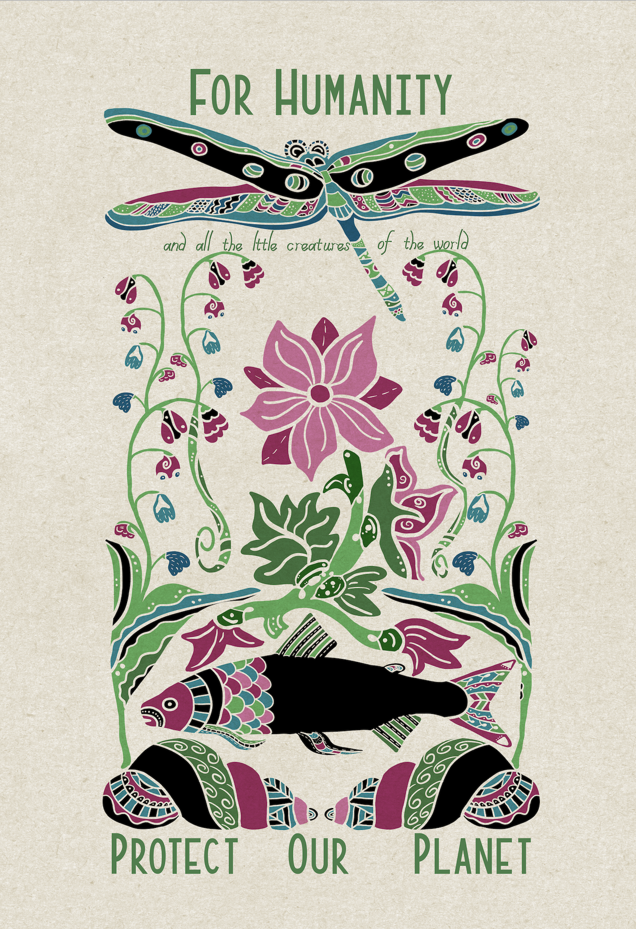
Loving this class! I spent much time creating the "parts" of my blackened sketch because I needed to rethink the "parts" of each object, revising many parts so the coloring could be added in a somewhat balanced way. My drawing is partly symmetrical and partly not, which created a problem for me.
I started with the dragonfly at the top, then dropped down to the lake/ocean floor with seashells, fish, and water plants. I chose the lotus and another non-water plant that dangled little flowers off its stem. I kept areas of black throughout to maintain a flow and balance. My purpose was a nature appreciation picture since I live in a rural, lake-filled area.
Like the Cats and Coffee, I chose the blue background -- because most of the objects are "under water," but it was too muted and hid the lovely colors. So I switched to a tan/lighter background and texture.
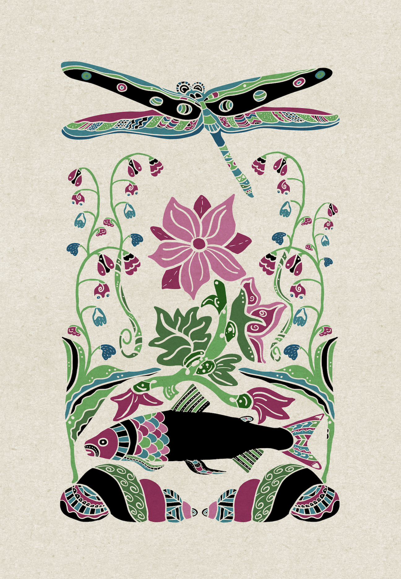
As I appreciated the results [not perfect, but I do love it], I realized this would be a beautiful "Protect Our Planet" poster. I did use Liz's fonts, but wanted a funky one for reference to the creatures of the world, so I took Liz's Create Fonts class and created my own font, called "Pixie." I'm still revising it, but it was ready for this project: "and all the little creatures of the world." I duplicated it several times to thicken it. Then I duplicated that and used alpha lock to fill the layer [text] with black beneath the green text layer. I then moved the black text slightly right and down to create a shadow.
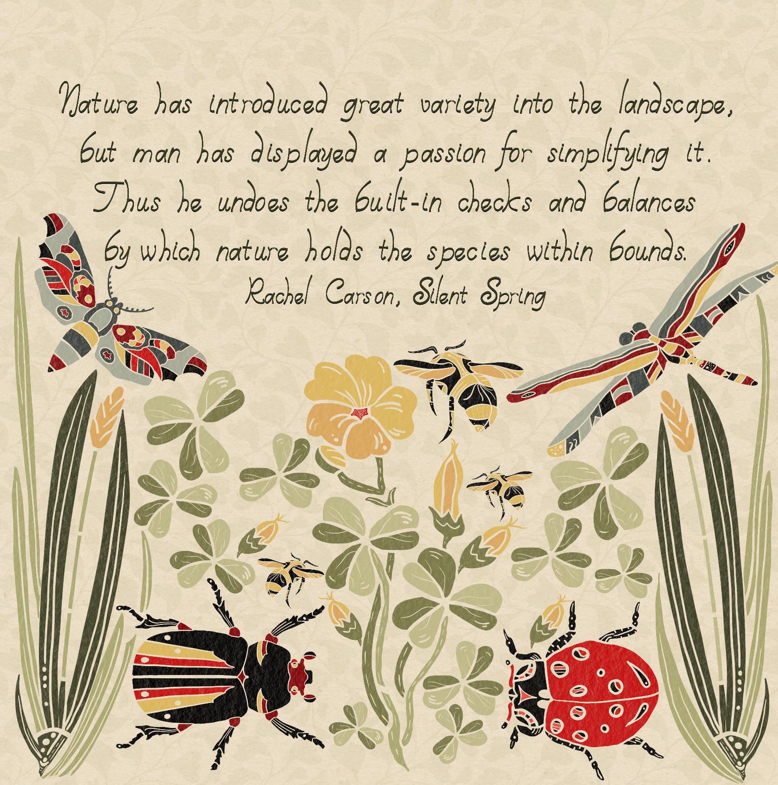
Project Three: Stencil Folk Art Arrangement
My theme is the balance of nature, complete with bugs and weeds.
I had a vision in my head, but didn’t actually plan it out; my project is therefore different than our expected project, but I still like it. I organized my shapes around the wood sorrel stamp, adding in more leaves and buds, leaving room at the top. I added a Rachel Carson quote in my newly created font and lightly filled the background with the “ginkgo” leaf brush I created in an earlier project. Instead of “multiply” blending, I alpha locked the merged object layers and painted a texture to that layer.
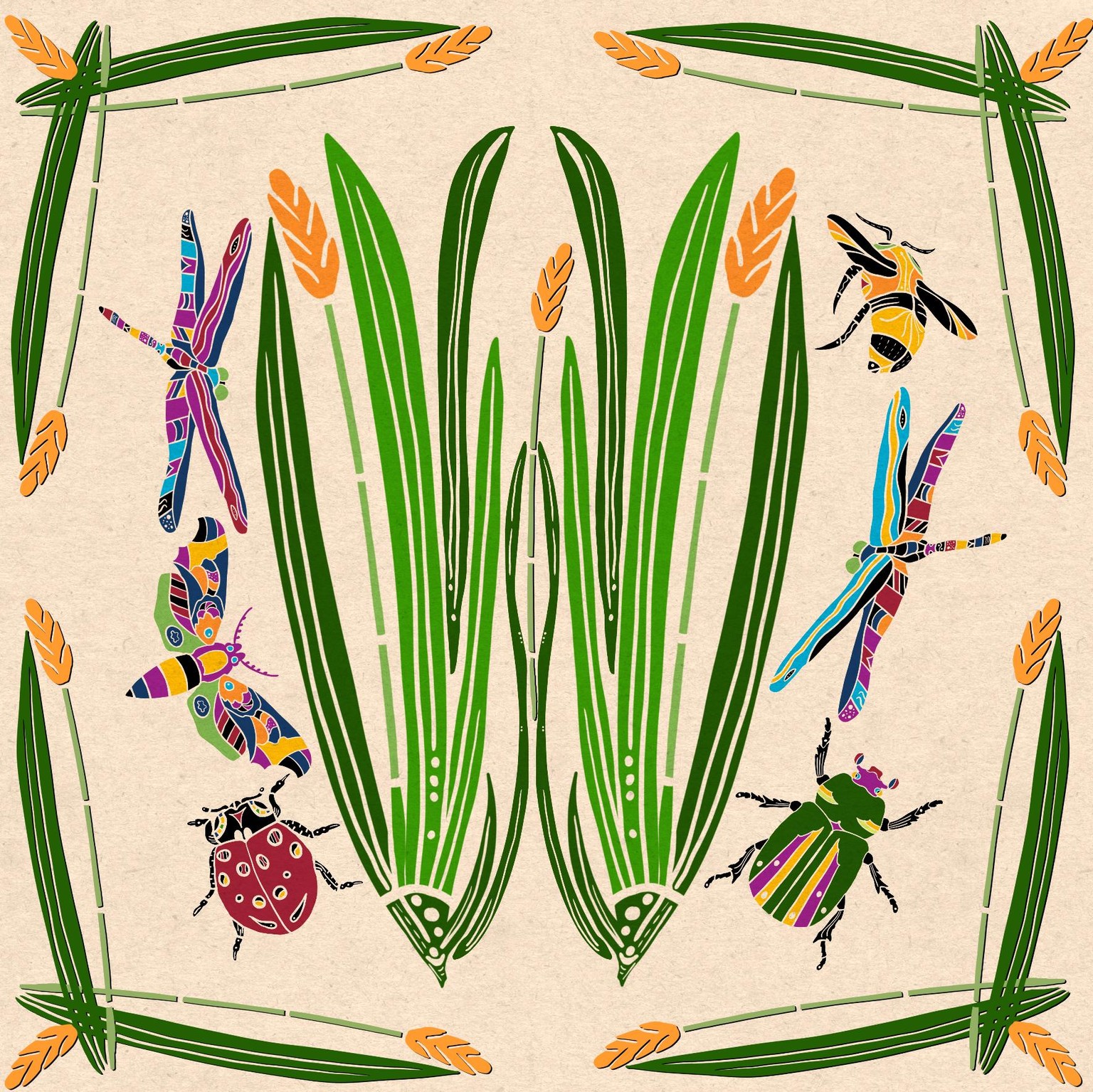
Project Square
I'm still trying to create that stamped look-- the square folk art of the project. The trouble is probably my choice of objects: insects and two tall plants don't organize well.
So I started with the grass and balanced the bugs around it, and adding a border of the plant, and, under request from my husband, used brighter colors:
Now, that's still not quite what I'm thinking of, so I thought perhaps something like this would work.
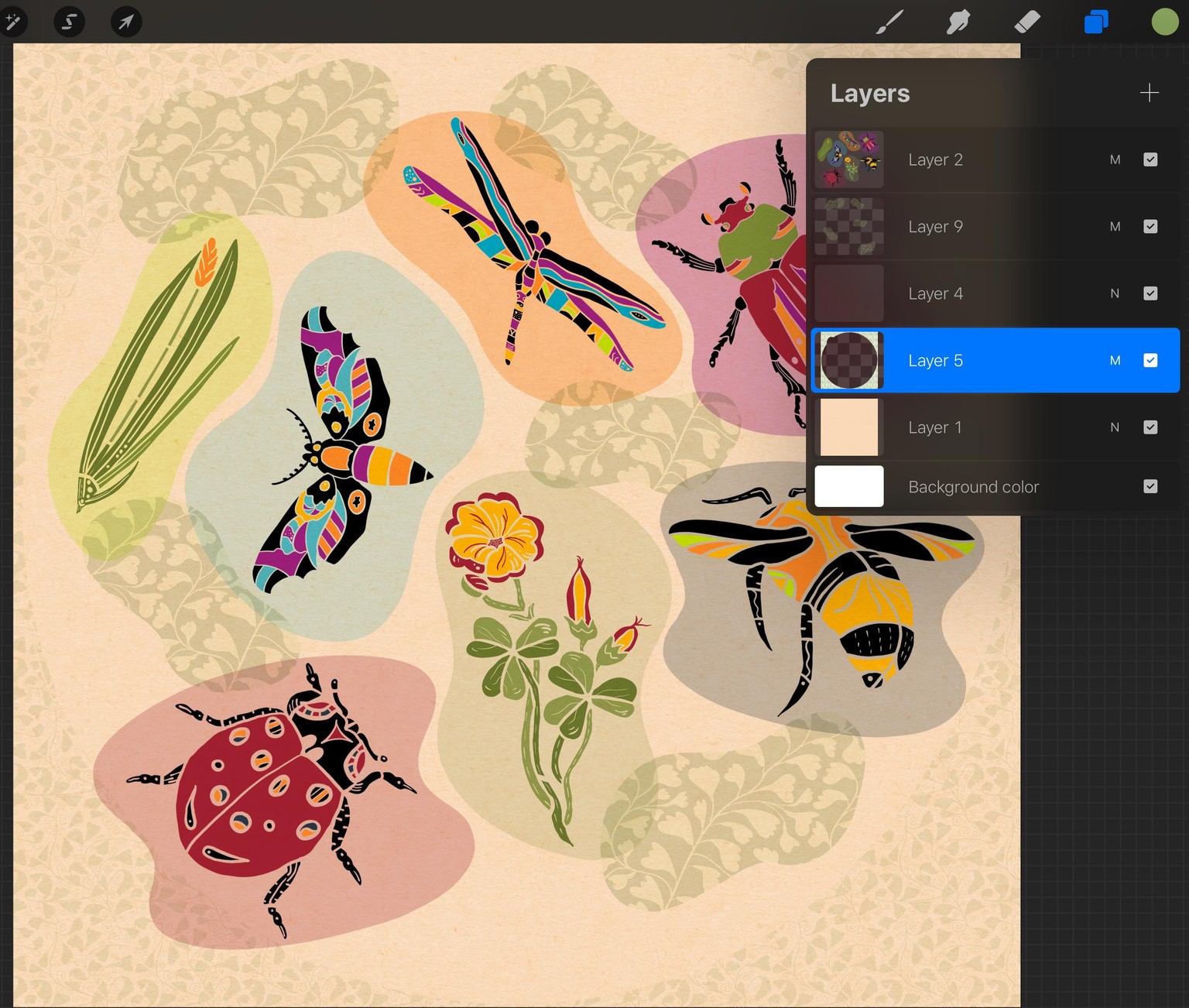
Because, if I like the design, I want to upload them to print-on-demand projects, I choose a large canvas, 20 inches square. That means I have only ten layers to create the design. It's not easy, then, to play around with ideas, like creating backgrounds shapes behind each stamp, like this:
I wanted to keep the layers separate for organizing and coloring, but I had to make those choices as I worked due to the layer limitations of ProCreate at the larger canvas size.
Perhaps you know of a solution that I don't ????
Here's how I worked my first try at it-- notice the layers. I created each blob background and chose a color to match, then merged those two layers together, eventually merging all the stamp layers together [top layer, multiplied].
Then I could add the additional green blobs and organize them. I merged them together [layer 9 in the image-- note: it really does help to name the layers, but...]. With alpha lock, I could then "paint" my ginkgo leaf brush over those to add more detail and interest to the little insect habitats :)
In layer 5 in the image, I created a circle and filled outwards to create a border, using a very light olive green. Using alpha lock on that layer and a slightly darker color, I "painted" the same leaf brush over that outer border. I erased a small part that overlapped the top left "blob."
I rather like it; what do you think?
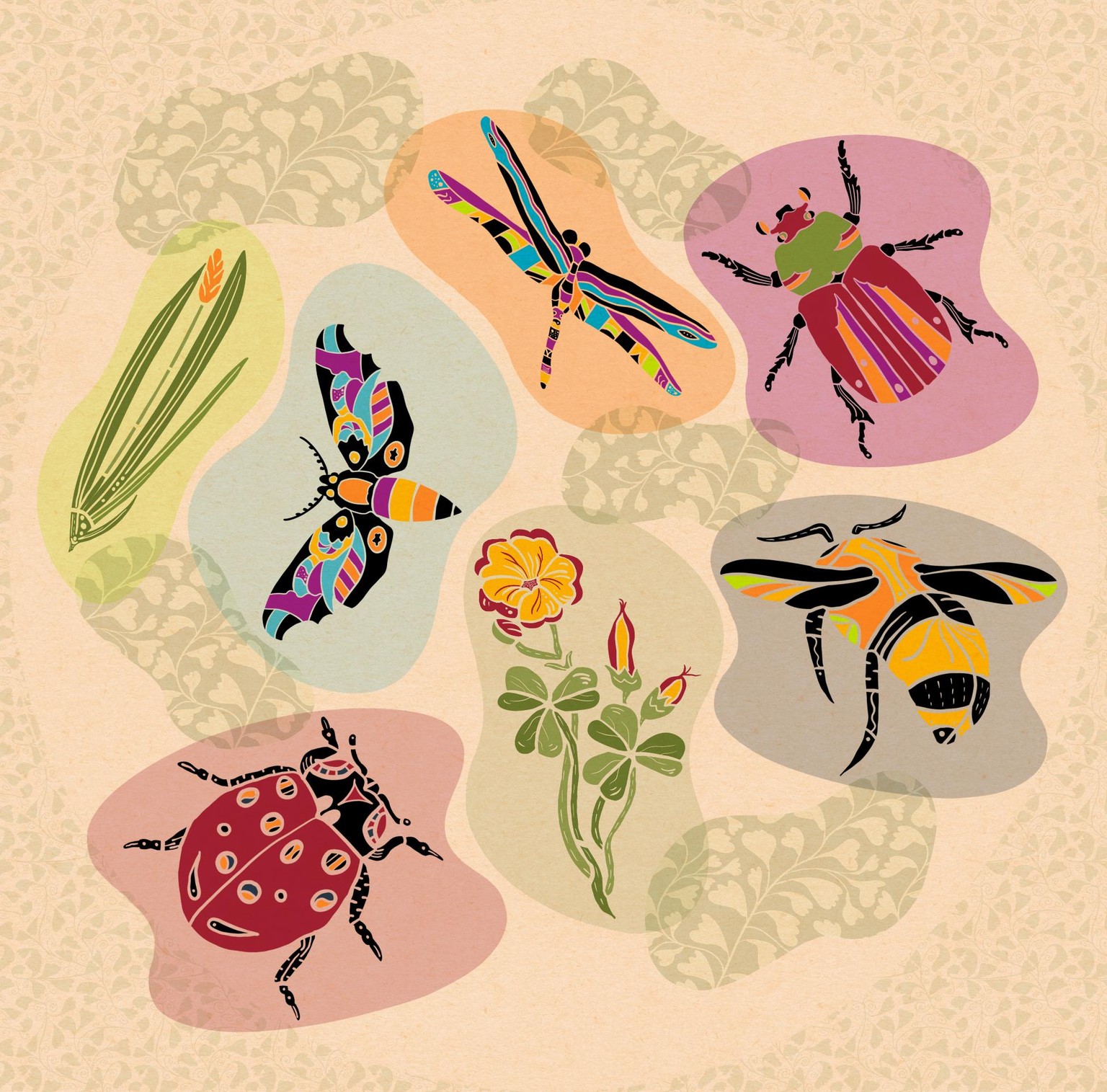
Now that the stamp blobs are ready, I could do a little experimentation, although, again, the layer limitation pose a problem; I just kept merging the new "green blogs" as I arranged them. Using the "select" menu helped with reorganizing when necessary.
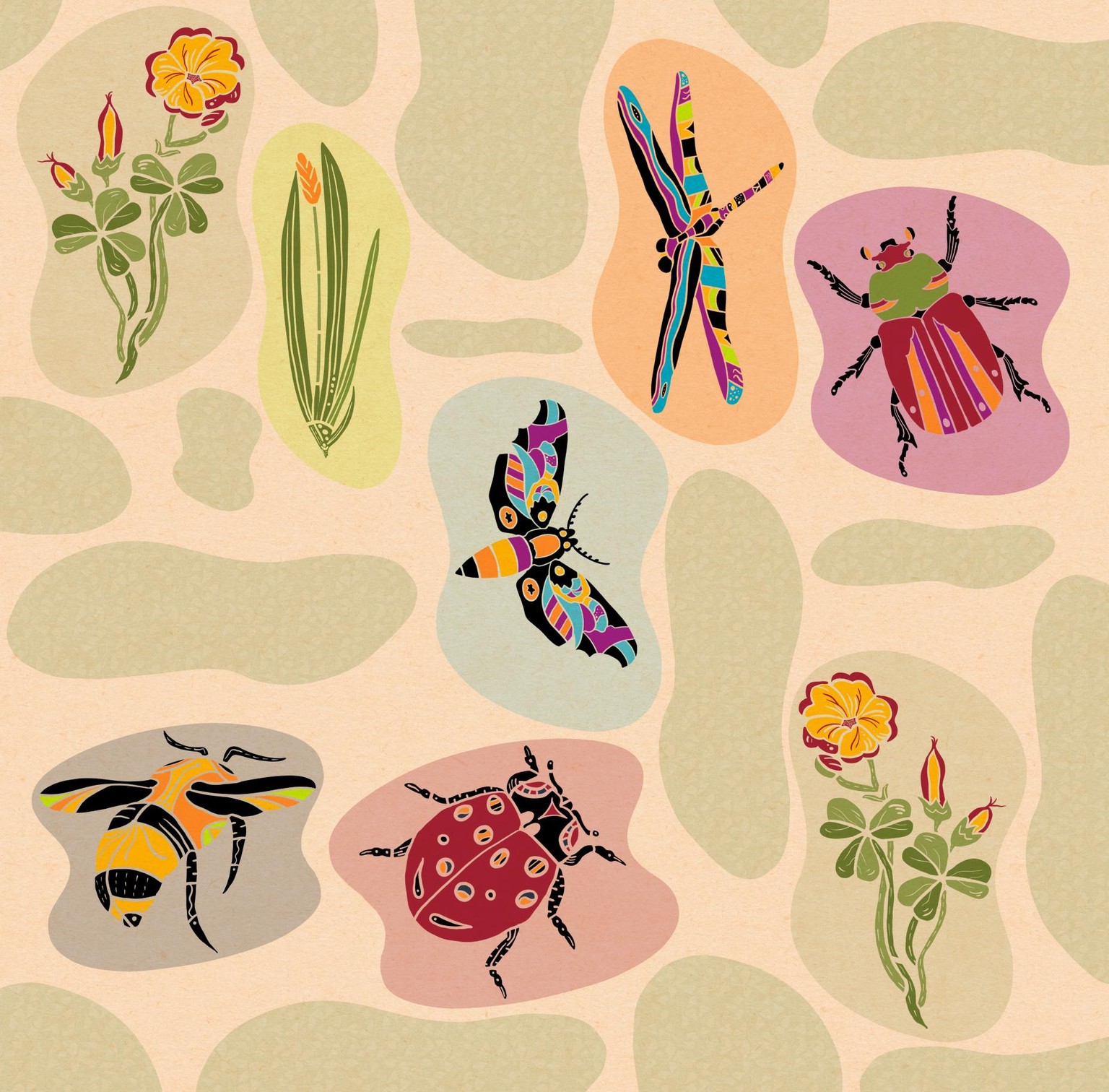
I'd love to create this as a repeating pattern, but repeating patterns in ProCreate are so difficult-- getting things in the exact space and place just does not work for me, so I'll need to try the Affinity Designer app for repeated patterns.
Here's the result -- I again used the ginkgo leaf brush on the green blob layer:
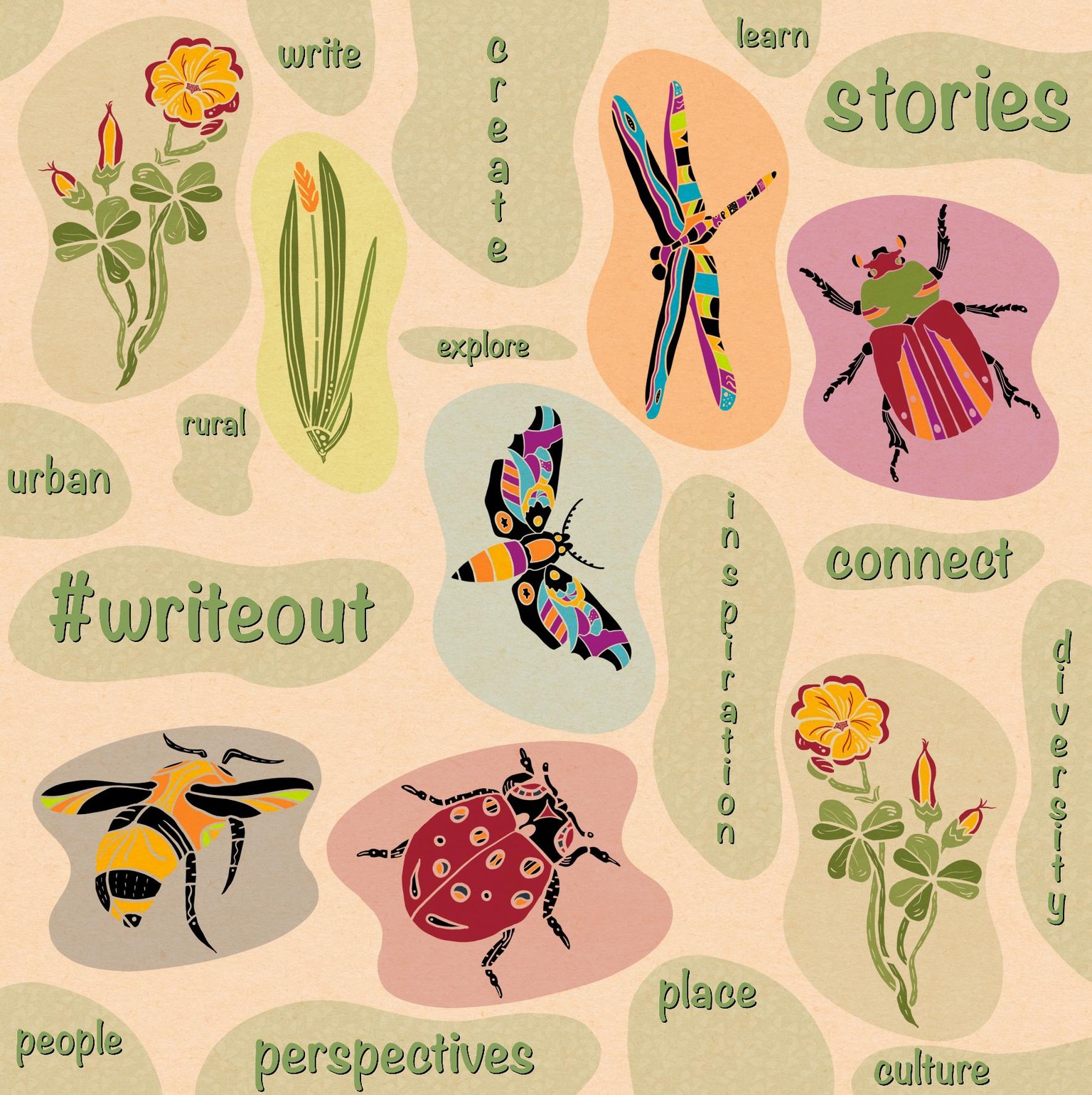
What's great about this particular design is that words can be added, like this one I created as I prepare to participate, along with so many others around the US and internationally, in the National Writing Project and National Park Service #writeout this October, 2019. I added all the words that reflects the project's goals and hopes--
Well, I think I've finished up with this course, but it is just the beginning of my Folk Art journey, which I blog about here, tagged Folk Art.
I look forward to seeing all the ideas in the projects that continue to be added here; I thank Liz for her clear and organized way of leading us step by step through a learning process to understand how to create folk art.
And, yes, I still need to revise my Pixie font, and I have several others to create...