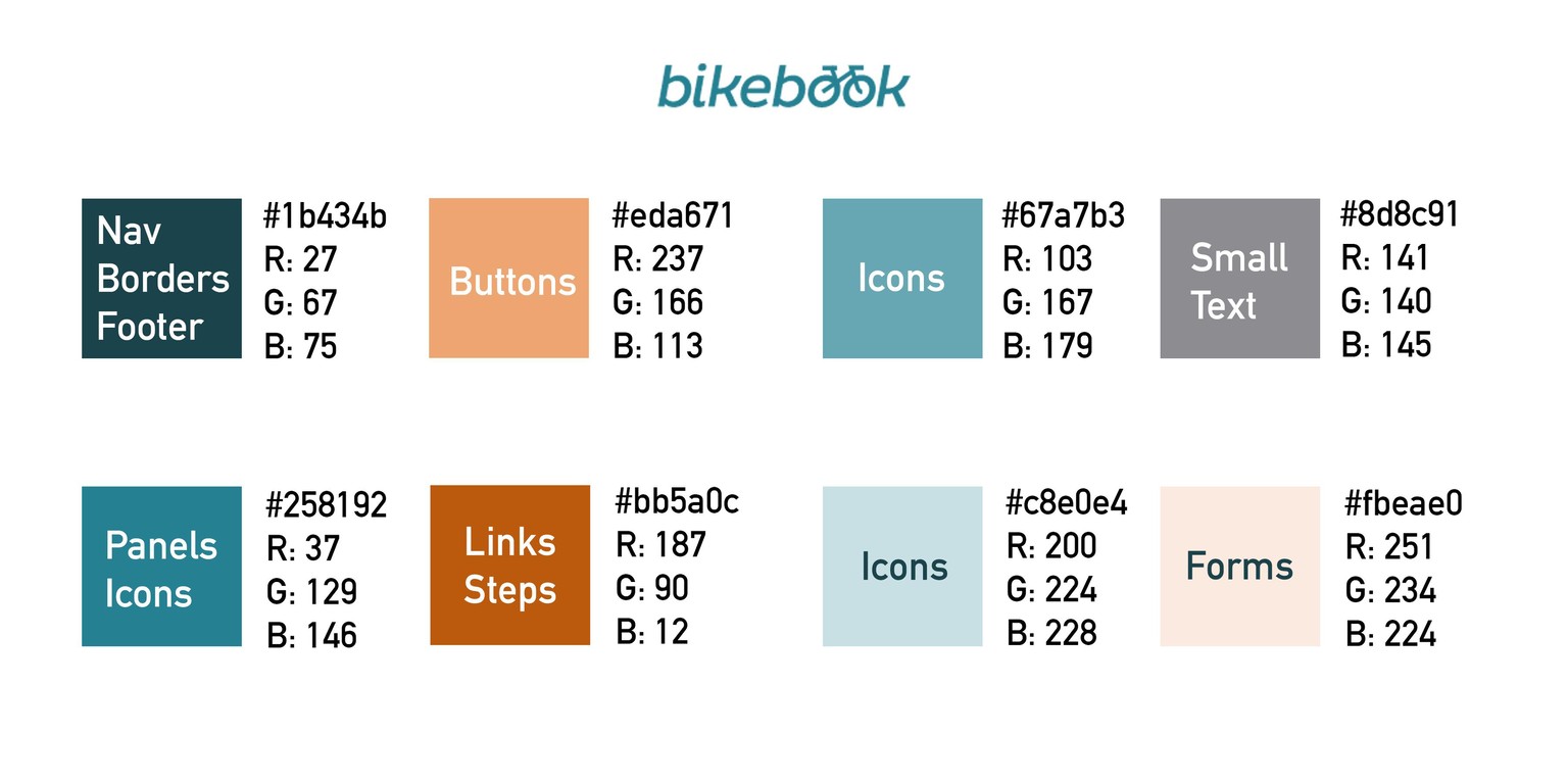
BikeBook in Duck Blue and Ochre (or Blue and Orange)
For this project, I chose my second palette from Class I, the one based on the bicycle photo. I tweaked the blue so that the contrast with white and with the ochre would be greater.
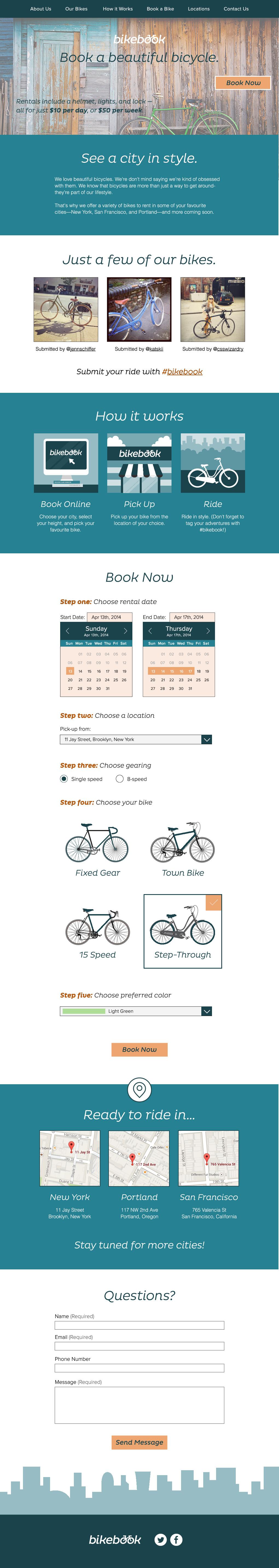
Here is my resulting web design. I ended up using almost only the blue and ochre (the grey was used for some of the smaller font).
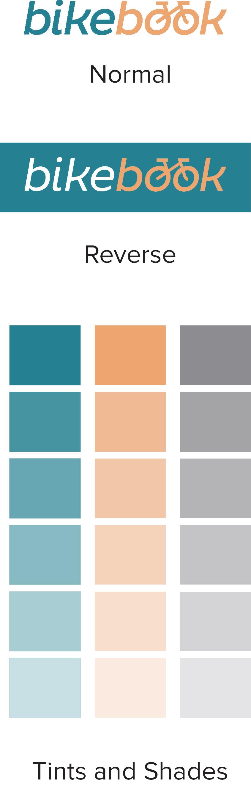
And here's my color guide for this project.