Band T-Shirt for Sigmun
Description:
I enrolled this class because of a t-shirt competition held by a band called Sigmun. The band is from Indonesia and could be classified as a psychedelic-stoner-rock band. They’ve just celebrated their anniversary of their debut album, Crimson Eyes, which explored themes like conflict, despair, and epiphany. I found out through reading their online presence, they are interested in surreal artists such as Salvador Dali, René Magritte, and Giorgio de Chirico. The band have a strong sense of imagery that sets them apart from other stoner bands, so I was confident enough to avoid the cliched images of eyes, ancient ruins, and gore.
Moodboard:
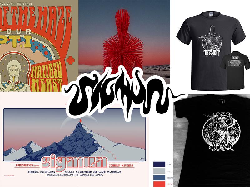
As for their moodboard, their existing materials are rich enough that I didn’t have to look far for inspiration and color palette. They seem to like the red and blue gradient, so I tried to incorporate that into my artwork.
Sketch:
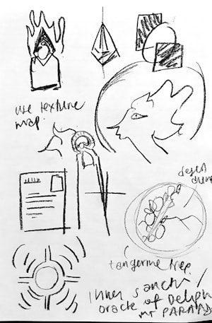
I’ve sketched some concepts.
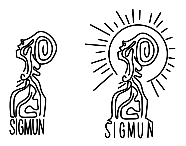
Then I experimented my ideas digitally.
Final Design:
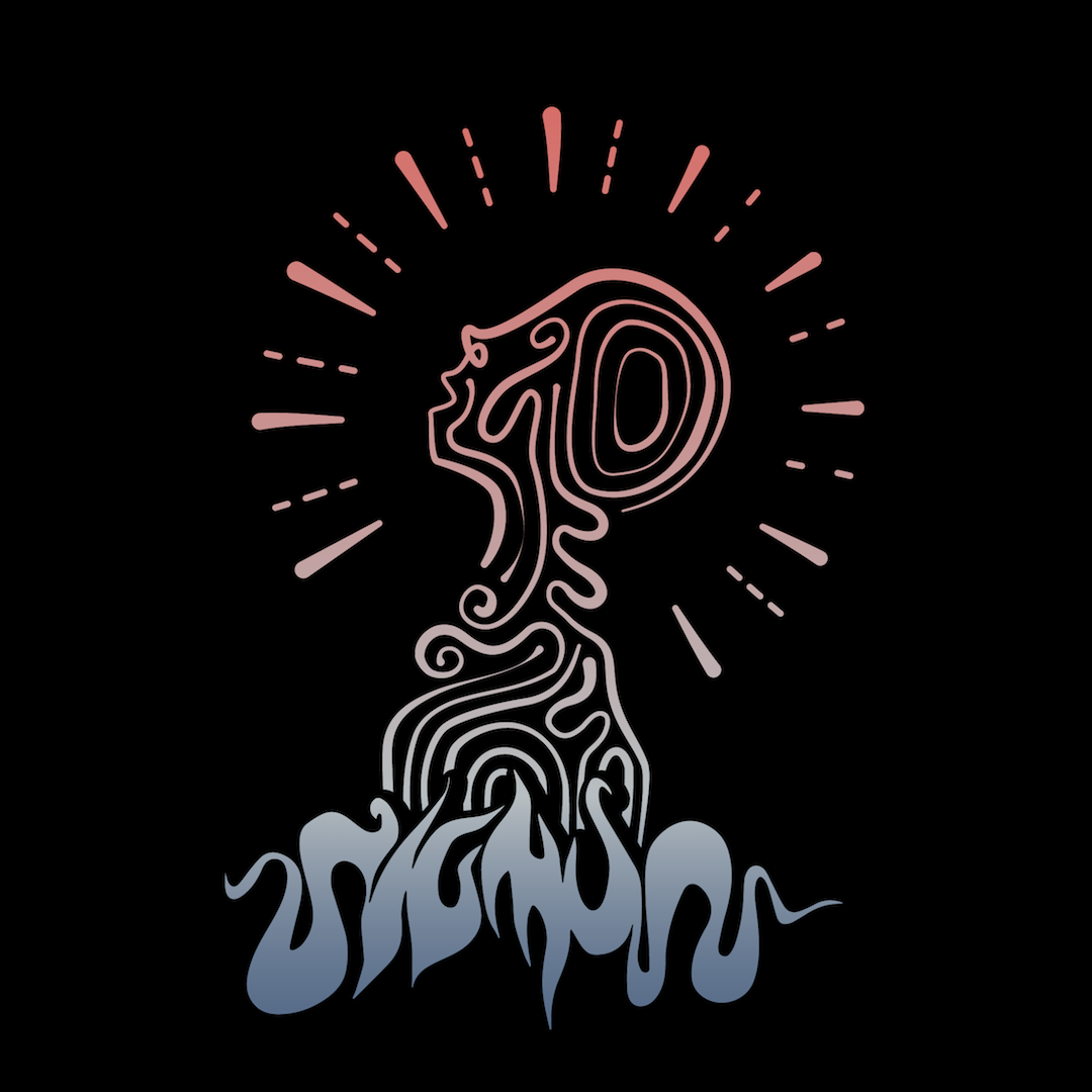
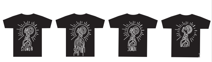
Here is my final design.
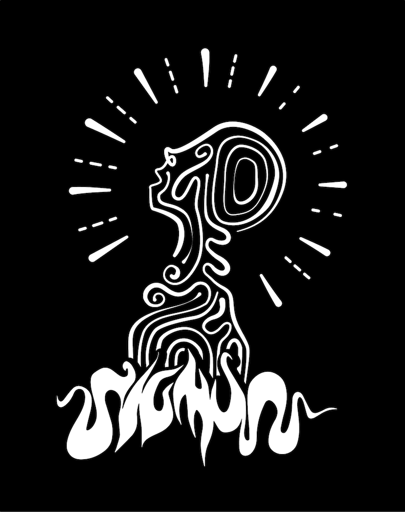
This one is an alternate version in case there is a demand for a more conventional color palette.
Tech Pack:
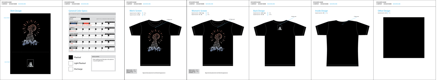
Here’s the tech pack using the Ai file provided in the Attachment section of this class.
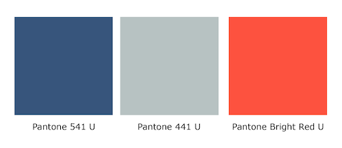
Here's the Pantone colors.
Mockup:
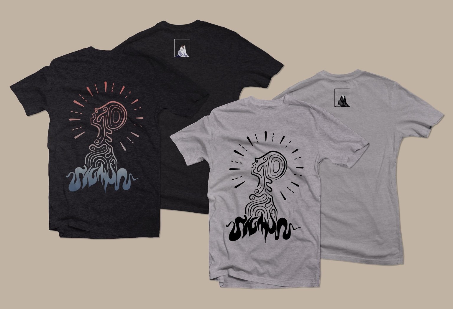
Here’s a t-shirt mockup. Template by Milan Vučković.
Conclusion:
Thank you Chris for teaching this class. I’ve learned an incredible amount of knowledge. The three key brand elements (typography-illustration-brand personality) reminded myself constantly on this assignment of the branding aspect of designing a t-shirt for a brand. It’s important to remember that the object is meant to promote a brand. Don’t obscure the name if the brand is still new and hasn’t reached iconic status. Never thought I could be excited to tackle more t-shirt project.
Note: In case anyone is interested behind the meaning of the illustration, please check my Instagram post here.