Sumac: a Levantine Menu Built on Hierarchy
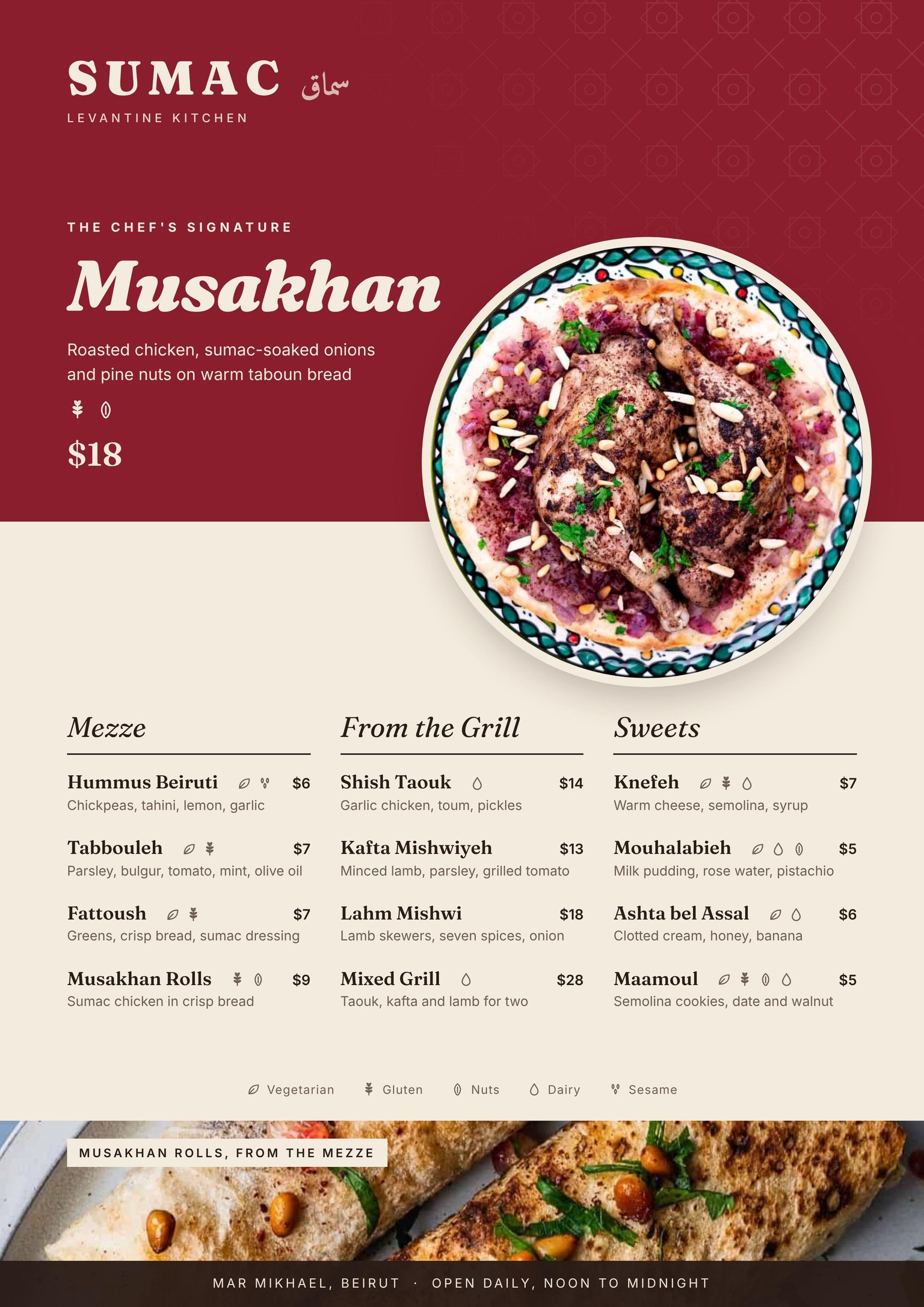
I designed a menu for Sumac, a fictional Lebanese restaurant named after the deep red spice behind so much Levantine food, to show my Lebanese roots.
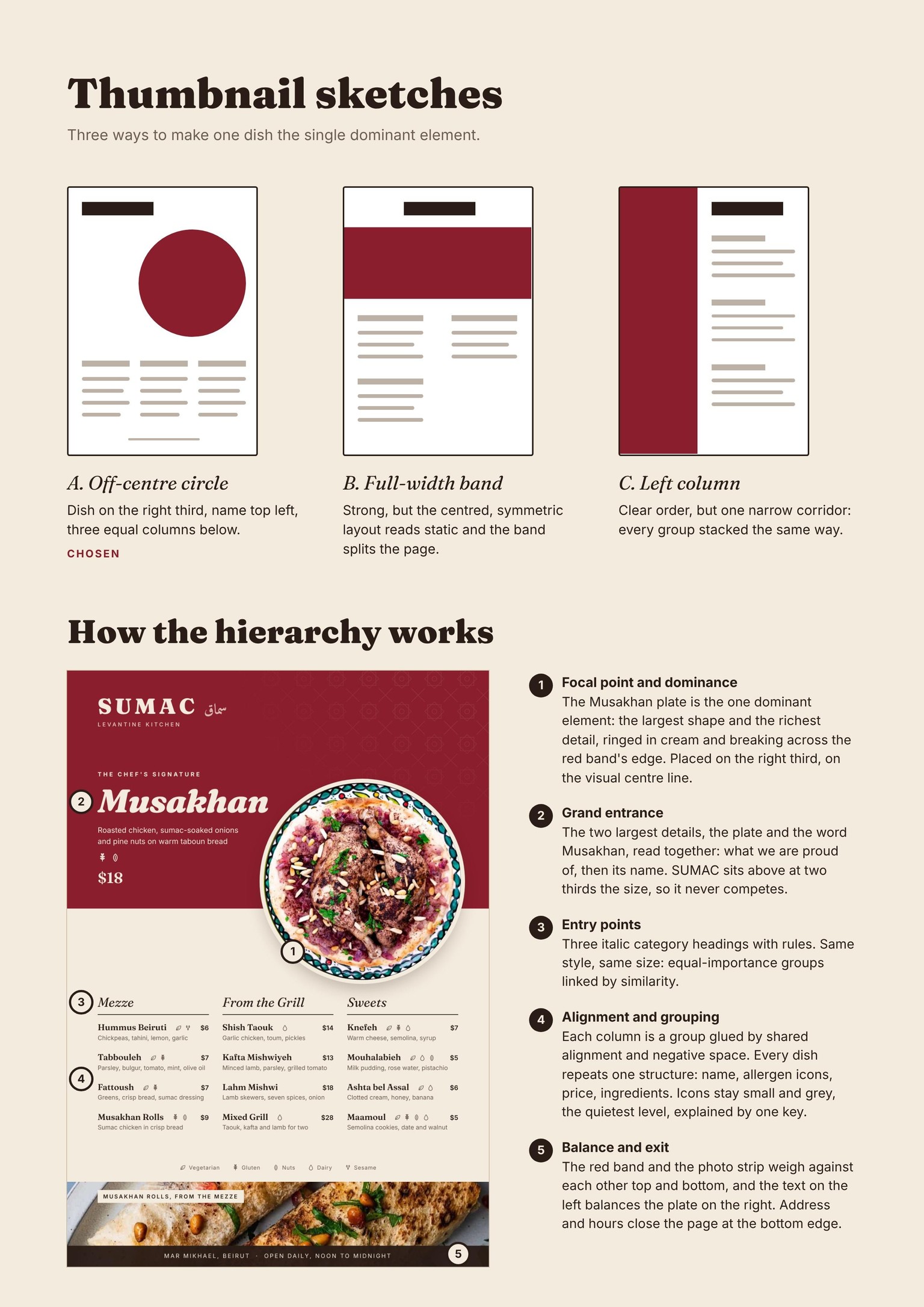
The signature dish, Musakhan, is the single dominant element: a round plate ringed in cream, breaking across the edge of a sumac-red band on the right third. Its name reads alongside it as the grand entrance, while the SUMAC wordmark sits above at two-thirds the size so the brand never competes with the dish.
Below, three italic category headings act as entry points. They match in style and size, so Mezze, Grill and Sweets read as equally important groups. Every dish repeats one structure: name, allergen icons, price, ingredients. Prices and icons stay small and grey so the food leads, and one key explains the icons. The red band and the photo strip balance each other top and bottom, and the address closes the page as the exit.
I started with three thumbnail sketches: an off-centre circle, a full-width band and a left column. I chose the off-centre composition because it gave the dish dominance without a static, symmetrical layout. Page 2 shows the sketches and how the hierarchy works.