Monochrome Watercolour Portraits
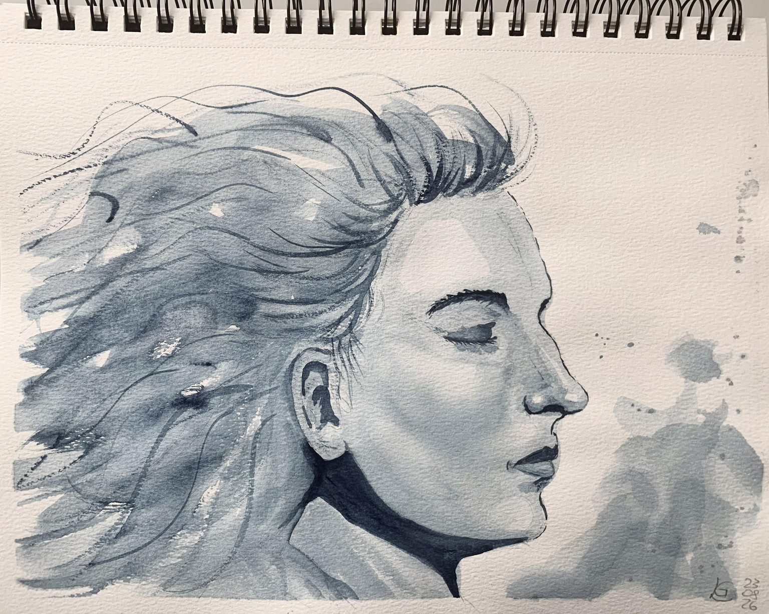
This class was challenging but very instructive.
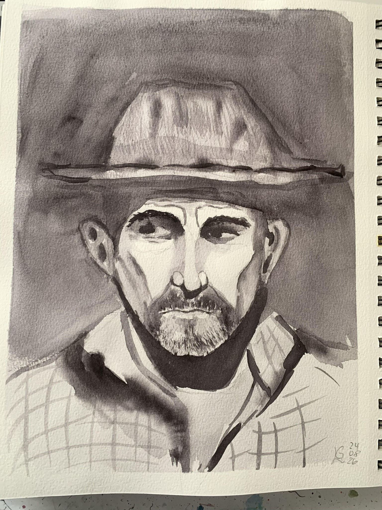
I am not pleased with the outcome of this painting. The reference photo was partly too dark for me and my colour (neutral tint) wasn't dark enough.
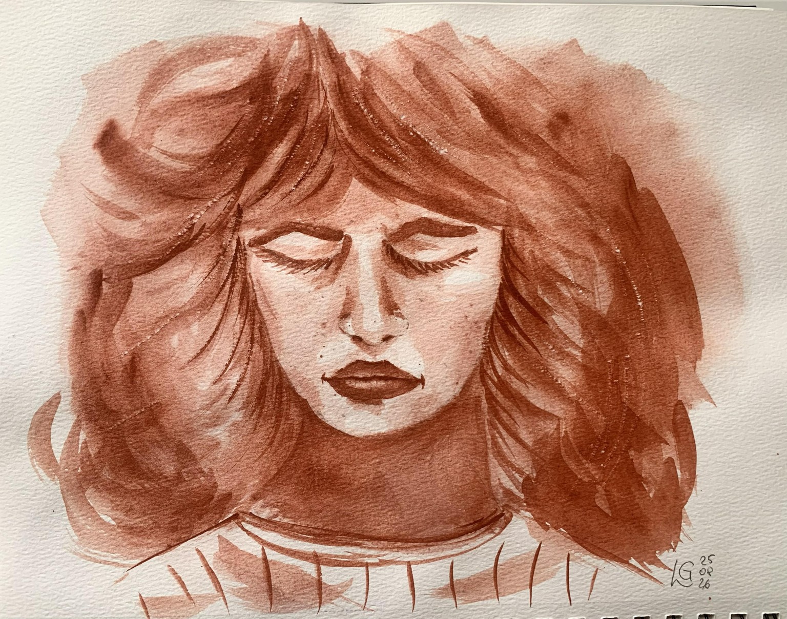
In this portrait I used venetian red but I had difficulties to achieve a dark tone. I also struggled with the hair structure. I noticed that I couldn't lift off colour from this paper which made it more difficult.
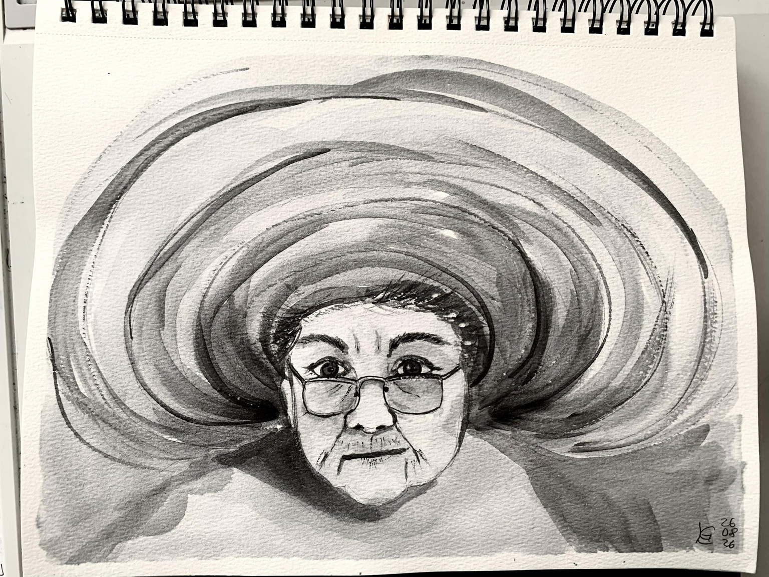
This was such a cute photo! (colour: paynes grey)
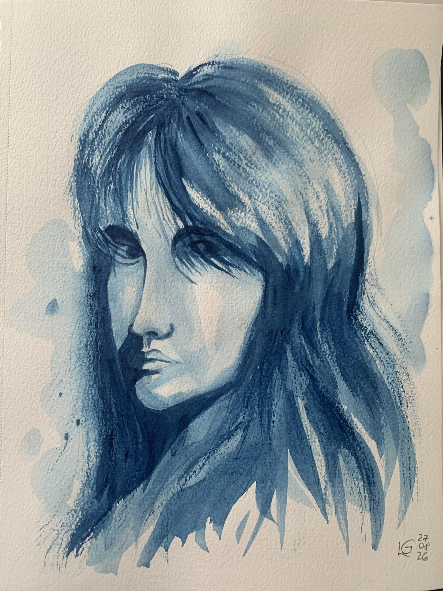
The ladies nose is too long - the proportions are not correct. (colour: prussian blue)
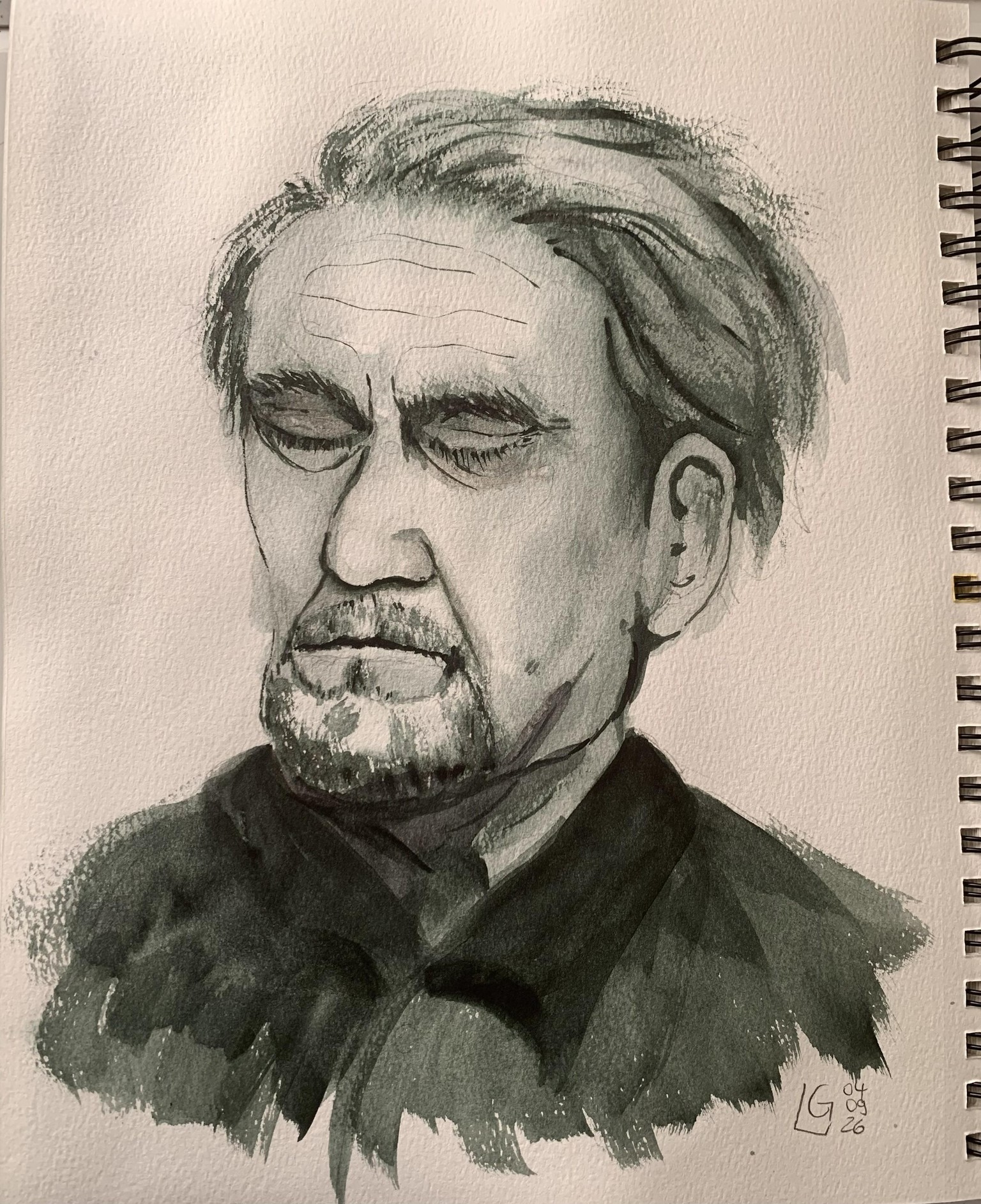
I am quite happy with the old gentleman's face, here I used perylene green which worked well.
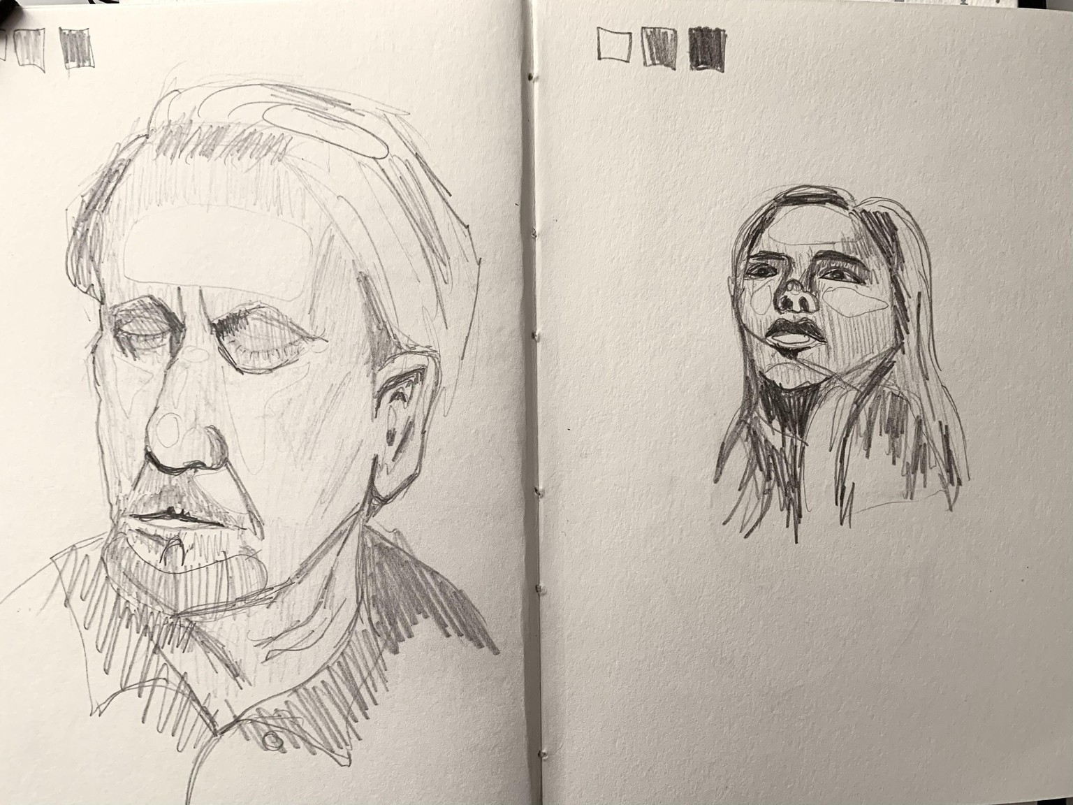
Thumbnail sketch of the last 2 projects.
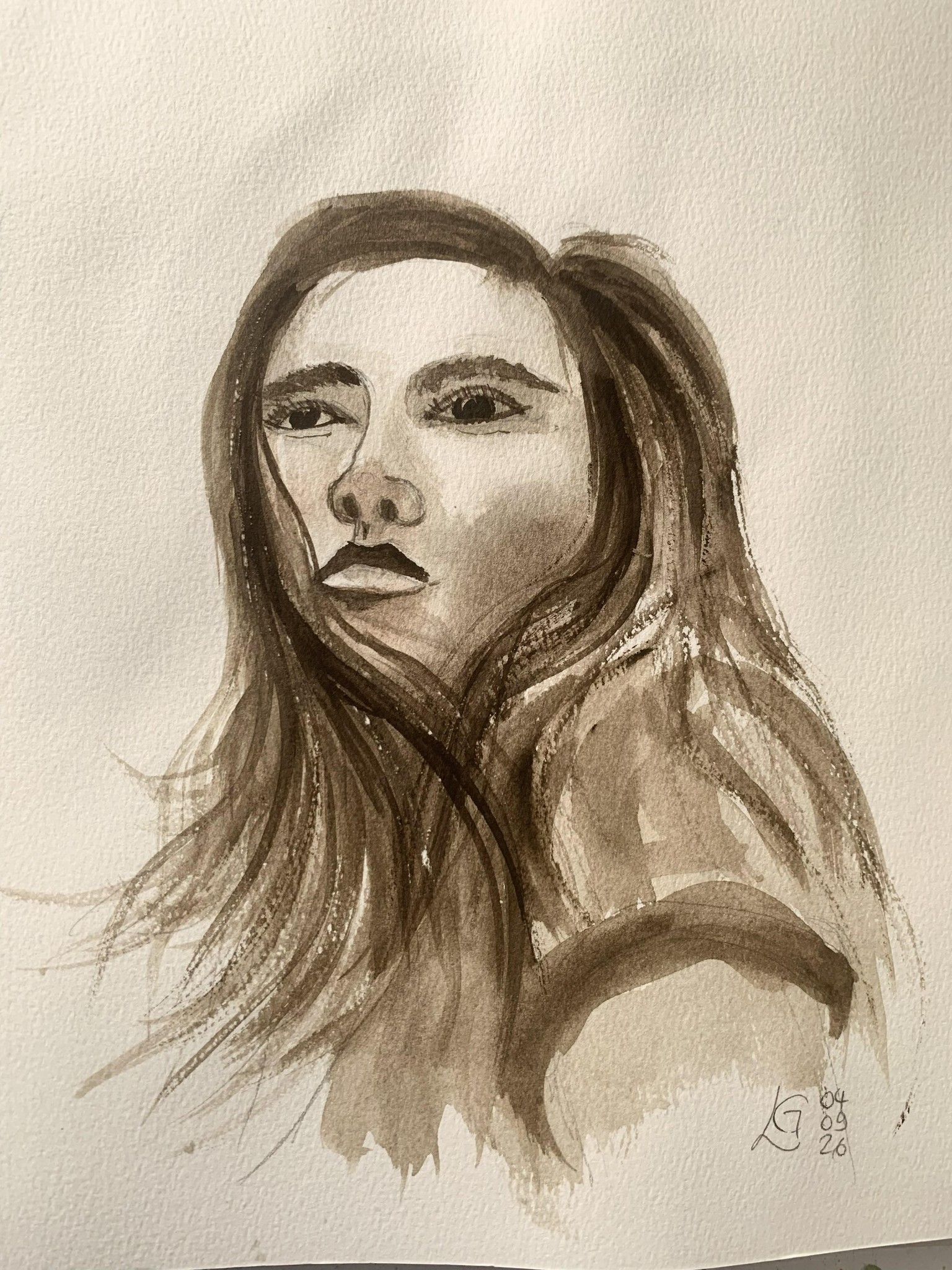
My painting doesn't really look alike the reference photo, still I like it.