Moody Colours and Theory Practice
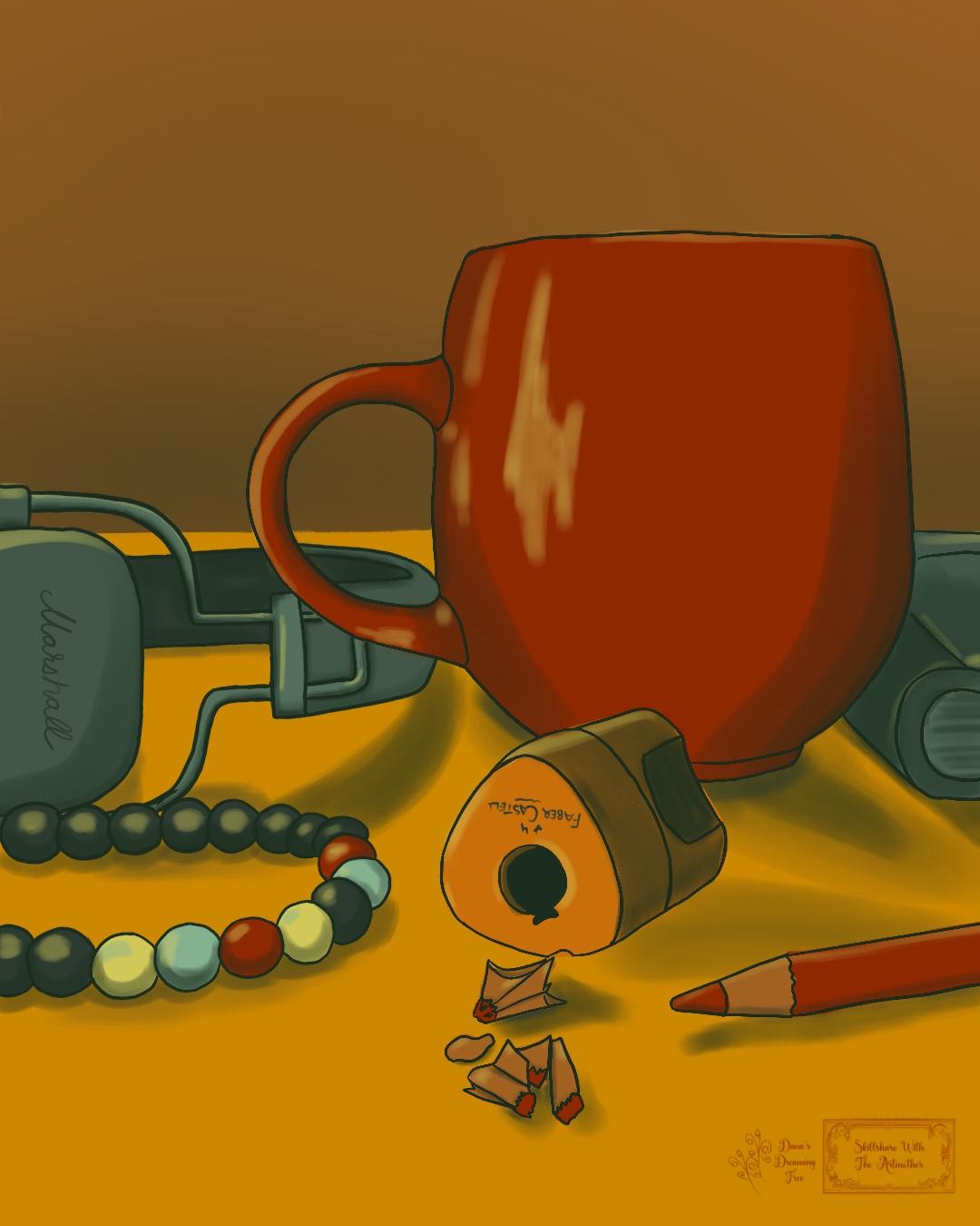
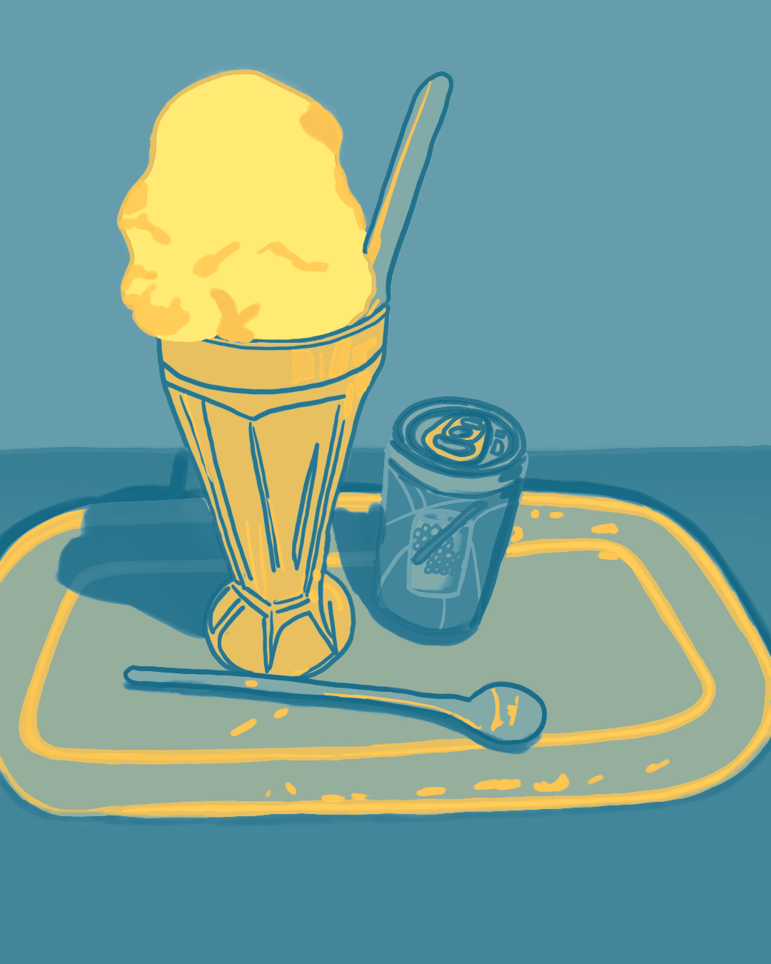
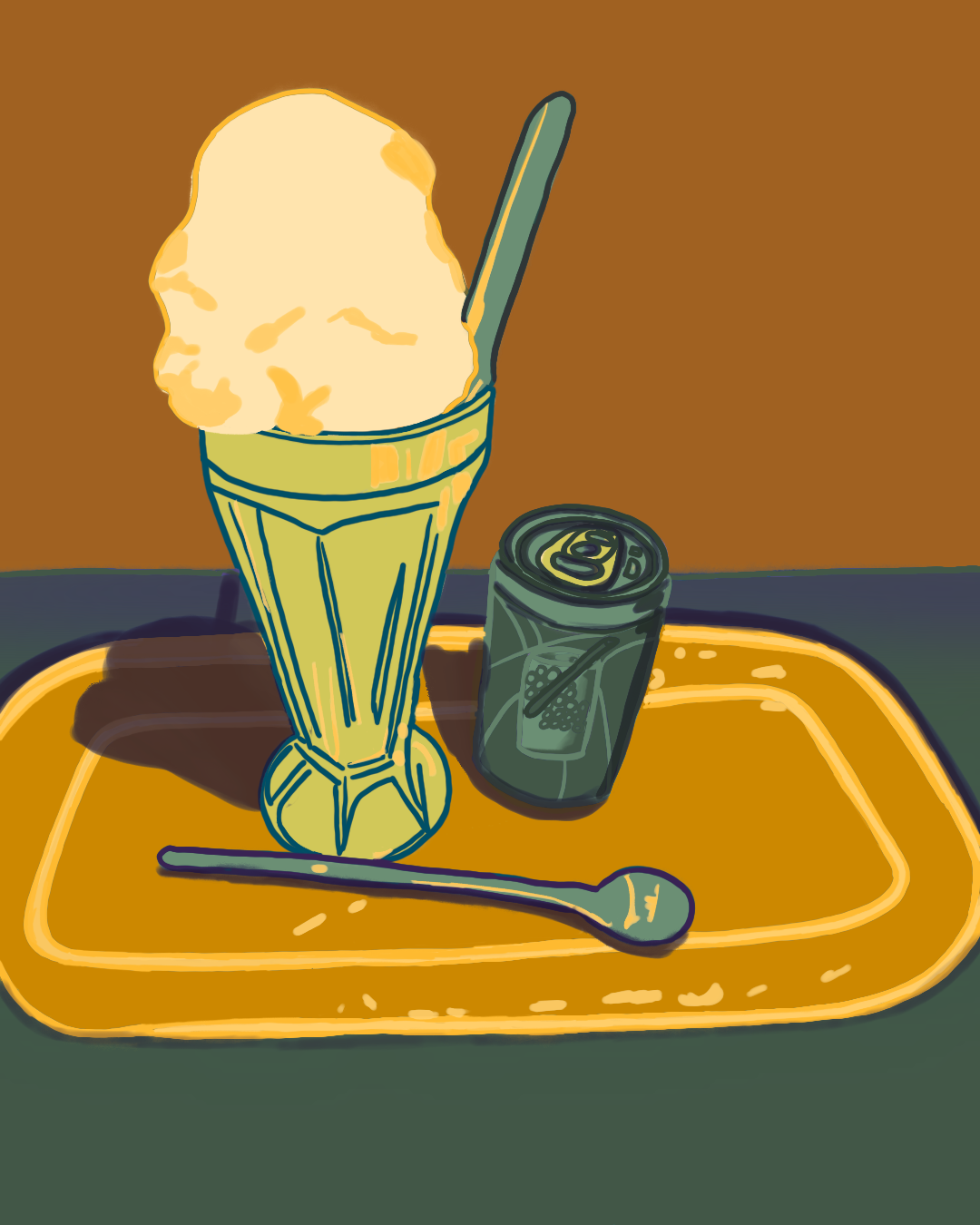
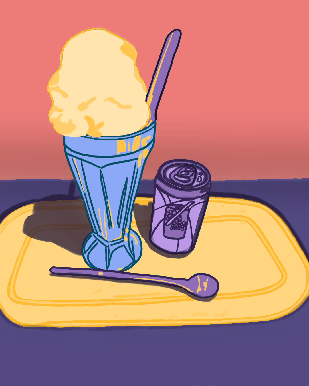
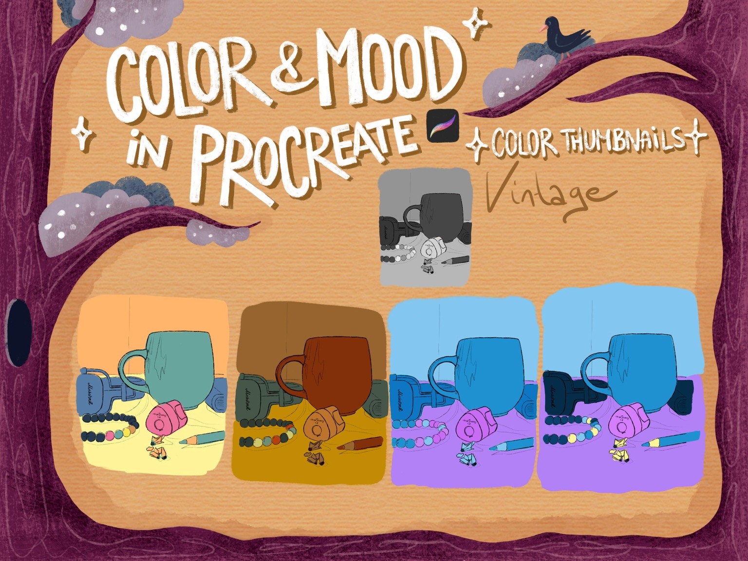
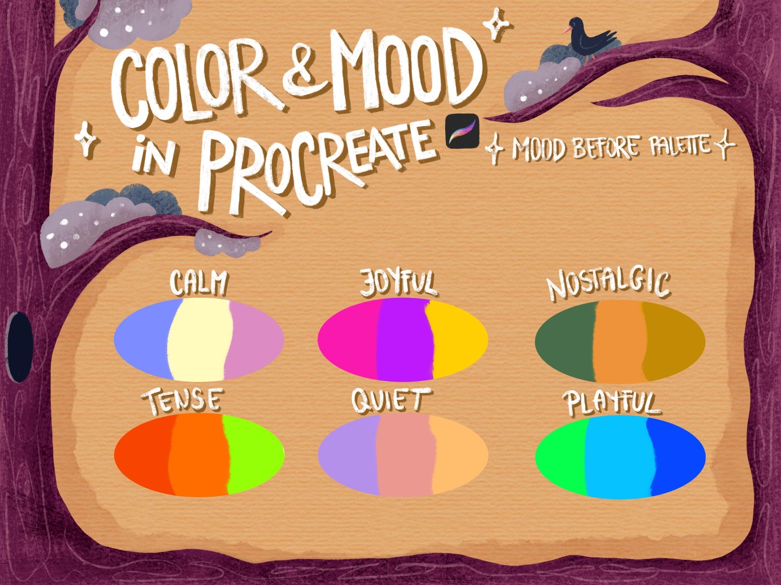
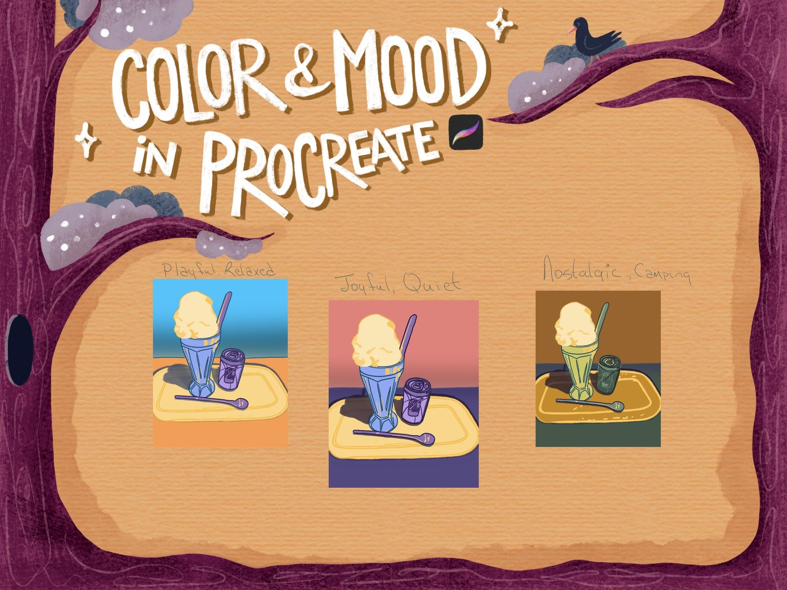
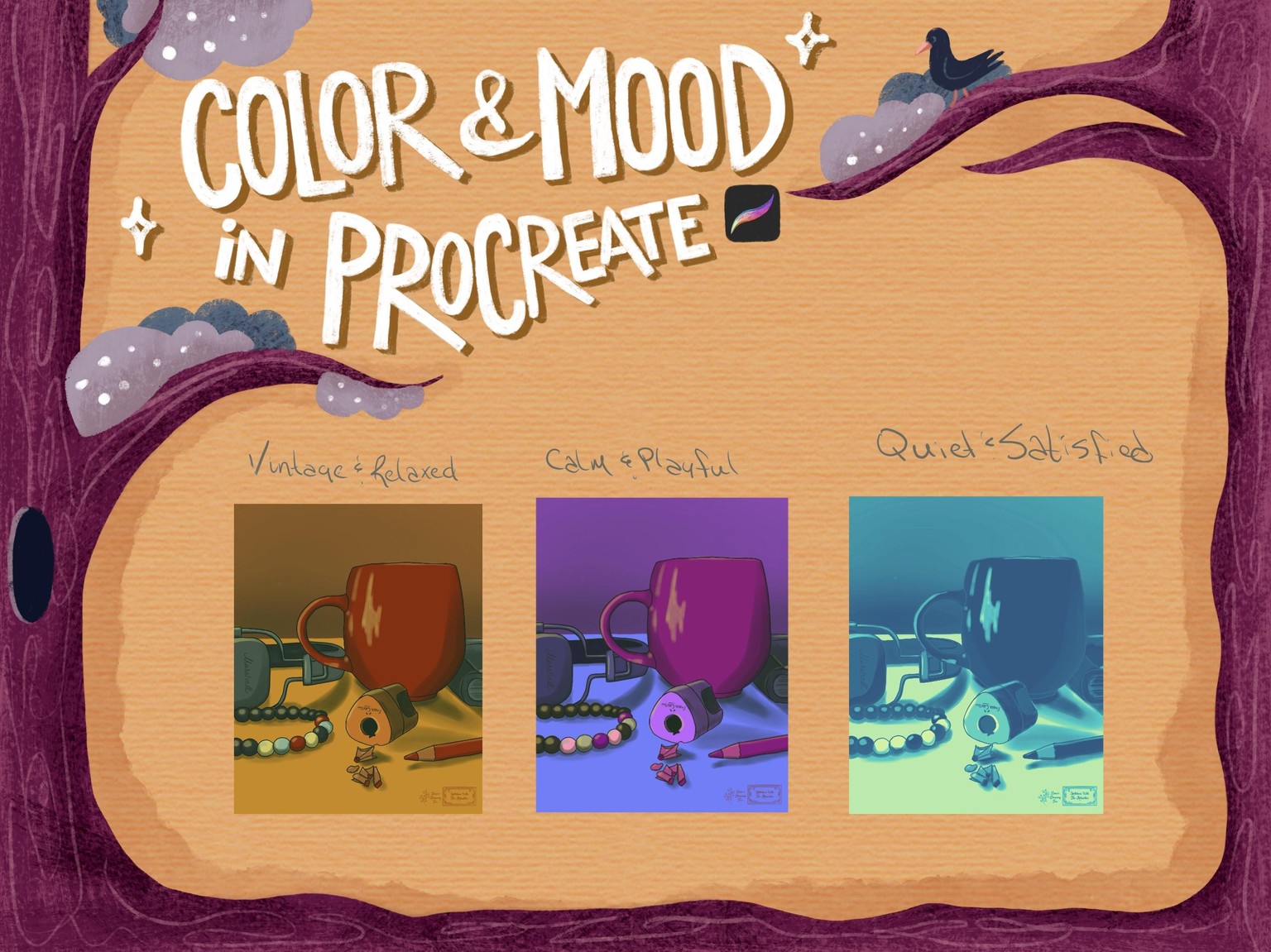
I tried to keep my illustration simple. It was a very good idea to focus on colour and the meanings of colour choices. I really liked exploring the recolor techniques. It was interesting to explore the gradient tool and how useful it can be. I found it challenging to select the right colors to match what I want to display/feel. Not all color combinations were successful - oops. I left the moody green tone since it reminded me of my parent's old vintage camper from the early 80's. It had an unusual gloom light to it.