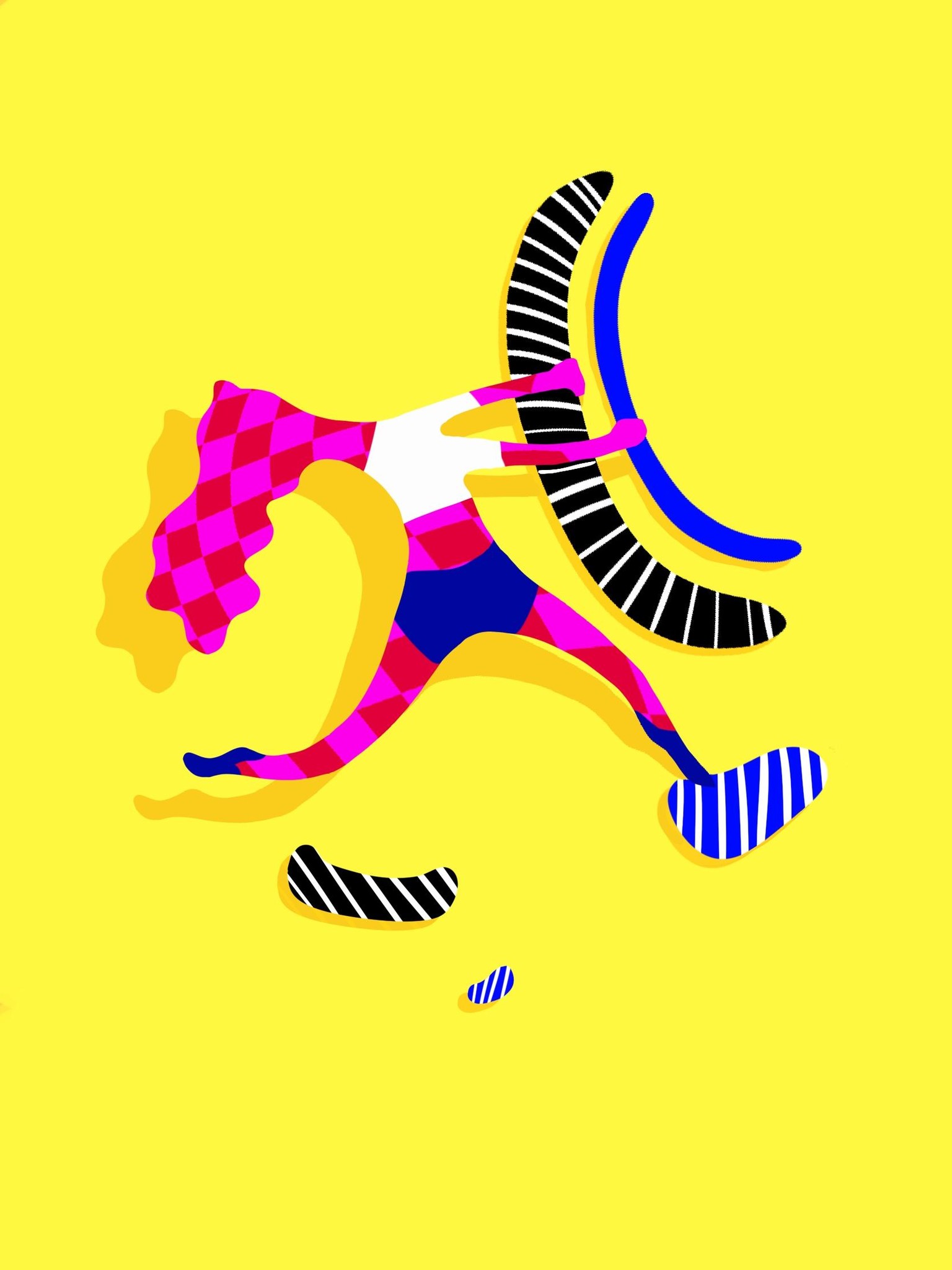
Stylization - Bouldering & espresso machine
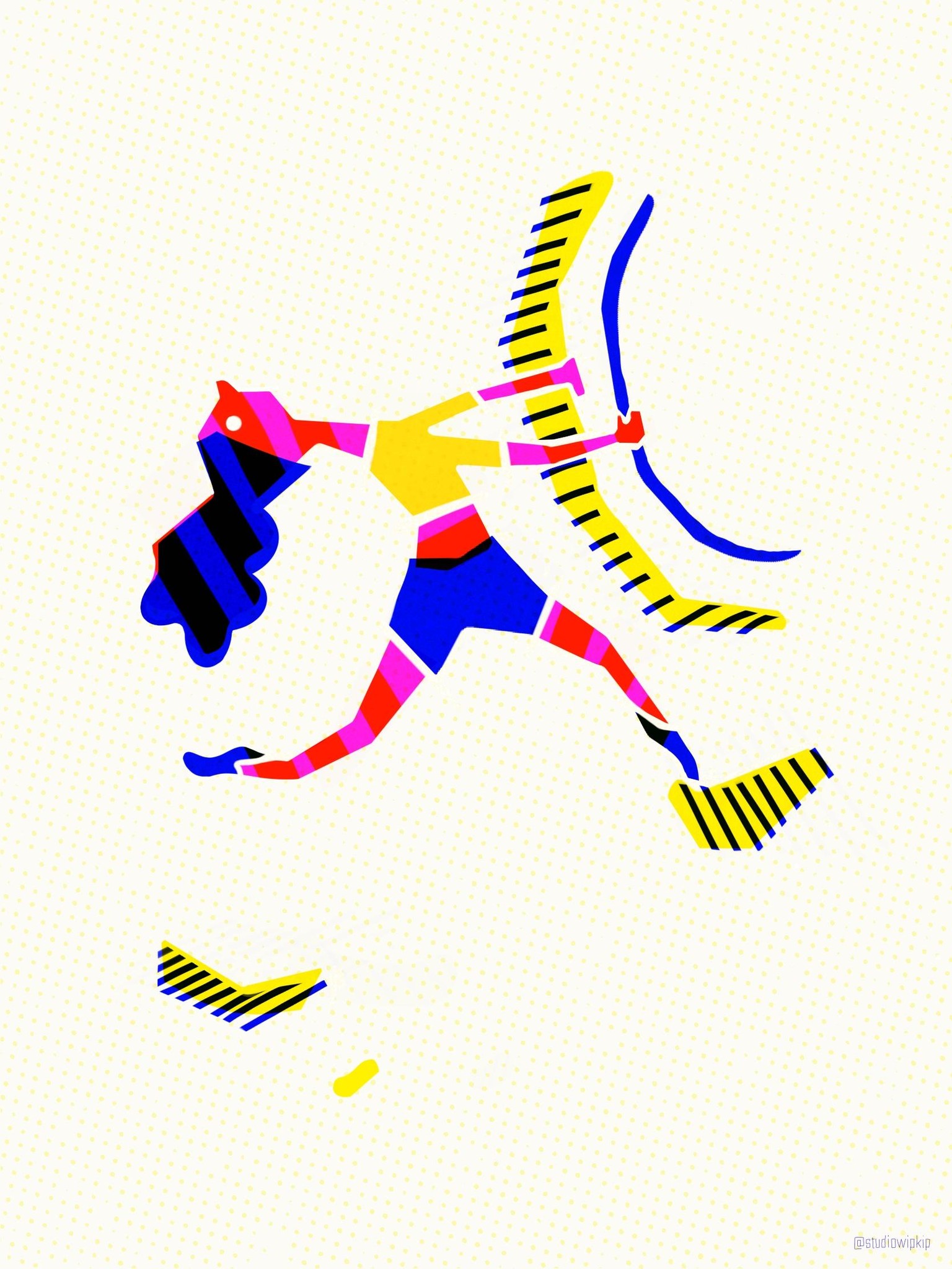
FINAL BOULDERING DRAWING:
After I finished the espresso machine illustration, I wanted to go back to my first bouldering drawing and applied everything I learned, and that turned out to be a lot!
FINAL ESPRESSO MACHINE DRAWING:
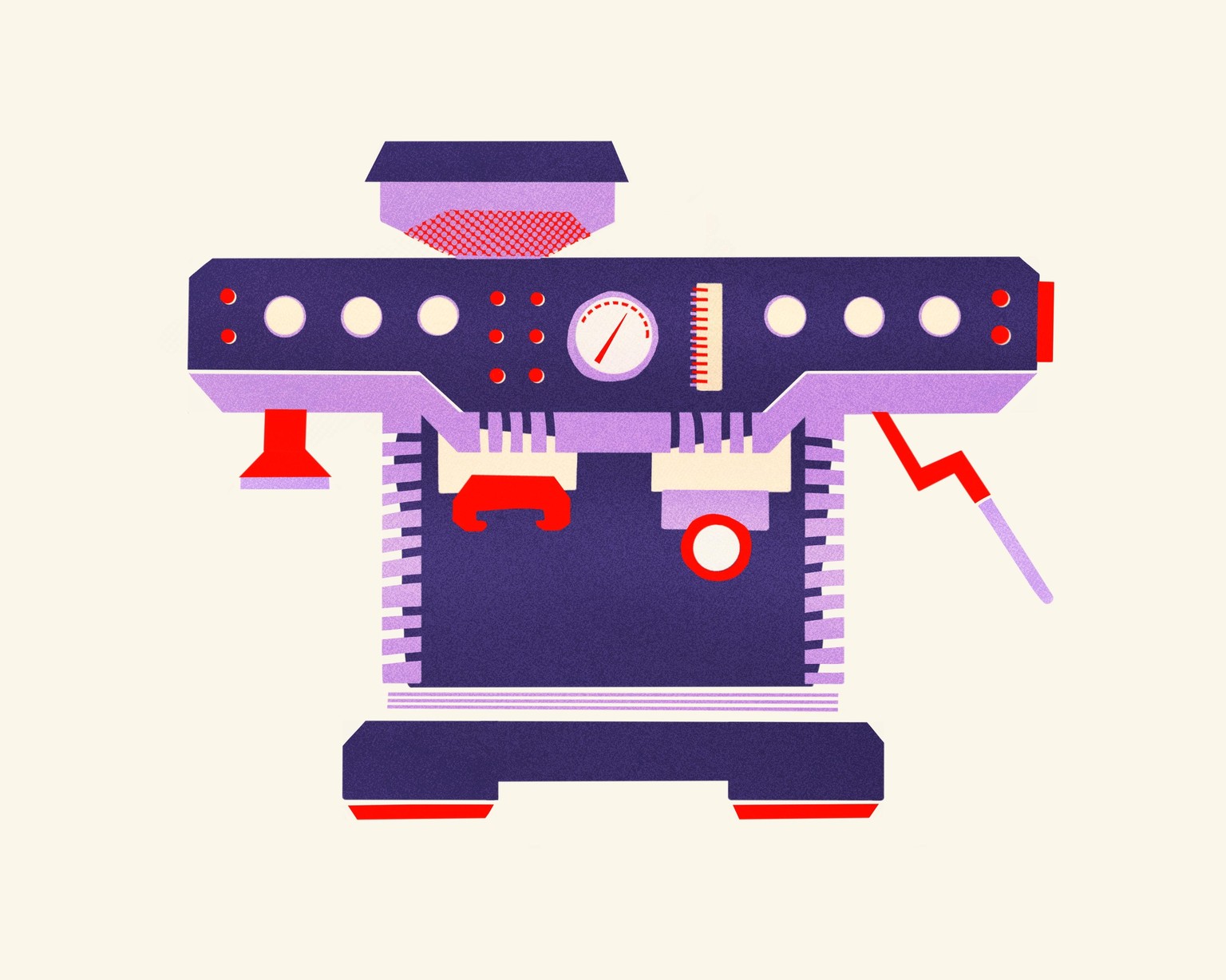
2 versions; I think I like the first one the best, because for me the drawing has more clarity without the little details on the control panel. While I was choosing colors, I also experimented with a colored background and I really liked the red one, but decided to focus on the colors within the drawing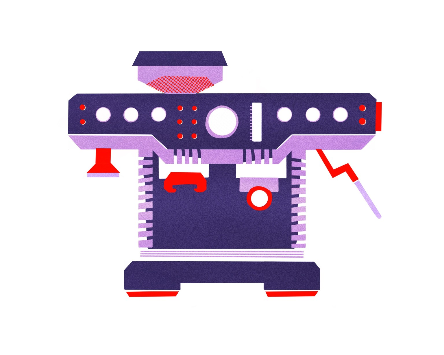
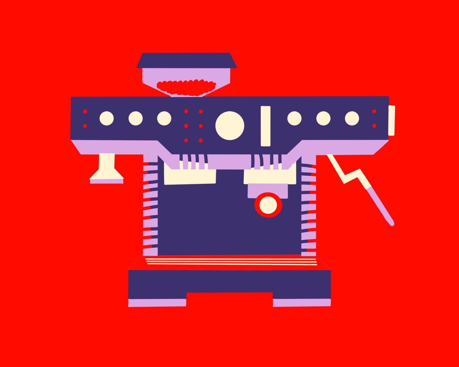
PUTTING IT ALL TOGETHER:
I tried to combine two of my earlier drawings I liked, which together reminded me of a gas station, and in a way, an espresso machine ís like a human gas station. But then I found out it got too much together, while the whole point for me was learning to stylize. So I choose for angular shapes and let go of the gas station idea.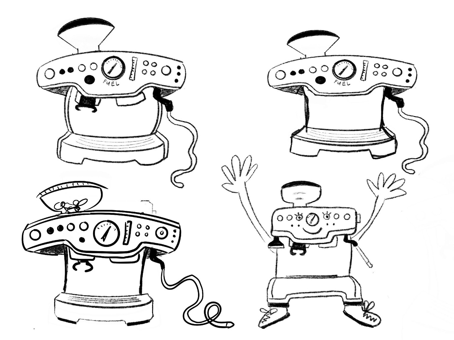
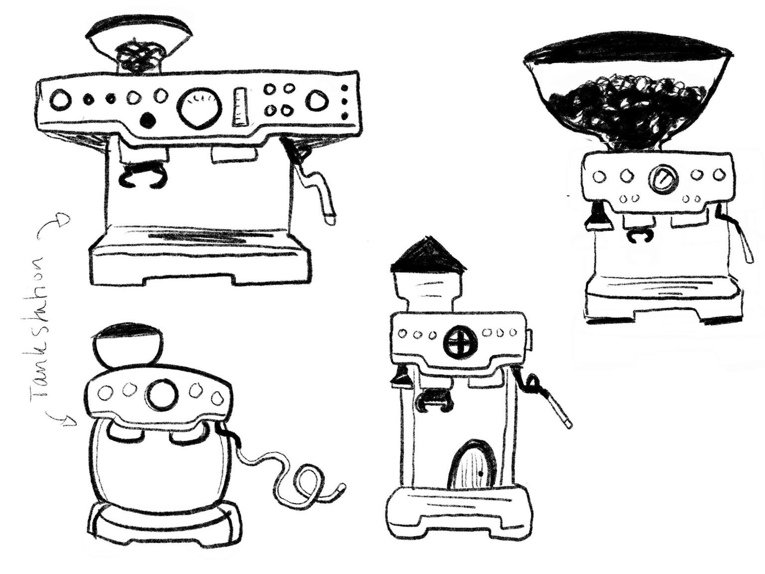
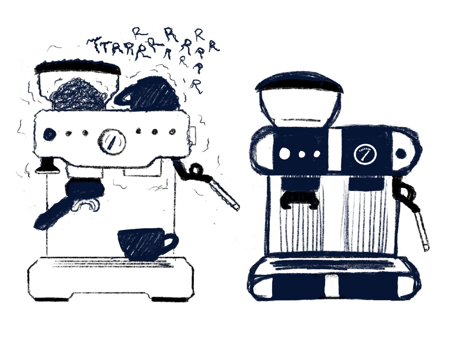
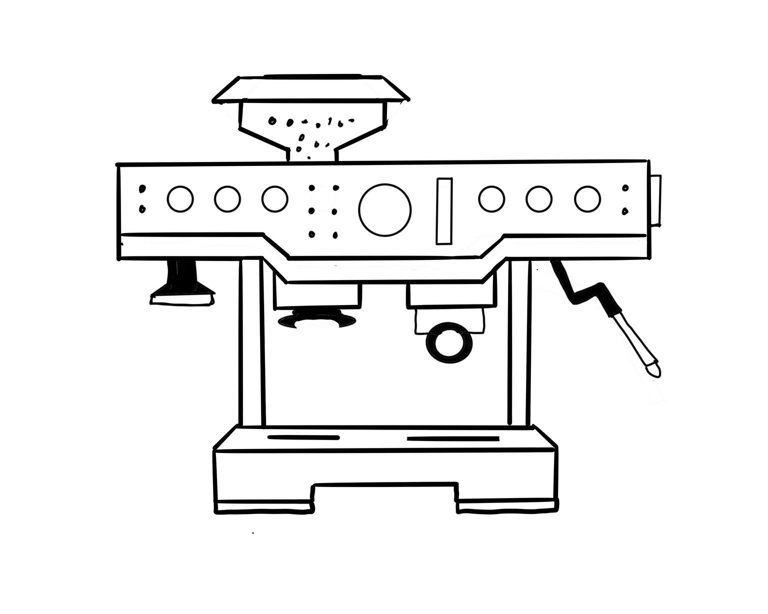 CUSTOMIZATION, EXAGGERATION, SINGULARITY: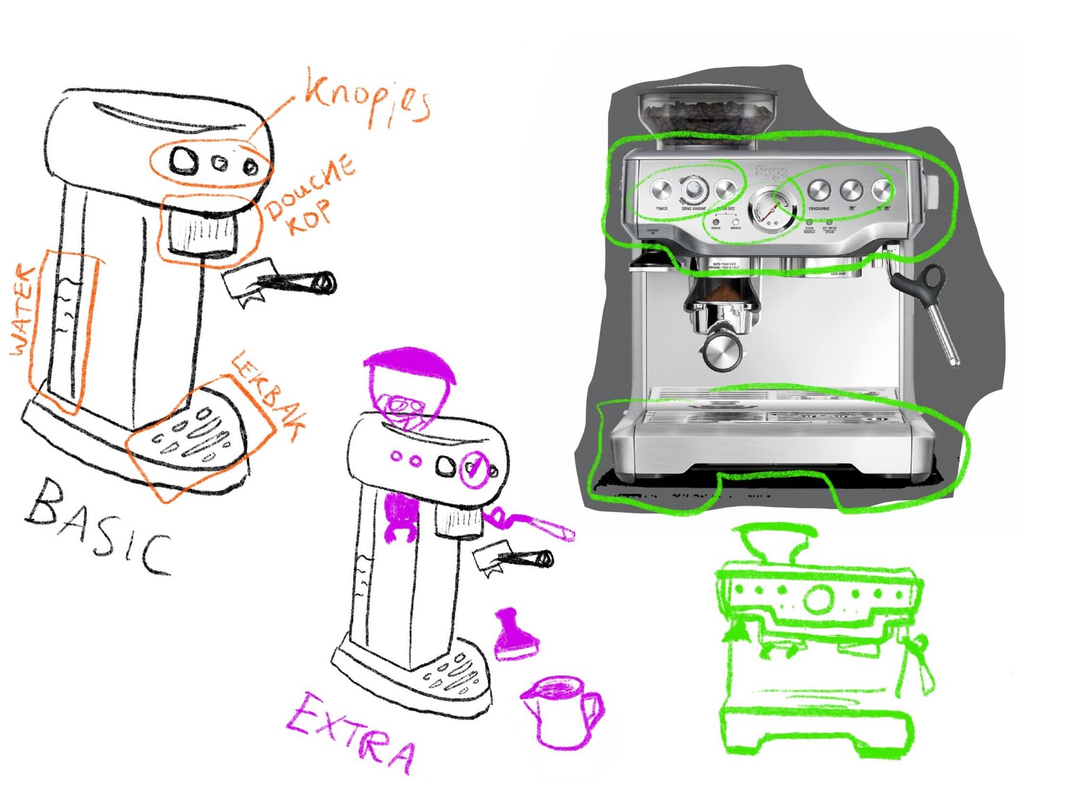
FIRST LESSONS:
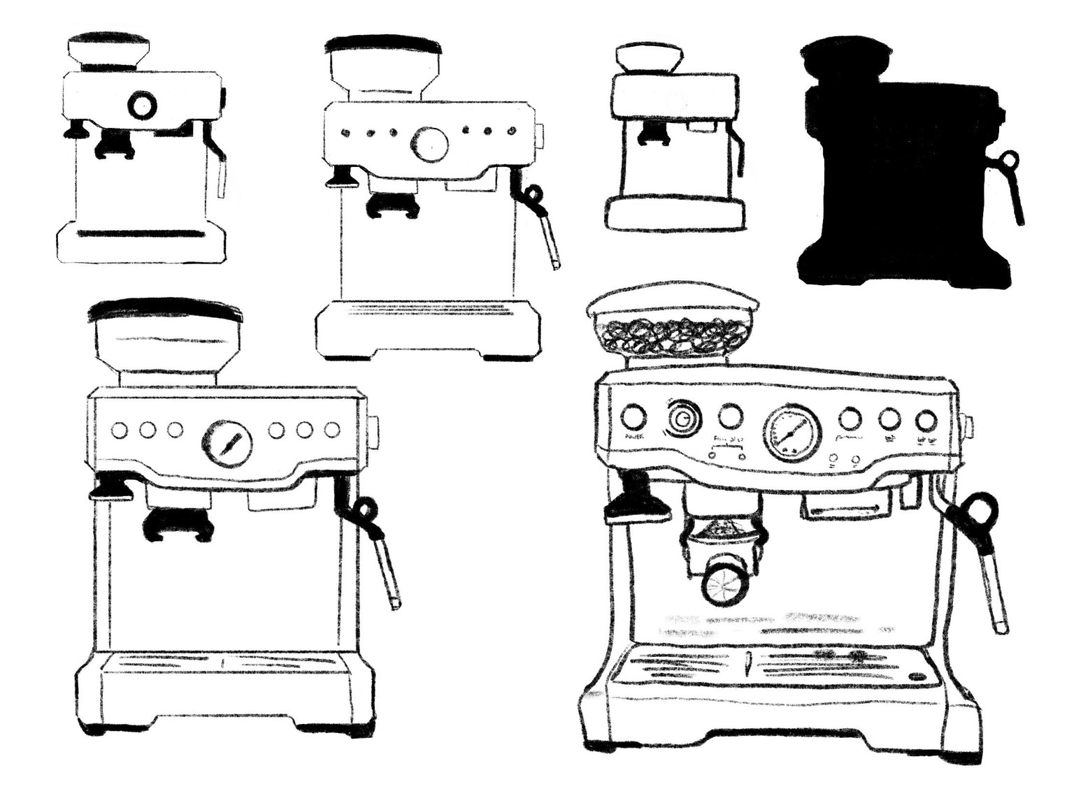
Figured I needed to switch to an object, because 'a person who is bouldering' gave me too many possibilities. So I choose the Sage Barista Express espresso machine. After a quick drawing like I would usually draw it, I started practicing with flattening & abstraction:
BEFORE
My stylized illustration of bouldering, eighties vibe, before taking the class. Exited to see what I'll make during/after the class!