David Lynch And His Symbols - Graphic Design Basics
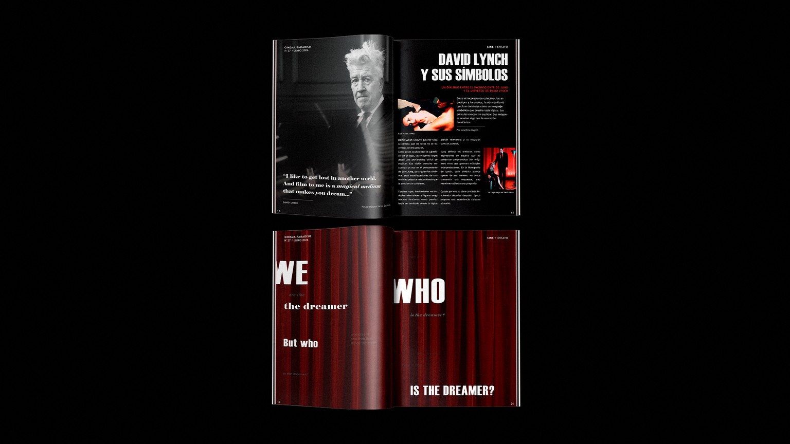
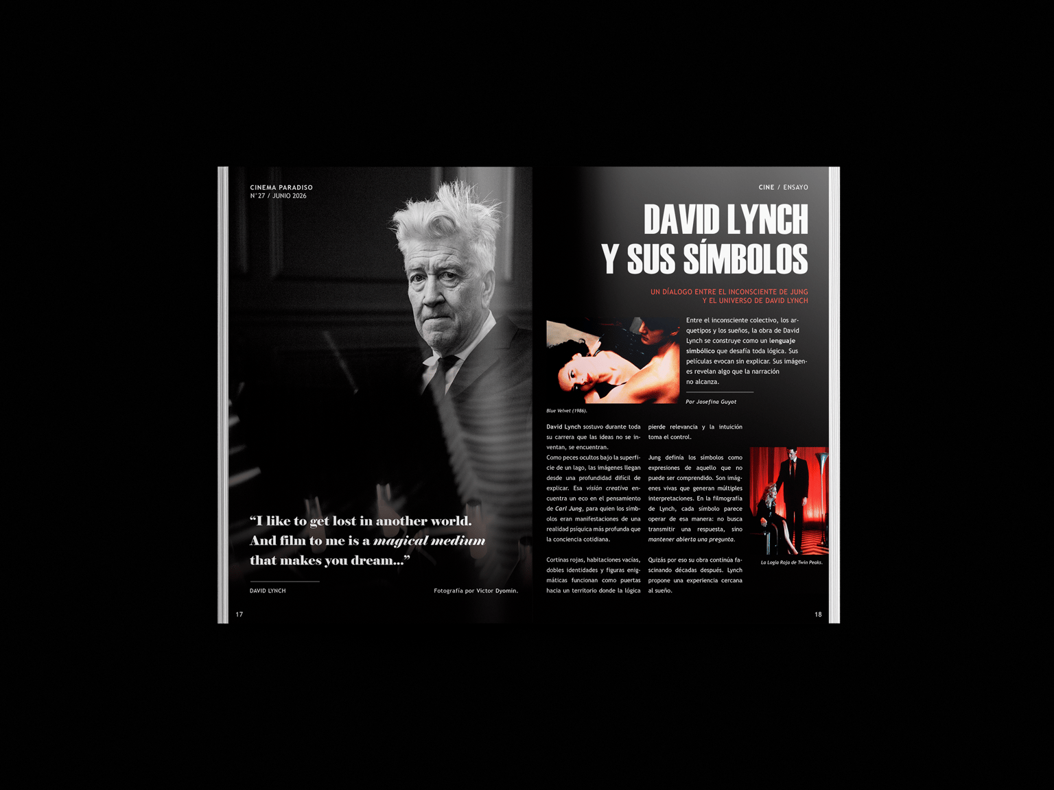
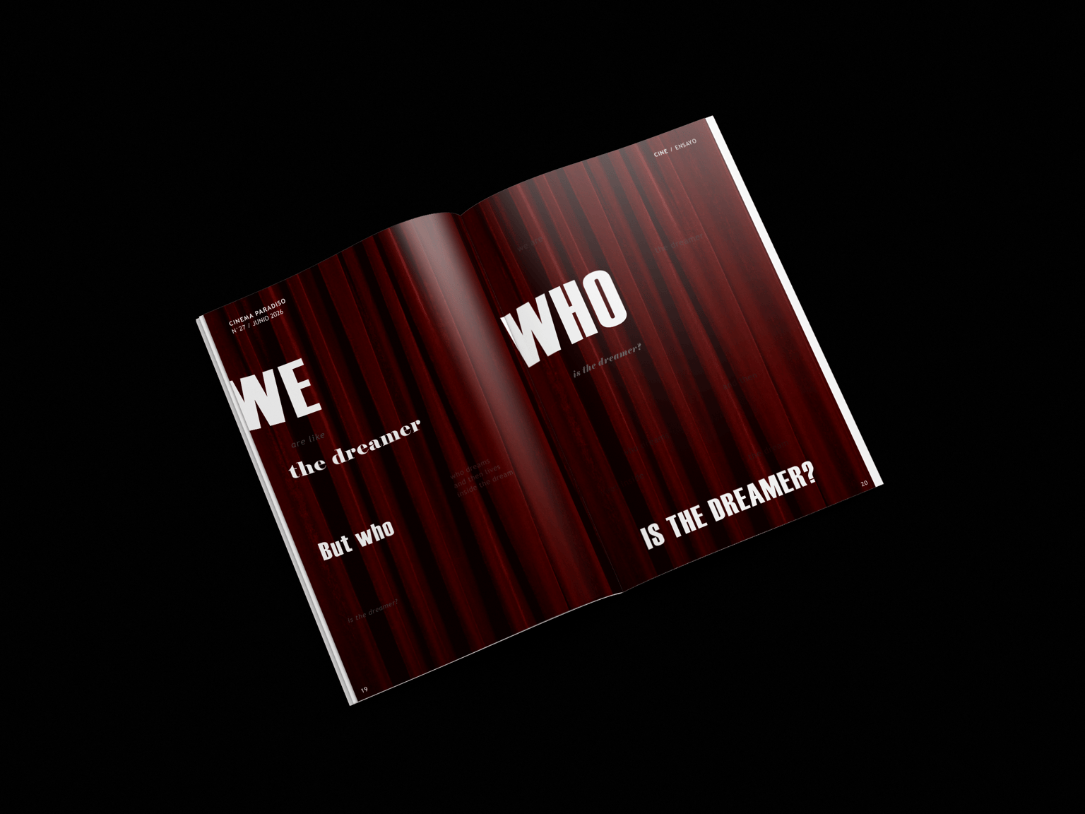
This editorial project explores the relationship between David Lynch’s symbolic universe and Carl Jung’s ideas about dreams, archetypes, and the unconscious, while also investigating several fundamental design principles through both structure and experimentation.
Hierarchy plays a central role, using variations in scale, weight, and placement to guide the reader’s attention and establish a clear visual path throughout the spreads. Contrast is created through the use of black, white, and deep red, as well as through the relationship between large and small typographic elements, dense and open areas, and image versus text.
Scale is used not only to create emphasis but also to communicate meaning, allowing certain words and ideas to dominate the composition while others invite closer observation. The repetition of typography, color, and editorial elements helps create consistency across the project, while shifts in composition introduce variety and maintain visual interest.
The project also relies heavily on rhythm and pacing. The first spread follows a more traditional editorial structure, while the second adopts a more conceptual approach, creating a progression that mirrors the movement from narrative understanding toward symbolic interpretation. Negative space is used deliberately to create moments of pause, encouraging contemplation and reinforcing the themes of mystery, ambiguity, and dream logic :)