Thumbnail sketches
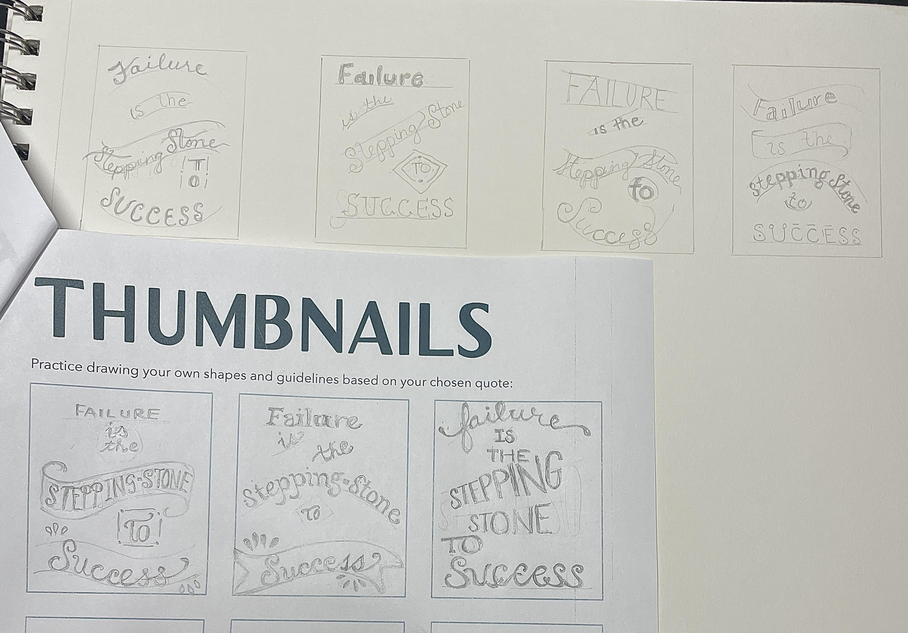
Here are my first attempts at thumbnail layouts. I found keeping the same letters consistent within one word difficult, as well as figuring out a "font," because I am brand new to this and haven't spent much time focusing on the various font choices. I made some of these up as I went along. Is that okay? I wanted to keep the emphasis on the words "stepping stone" and "success" rather than "failure." Those seemed like the words I wanted people (and myself) to walk away with when reading this quote. Any feedback is very much appreciated. Thanks!