Exploring Luxury vs Playful Color Palettes
For this project, I explored how different color choices can completely change how a design feels. I chose two very different visuals — a luxury fashion magazine cover and a playful kids poster — and created color palettes based on them.
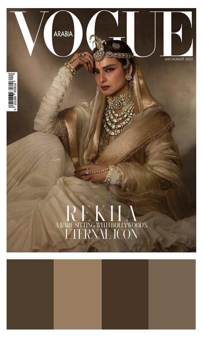
Luxury PaletteFor the luxury reference, I chose a fashion magazine cover that mostly uses soft browns, beige, and gold tones.
What I really liked about this is that even though there are not many colors, it still feels very rich and elegant. It made me realize that you don’t always need a lot of colors to make something look luxurious. Sometimes keeping things simple and minimal actually makes it feel more premium.
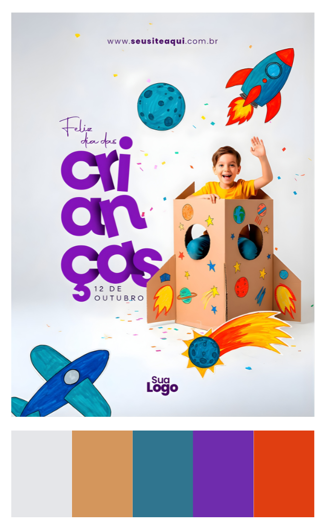
For the second one, I chose a kids poster which has bright and contrasting colors like purple, orange, blue, and yellow.
This one feels completely opposite to the fashion magazine. It looks fun, energetic, and eye-catching. The strong colors make it feel more lively and playful, which fits the theme perfectly.
From this project, I understood that colors are not just for decoration — they change the whole mood of a design.
• Fewer and softer colors can make something feel calm and luxurious
• Bright and contrasting colors can make something feel fun and energetic
• Choosing the right colors depends on what feeling you want to create