Intricate Pen & Ink
I'm just starting this class, and I intend to do a final project accoding to what @chloegendron dictates, but I wanted to practice some of her instruction in an even more basic way - different pen weights, multiple passes, and of course different shadow/light values. I chose bull kelp because it's actually pretty simple to draw.
I used a 01, an 05, and an 08 and did three passes.
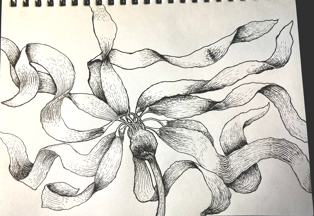
I'll post more as I progress. :)
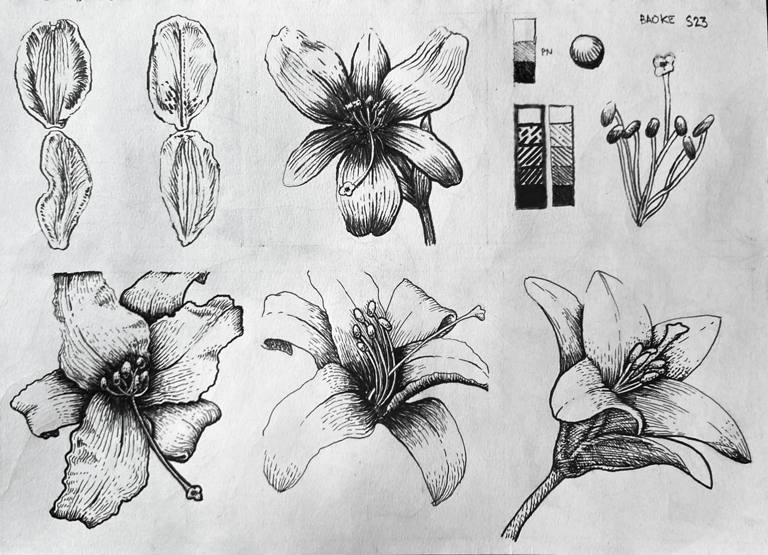
Progressing through the lesson. I did some lilies practice and focused on the feedback Chole gave me. Thanks, Chole! I can see improvement! I'll keep going until my final is done. 👍
Apologies for the paper looking so dirty. Just not a great photo. But hey, I think it adds a bit of character. :)
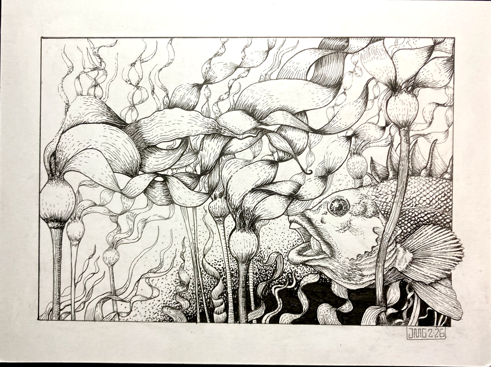
Ehhh...I think I lost the plot a little bit. I think I might try to work with Chloe's final comp idea. I'm not happy with my layout. Even though I did try to separate values and layers, everything still kinda looks like it's the same tone. I didn't leave anywhere for the eye to move. I guess I struggled with trying to bring out the forms, but I overworked it, I guess? Feel free to leave comments or suggestions for my "Rockfish and Cormorant" illustration.
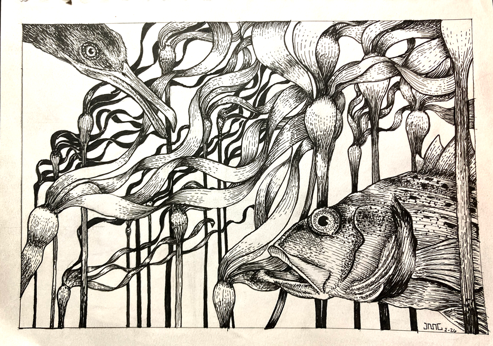
I wanted to really get layering down and make sure I wasd capable of visually separating background to foreground. I also wanted to work on different texturing and lighting. This FINAL final took several days. I'm estimating probably around the 24 - 48 hour total working time this past week or so. I used micron 01, 05, 08, and 10 for the black fills.