Authority Trading — Visual Identity & Color Strategy


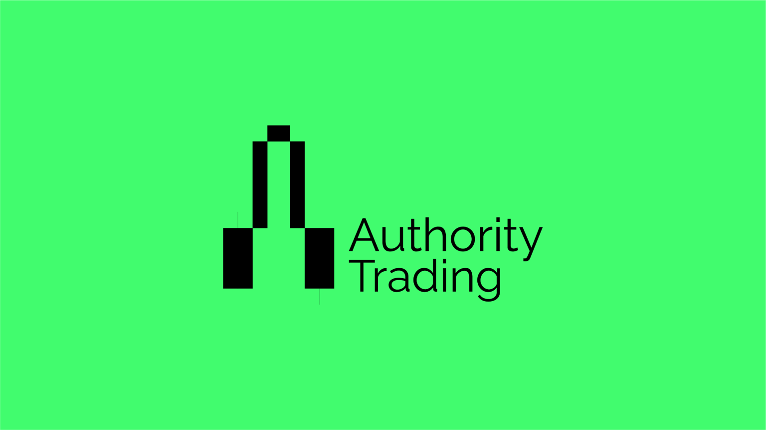
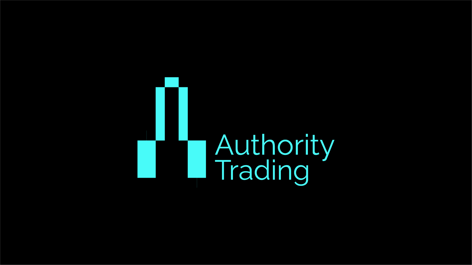
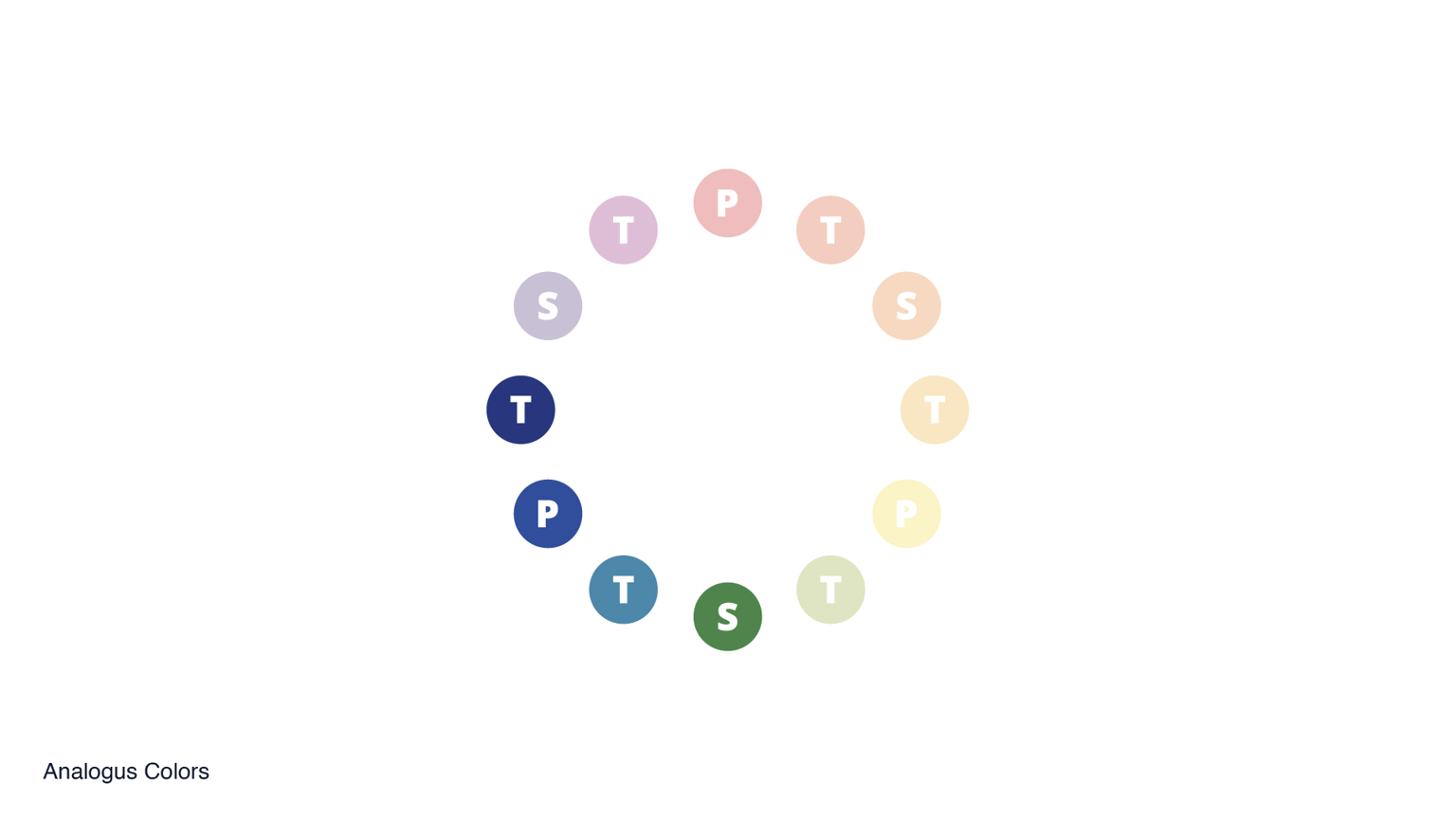
Authority Trading is a group of professionals dedicated to teaching trading and market fundamentals. I was commissioned to create their visual identity, starting with the logo. Afterward, I developed a color palette based on analogous colors and carefully checked contrast to ensure clarity and accessibility. Dark blue was chosen as the primary color because it best reflects the brand’s personality: professionalism, stability, confidence, and authority. The use of cool, analogous colors reinforces a sense of calm, control, and trustworthiness, aligning with the reassuring and disciplined approach Authority Trading aims to convey.