I Cute-ified My Dog
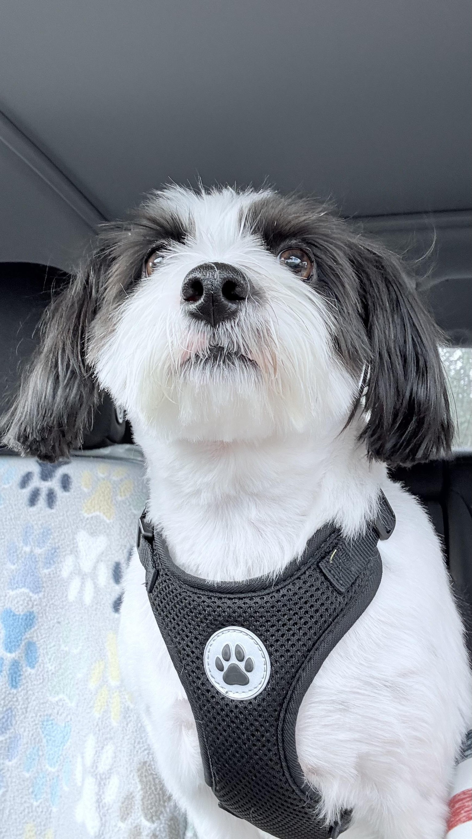
I used my dog, Ferris, as inspiration because he is the CEO of my doggie-themed graphic designs.
1st sketch: I flipped my egg shape upside down to give him an extra large head and smaller body. The eyes creeped me out and I needed to change them.
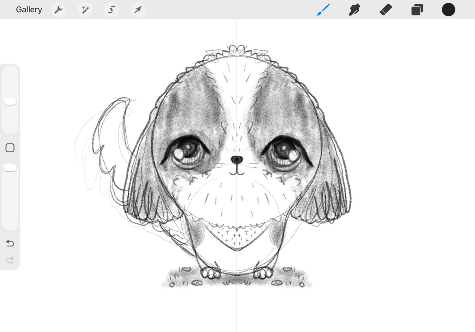
My 2nd sketch: Removed tail. Made tiny eyes. Added cheeks. Refined details.
3rd sketch: Face didn’t have enough contrast so made nose larger. Added eyebrow area/hair over his eyes to look less flat.
Final sketch: added ground so he wasn’t floating.
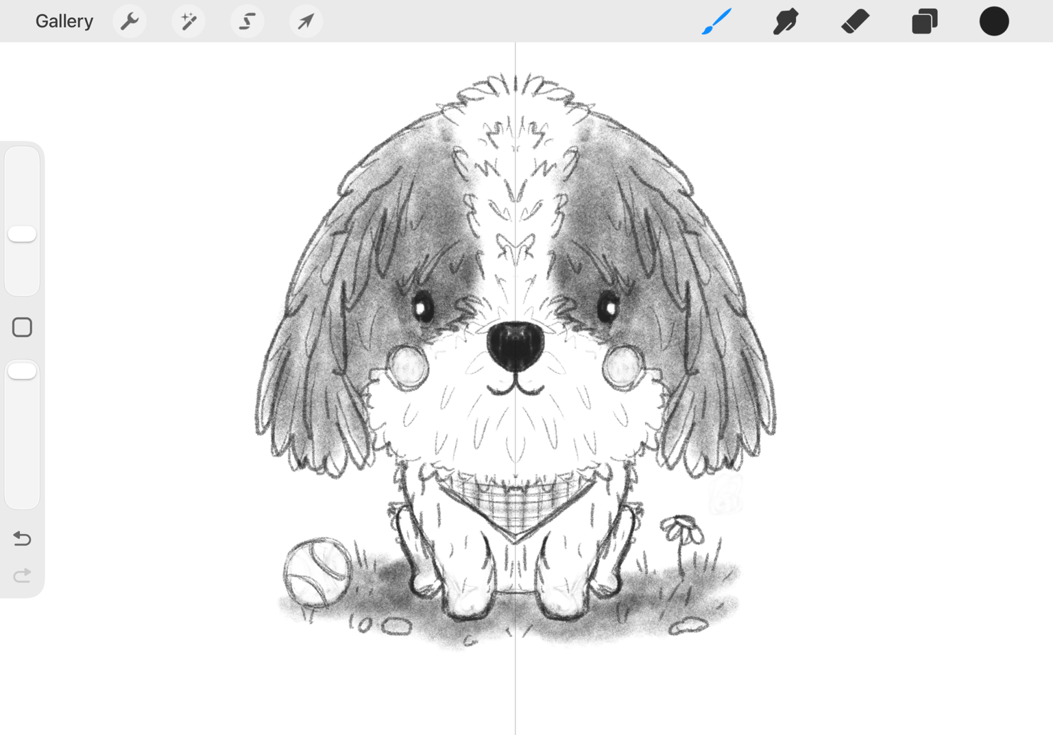
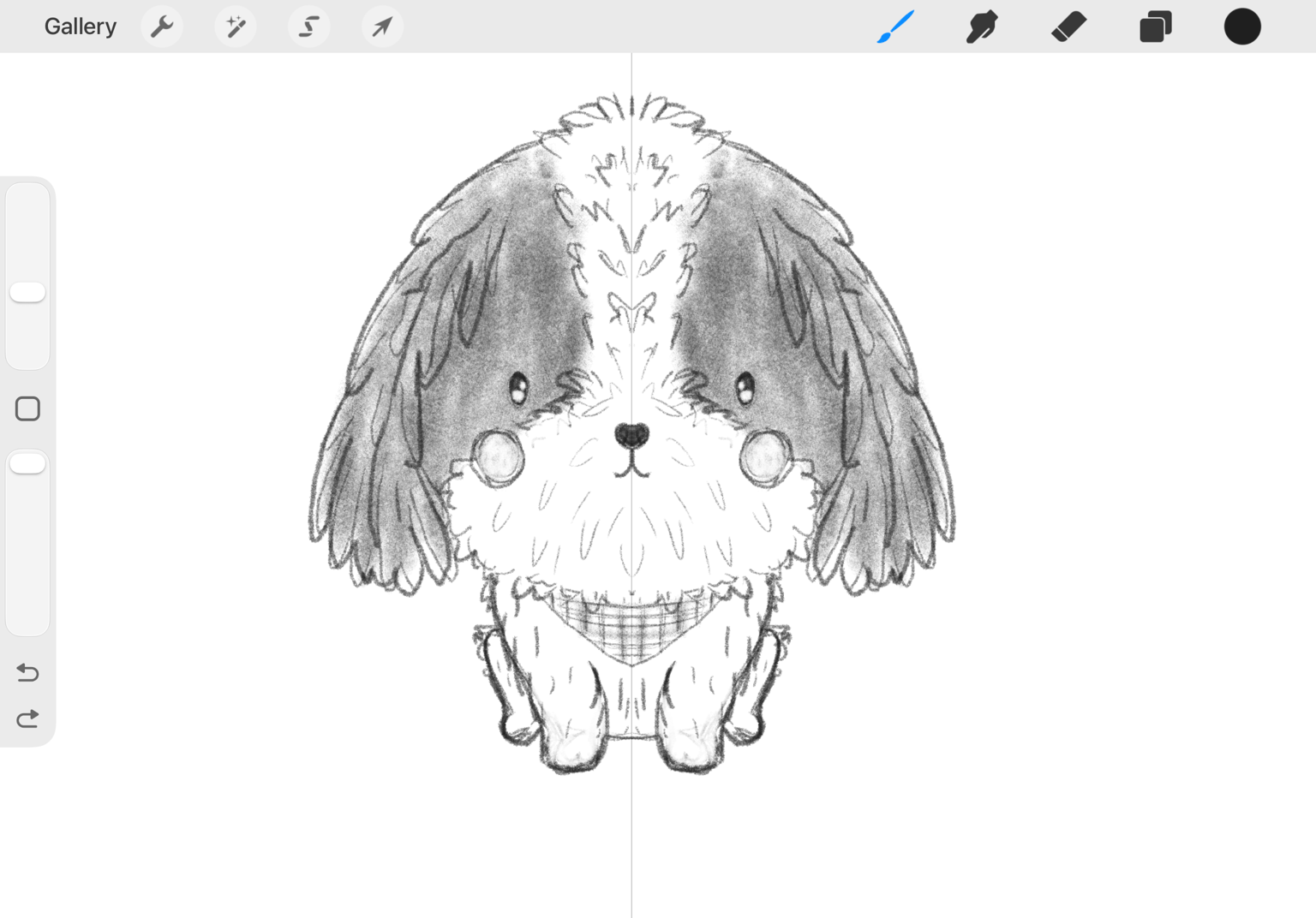
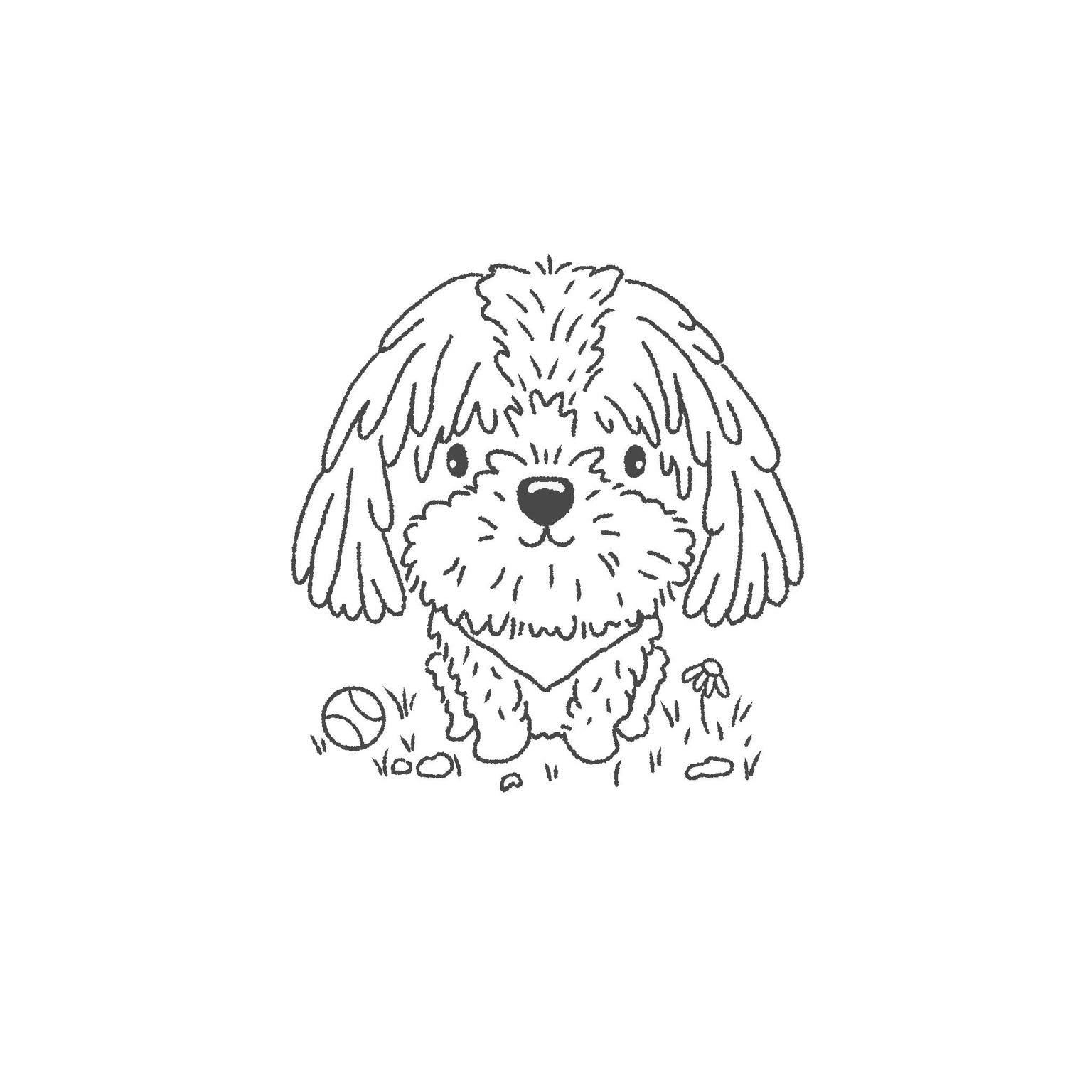
Line Art: Traced sketch with textured Procreate brush to add to style and make him look more scruffy.
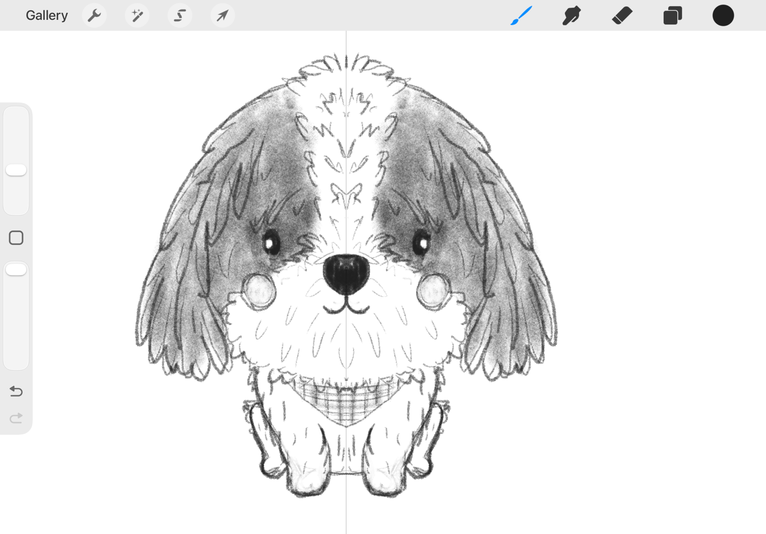
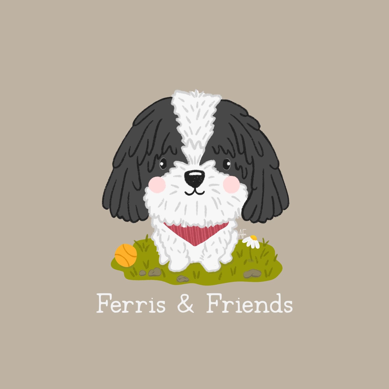
I went through a few versions and styles of coloring this using Procreate brushes such as watercolors, alcohol markers, and textured brushes.
The texture brushes were my favorite and most vibrant so that’s the one I’m posting!
Final design: Redrew all in a new layer using color and texture brushes. Added name of product line. Added signature stamp.
Thank you, Lettie, for this fun and informative class! I’ve got handlettering and doodling as my jam and really want to expand my skills to being able to illustrate stylized characters.
P.S.
My husband says he doesn’t like the cheeks. Should I remove them? Or place them behind the hair on his snout?
P.P.S.
Here’s a photo of Ferris right after a haircut ☺️