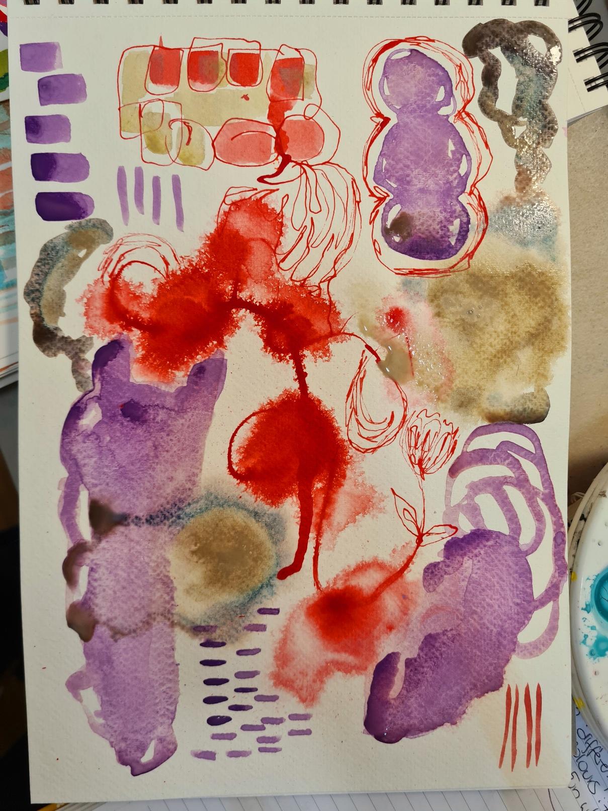
Acrylic inks abstract flow
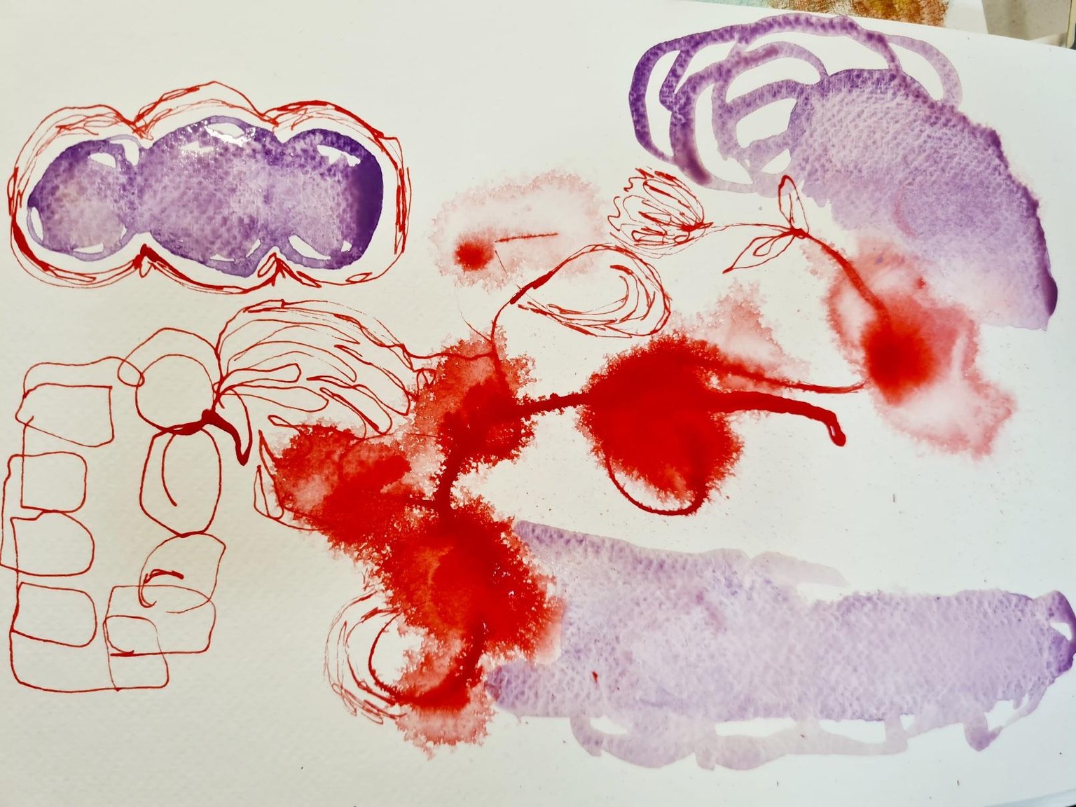
I've had this AMSTERDAM 315 PYRROLE RED acrylic ink which I am not too keen on. However I like to challenge myself when I encounter a colour I'm adverse to, to then get curious and explore what surprising colour combinations would make this colour pop, or compliment it in a harmonious manner. Intuitive abstracts are a stimulating exercise to explore unexpected palettes and compositions. The experimenting is endless! Acrylic ink is one of my favourite wet mediums to do loose experimental play and abstracts with.
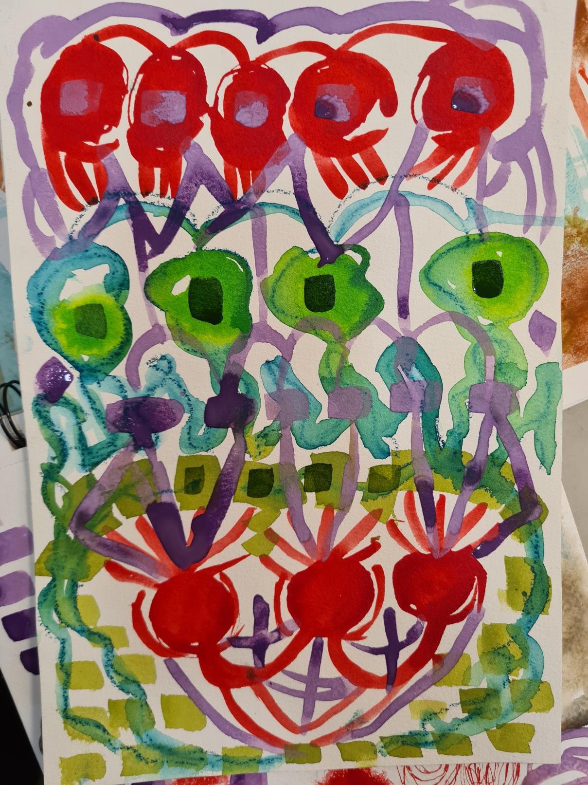
This PYRROLE RED and green piece I don't like at all. I'm not sure how I can adjust this painting with the next layers to make it appear more cohesive?