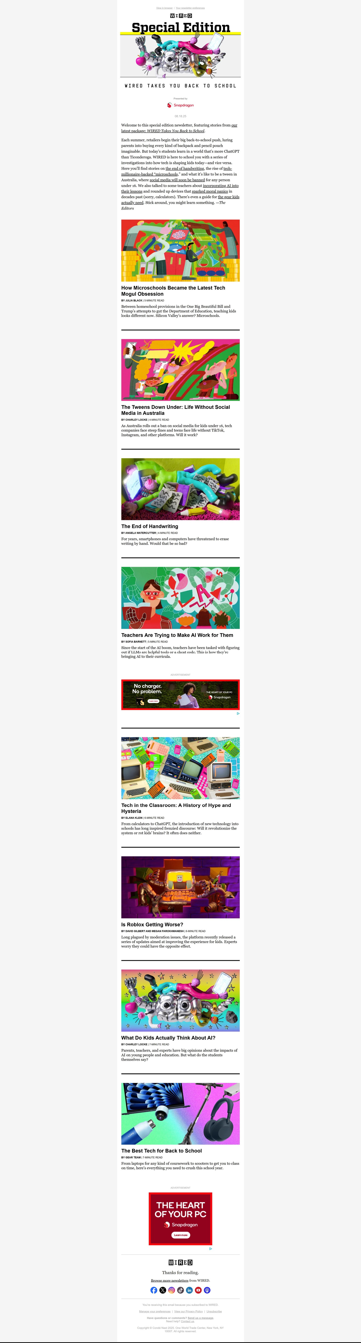
Action Email
When I first started thinking about this project, I was going to share an email newsletter from a local bookstore, because I think their newsletters are beautiful and use a lot of cool typography. But then I realized that most of the typography I liked was in images, which might not load for everyone. So I went and found this Wired newsletter I just received. I think Wired's design is usually on point, both in print and digital. I haven't engaged with this yet, but I'm going to click some of the links to read the articles. It's a "READ ME" email. The images are really engaging but even if you can't see the images, the text is arranged in a single column (which is maybe more responsive?) Even if the correct fonts didn't load, it would still look neat and organized. Each article link has a concise summary.