Set of 3d typography posters
I've done 3 poster.
Balance - I used special font, which Inicialy was lack of Balance ( cut in B lettoer no middle post in A etc.)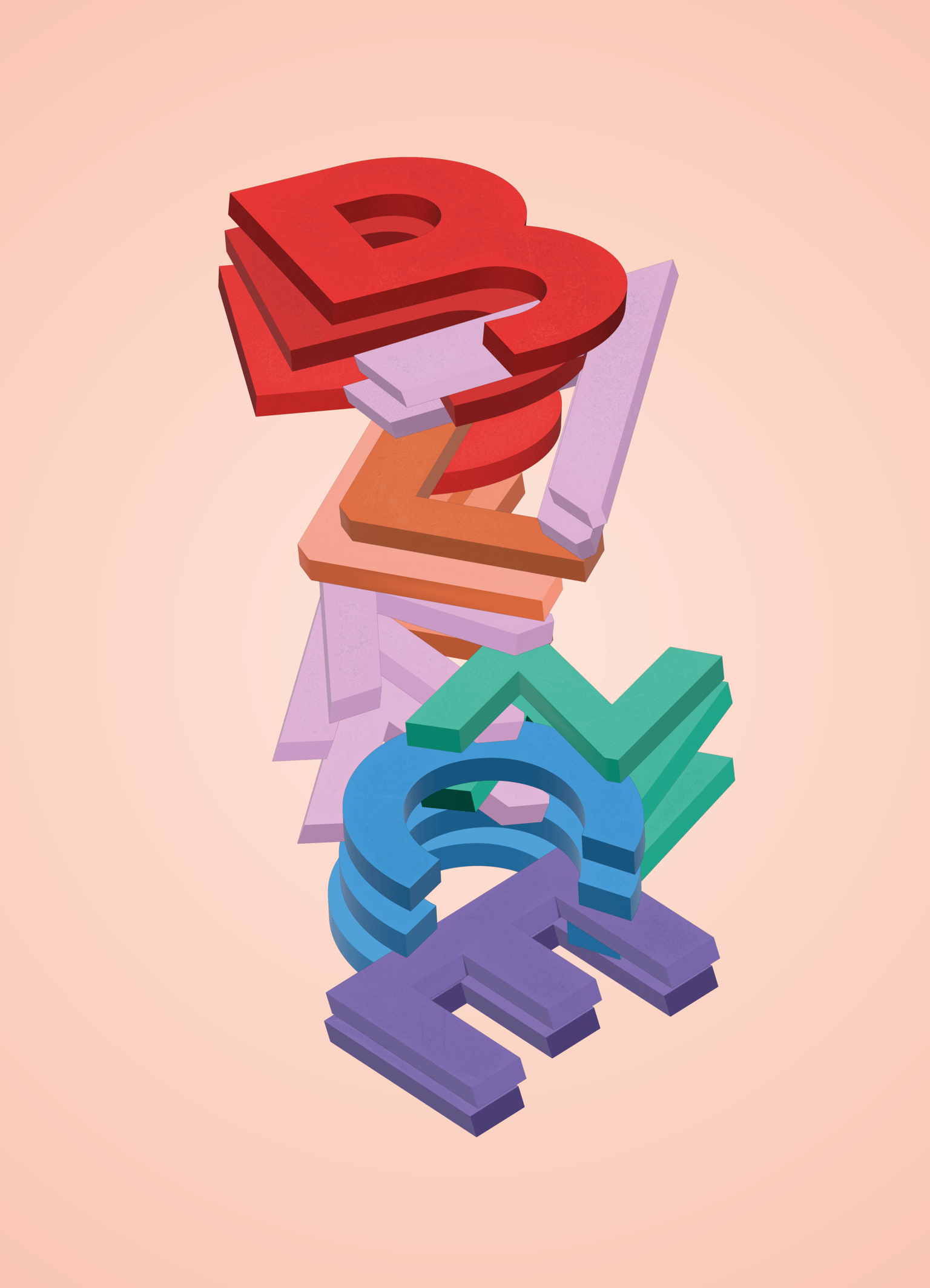
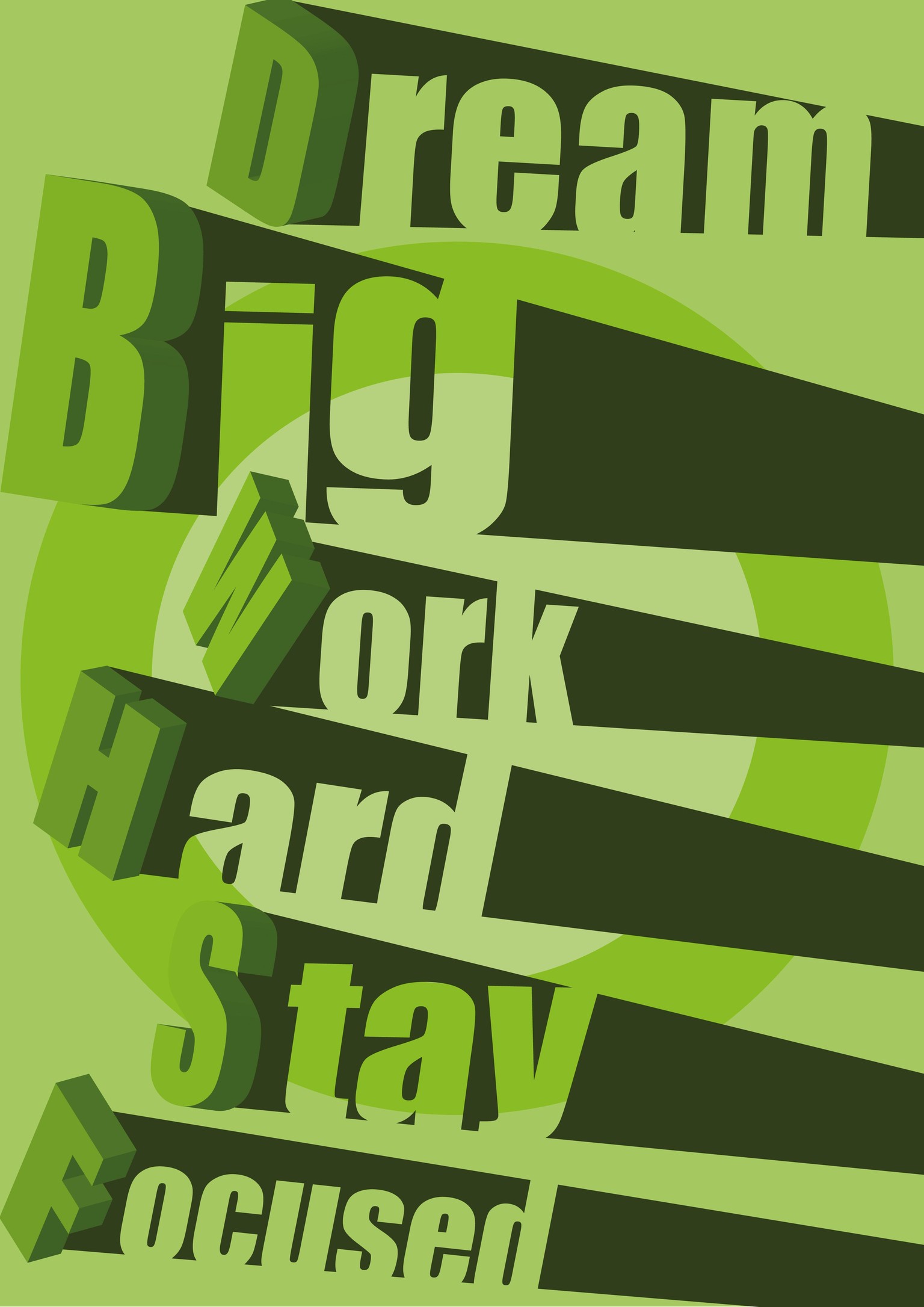
Second One - Quote.
Third One - Monday - lettering enhanced with isometric illustrations.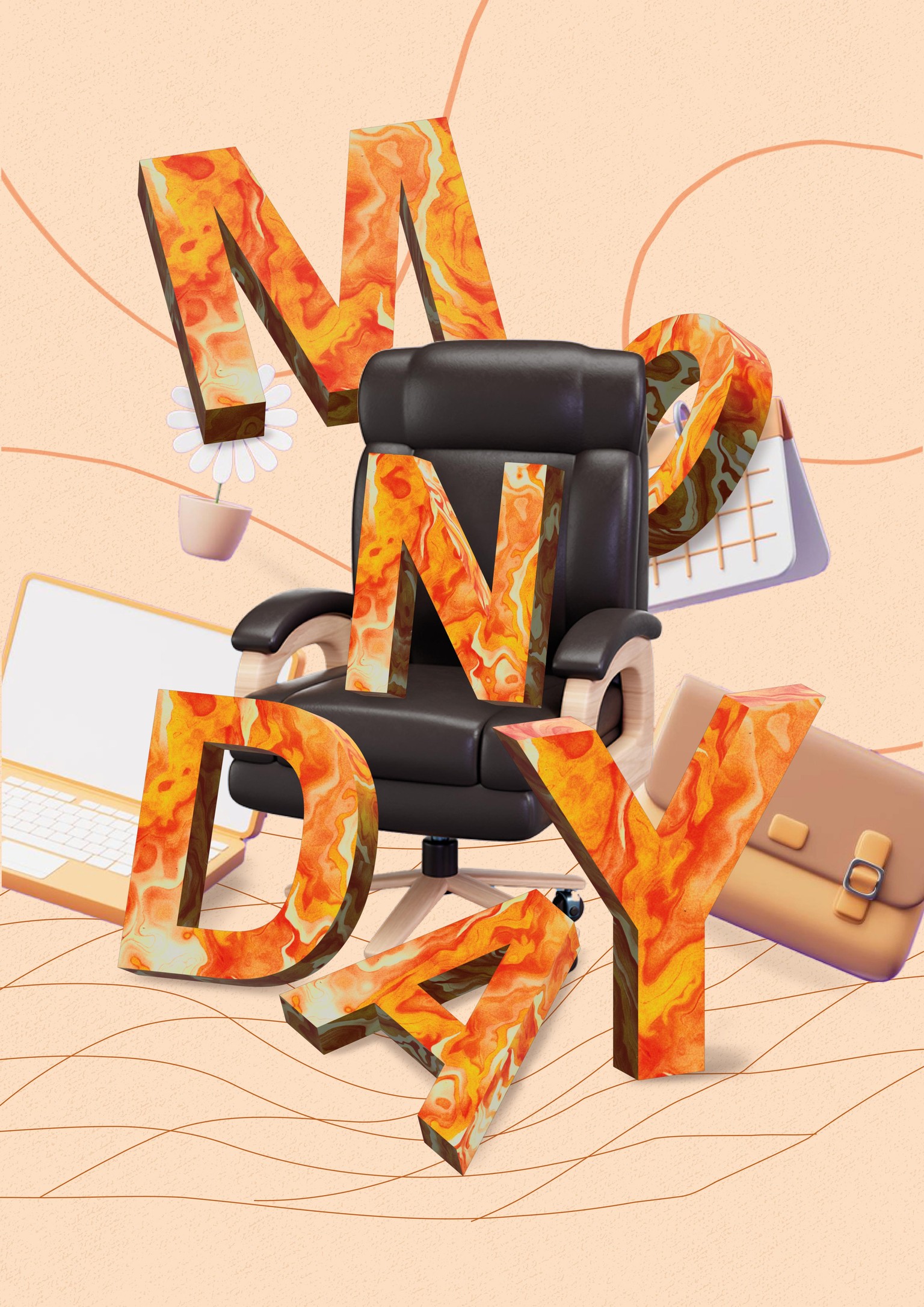
Let me know what you think :)
More my project you can find on my
Behance: https://www.behance.net/michawolski4
Instagram: https://www.instagram.com/mihu_wolski_1996/