Motivational Icon
In this project, I tried to visualize my favorite quotes, which is 'It's all about perspective'.
I would like to be reminded everyday that life is just all about perspective, that's why it's important to keep an open eye, so that I can see things from different perspective. I would like it to be put on my working desk, as, obviously, that's one place where I need to clear my perspective at.
So, I tried to breakdown what perspective related to, which I came to: Eyes, Perspective Lines, and Prism. From there I tried to sketch the idea out.
1. First Sketch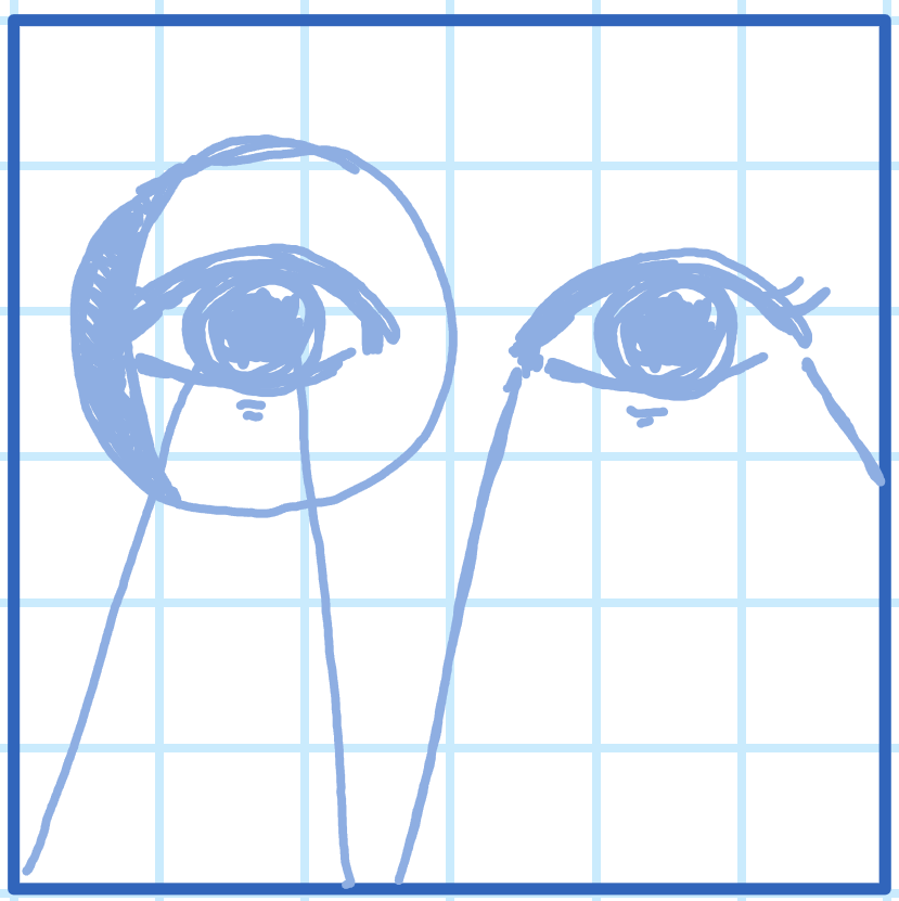
My first sketch depict a pair of eyes, one with horse blinders, as Indonesian parents always said, 'You always have to keep an open eyes, do not walk around like you are wearing a horse blinders'. I quite like how it look, but I don't think it is literal enough. Also, I am not quite sure about the horse blinders. That's why I decided to move on into my second sketch.
2. Second Sketch
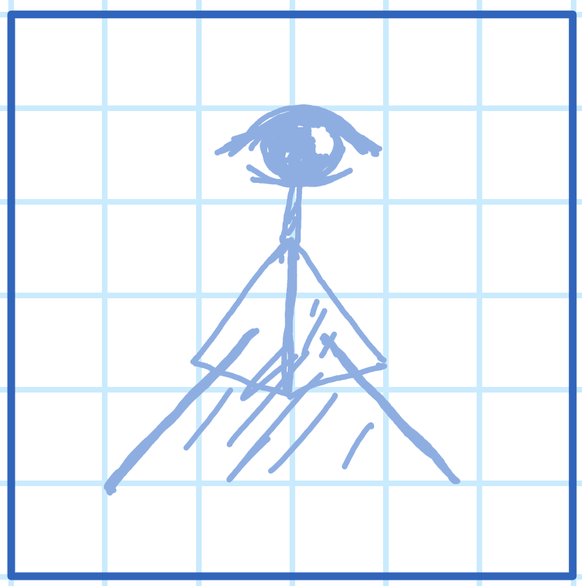
In the second sketch I tried to incorporate a prism for it's ability to refracts light, but I don't think it represent the quotes enough, so I moved on to sketch three.
3. Third Sketch
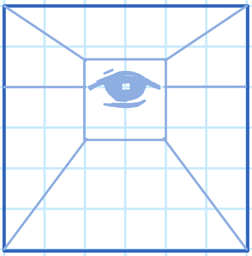
In the third sketch, I tried to incorporate the 'Perspective Lines' that is usually used in creating a perspective drawing. But I don't get the feeling, so I moved to the fourth sketch.
4. Fourth Sketch
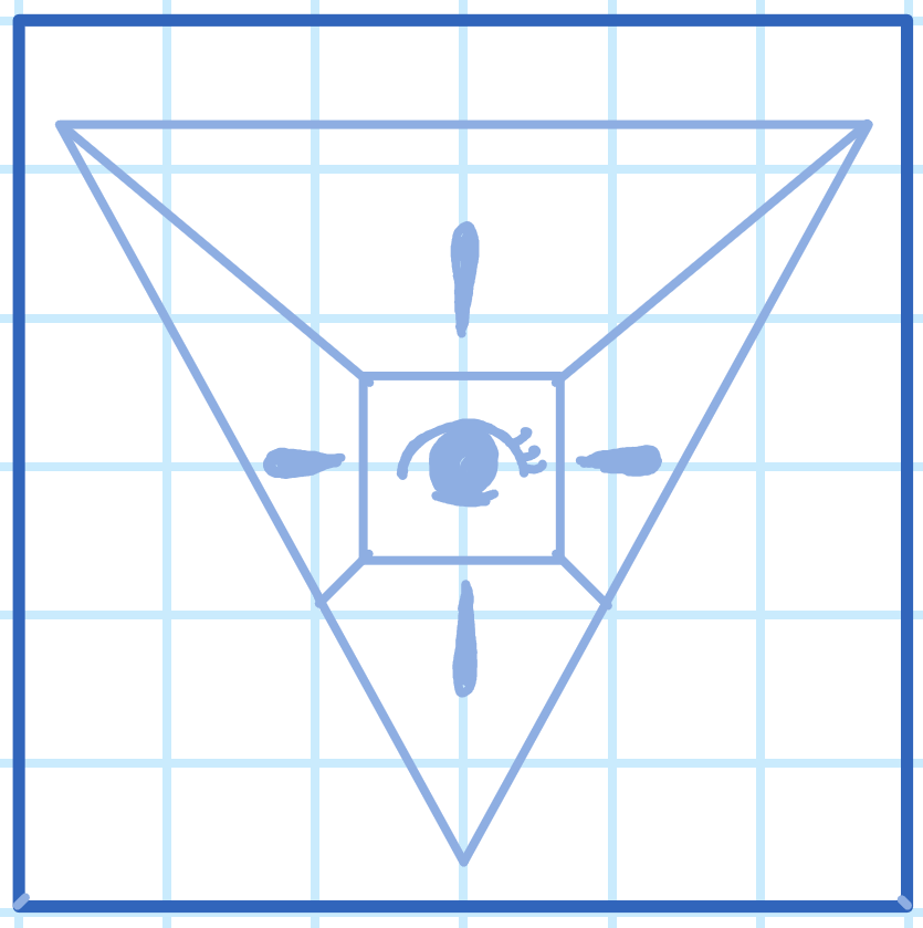
Here, I tried to incorporate all elements, the eye, prism and perspective lines. But... It looks kind of like the illuminati symbol(?). For it's ambiguity, I moved on to the fifth sketch.
5. Fifth Sketch
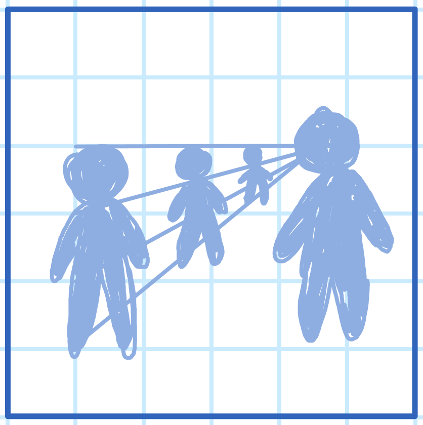
Here, I tried to incorporate a figure/person to create the perspective effect. I don't know why but I feel the figure on the right looks like it's shooting a laser to the figure on the left side, so I tried to picture it differently in the sixth sketch.
6. Sixth Sketch
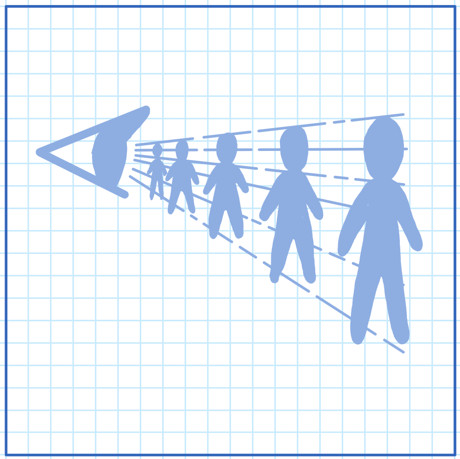
This is my sixth sketch, I tried changing the figure with an eye. And I think it works. So I moved to the refining steps.
Refined Sketch
This is how the refined sketch looks like...
Final Icon
And this is how the final icon looks like.
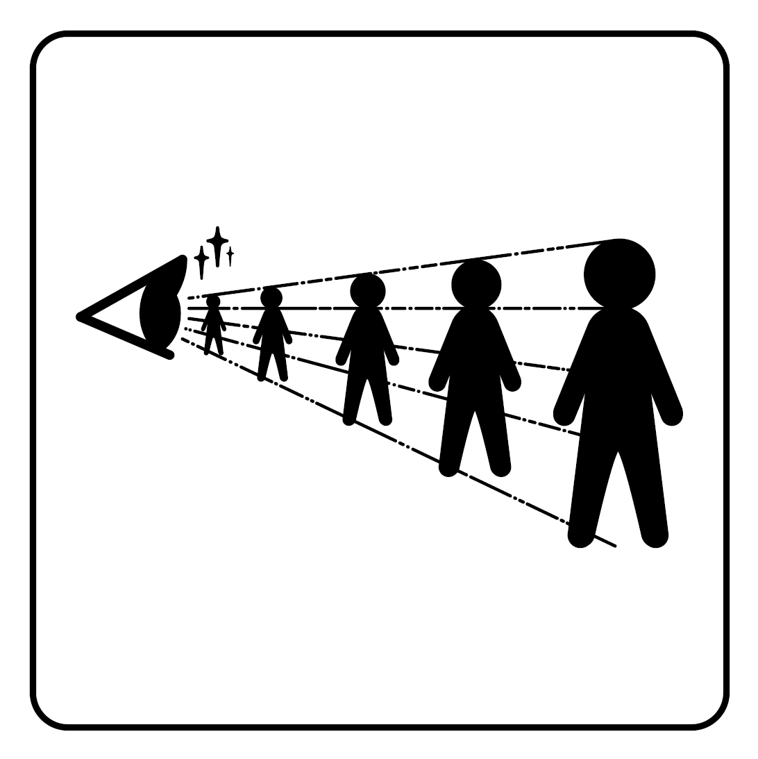
It's not perfect and there are still a lot of room for improvement. So, please do let me know if you have any feedback on my work.
Thank you!