Abstract Black Art (Personal Brand)
Hello! So, I am not by any means a graphic designer and don't really have the intention of ever making logos for anyone as its really not my strong suit lol But I AM an Animator, and I need a logo for my brand, Abstract Black Art. This all means that I didn't even bother to make the class assignment. I instead decided it was time to remake my logo using the skills I learned in this class! My original logo is the cover image for this post lol
My problem now is I don't know which one to choose. I like both for different reasons.
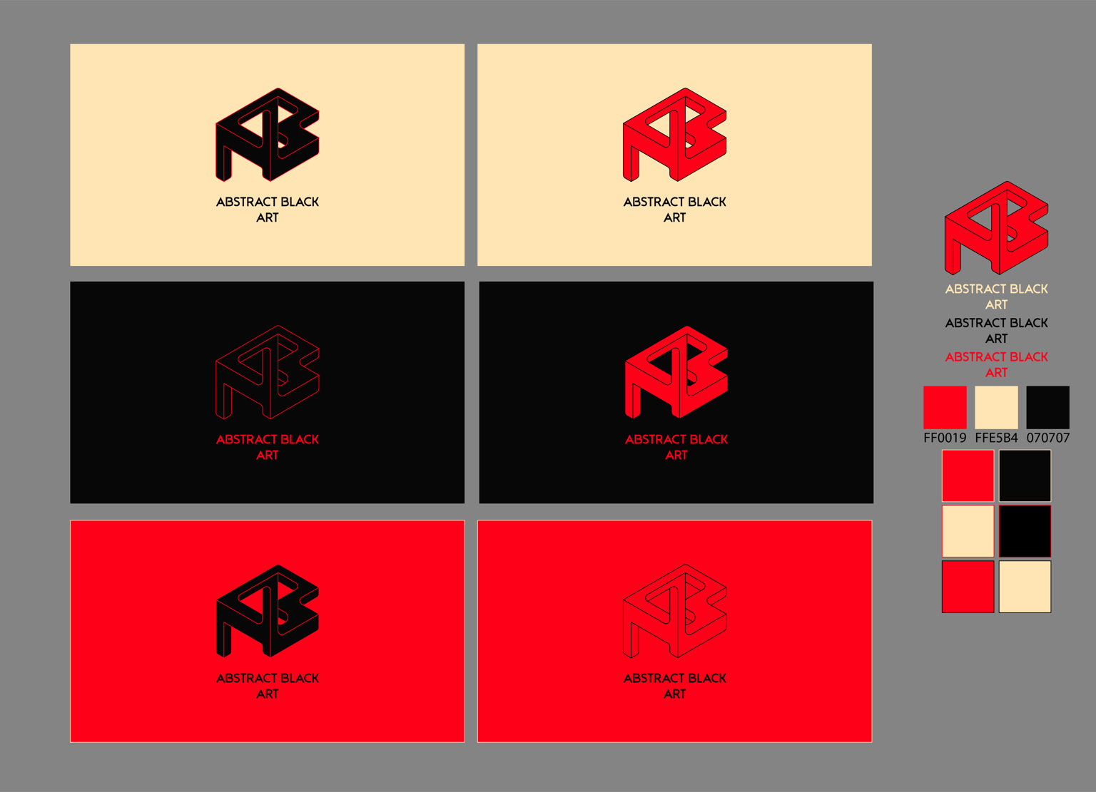
Option 1 -
I like the bold Black and red logo. As you mentioned in your lessons, sometimes its best to have a logo that is one color, which through this example, is something I agree with. I think this one is bold and speaks loudly, which is the sort of animation that I create. The peach is only going to be used for mediums with text as it is (kind of???) easier to read on a screen while still keeping the viewer engaged. The other options are going to be used as a bumper for animations.
The problem with this one is it doesn't totally align with my business values which are to be -
- Surreal
- Thought-provoking
- Unconventional
- Avant Garde
- Imaginative
- Non-Representational
- Experimental/Disruptive
This very much feels like the safer option, but I love red and black so much that its hard for me to be objective.
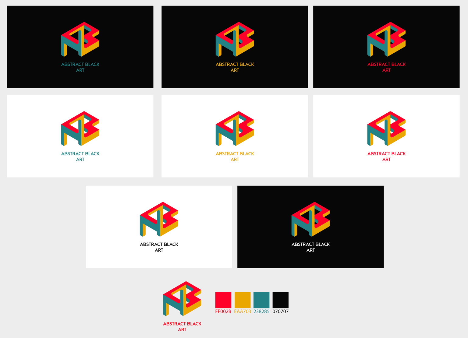
Option 2 -
This option feels a lot more "retro" with the colors being very reminiscent of late 90s or early 2000s video game company logos. An example would be the Nintendo logo, a 4-color "N" or the Atari logo.
This logo feels a lot closer to the core values of my business. This era in video games was very experimental and innovative, where companies and people were willing to take risks to make a crazy game that pushed the boundaries of the hardware and imagination of the time. I like how the retro colors with the sleek and abstract logo that I've created, which furthers my point.
The problem I see with this is the almost immediate connection to "retro" that I get from this. It's not lost on me that most, if not all, modern logos are sleek and minimal with only 1 color being the dominant color of the logo and secondary/tertiary colors being used outside of the logo, like in print or websites. This could be an issue if a client or viewer gets the impression that they are going to watch something retro rather than modern/sleek and abstract/experimental/disruptive.
I am stuck here, and as much as i'd love to pay a professional to do this for me, so I can move onto other things, I don't have any real money at the moment lol So here I am taking as many logo design skillshare classes I can to make up for the difference until I can get someone who specializes in this to do it for me!
Please help! Truly, any and all feedback on any part of this logo design would be greatly appreciated! because again, I am not a graphic designer. I have learned through Skillshare and youtube, but I'd never call myself a professional haha