Courage
My first attempt at this had a single background colour - a greeny blue that wasn't quite turquoise and wasn't quite teal. I kept the other colours very cool toned, and whilst the journaling was regarding living with chronic pain, I loved how this page turned out. I think it gives a very calm feel.
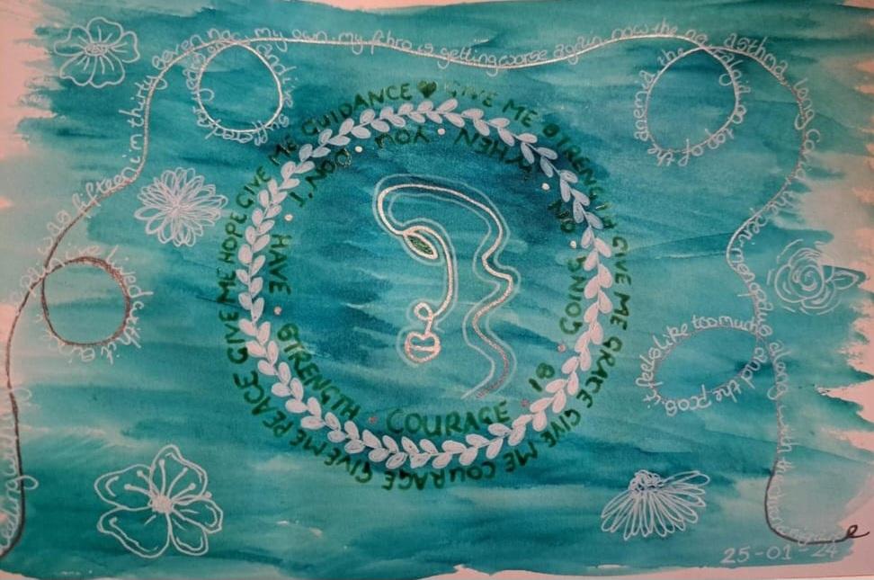
Unfortunately, my old previous art journal was damaged, and I wanted to recreate (but not copy) the page into my new book.
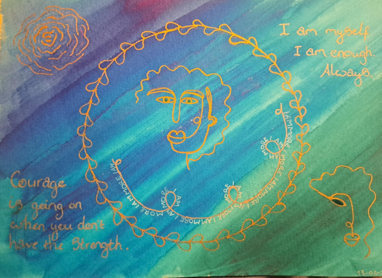
This time I went for a rich blend of watercolour for the background, whilst adding the details with metallic gold, with the journaling done in opaque white and metallic silver. I added elements that I use in a lot of my pages:- like the line portraits, the wreath, roses, and the journaling following a curling line. The page was still created thinking about how chronic pain affects my life, but it feels a lot warmer than my last piece.
I may go back and fill in the half-heart leaves on the wreath. As whilst I like it equally to my first, it feels like something is missing.