Visualizing Data for Insightful Decisions
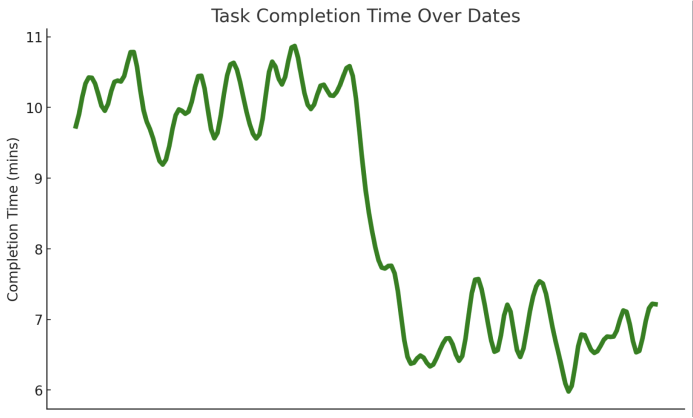
Line Graph - Task Completion Time Over Dates
- Data Story: This graph tracks the time taken to complete tasks over a series of days. The data shows fluctuations in task completion times, providing insights into productivity or task complexity over time.
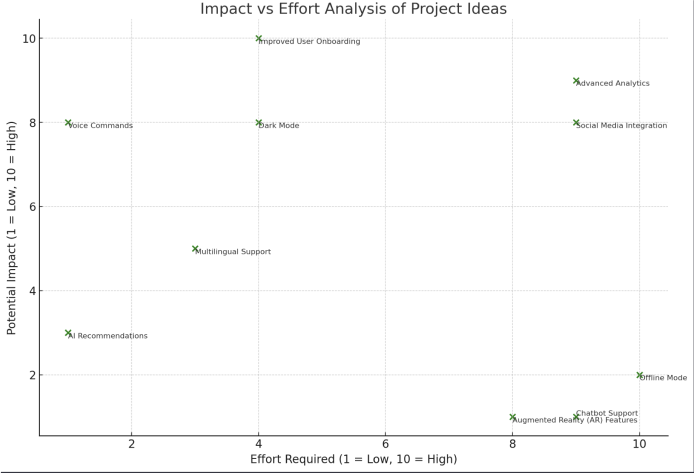
Impact/Effort Scatter Plot - Project Ideas Evaluation
- Data Story: This plot maps out various project ideas, categorizing them based on the effort required for implementation and their potential impact. It serves as a strategic tool for prioritizing projects, like focusing on 'Voice Commands' for its high impact yet low effort.
Design Journey:
- Before-and-After: Initially, some data points and labels in the scatter plot overlapped, making it hard to read. By adjusting the label positions and point sizes, the final visualization became more reader-friendly. Similarly, the line graph was refined with a smoothing filter to better illustrate the trends, and unnecessary elements like grid lines and the X-axis were removed for simplicity and focus on the data story.