Mist and Shadows
In this course, I chose to use some new watercolour paints I just received. They are White Nights and the names all include the word mist or shadows. I thought this would give a different smoky feel. After swatching the different colours I created the samplers. You can see in the photo how dark the colours appear in the palette and how bright some are in the colour swatch. In this set I used, Chromium Cobalt Mist, Blue Mist, Lilac Mist and Aquamarine Mist. As you can see they are much brighter. Here I added some black dots with a posca pen, some white dots with a stencil and some gold for marks. There is also some graphite in the background.
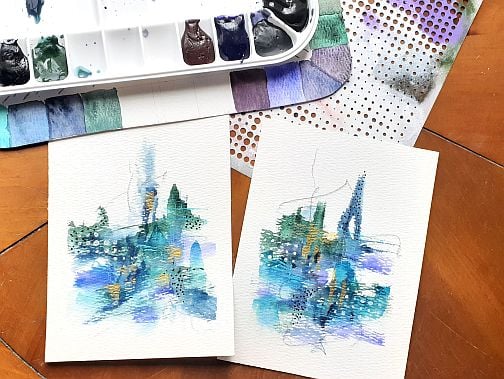
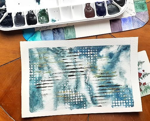
On these nest two I used, Dark Blue Shadows and Gray Blue Mist instead of the Aquamarine Mist and Blue mist and I went edge to edge. The shadow colours are definitely more muted. Here I added black posca pen dots, white stencil dots, and purple stencil line/squares along with black and gold vertical lines from a credit card.
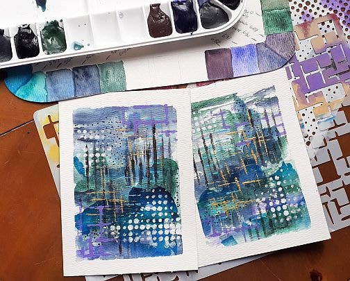
In these next three, I used the Grey Rose Mist and Violet Mist. I added purple stencil dots, white posca dots and lines, black posca dots and lines with a metallic blue with a stencil. I may be hard to see in this photo but the grey rose mist is a beautiful granulating colour. I have quite a few stencils so I started exploring more with them as well.
In this sample, I wanted to push the granulation more, so I did wet on wet in three layers allowing each layer to completely dry. I used the Chromium Cobalt Mist ( the lovely green in the background), added some Blue mist and then Dark Blue Shadows. I like the contract I was able to achieve with the two blues. I used black with a piece of corrugated plastic to create the broken horizontal lines, a credit card for the gold vertical lines, white acrylic with the dots stencil and then used what I am calling a cracked effect stencil with a metallic blue where the texture appears stronger in the lover right corner and fades out in the top left.
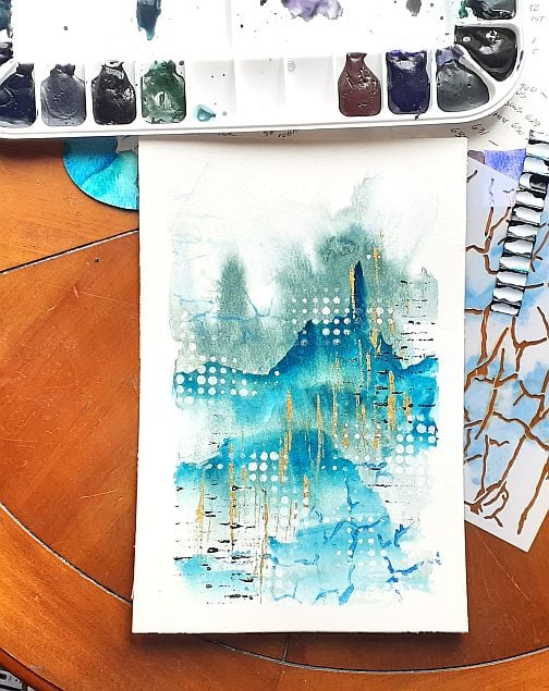
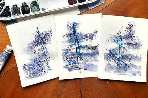
This is were I started playing with just one colour wet in wet to work with the granulation. This next example is definitely moving into the smokier side of things. This is the Dark Blue Shadows colour. On top I used some black acrylic paint with corrugated cardboard, white acrylic with the dot stencil and gold acrylic with a credit card. You can see the blue and green pigments in this colour have granulated.
In this next sample, which I love love, I used the Grey Rose Mist wet on wet for the background. In this granulation you can seem the pink so I added some pink acrylic dots with a stencil and then used the multi-circle stencil shown with a combination of prussian blue and black to create the stencils marks on top. 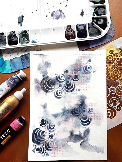
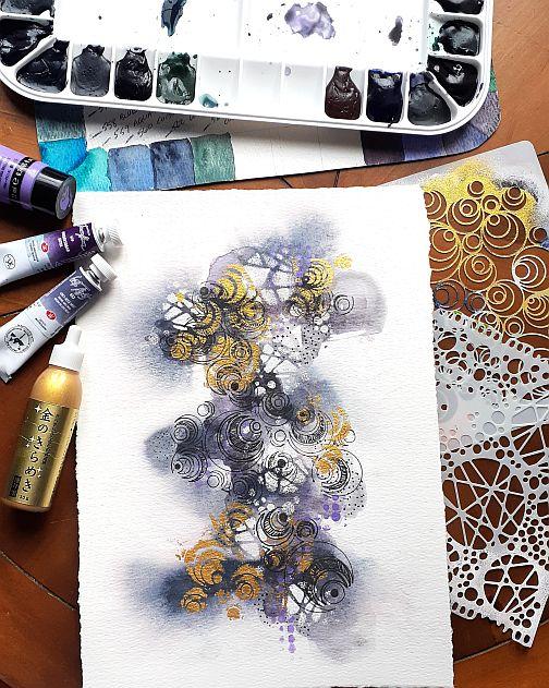
The final piece I made uses the Grey Rose Mist with Violet Shadows wet on wet in two layers with drying time for each layer. I wanted to see the granulation from each paint. If you look around the edges you can sort of see how the Grey Rose Mist dispersed and granulated on the wet paper. The Violet Shadow provided some of the darker areas. I love this stencil, but I don't use often as I would prefer the reverse where the stencil lays down the lines rather than the fill areas. I tried using it with my gold mica paste and felt that is was too much. So - add more layers right. I used the other stencil shown to break things up again, but found the fill areas again were to much. So I took the first stencil, took a deep breath and used a rollerball black pen to add outlines for the fill areas using the stencil. I then add some fine dots and lines within some fill areas to add more interest and depth. This is so far removed from where I started, and I love it so much I deckled the edges. I can't wait to play more with the other shadow colours and I don't even have all of the colours in the set yet.