clawd
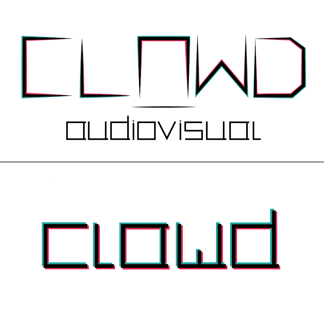
So this logo was created for a personal audiovisual related service, and I went with the 3D effect so I wouldn't use what every other logo usually uses, which is cameras. The original, on top, was too harsh, too thin and definitely felt too crowded. There was also the issue that a lot of people I asked feedback from, couldn't understand that the third letter was an A. After getting over that criticism that I did take a bit personally (xD), I decided to use the best design tip you can give anyone, I simplified it all. I liked the font I had created for the "audiovisual" word, so I decided to stick with it but thicken it and enlarge it: this created a lot of space without having to overexplain the logo with an extra word. Plus the new version, at the bottom, is also softer which goes more in-line with the person behind the brand. Overall, I was much happier with the new outcome and felt much more comfortable using it. Next step, I'd like to create an icon to shorten this mark, making something that would fit a profile picture. Perhaps by taking a page out of Netflix's book with their iconic "N" and simply using the "c", which would also be reminiscent of my own name, that also starts with c.