Data Visualization of Physical Activity in Japan
I came across data for physical activity in Japan and decided to make it the project for this class!
The original graph was very cluttered and confusing. I manually extracted the data, decided I wanted to focus on the physical activity (more than one day a week) of all genders and then started turning it into a new graph according to your lesson.
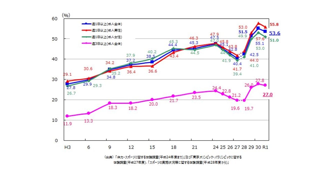
Original graph (only in Japanese, sorry)
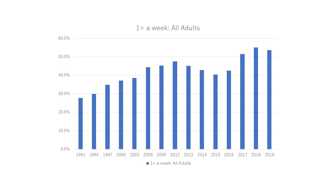
Turning the original data (blue line) into the standard PowerPoint graph
First try at cleaning it up and making it more easy to understand by following the steps you outlined (changed colors of graphs, got rid of the legend, got rid of the grid lines and y-axis labels, added title, added values inside the bars)
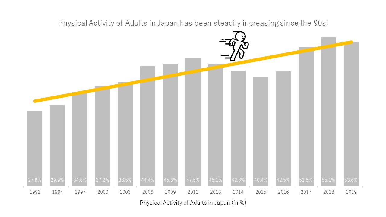
I felt that with just the data/bars, the change throughout the years did not really come out well, so I added a trendline in Powerpoint and then also found an icon of a guy running that I thought fit perfectly!
However, I did not like how the numbers looked inside the bars. I tried placing them on top, but then some were covered by the trendline. I tried adding a table with the values to the years, but that made it look complicated again.
So in the end, I changed the design from bars to a line, narrowed down scale on the left (when it started with 0, there was way too much white space on the bottom), moved the title outside the graph so that I could better customize it and moved some of the values so that they don't overlap with the trendline.
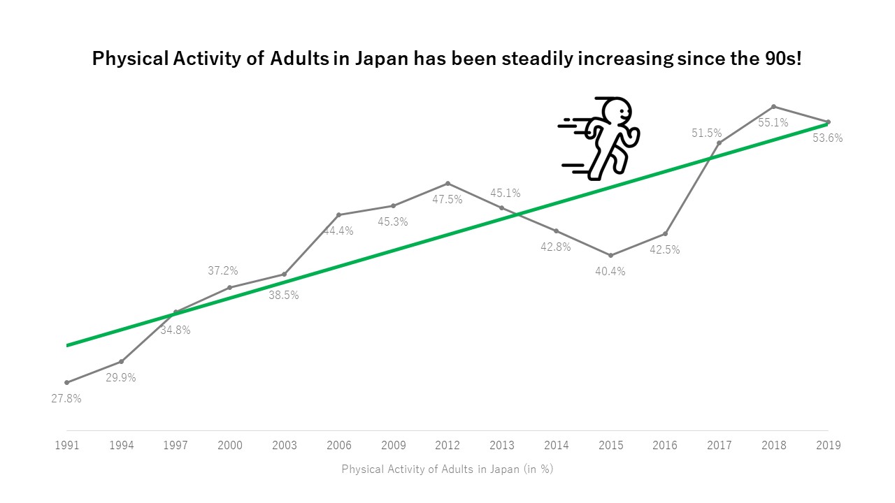
Probably not the most perfect graph, but I really like how it turned out!
I'd be happy to hear any kind of feedback :)