making a quote pt. 2
i enjoy learning about lettering and still think practice is what will help me get better. everyone has different techniques and ways of explaining things which is great to have many tools.
i hope that i can see lettering as fun instead of frustrating.
these are progress photos and the best i could do, i will try to include link to pt. 1
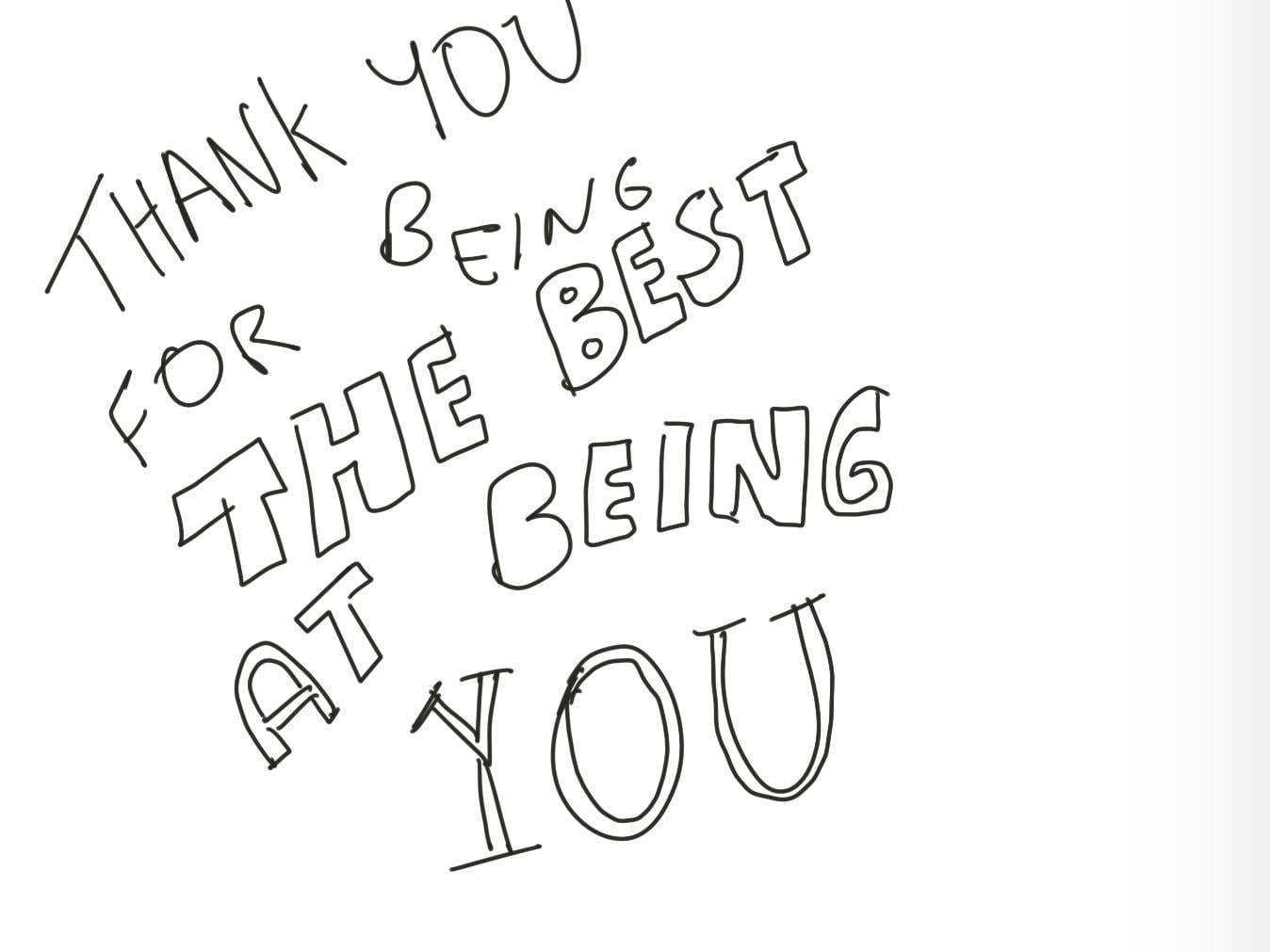
i had a hard time with flourishes, i will look at that class next. please provide constructive feedback. i did this digitally with procreate.
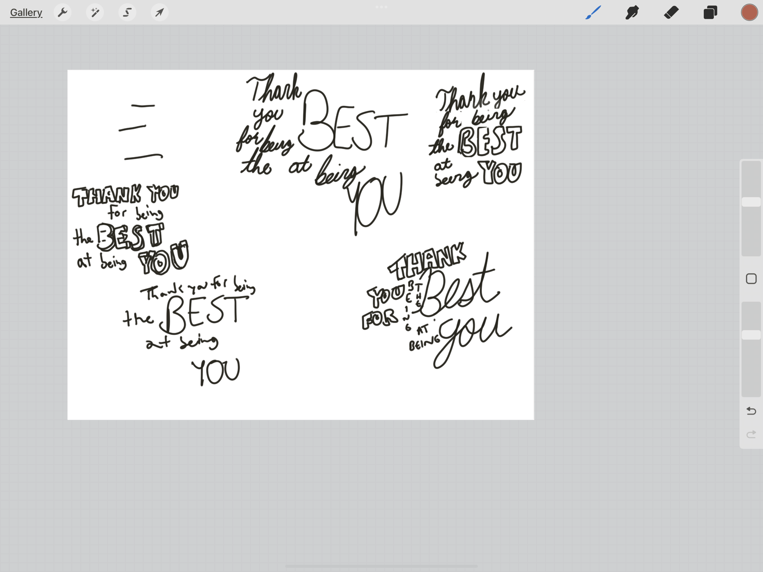
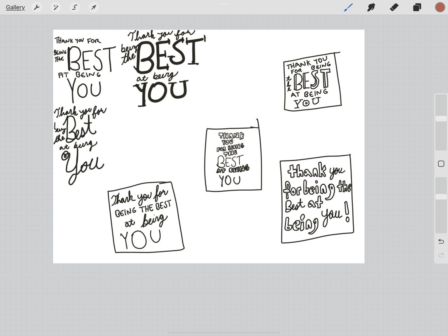
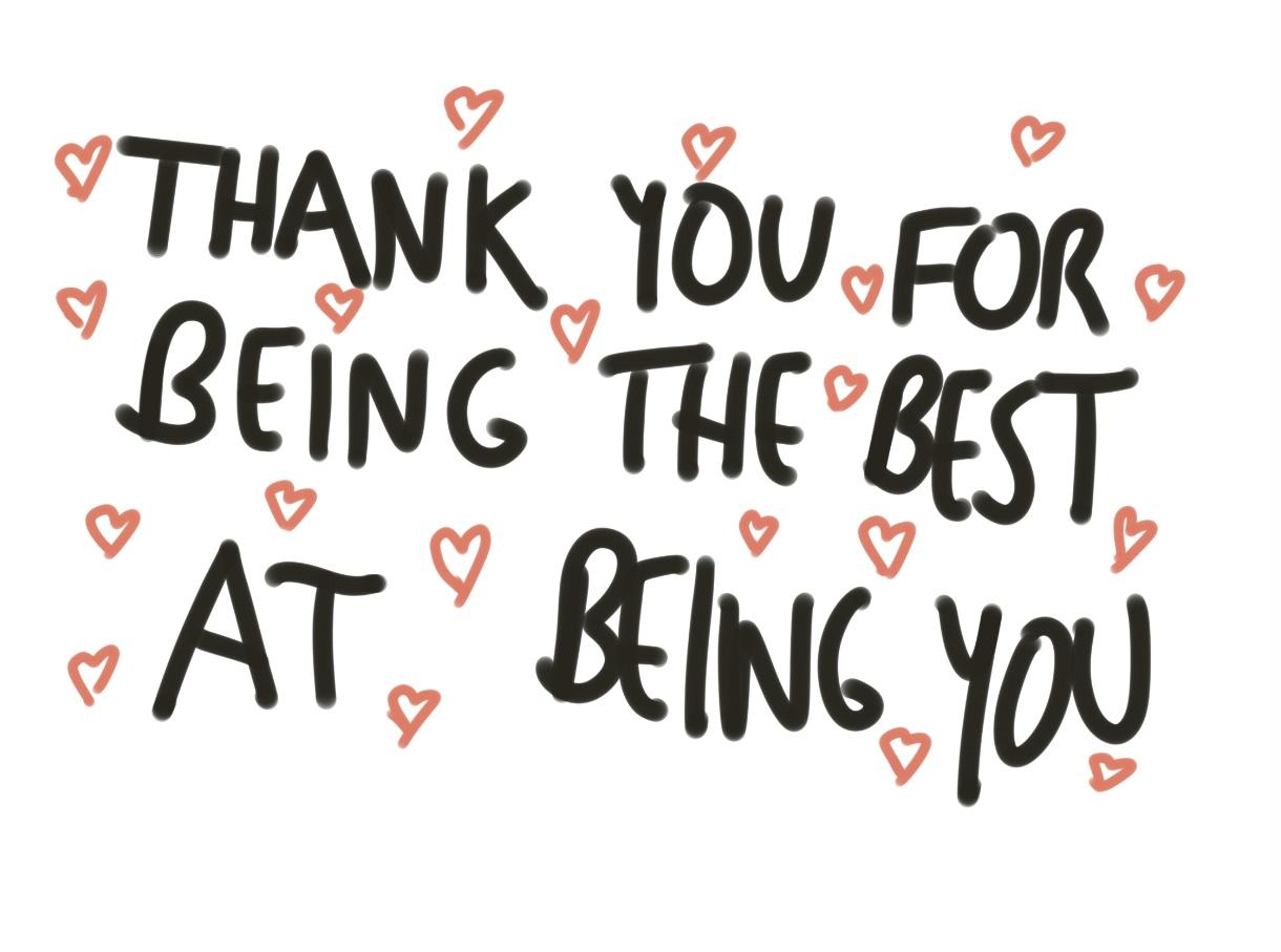
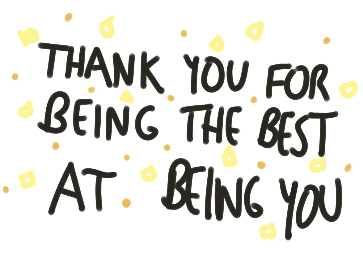
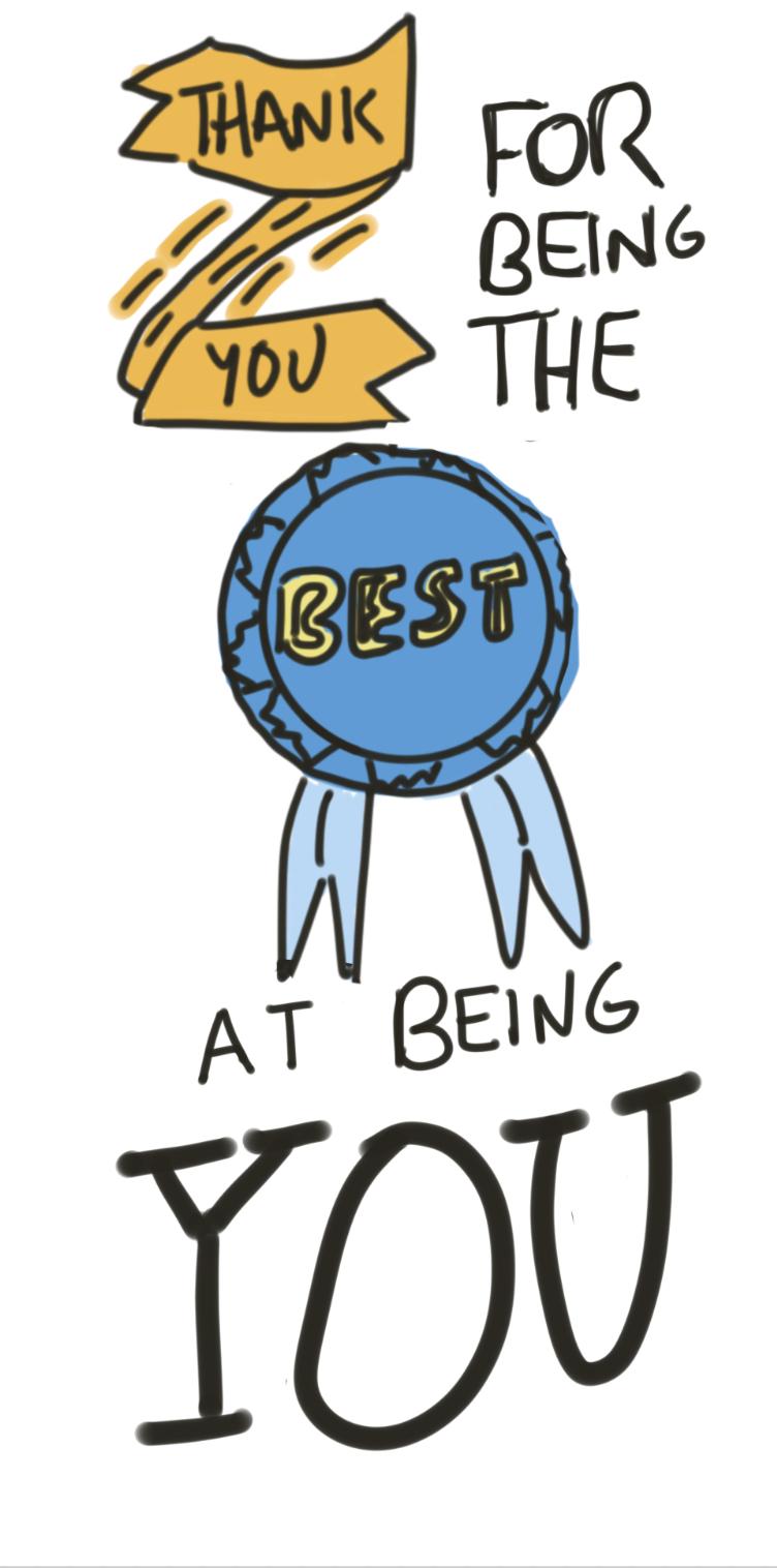
quote: thank you for being the best at being you
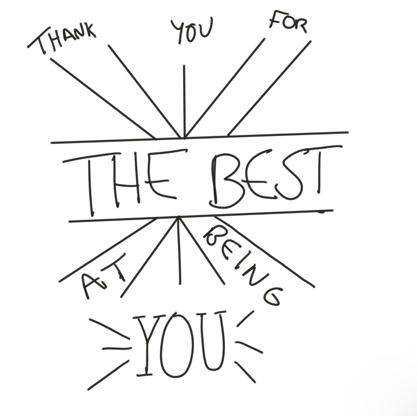
lesson 1 the text
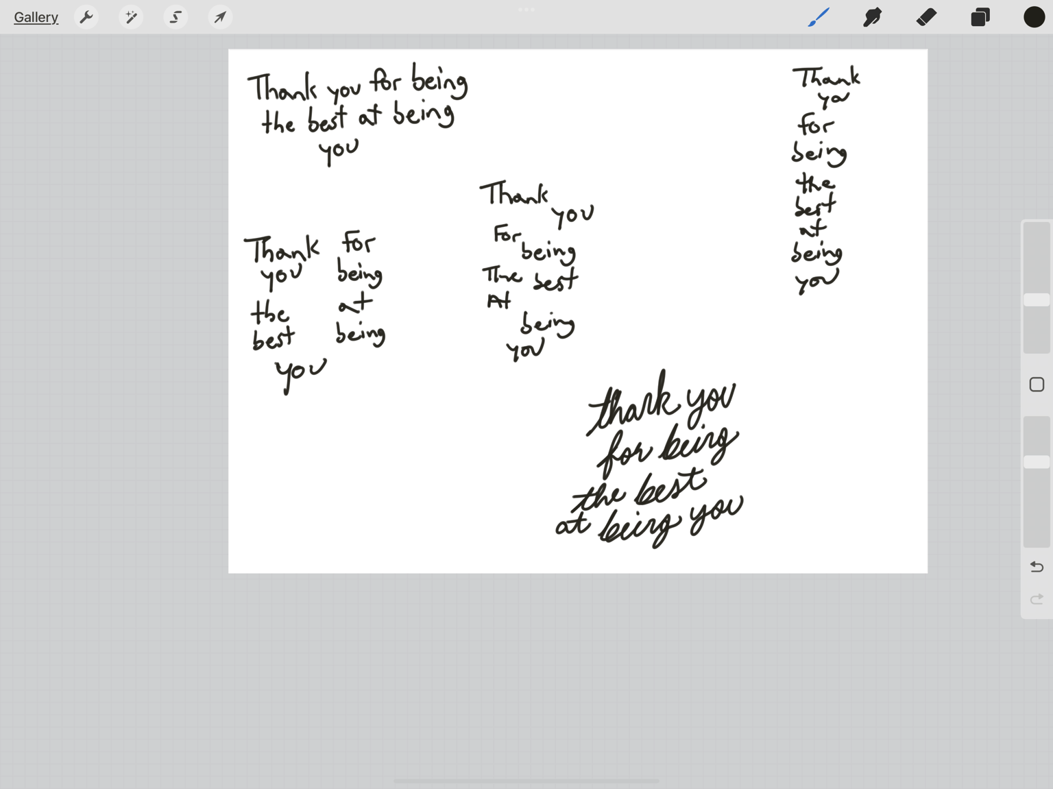
lesson 2 heirarchy
lesson 3 font
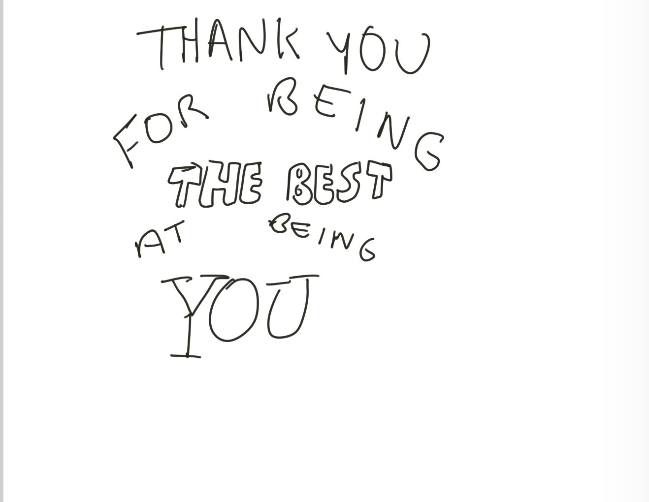
lesson 4 orientation of the text
i tried to do both the diagonal and the arch. but it didnt look right so second one i used the arch
lesson 5 banners
oh banners and ribbons are a major struggle for me.
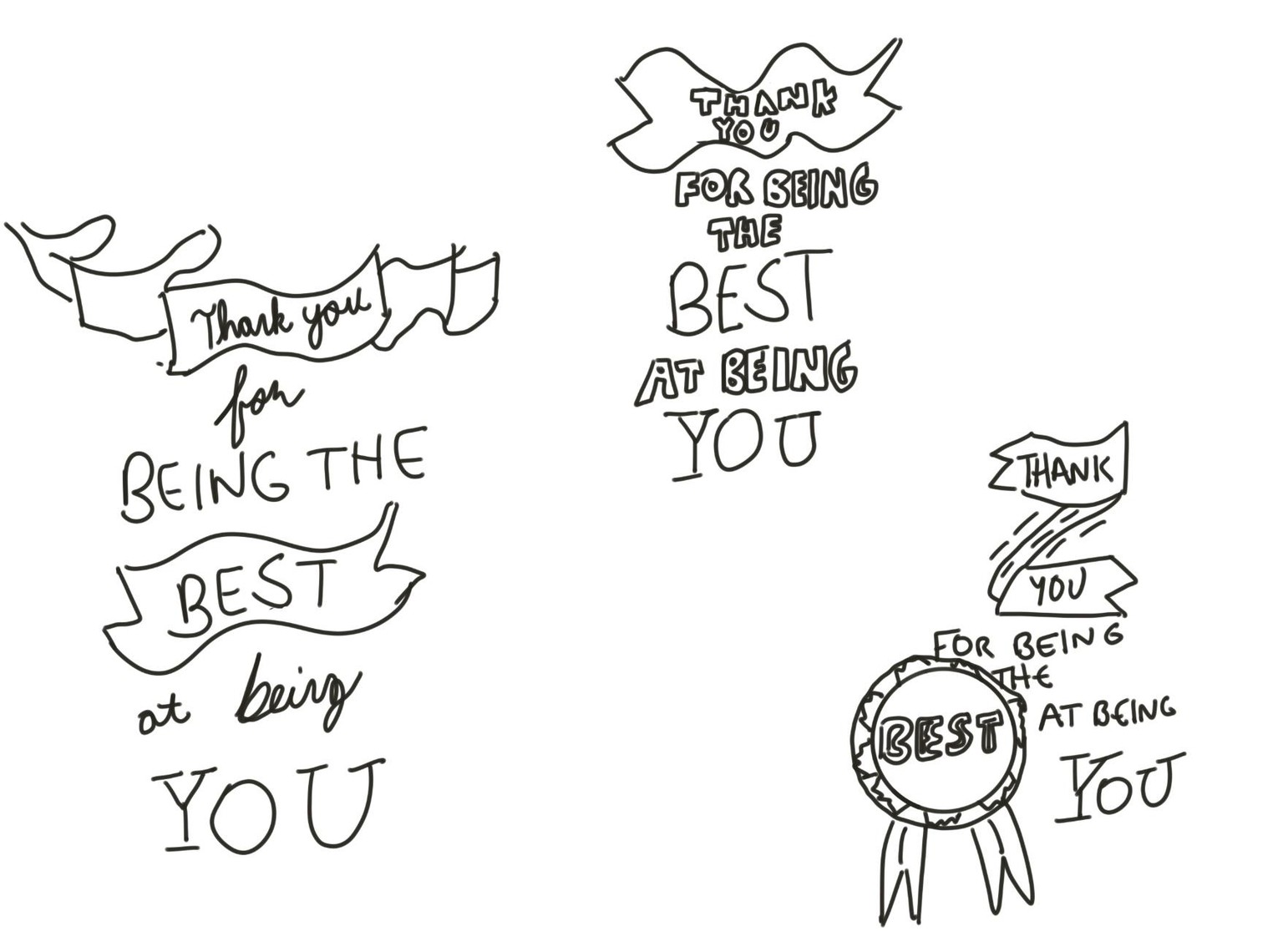
lesson 8 framing the text
lesson 10 decorative shapes
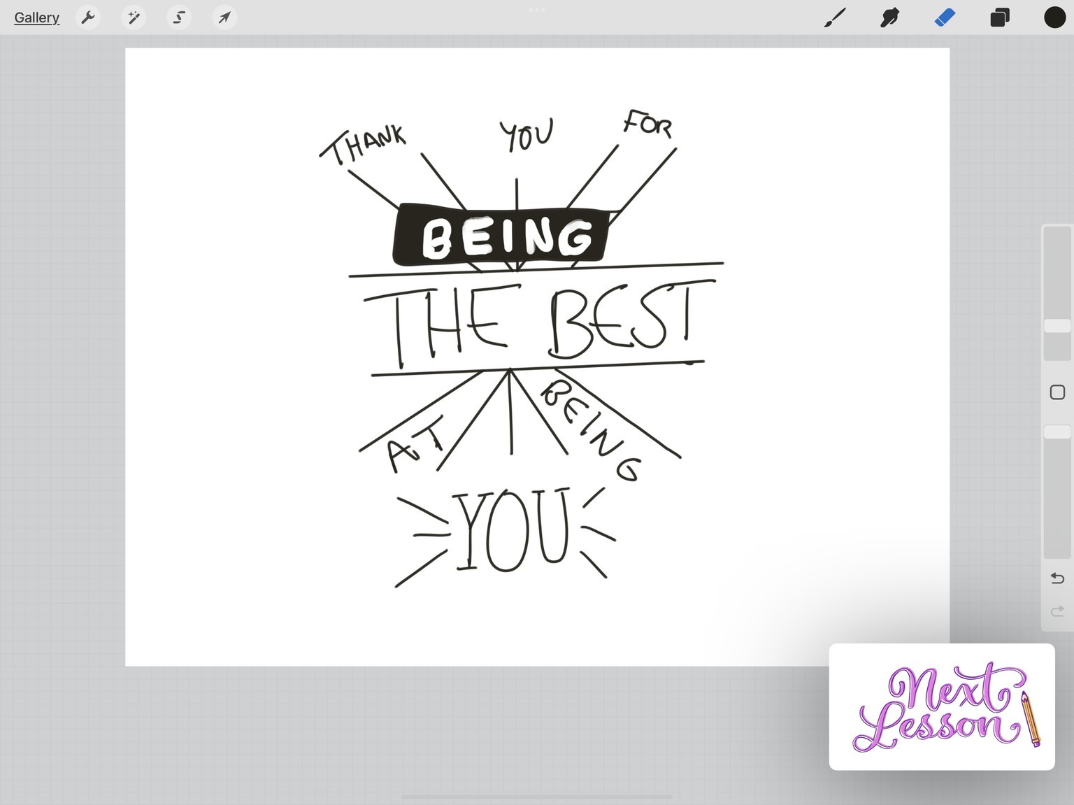
final one i went with
here is the link to part 1
https://www.skillshare.com/projects/446619
if possible, please look at both. do you see a difference? aside from the font
thankful skillshare helps me try to be creative!
would you like a timelapse of the process? i can put it on youtube and update project. thank you!