Record Store Day
This is a project I had in mind for quite a long time and decided to adapt it for this course.
I started with the idea of making it a flat artwork so I started with Illustrator mobile....
I aimed at 2 colours only, taking swatches from an a local screenprinter website for guidance.
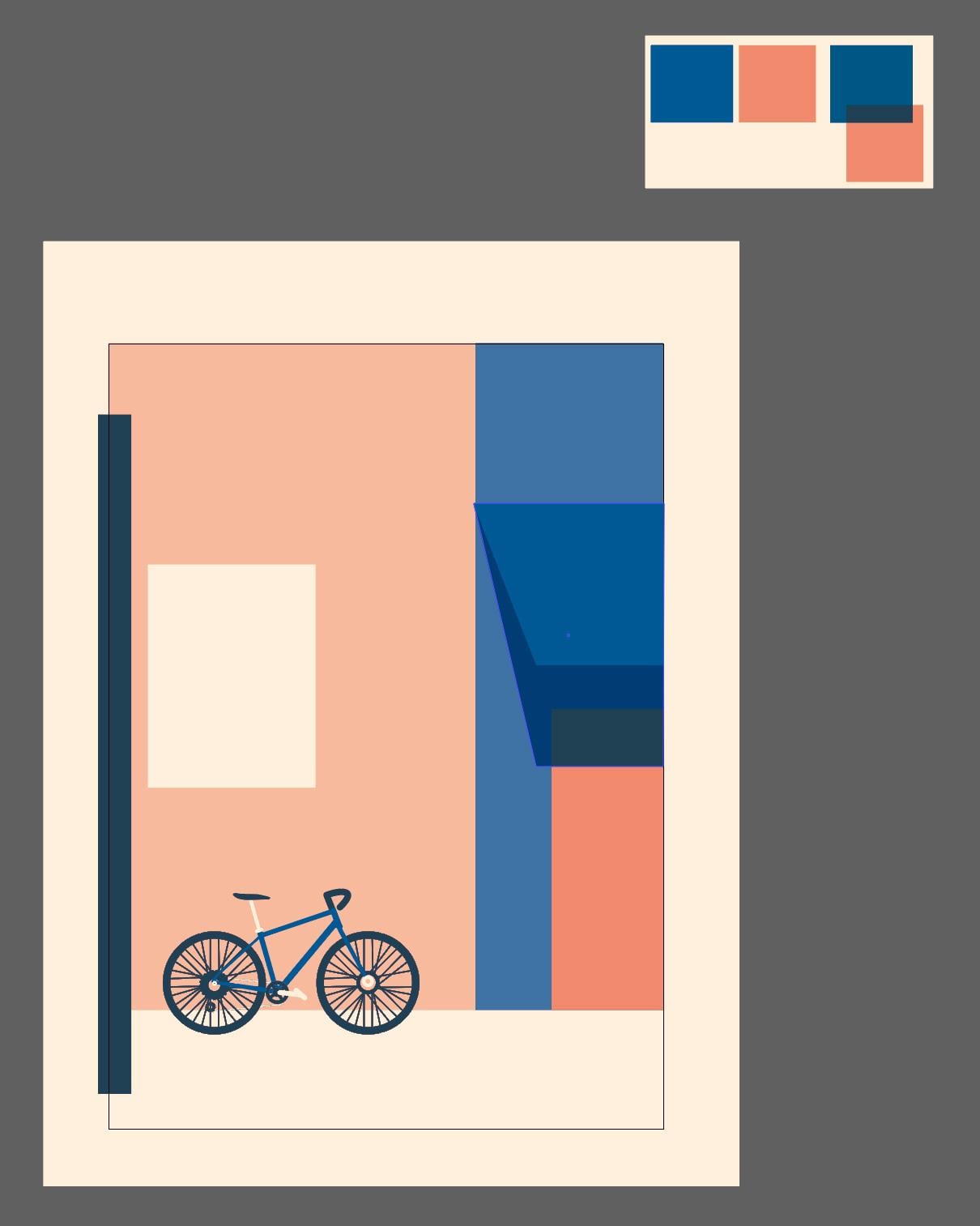
But, of course, it was not to be, as I kept adding shadows, details, highlights and what-not... (as expected for those who know me). I went through a lot of iterations (Shop sign, billboard added, then removed)
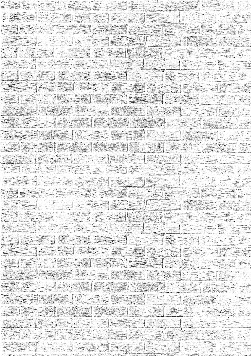
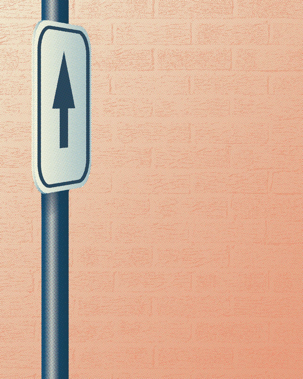
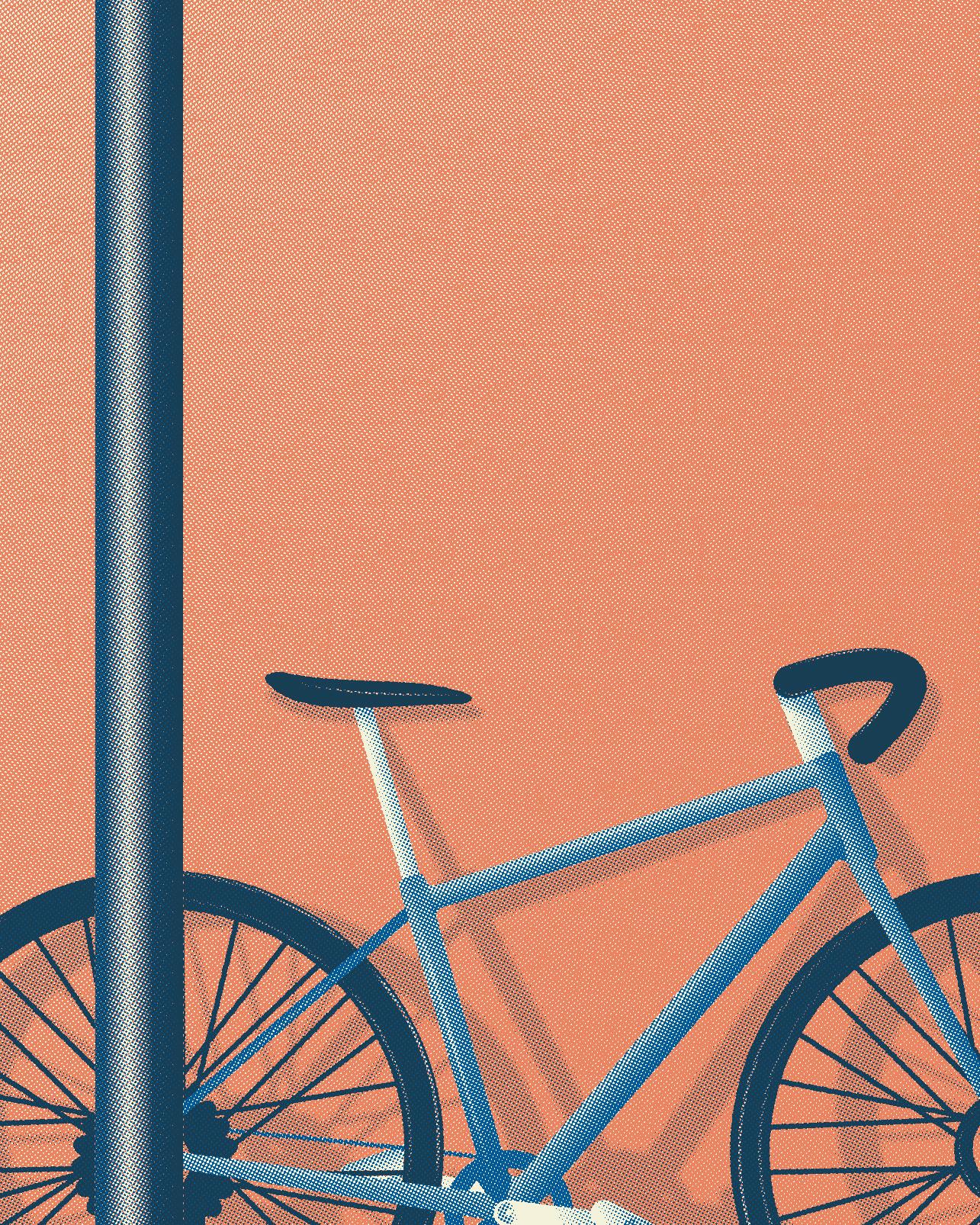
One thing I wanted was to keep quite a lot of empty space around the bike to attract attention, but also keep a bit of interest, so I added a brick texture... (this is the wall outside my house, and the image have been stitched in Photoshop to create a full wall)
So it ended up with a gazillion little details, an insane amount of gradients and a lots of trials and errors.
And of course, I was late for Record Store Day!
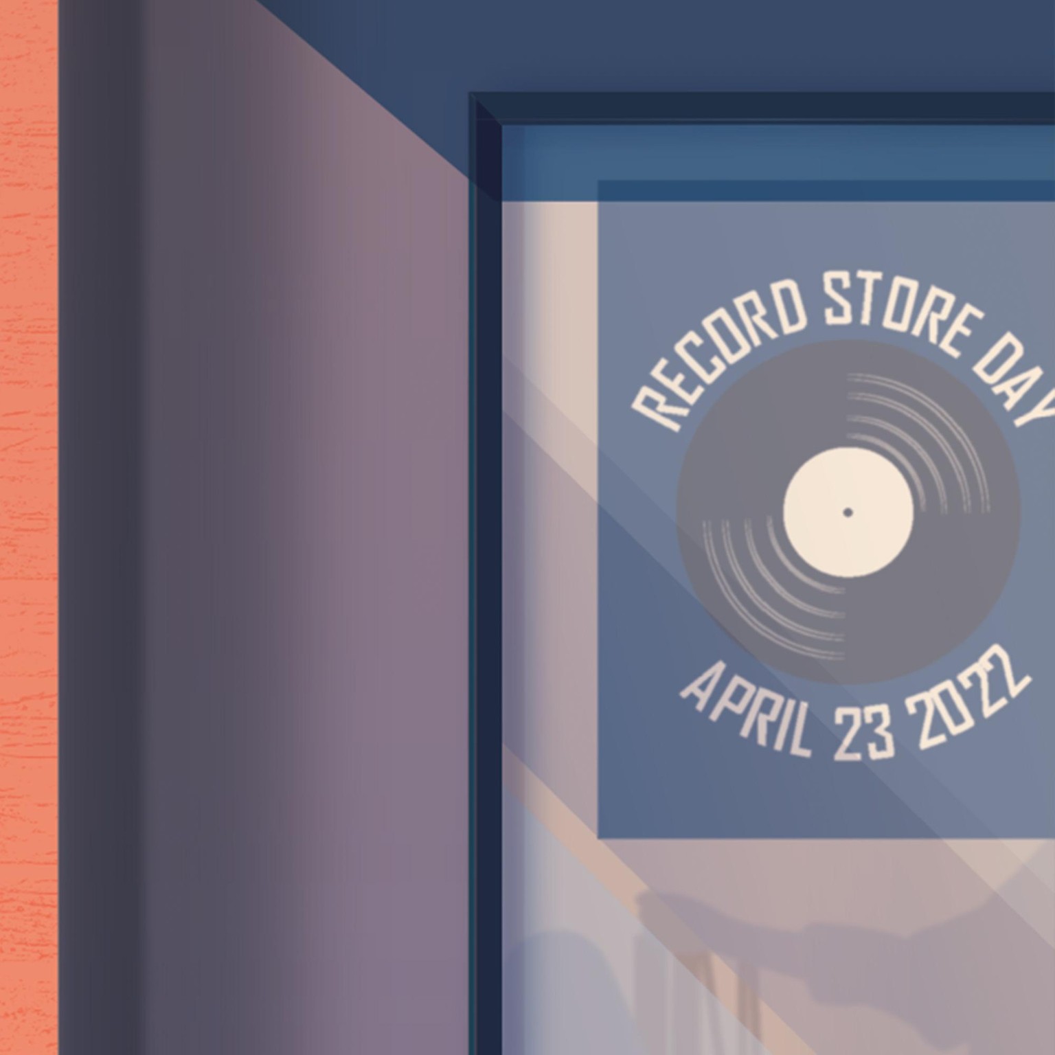
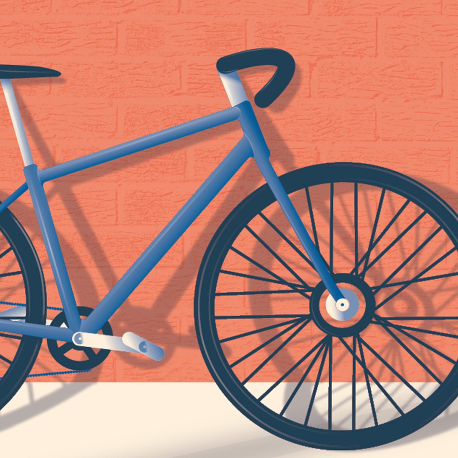
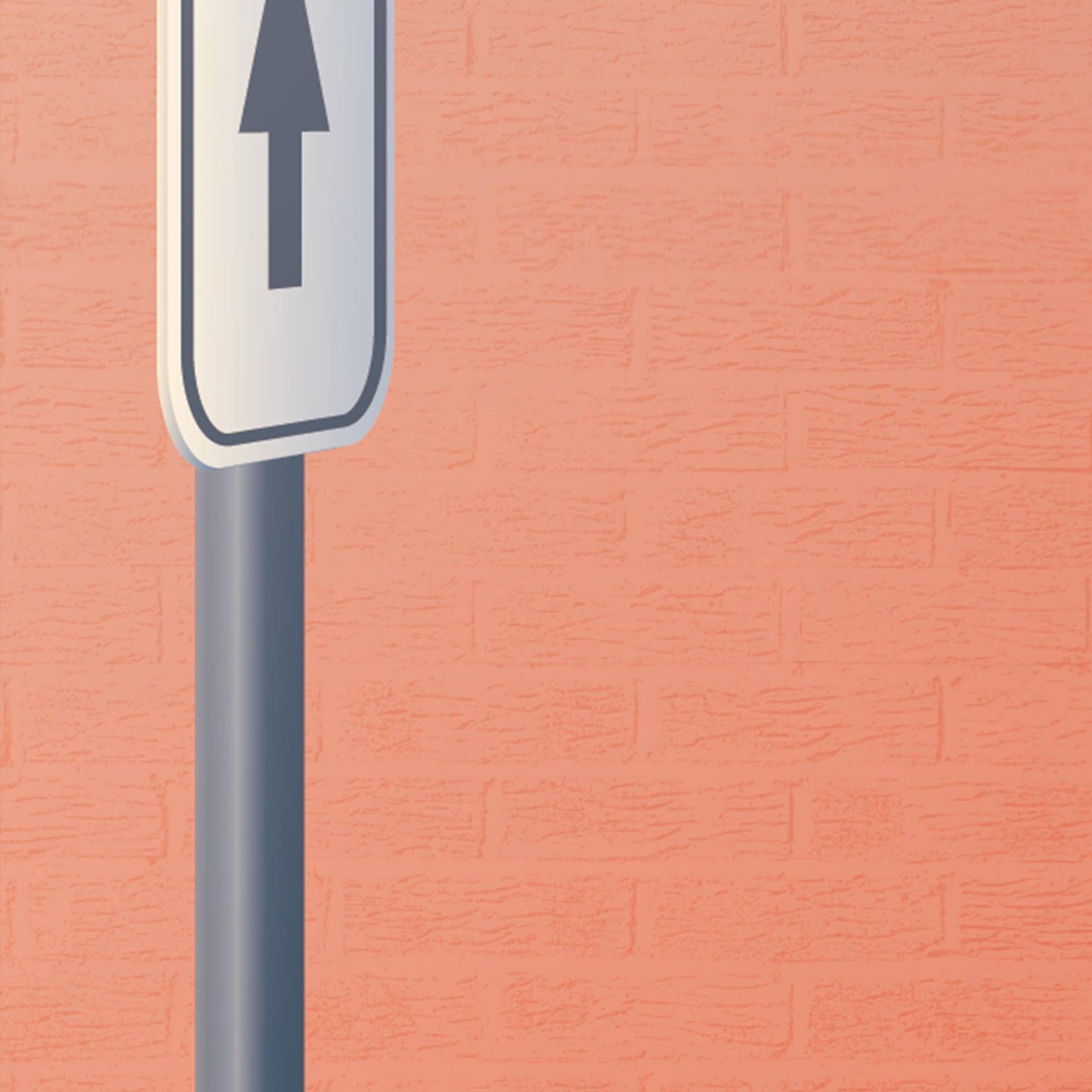
Here are some details:
Obviously, creating the separations was a real PITA (nobody to blame but me!) but I got there in the end. One very helpful thing I took from the course was the logic behind the process. The explanations from the printer were a very nice addition, I think it would have been even better if we could have seen him working on the files....
Eventually, creating the halftoning went as a breeze, I didn't even panic!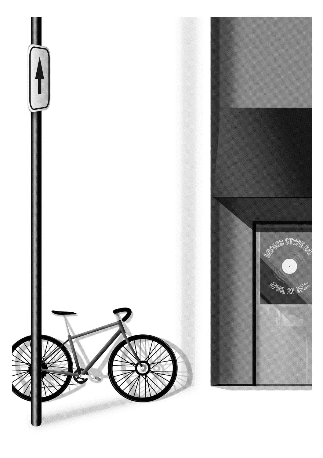
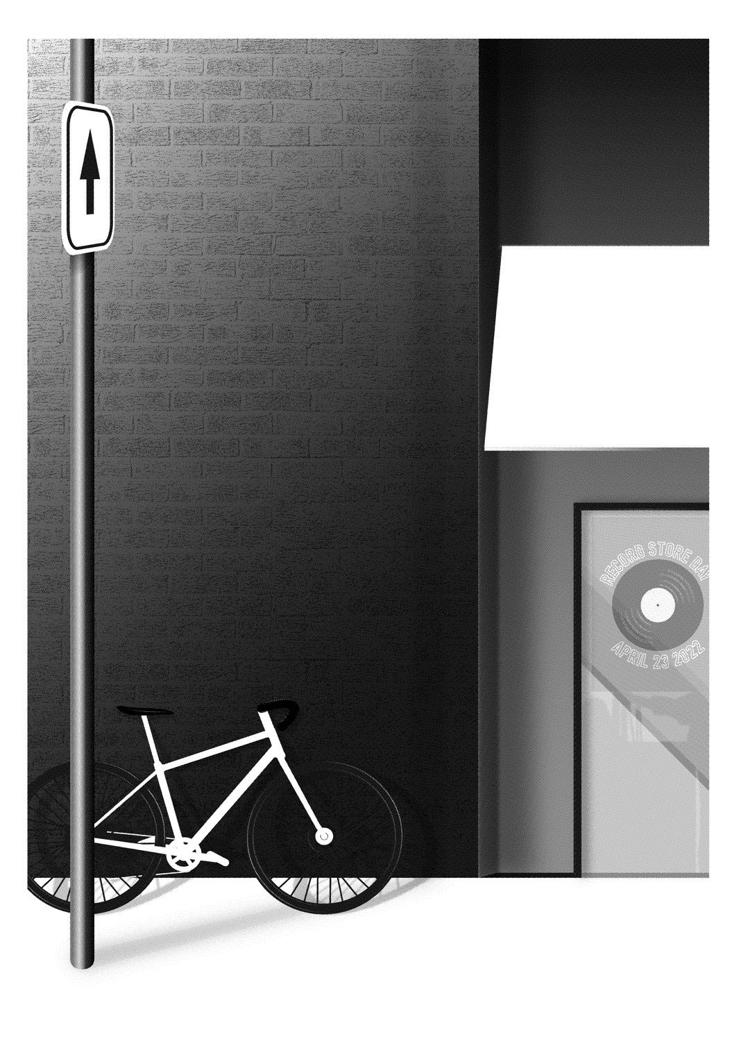
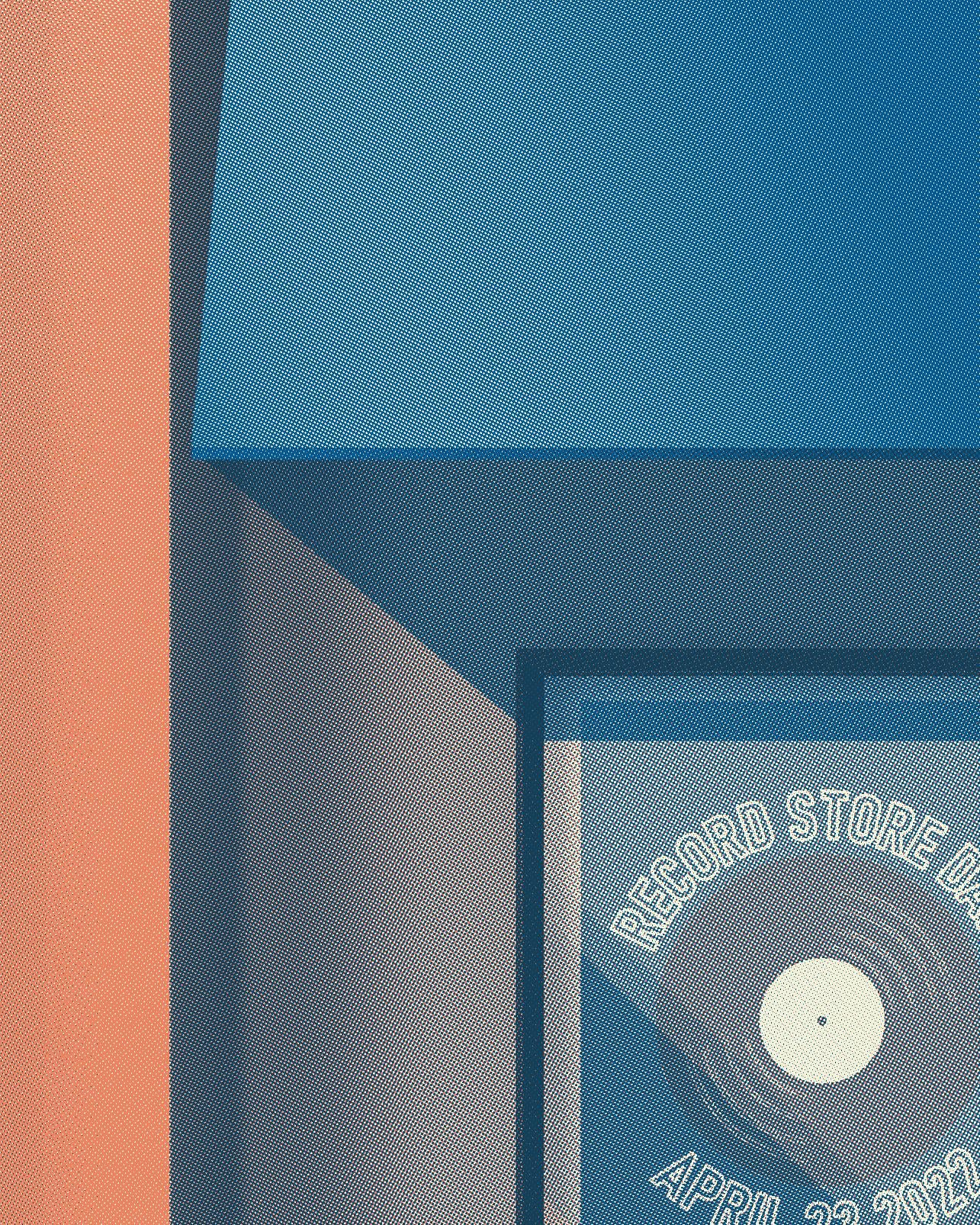
And now the end result (halftoned) with details as well:
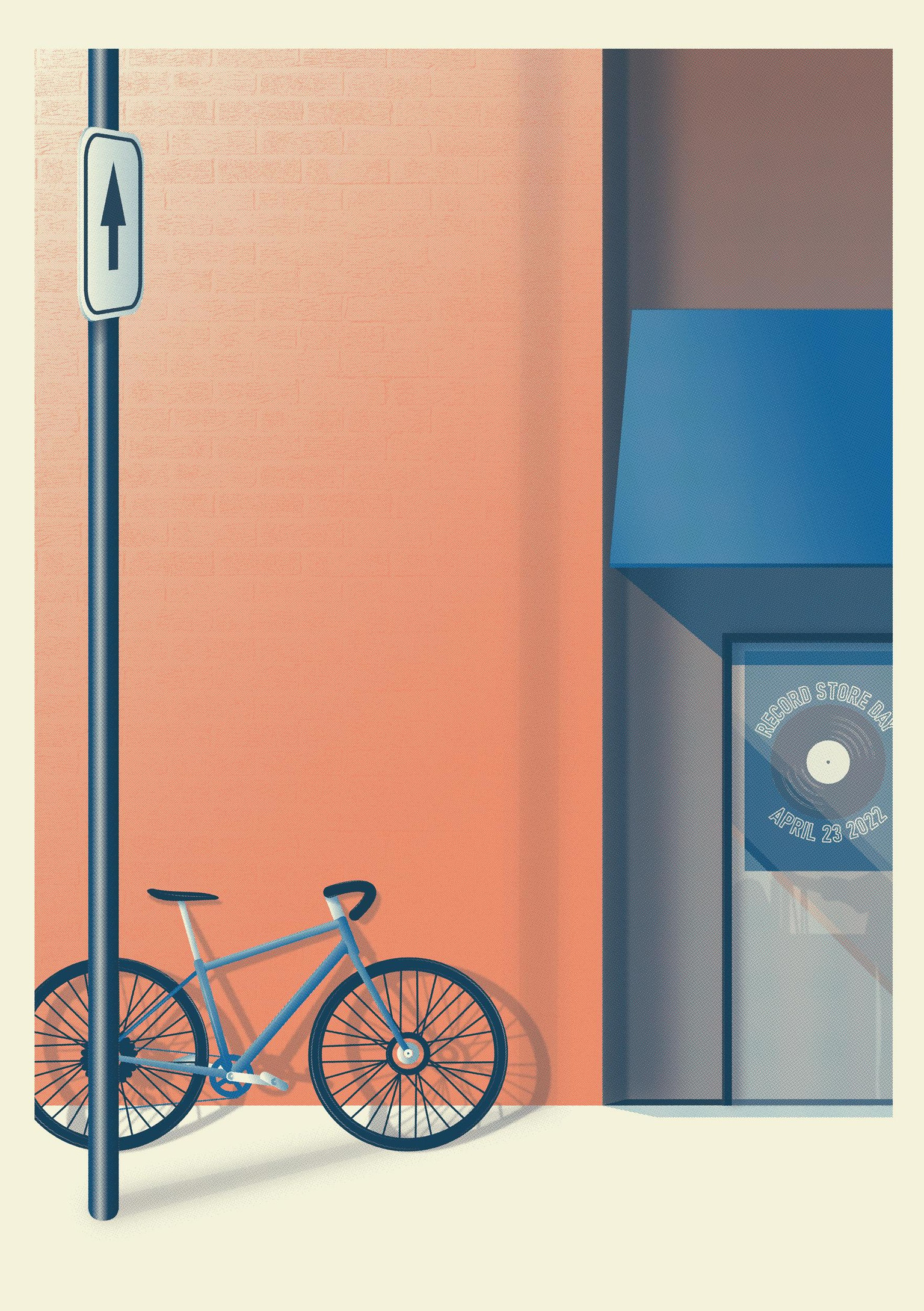
In the end I decided to adapt the file for Risography (because I am a contrarian!) as the amount of details didn't seem adapted for screenprinting (but I may be wrong!). Hopefully I learned invaluable skills concerning separations that will be easily adapted for other printing methods...
I really enjoyed the course, it really challenged me putting in the hours to make it right.