Whiplash Movie poster
I've only really properly used illustrator for a couple months and this course really helped!
I started off with some source material regarding scenes and color palettes from the movie itself.
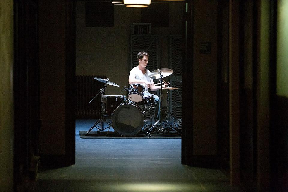
I liked this dramatic very harsh chiaroscuro light to dark which mirrored specific scenes in the film.
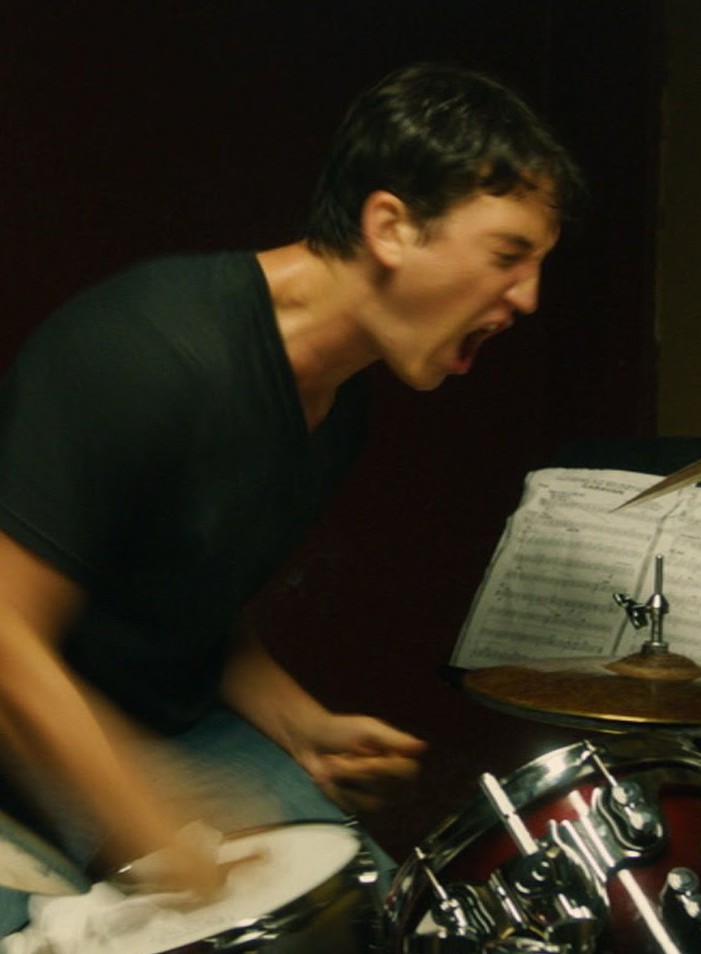
It would go from quiet to vulgar and chaotic very quickly like in this scene.
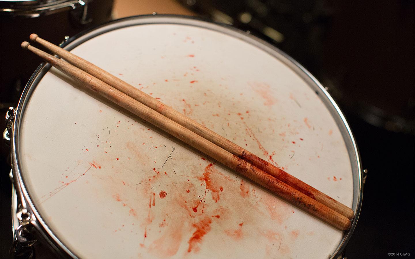
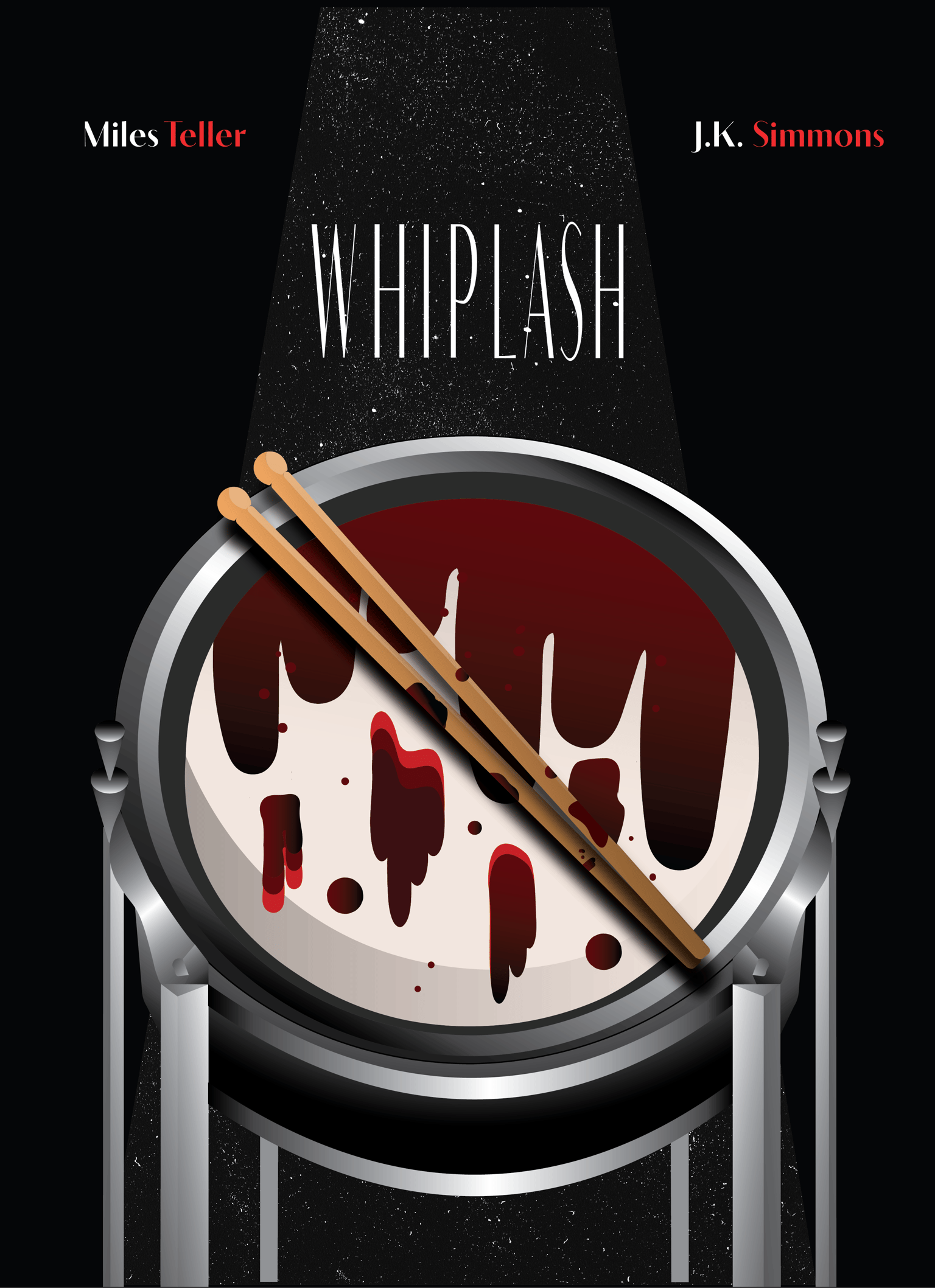
Which I then translated into this close up of one of the drums from his kit splattered with blood from his hands.
Sketch and coloring:
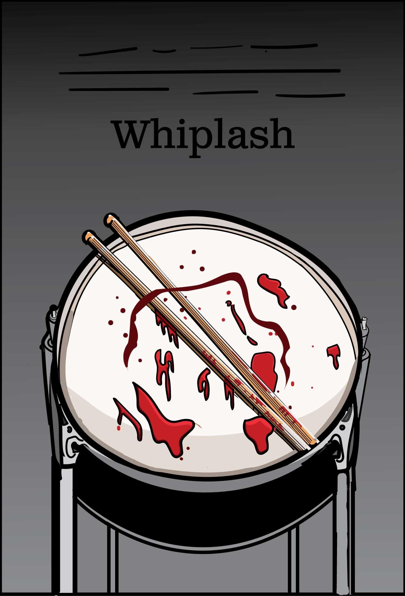
I decided on this top down view, as though we are the main character, Andrew. The blob brush was never a tool I considered using in conjunction with the pencil and pen tool but it increased my workflow by a lot!
After struggling to use the pathfinder tool tracing my sketch I had to start over on the final draft a few times. However by using the blend tool and shape maker tool I had a decent result.
Final draft:
Please leave feedback, what could I have done differently?
Thanks!