color schemes
I have been experimenting with colour for a while now. So far, however, I focused on various color wheels, never thought of moods being expressed by colour schemes.
Thank you for opening my eyes in this matter and letting me become more aware and intentional in my colour choices.
Here is an example of the farmhouse in three different "tones".
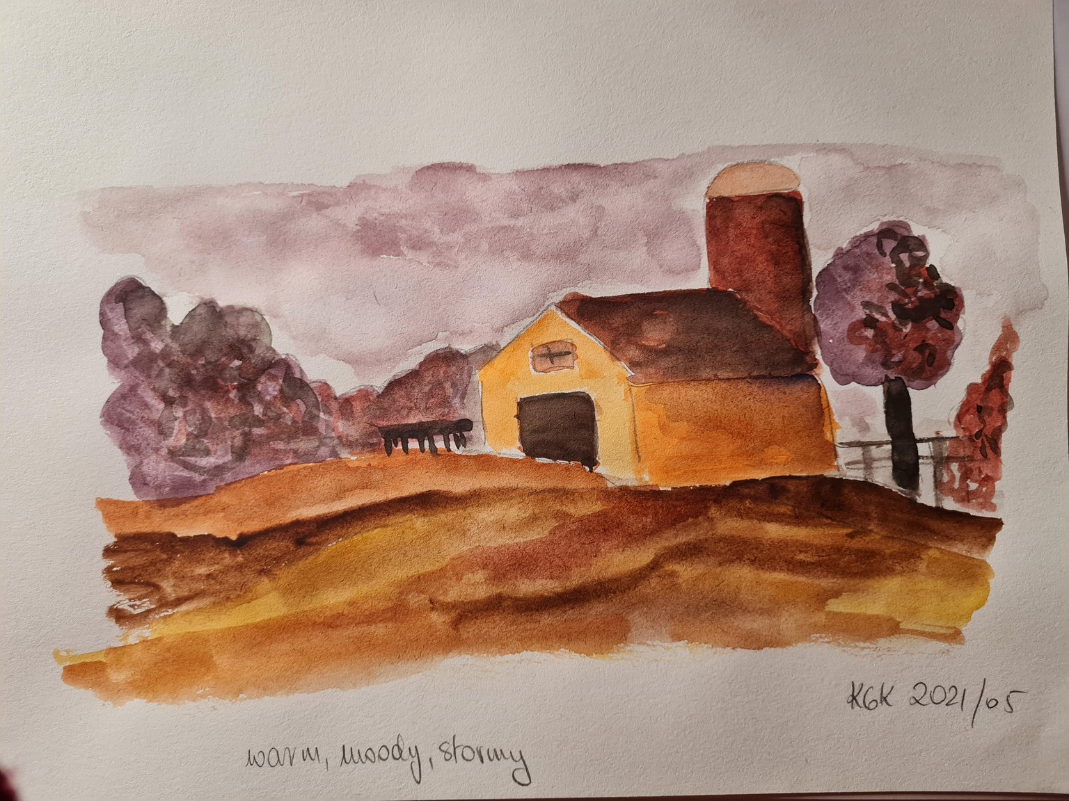
I started with earthy, moody, stormy feel.
I particularly like the purples for the trees and for the sky. (Note: I quite intentionally use a 12-colour basic palette, to learn mixing and not treat the palette as "the box of crayons")
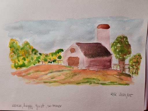
I then went for this summery, happy feeling.
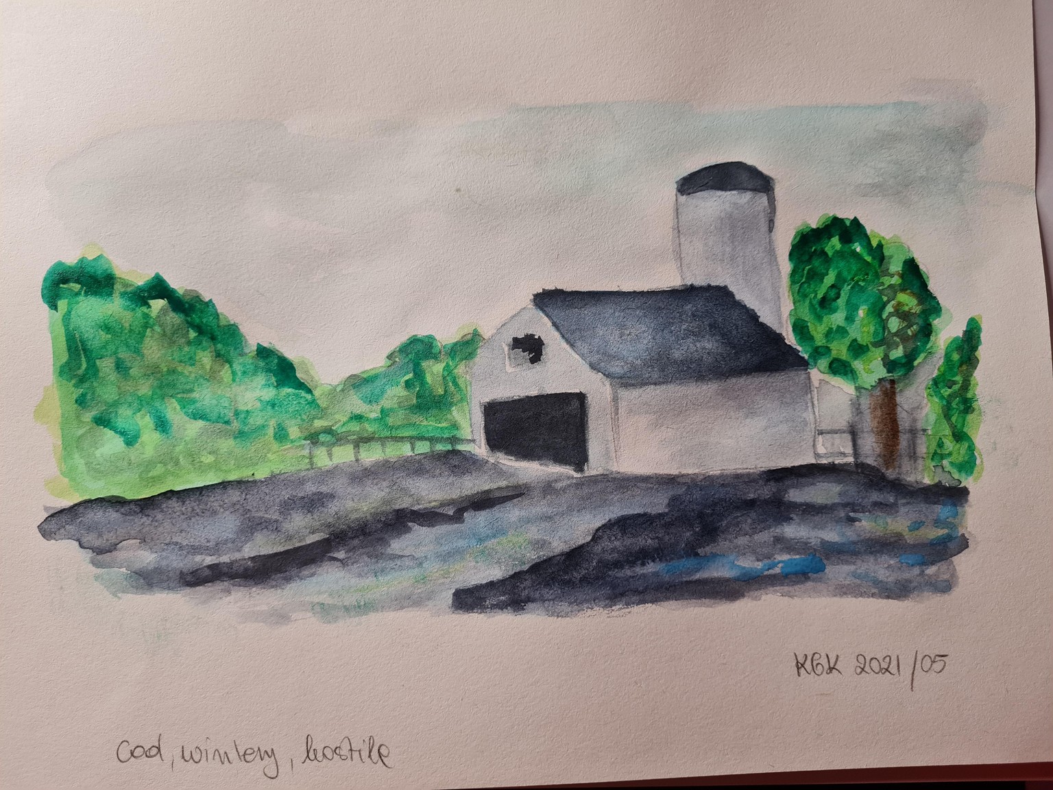
Third, cool one, proved much more tricky.
I need to learn about cool reds, every single red and purple I mixed seemed much to warm to put here.
Thank you for the class, it was very eye-opening!
(and I love the app, quite addictive!)
Karolina.