Hubert - an All-Caps Display Font
This is all a bit new for me - but here's my first font, which turned out to be both retro and chunky and curvy. The shape evolved over a bunch of Procreate sketches, working with a grid - I knew I wanted to do something high contrast, and I started with the H and basically just made it up from there. It was around where I pulled off the K that I really got a handle on what I wanted to do. Once I was happy with my messy (but grid-based) sketches, I shifted over to Affinity Designer and managed to properly get my head around doing curves. Dealing with Glyphs Mini was challenging - kerning regularly made me want to hurl my computer at the wall - but I've got it done. It doesn't have all the symbols, because I got to a point where I just needed to finish it - but I am going to go back to this once I've built a couple more fonts and add some lower case letters, and see if I can get my head around diacritics as well. This has been a really useful course, and I'm sure I'll be revisiting it again (especially once I try something that properly features both curves and diagonals!). 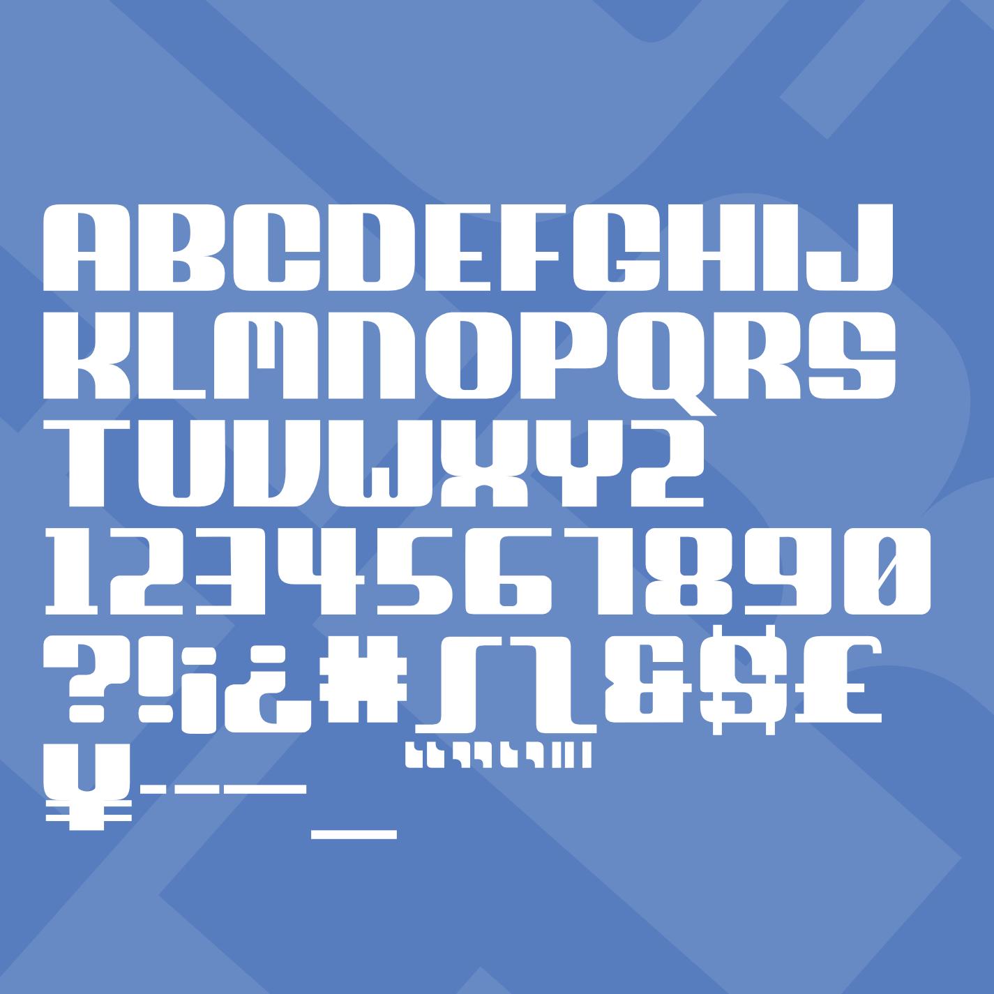

Thanks for looking!