My Lovely Daughter
This rough-draft of a website is for my lovely daughter and her soon-to-be husband.
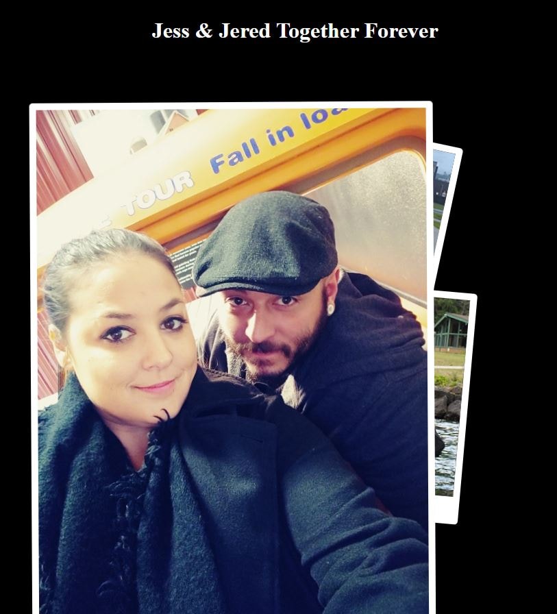
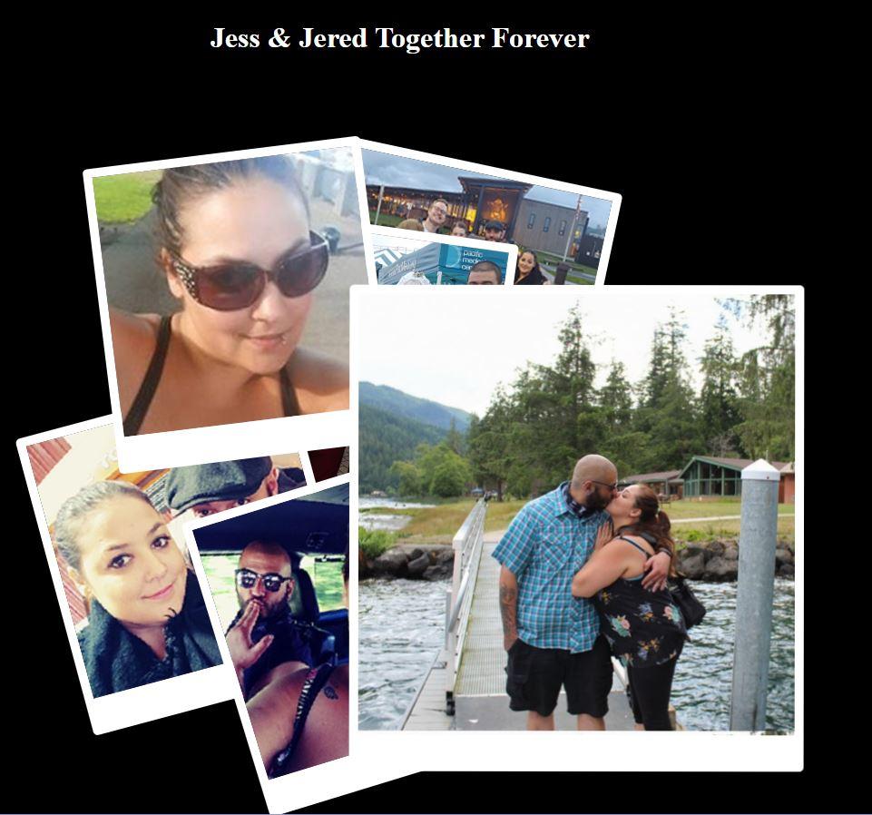
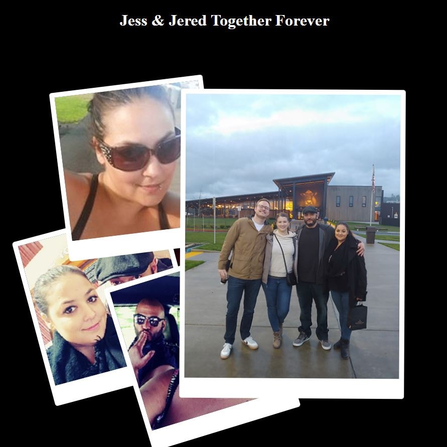
The websites used for my inspiration had old fashioned looking photos. That idea was expanded upon with the use of TRANSFORM property, the :HOVER pseudo class, and Z-INDEX to make each image enlarge to full size and float to the top of the pile.
The most time-consuming part was sizing each of the images in a photo editor. It seems different editors have their own idea about how many pixels a 3" square photo is.
Two photos were used for each <div> element, one for the original the the other for enlarged image.
My next step will be to add a fancy font, but haven't picked one out yet.
All advice welcome, always looking to improve my CSS3.
Here is my code so far:
<!DOCTYPE html>
<html lang="en">
<head>
<meta charset="UFT-8" />
<meta name="viewport" content="width=device-width, initial-scale="1.0" />
<meta http-equiv="X-UA-compatible" content="ie=edge" />
<link rel="stylesheet" href="css201.css" type="text/css" >
<title>Jess_&_Jered_Together_Forever</title>
<style>
.header{
display: ;
position: sticky;
text-align: center;
}
body {
background-color: black;
color: white;
height: 100%;
position: relative;
padding: 5px;
}
.card {
background-color: grey;
border-top: 10px solid white;
border-right: 10px solid white;
border-bottom: 40px solid white;
border-left: 10px solid white;
border-radius: 5px;
position: absolute;
transition: all 0.5s ease-in-out;
}
/* Jessica Selfie */
#c1 {
background-image: url("Jess_288pxSQ.jpg");
height: 288px;
width: 288px;
left: 20%;
top: 170px;
transform: rotate(-7deg);
z-index: 1;
}
#c1:hover {
background-image: url("Jess_6x4.jpg");
height: 432px;
width: 288;
left: 20%;
top: 170px;
transform: rotate(0deg);
z-index: 5;
}
/* Jessica and Jered Kissing on the dock. */
#c2 {
background-image: url("kissing_3x3.jpg");
height: 288px;
width: 288px;
left: 45%;
top: 415px;
transform: rotate(5deg);
z-index: 2;
}
#c2:hover {
background-image: url("kissing_567x485.jpg");
height: 490px;
width: 485px;
left: 45%;
top: 315px;
transform: rotate(0deg);
z-index: 2;
}
/*Jered's Sister and Boyfriend. */
#c3 {
background-image: url("JeredFamily_3x3.jpg");
height: 238px;
width: 288px;
left: 42%;
top: 182px;
transform: rotate(12deg);
z-index: -1;
}
#c3:hover {
background-image: url("JeredFamily_6x8.jpg");
height: 576px;
width: 432px;
left: 42%;
top: 182px;
transform: rotate(0deg);
z-index: 2;
}
/* With Santa, 2019. */
#c4 {
background-image: url("santa_3x3.jpg");
height: 288px;
width: 288px;
left: 32%;
top: 250px;
transform: rotate(8deg);
z-index: -1;
}
#c4:hover {
background-image: url("santa_med.jpg");
height: 622px;
width: 800px;
left: 32%;
top: 250px;
transform: rotate(0deg);
z-index: 2;
}
/* Jess & Jered Selfie */
#c5 {
background-image: url("selfie_3x3.jpg");
height: 288px;
width: 288px;
left: 15%;
top: 442px;
transform: rotate(-15deg);
z-index: -1;
}
#c5:hover {
background-image: url("selfie_34x45.jpg");
height: 762px;
width: 576px;
left: 15%;
top: 142px;
transform: rotate(0deg);
z-index: 2;
}
/* Jess & Jered driving */
#c6 {
background-image: url("jessJered_driving_3x3.jpg");
height: 288px;
width: 288px;
left: 32%;
top: 528px;
transform: rotate(-17deg);
z-index: -1;
}
#c6:hover {
background-image: url("driving-crop.jpg");
height: 435px;
width: 576px;
left: 32%;
top: 228px;
transform: rotate(0deg);
z-index: 2;
}
</style>
</head>
<body>
<div class="header">
<h1>Jess & Jered Together Forever</h1>
<h2> </h2>
<h3> </h3>
</div>
<div>
<div class="card" id="c1"></div>
<div class="card" id="c2"></div>
<div class="card" id="c3"></div>
<div class="card" id="c4"></div>
<div class="card" id="c5"></div>
<div class="card" id="c6"></div>
<!--
<div class="card" id="c7">7</div>
<div class="card" id="c8">8</div>
<div class="card" id="c9">9</div>
<div class="card" id="c10">10</div>
-->
</div>
<!--
<div class="footer">
<p>web design by glo russo 2020</p>
</div>
-->
</body>
</html>
(MY BABY IS GETTING MARRIED!)