Illinois recreation
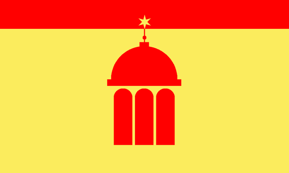
Illinois's flag is just its god-awful state seal and the word Illinois written below it. So I decided to sketch out this thing on GIMP.
The center-piece is a minimalist mock-up of Illinois's state capitol building. This building has three windows and a dome top with a flag on top. I replaced the flag with a Chicago star to represent Chicago's importance. Instead of the Chicago star being red, it's surrounded by red. This represents the red glow on the horizon I always saw as a kid at night, looking toward Chicago. The rest of the flag is the color maize to represent that the rest of Illinois is corn.
I think the building logo could use some serious work and re-proportioning. The star is also uncentered by a single pixel because it's a 1000 pixel-wide canves and a star with a point that is only 1 pixel, meaning I couldn't actually center it. It's a nice start and it's been pretty fun applying the advice of these videos.
I don't have Adobe illustrator but I might have to grab the free trial to actually fix this design and make it look professional.