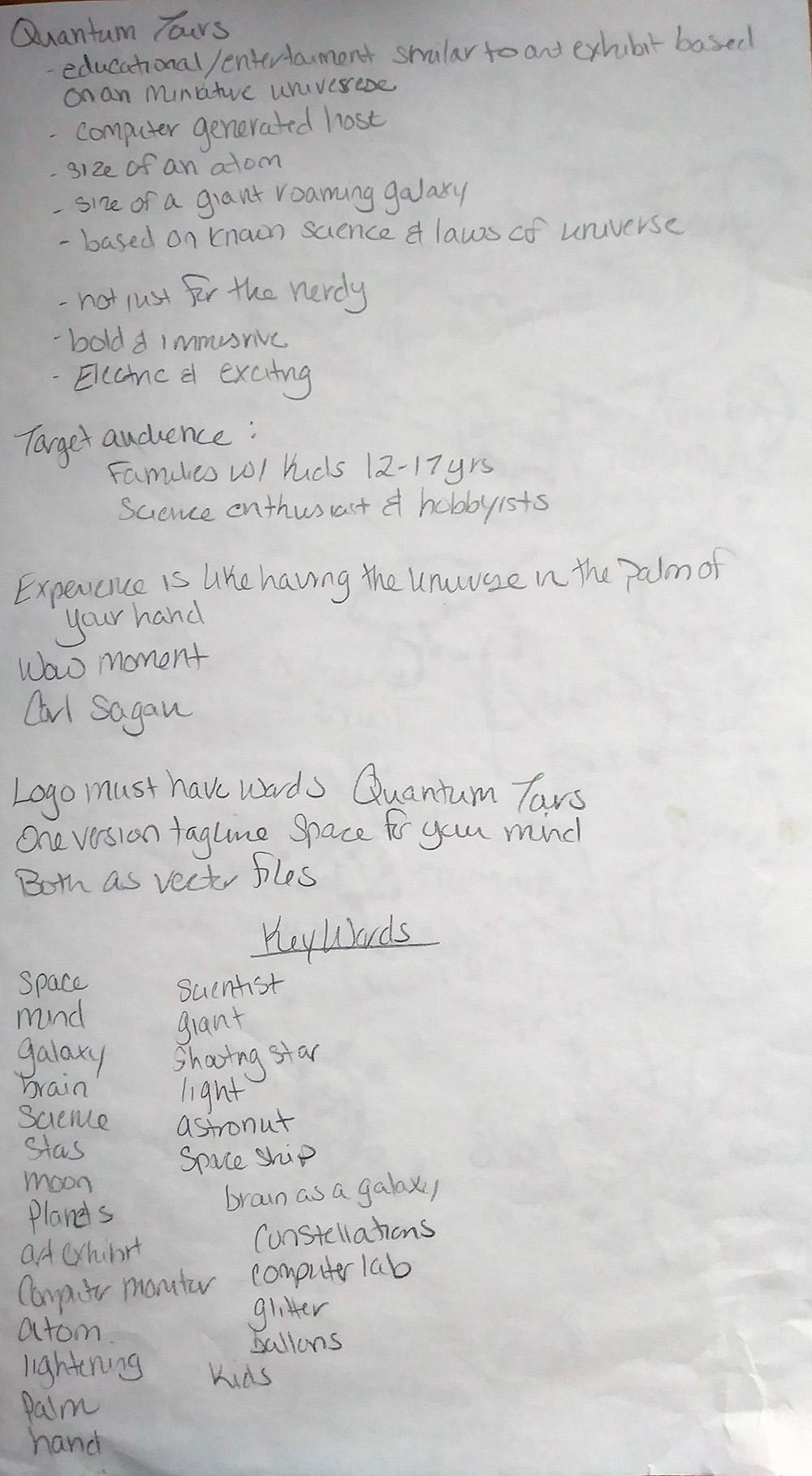
Quantum Tours
I started with looking over the brief and outlining what was needed in my own words so that I wouldn't forget the key points. Then I went into sketch mode.
I also created a moodboard on Pinterest to get ideas:
https://www.pinterest.com/desertfyre/quantam-tours/
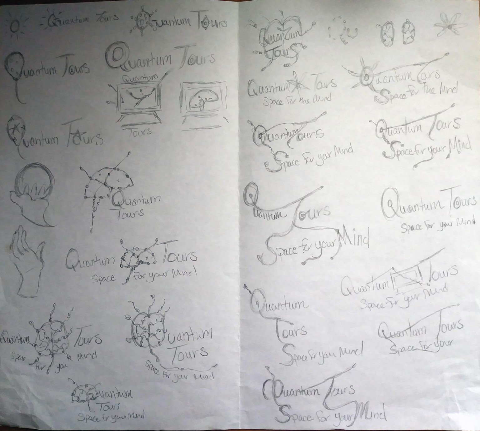
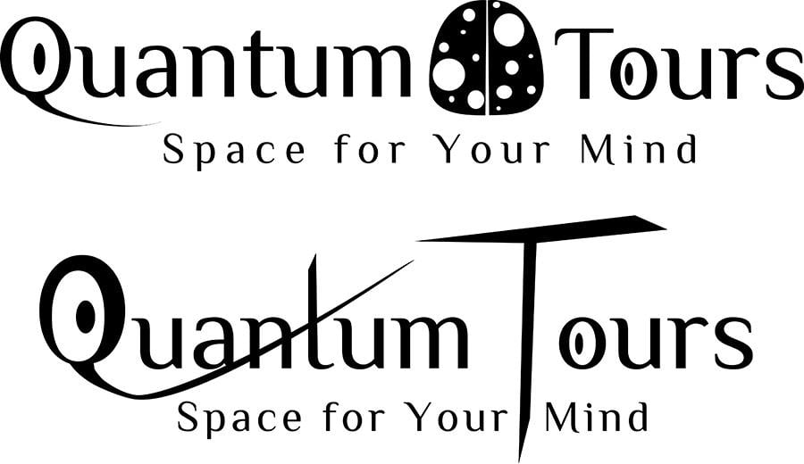
Afterwards I went into Illustrator and began playing around. I found a font I really liked and began to build on some of my sketch ideas. Some went no where and others didn't look or feel right once I saw it.
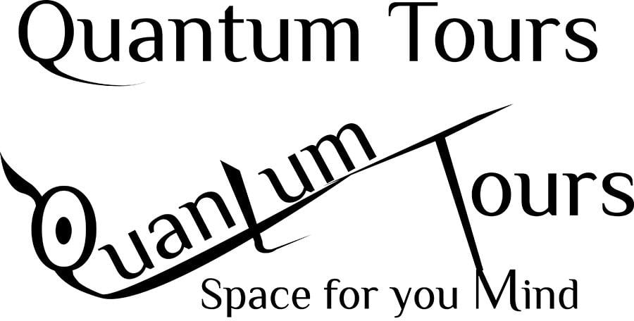
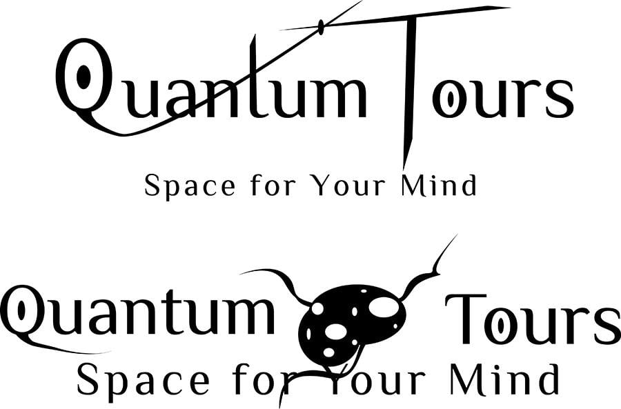
However the one below as the best two ideas but I really liked the top one. I felt it conveyed both the space/universe with a mind concept that I was trying to go for.
So I took the first one and started with the color. I also got a universe photo and took colors from that. I tried different combinations to decide once one I liked.
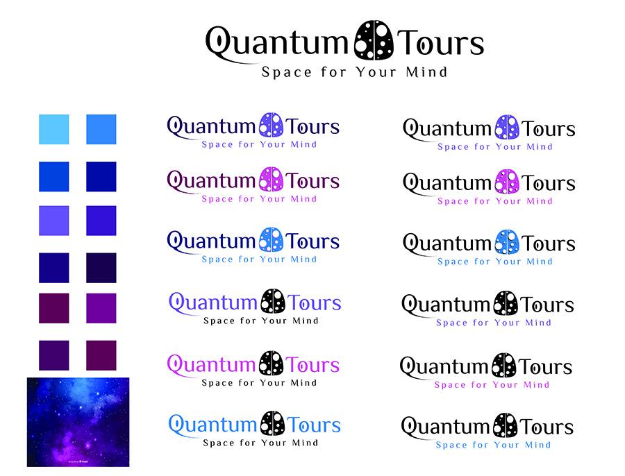
In the end I felt the purple conveyed the electric and exciting for families with kids, science enthusiasts and hobbyists, while still having a universe feel to it. While I loved the blue, I felt it was a bit too calm like water and the pink just didn't work in my opinion.

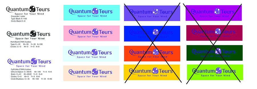
I also created a color chart on what not to do and the backgrounds they work better together with.
I'm really happy with what came out after following this class. I felt I learned so much. Thanks to Shawn Barry for creating this class! I have had some logo design in my graphic design training but none was extensive as this. I feel that I understand how to think about logo designs in way that I was taught before. And I'm happy to have an understanding on how to do this if a client is involved. Thanks again for taking the time to create this class!