Animated slide for my next class.
I took this class as I wanted to animate the text on one of the slides for the upcoming Skillshare class I'm currently working on, keeping a similar style to my other static slides that I already designed.
There maybe was an easier way I could of done this, but I wasn't sure how, so I just went with this! At least I could learn something new whilst I worked on it :)
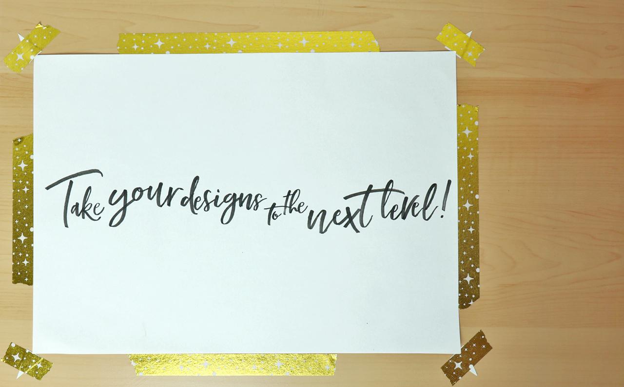
My phrase is 'Take your designs to the next level!' and most of my static slides feature a handwritten font in light grey on a dark blue background.
First I typed out my phrase onto my slide design template in Adobe Illustrator.
This is what it looked like with no editing done to the text.
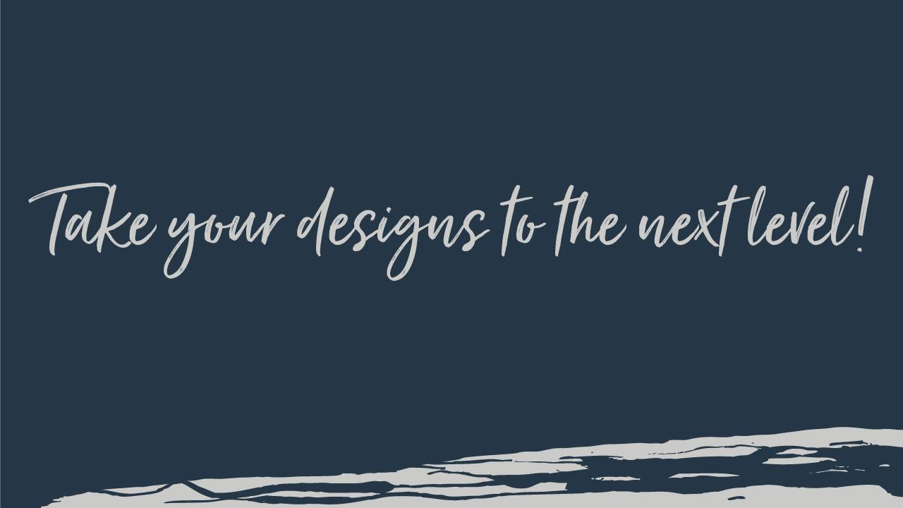
Next I began to play around with the text selecting one letter at the time, using open type features to activate stylistic alternates in my chosen font, until it looked a bit more naturally handwritten with more varied characters. I then used the character panel to change the size of each letter or word and adjust the tracking/kerning and baselines. I put each word on a separate layer so that I could move them around independently and create a more bouncy dynamic composition with more movement and energy!
This is what it turned out like after all the alterations and became the draft image for my animated slide.
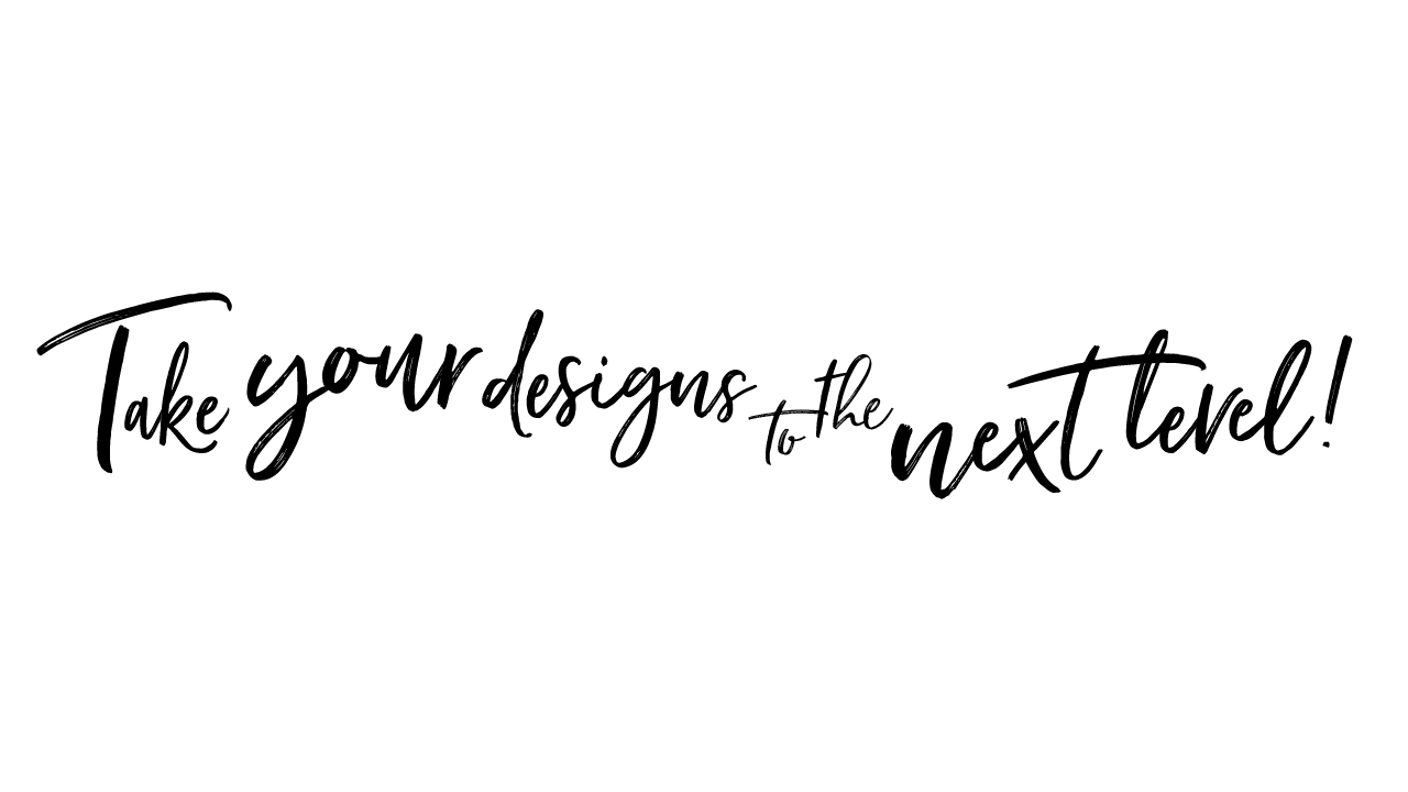
I then duplicated the slide, made it into simple black and white text and printed it out...
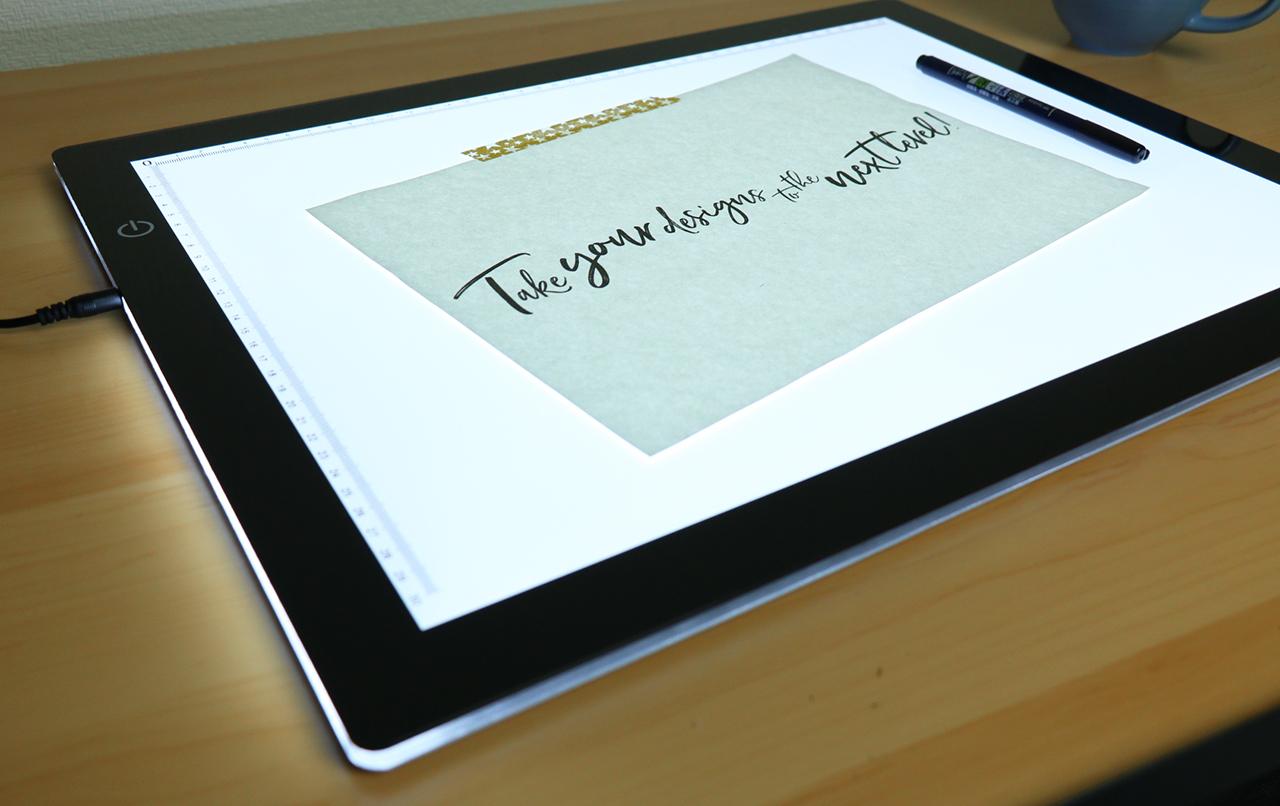
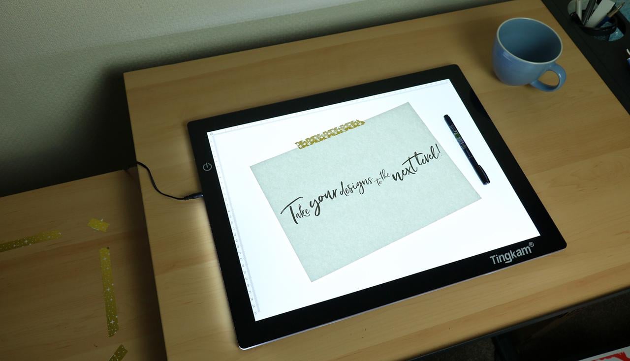
Next I set up my light pad and practised drawing my phrase a few times using sheets of marker paper to test out which pen to use and get a feel for it. I also thought the extra frames of the full phrase may be useful at the end of my animation, to create a wobbly effect where I would be able to keep my phrase on the screen for longer, but still keep some movement going.
I decided to use the Tombow Fudenosuke calligraphy pen with a small, soft and very flexible tip to letter my design. Here's a clip in action...
Once I was confident with my design, I masked off the frame area with Washi tape on the small, extendable portion underneath my drawing table to line up my paper, and set up my camera on a tripod with extension arm, so that I could photograph my frames from above (this was very tricky to get the framing right on the camera and was probably the biggest headache of the whole thing!). I had to set the camera up so high that I ended up having to stand on a step stool to see the LCD and take the photos! I also had to set up some artificial light and use manual focus on my camera to make sure half of my frames didn't turn out blurry.
Instead of doing all my frames on a separate sheet of paper - I think I had about 70 frames! - I decided to do it all on one sheet of paper and just take a photo between every natural brush stroke of each letter. This took me about 4 hours and I had to work against the clock to get it done before my camera battery ran out! (I don't have a quick release on my extension arm, so would of had to move the camera and ruin the setup to change the battery!). I would probably have used my scanner to digitise the images if I had done it on multiple sheets of paper like Carmina and could of done all the scanning in one go, but I couldn't face firing up the scanner between each brush stroke to do it on one sheet!
This is what my frames looked like after importing all my photos into a layer stack (great tip!), in my Photoshop document before I made any edits to them...
I shot my frames in 16:9 ratio to make my life easier, but because of the framing still had to crop it to my design and then resize so that it was 1280 x 720 dimensions, the same as all my other static slides for my Skillshare class.
I aligned my layers and then spent a long time adjusting the duration of all my frames to get the speed of each stroke as close as I could to what I wanted. I mostly used durations of around 0.02secs to 1.3secs and duplicated some frames to leave slightly bigger gaps between each new word starting. I used the 4 practise versions of the whole phrase that I had done at the start as variations at the end of the animation, which I then also duplicated another 4 times each - in total my final timeline now stands at exactly 100 frames!
I then created adjustment layers using, levels, brightness & contrast and selective colour, to get my background to look more even and less blue and my letters darker and more contrasting (I don't like curves!).
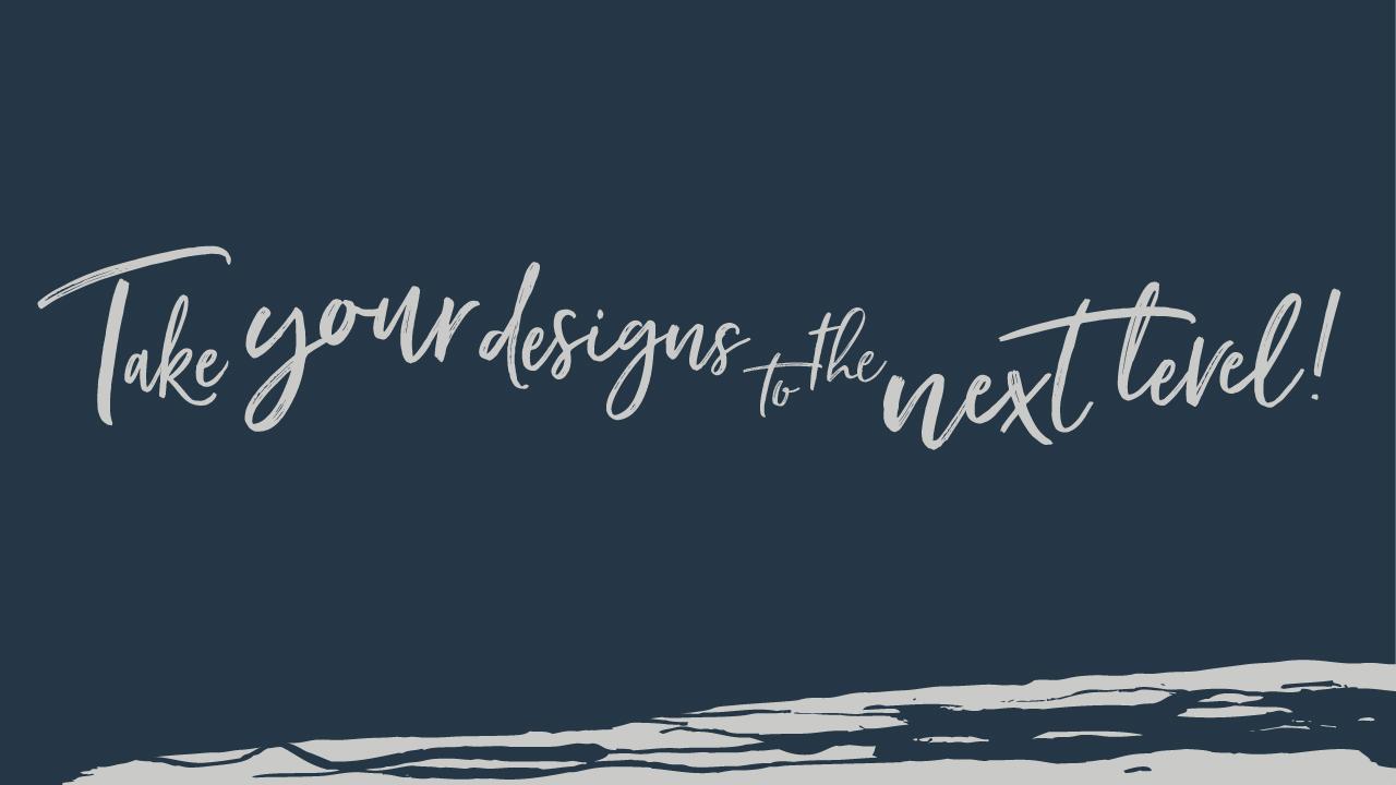
Here it is before making the final colour adjustments and a few more tweaks to the speed...

Next I used a Gradient map layer adjustment set to a 'black and white' gradient and changed the black colour on the slider in the menu to light grey, and the white colour to dark blue to match my other slides. This was the closest I could get to my original design draft, as I couldn't work out how to make my white background in my images transparent, so that I could copy and paste in the original background image from my static slides from Illustrator as a background layer.

This is my final animation and I am really happy with it! The file size was really big (about 17MB, so to upload it, I have had to use a gif optimizer, to reduce the file size to about 1.8MB by cutting colours down to 200 and compressing slightly as a lossyGIF, so it may not look quite as good quality here as it should :)
I will upload a link here to my new class when it is published so you can see it in action!
MANY THANKS!!