PG2 | Part 1
Unit 1, Video 1
A brief dancing introduction by Joshua Davis (with his daughter?). We should get this party started. Which is really a motivating introduction to start this course.
Some explanation about my numbering. For instance: PG2_2_2_2.
– PG2 is the project name of this course.
– PG2_2 is the second chapter. In this case its about H.ROTATE.
– PG2_2_2 is Joshua’s second example.
– PG2_2_2_2 is my second example on Joshua’s second example.
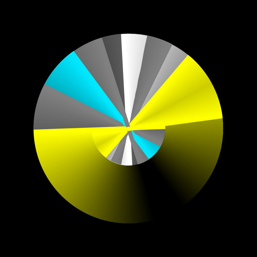
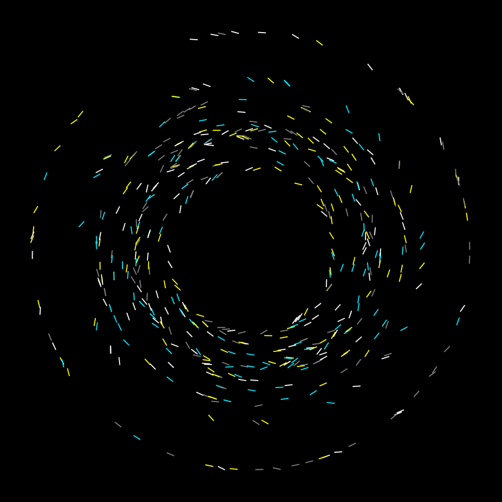
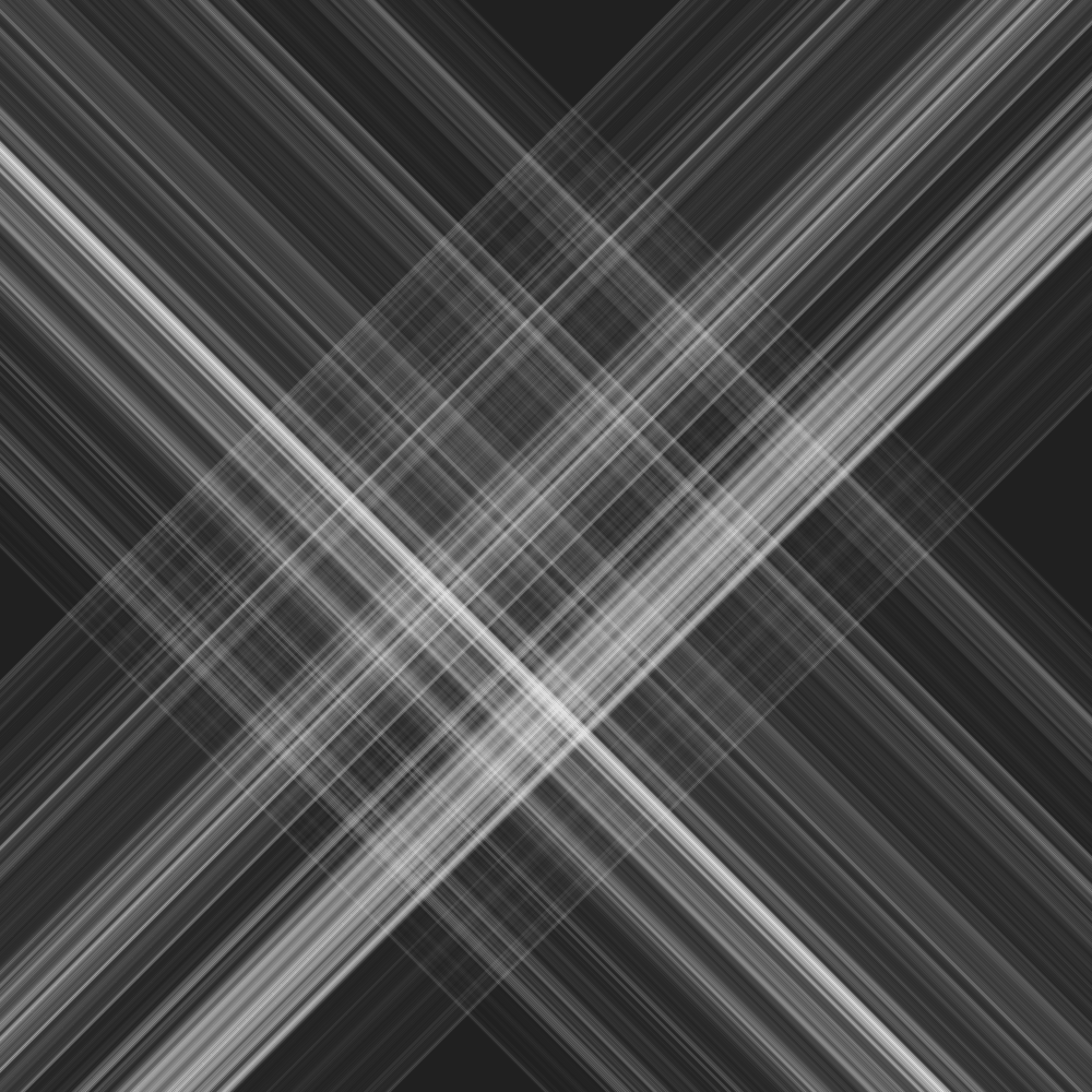
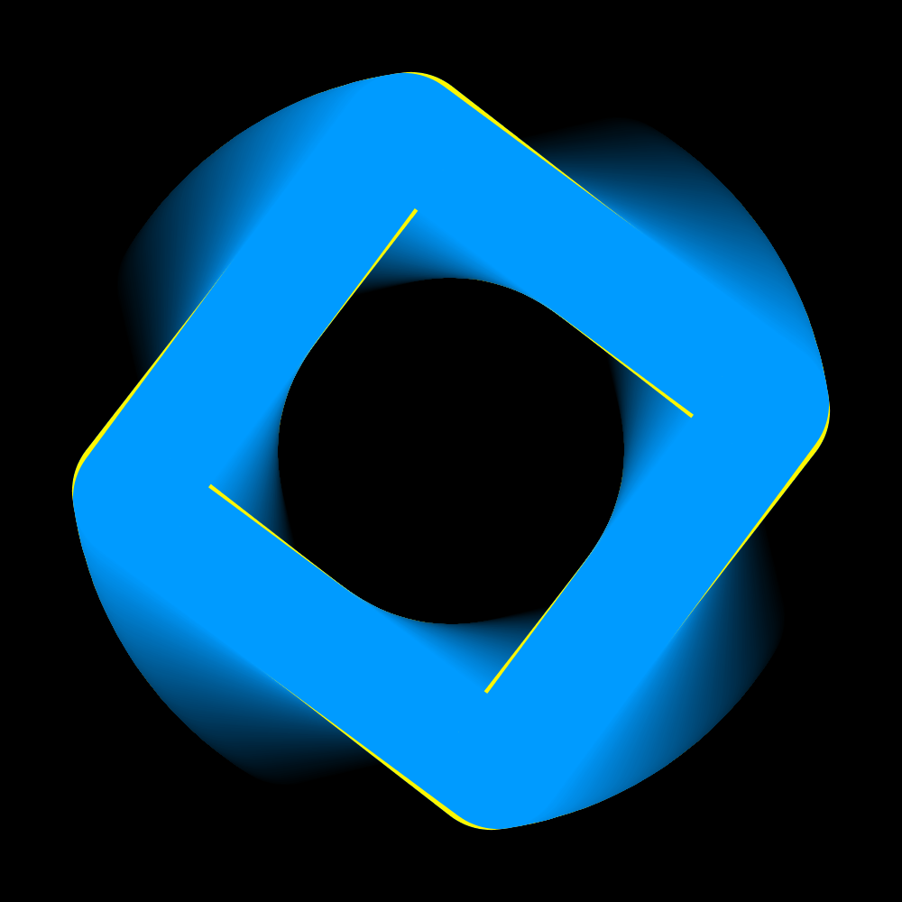
HRotate
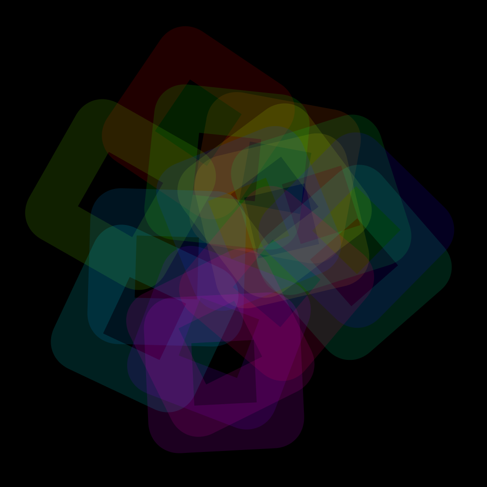
PG2_2_1_1
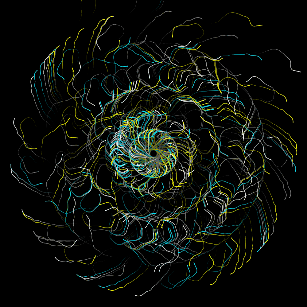
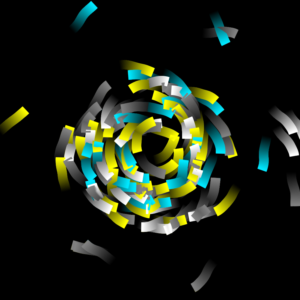
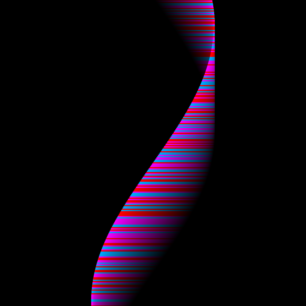
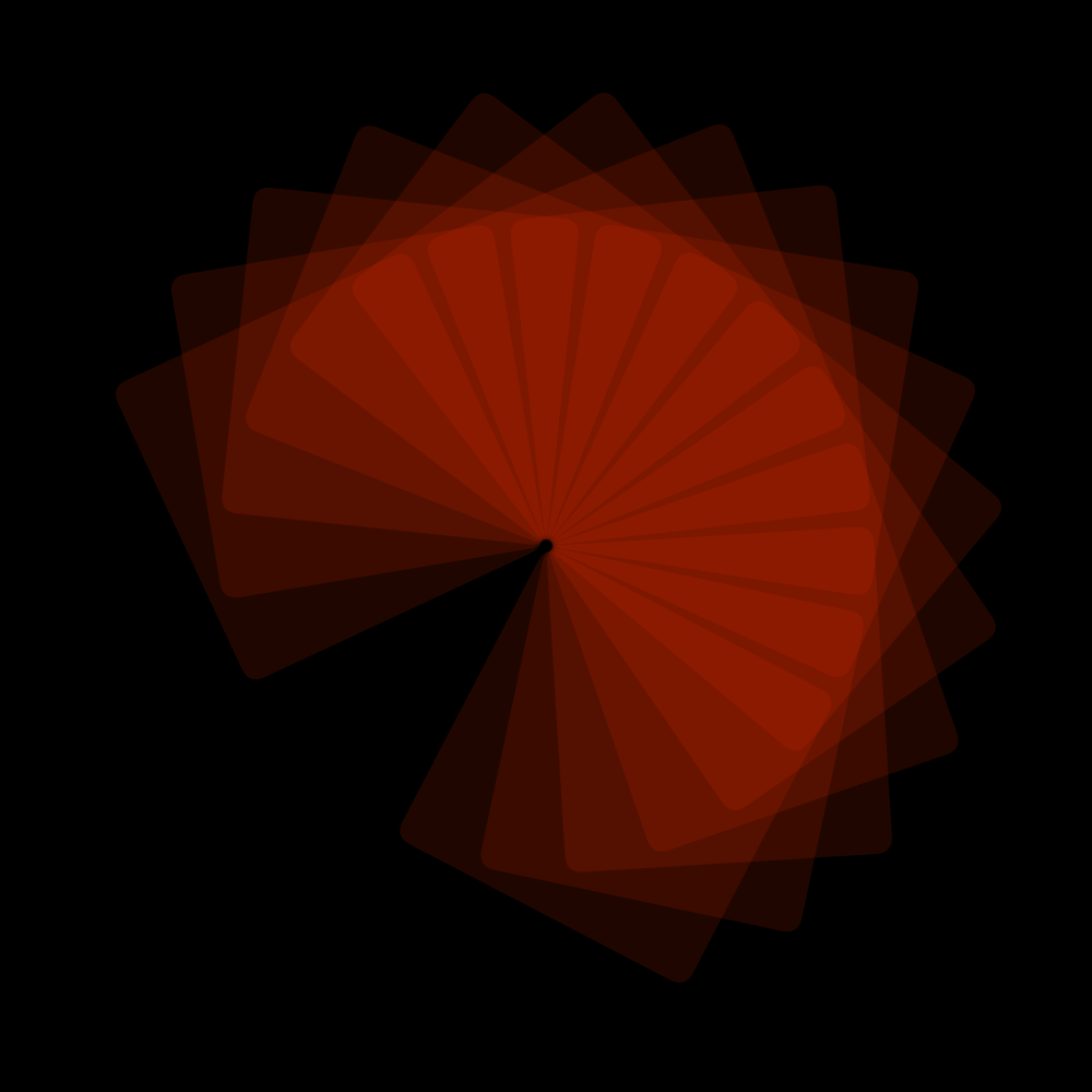
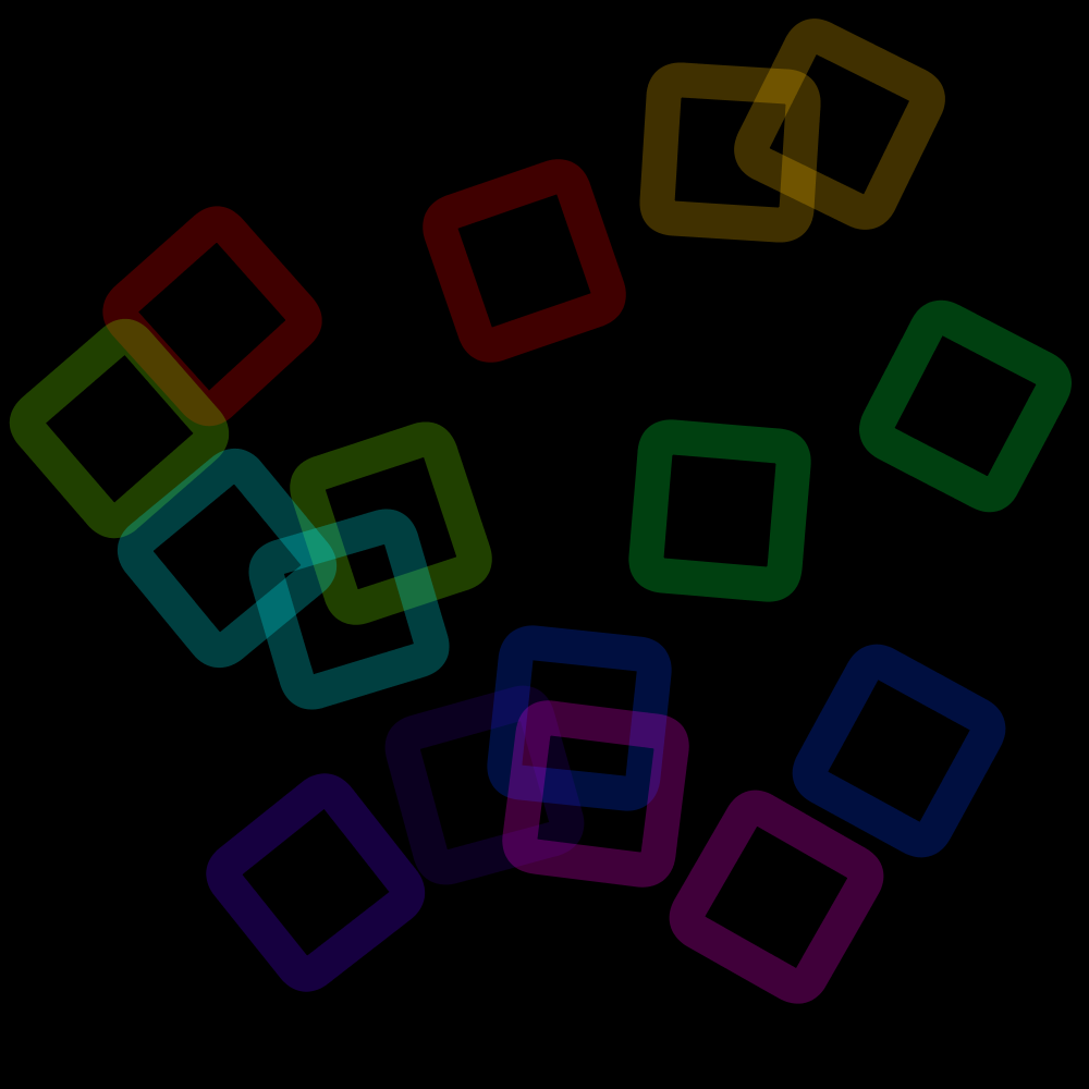
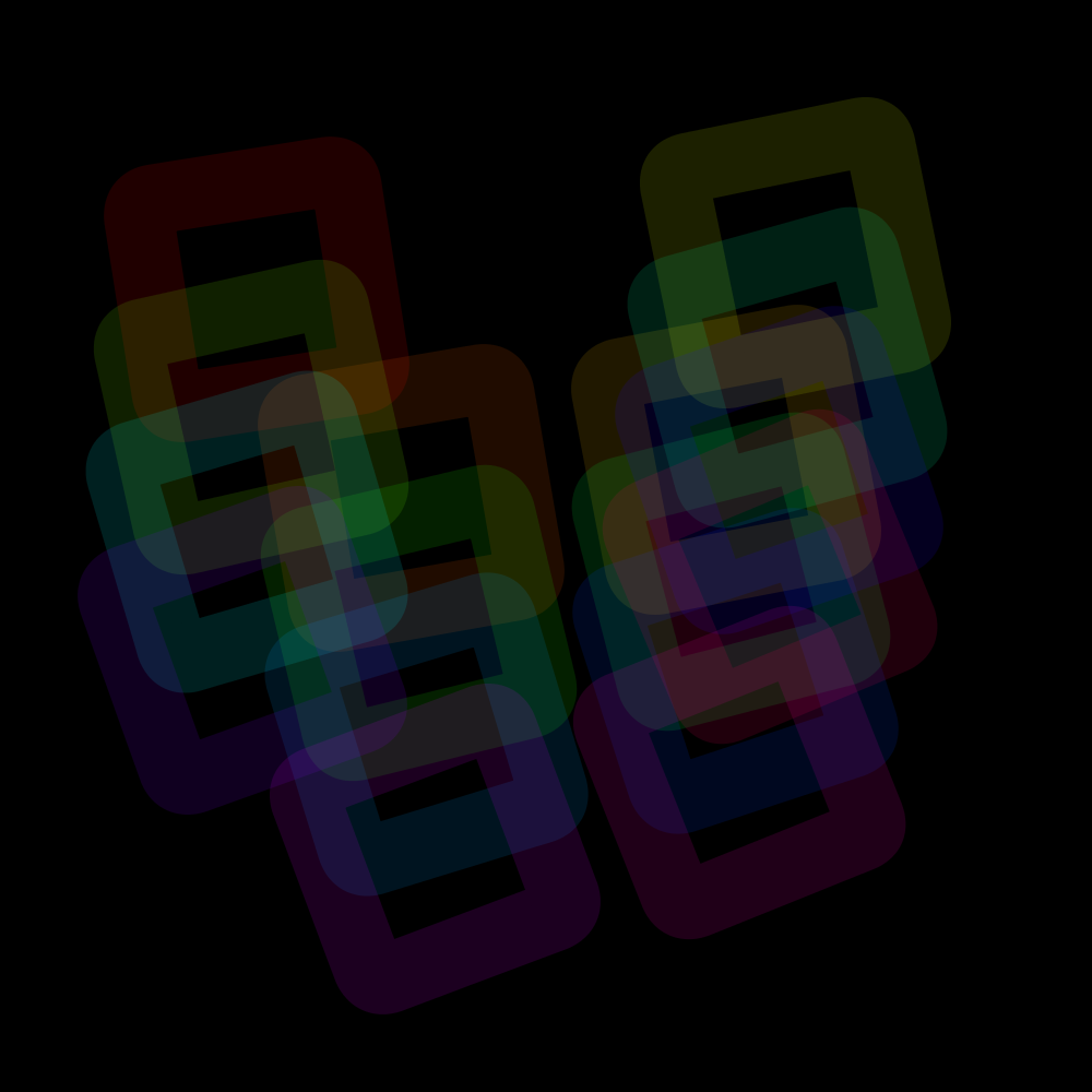
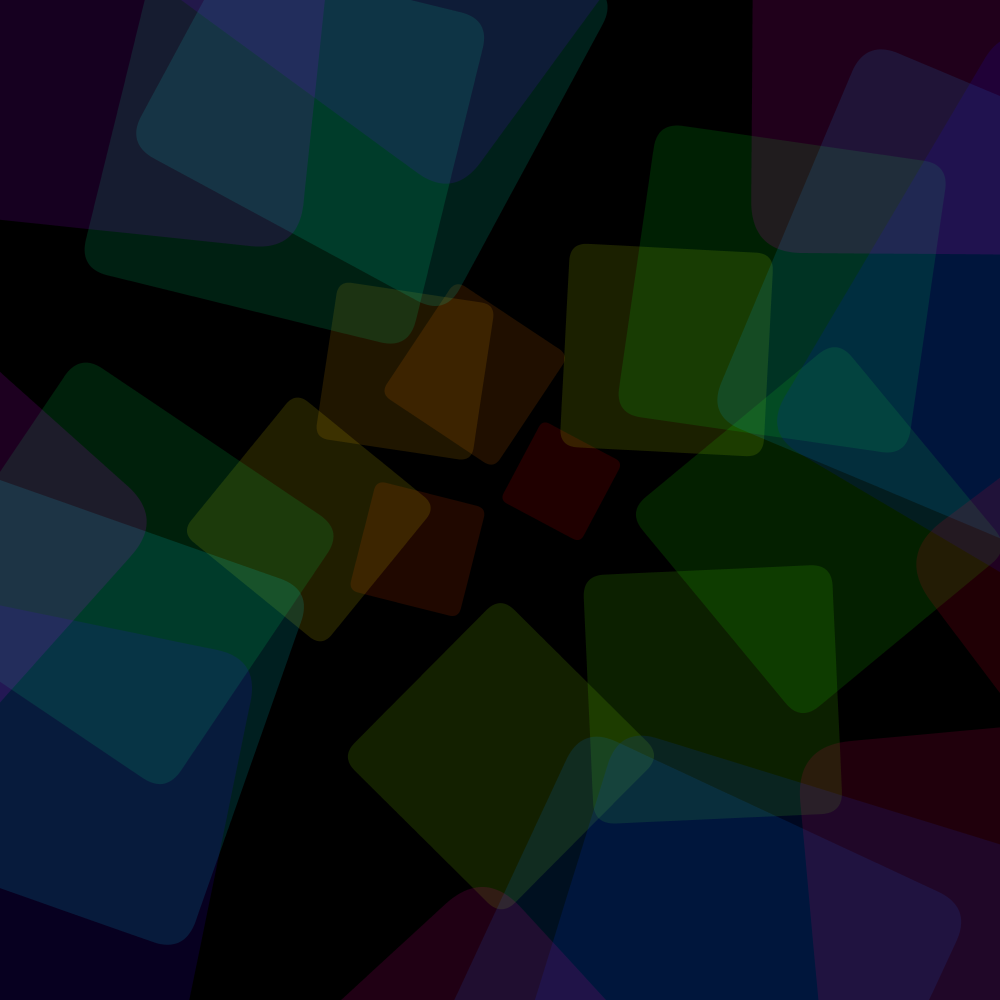
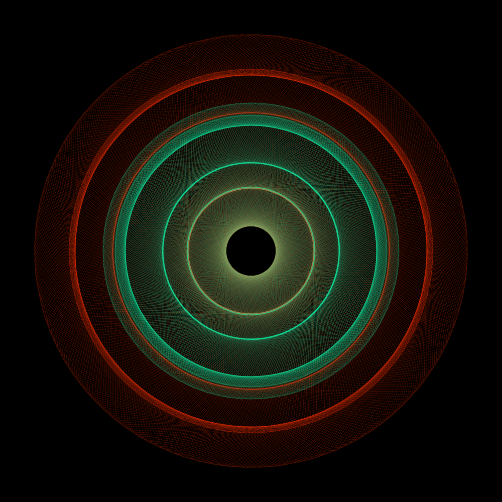
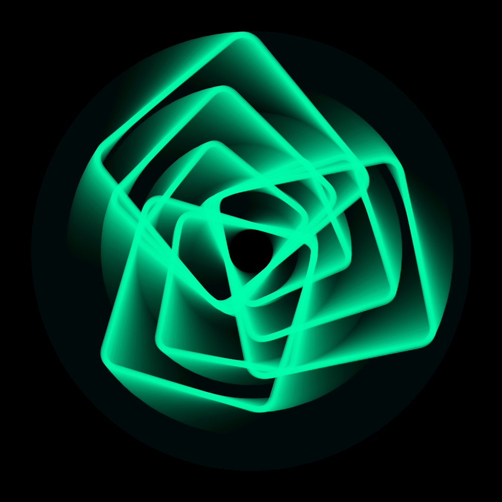
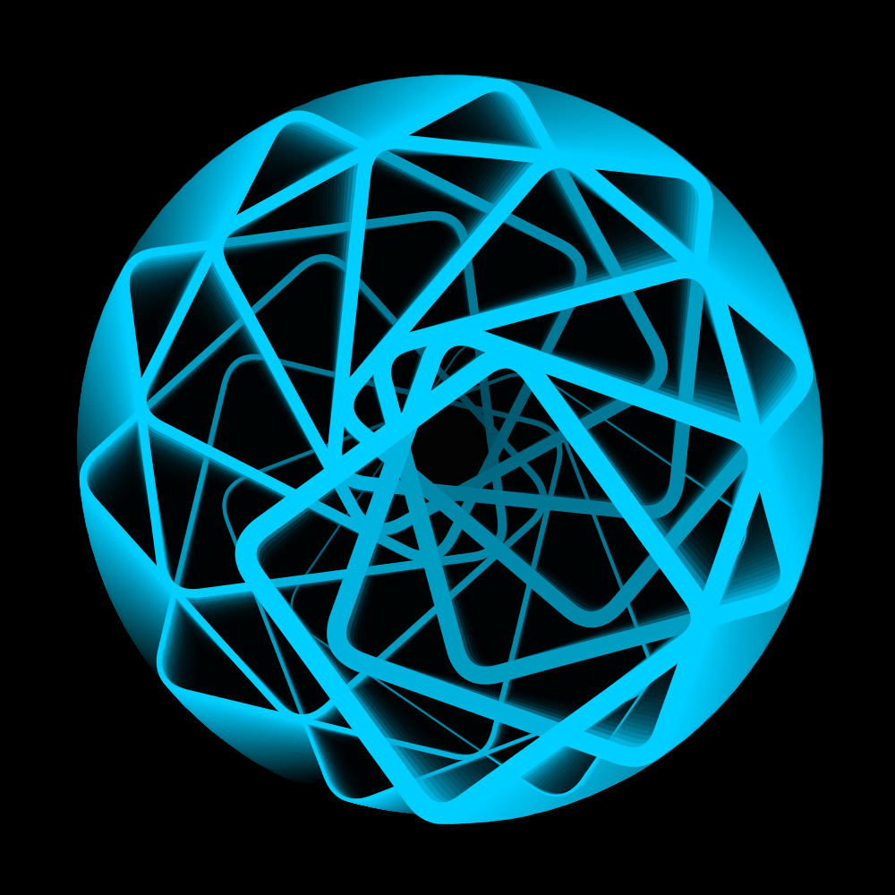
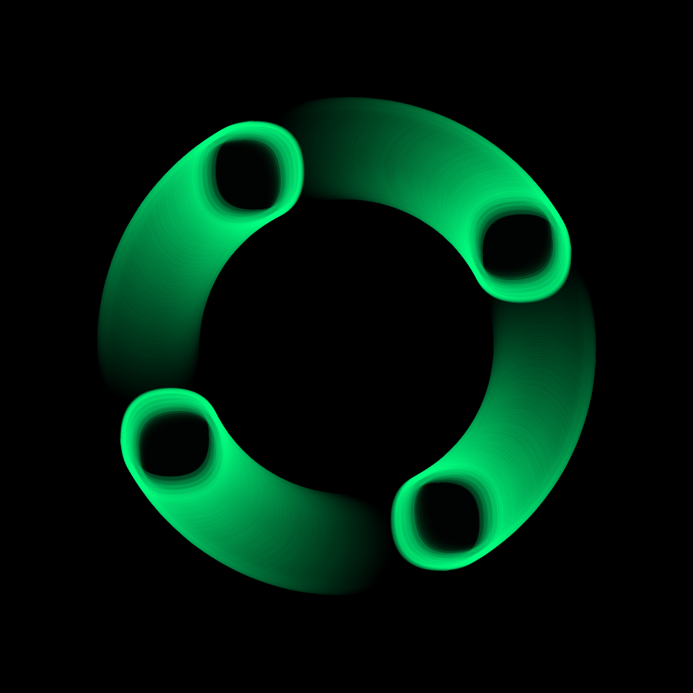
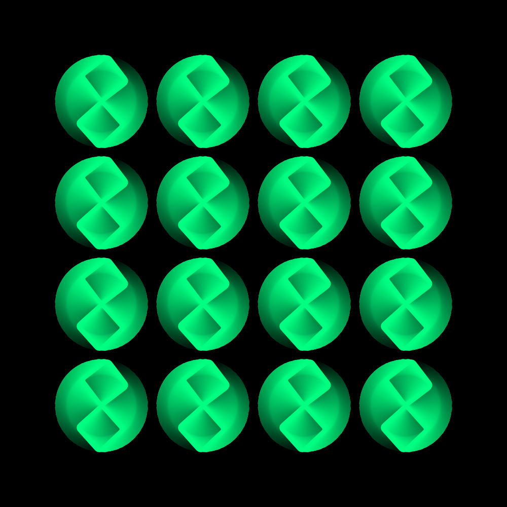
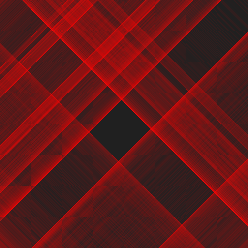
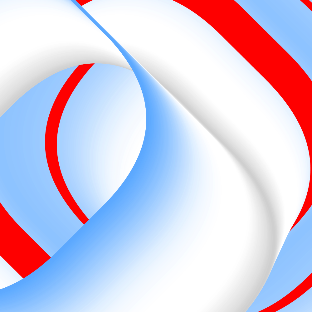
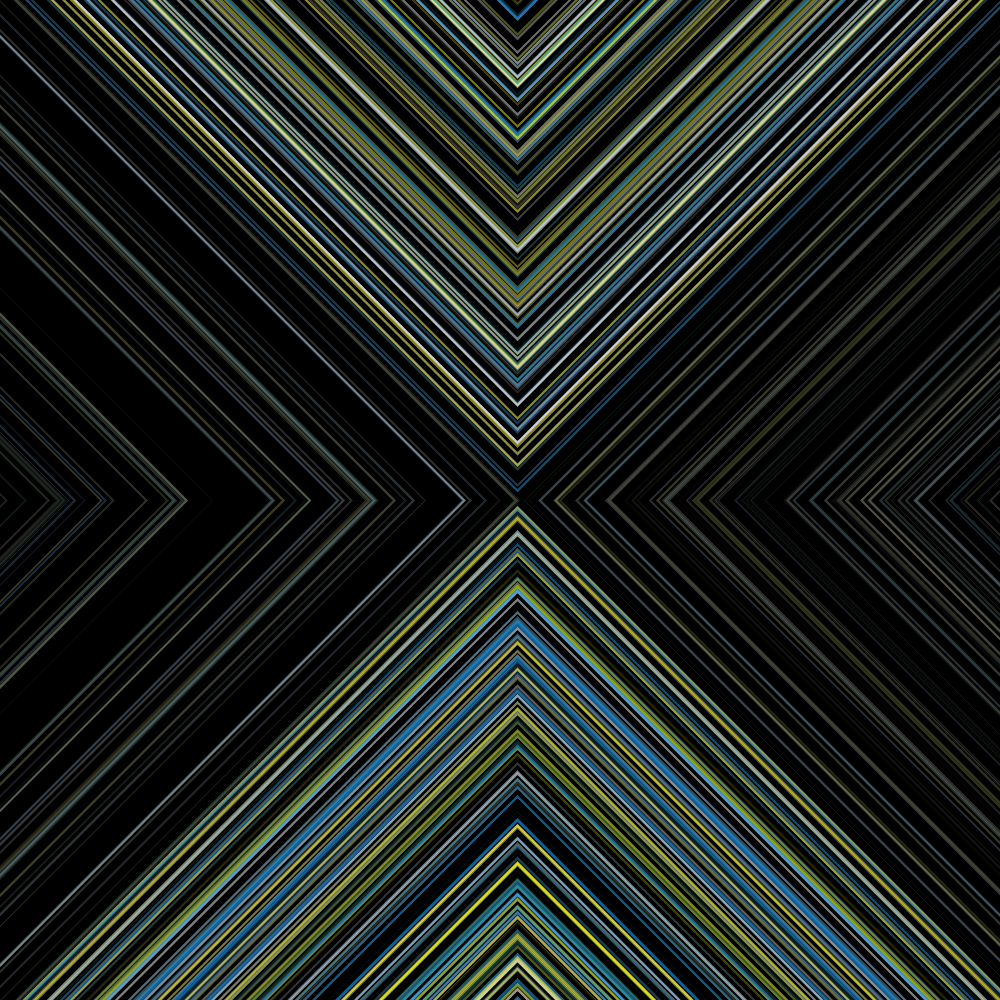
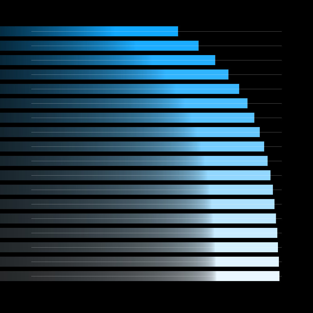
That’s handy. StageW and StageH are used to generate a variable in the beginning. And than used as a size indicator in setup. Or is this just extravagant? Usually I change the names of the variables to my own variable names first. This immediately provides more insight into the structure of the program. Incidentally, I received two errors: ‘The static method background (int) from the type H should be accessed in a static way.’ Okay... that is a reference to the size variables created in the beginning. And: ‘The method speed (float) from the HRotate type is deprecated.’ No idea how I must interpret that information but the program just works. My first idea was to make several rectangles that rotate with different speed. I came up with sixteen squares. Because of the variable speed, the squares form different unexpected formations.
https://vimeo.com/251320742
PG2_2_1_2
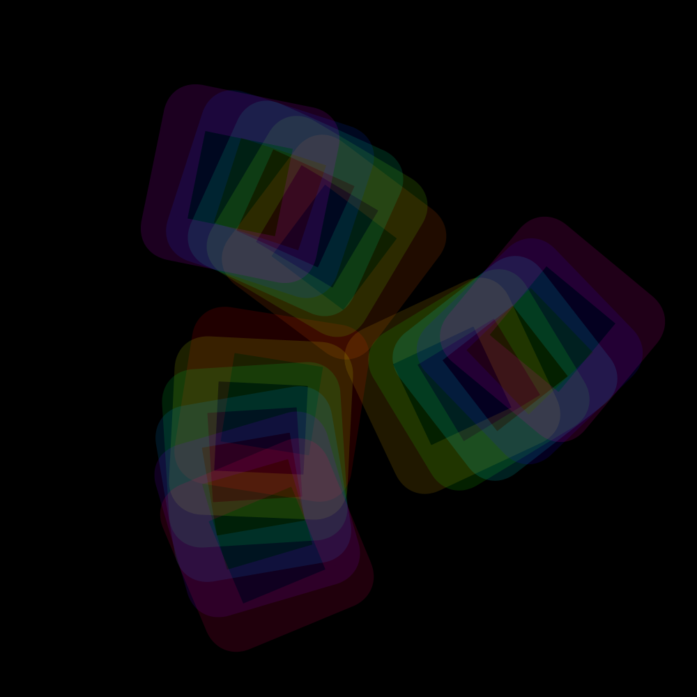
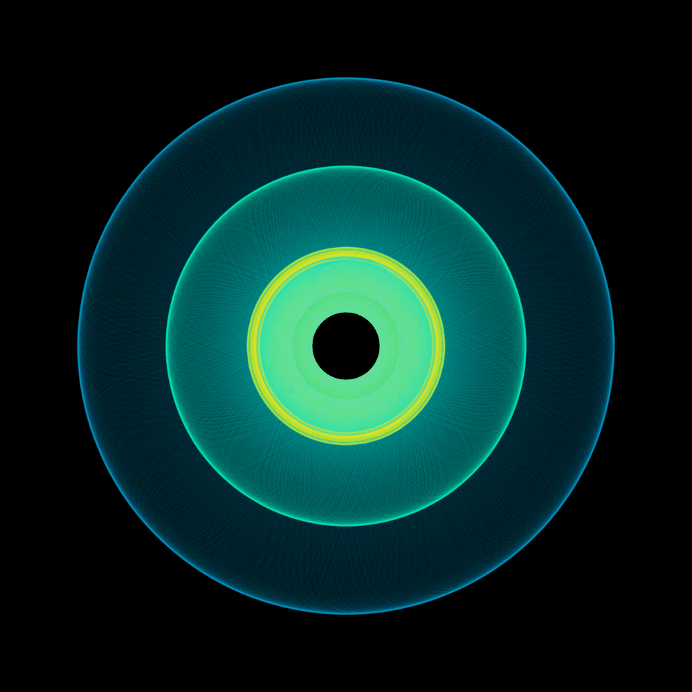
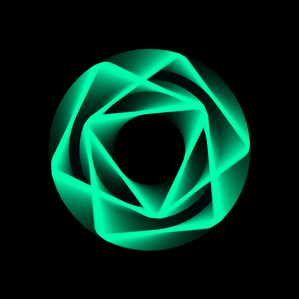
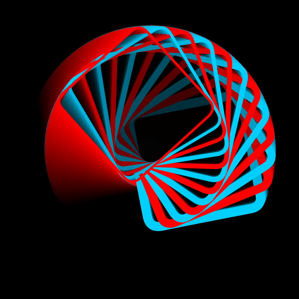
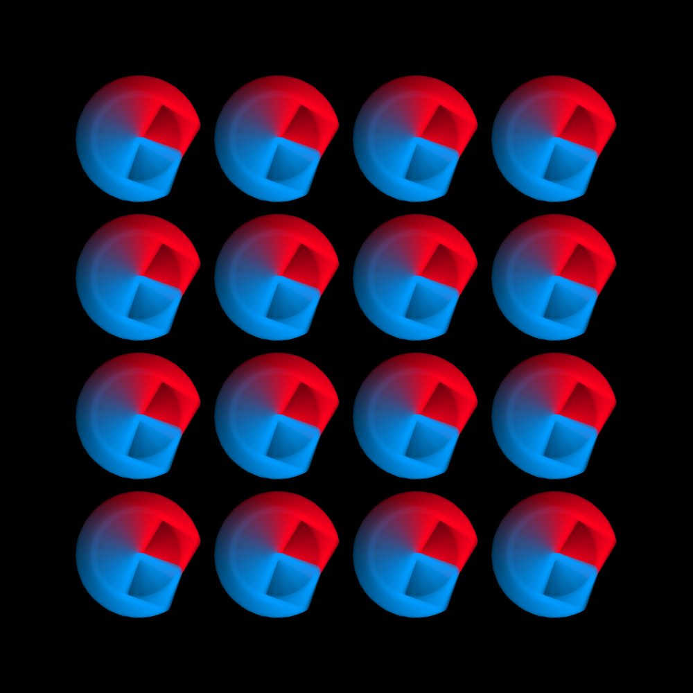
This version uses sixteen different sizes of squares. However, they rotate around the same center of the display window. Here, too, there are various interesting unexpected formations at certain times.
https://vimeo.com/251340766
PG2_2_1_3
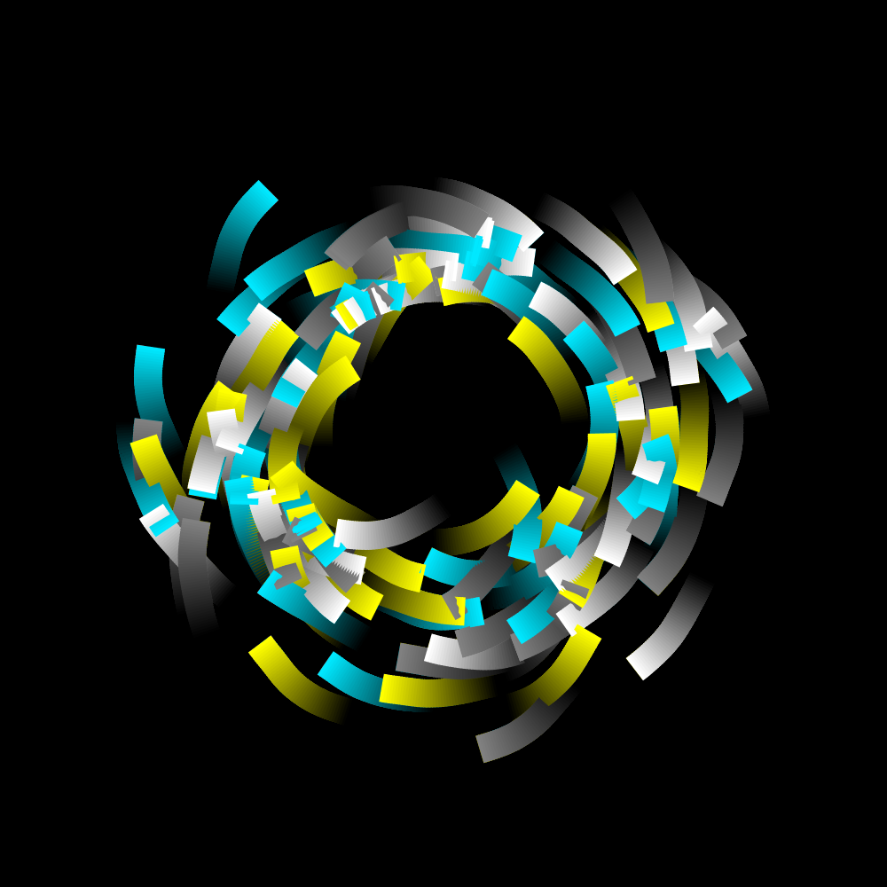
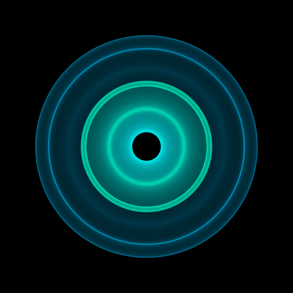
A version with very thick outlines. No fills. Very surprising are the times that the squares separate apart from each other. Other patterns are formed, which in itself is also surprising.
https://vimeo.com/251340874
PG2_2_2_1
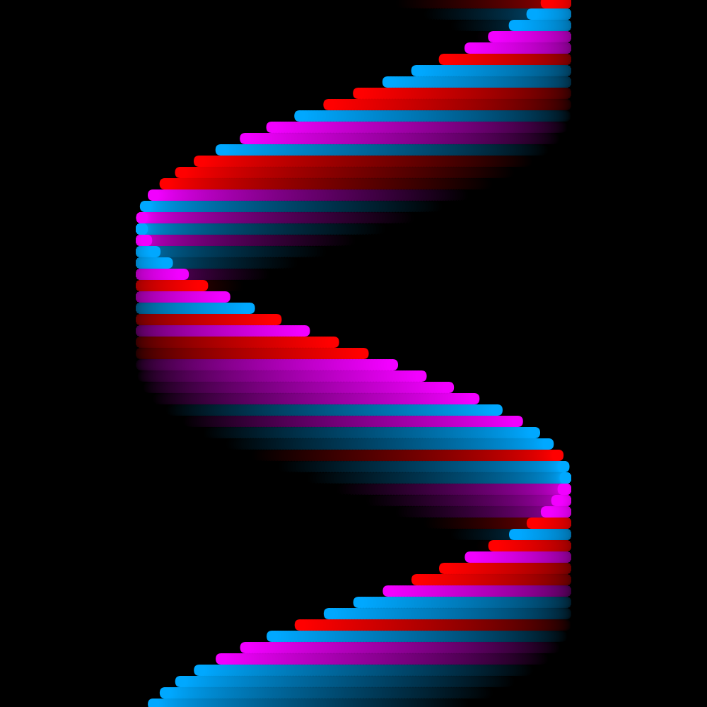
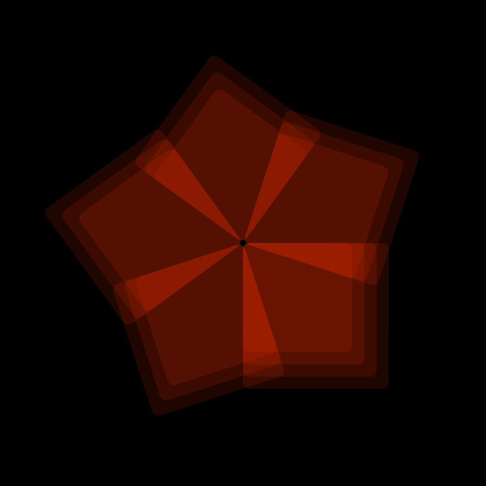
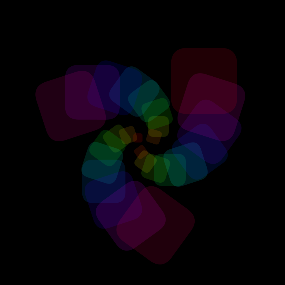
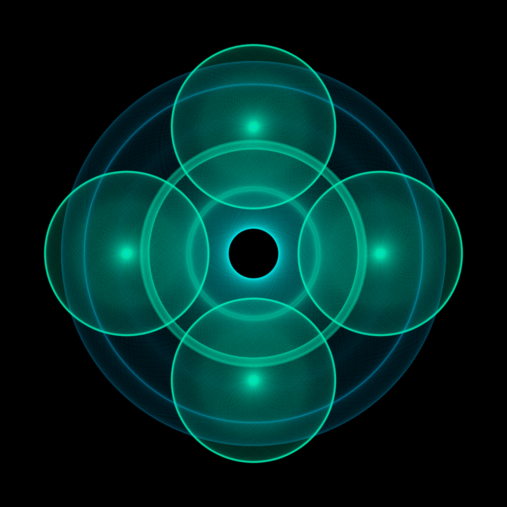
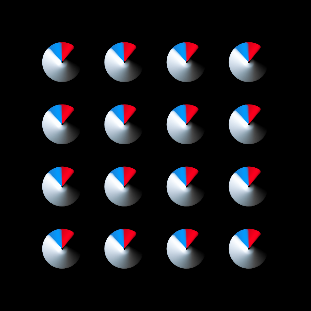
This is a similar program as the previous one. The biggest difference is that half of the sixteen squares turn anti-clockwise. I copied the settings from the last program. The interaction of the counter-rotating squares still makes interesting compositions.
https://vimeo.com/251340965
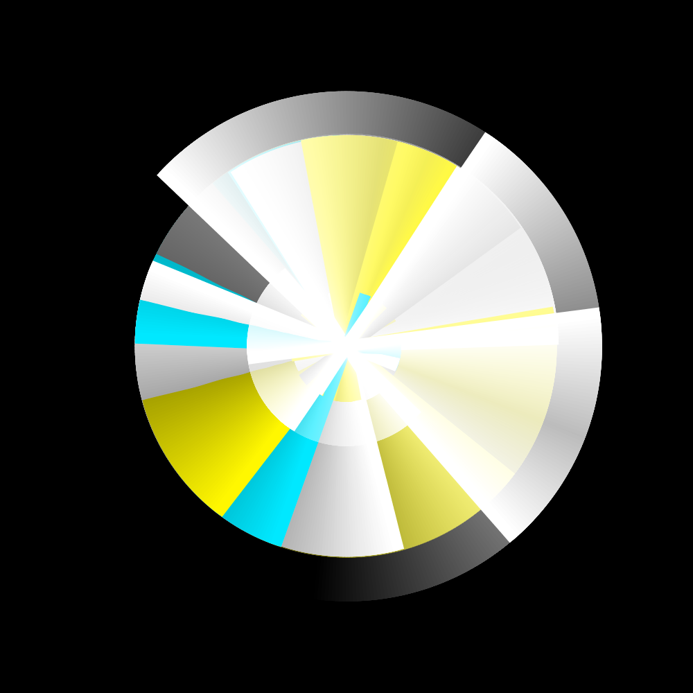
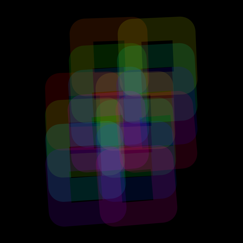
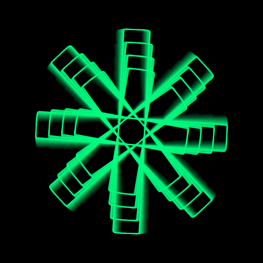
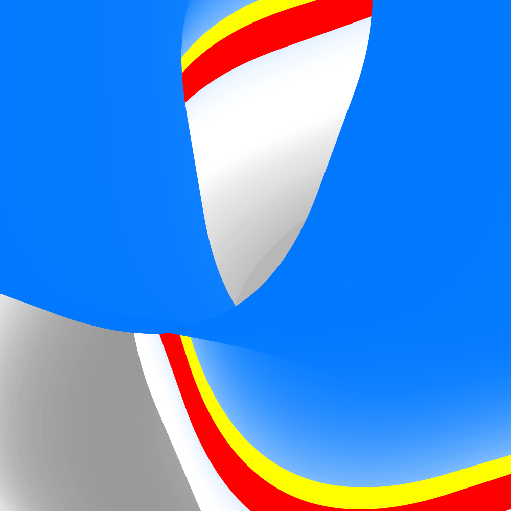
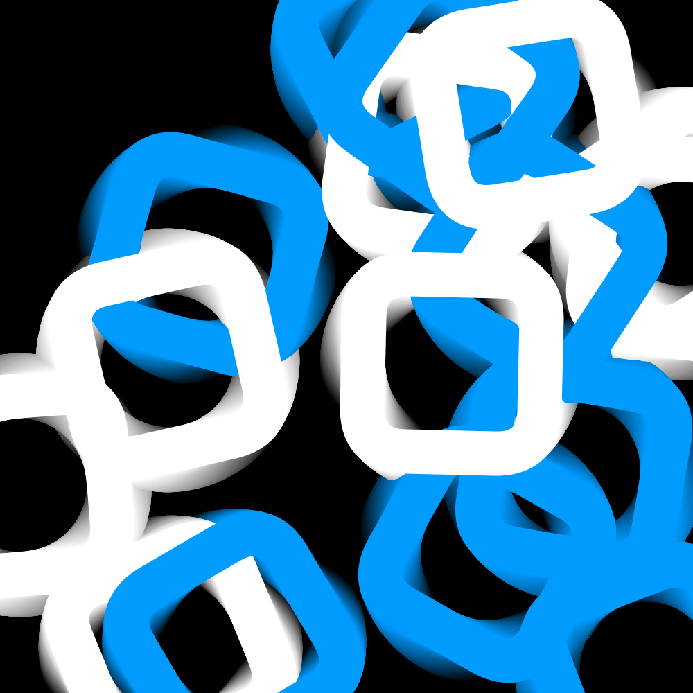
PG2_2_3_1
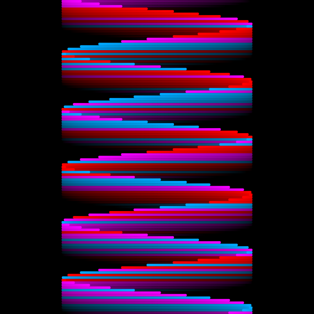
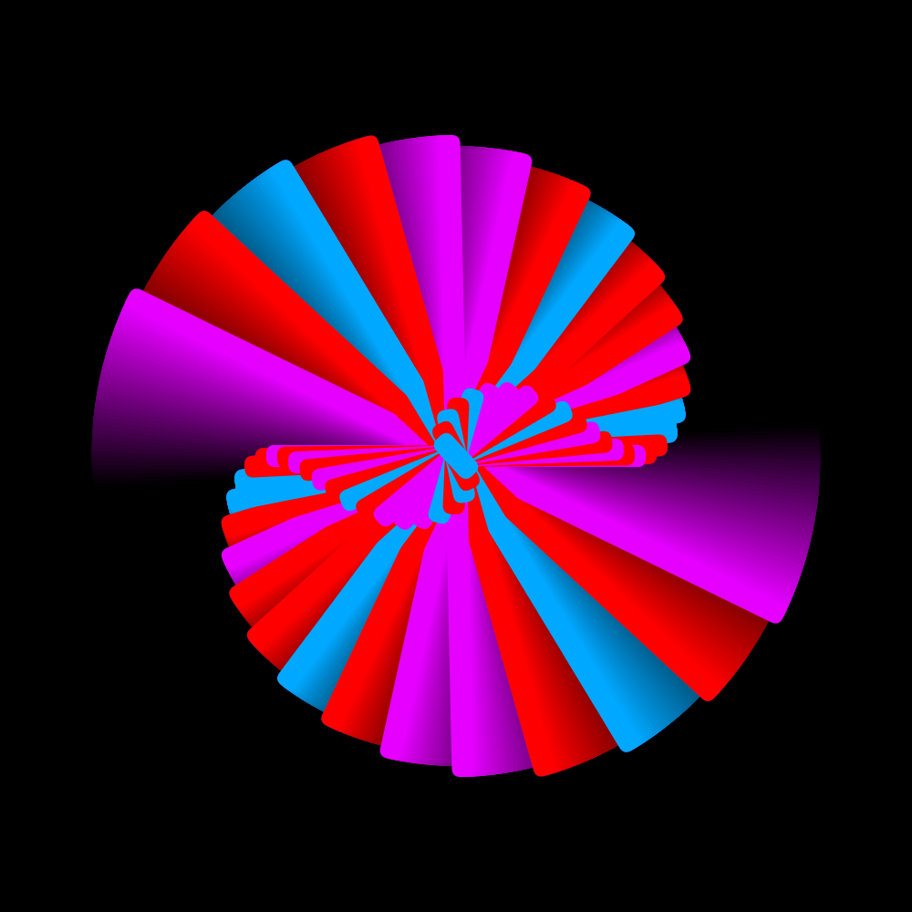
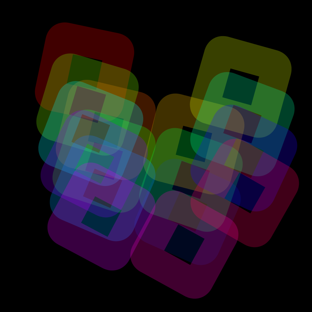
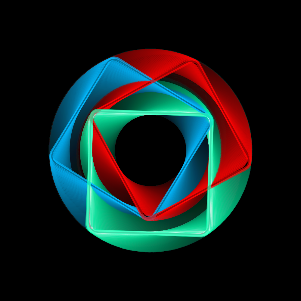
This program is a good example of how you can work with the HRotate function in a more compact way. I also changed the color scheme by using eight colors instead of one. The line thickness is also made thicker in order to show the colors better. A day later I decided to slightly reduce the size of the squares.
https://vimeo.com/251341074
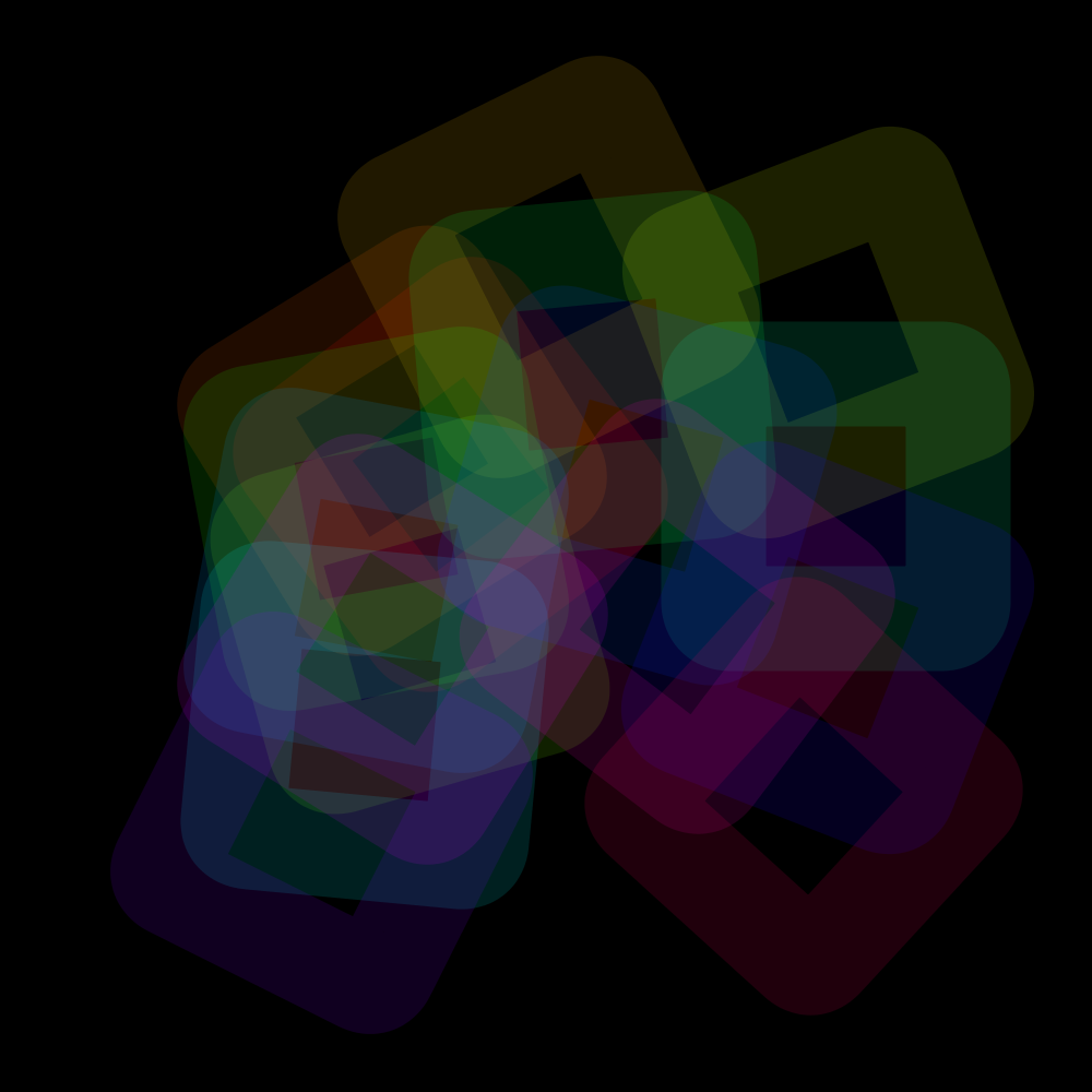
PG2_2_4_1
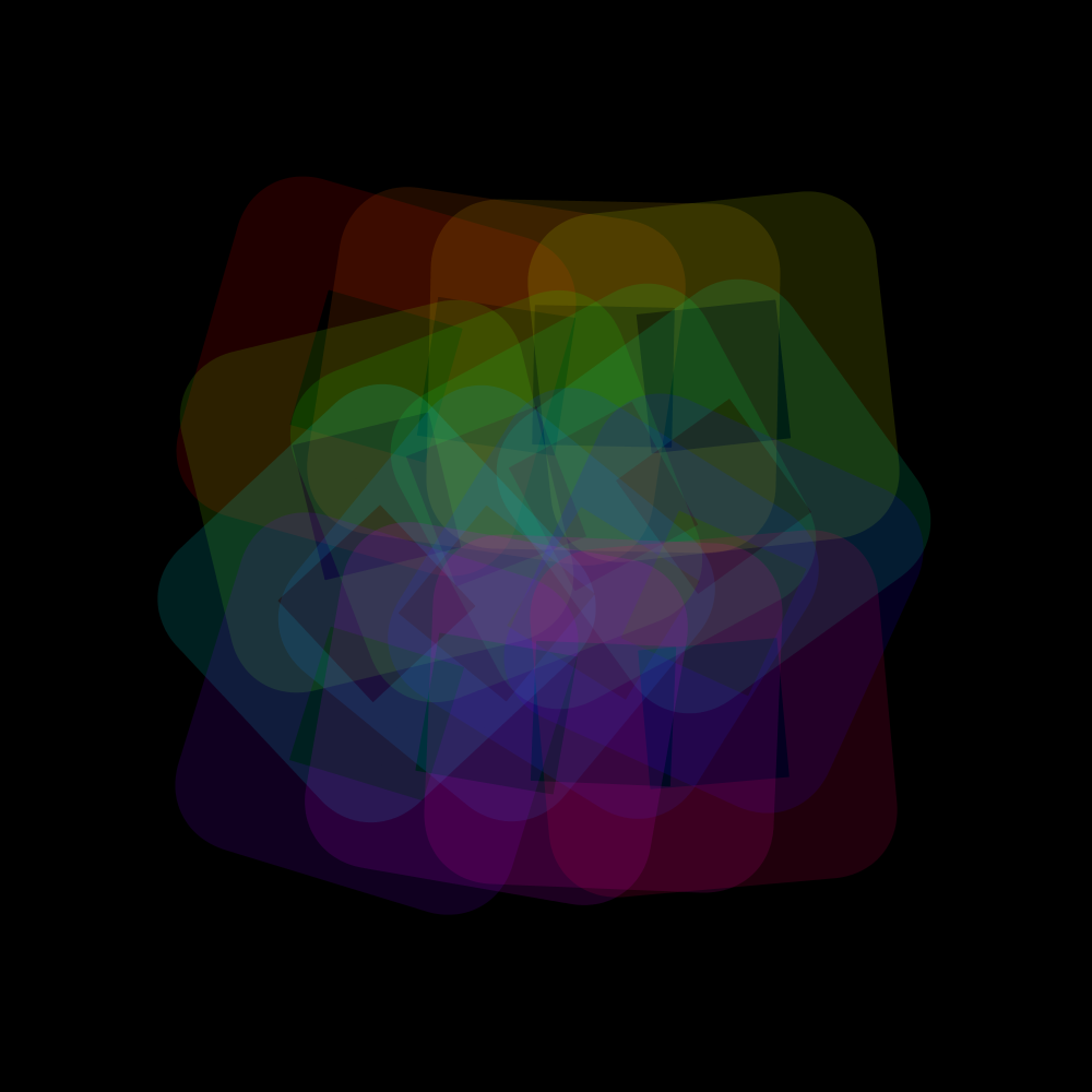
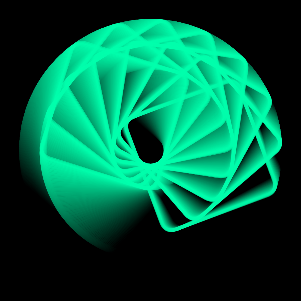
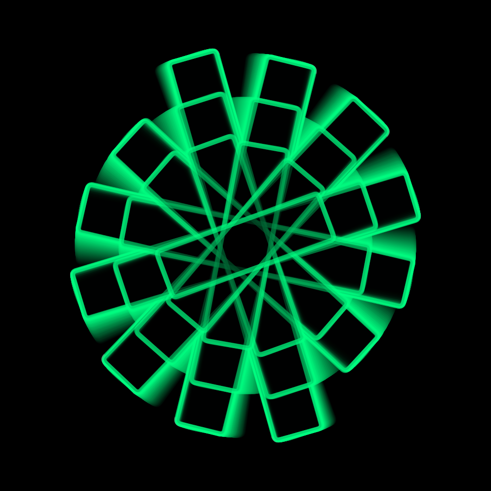
The original program uses three squares all three in a different location. They also run at their own speed. But because I already have sixteen squares, it might be useful to have them all run at a different location and with a different speed. Sixteen is four times four. That forms a neat square. The result, however, is hopelesly disappointing. it looks rather chaotic.
https://vimeo.com/251341166
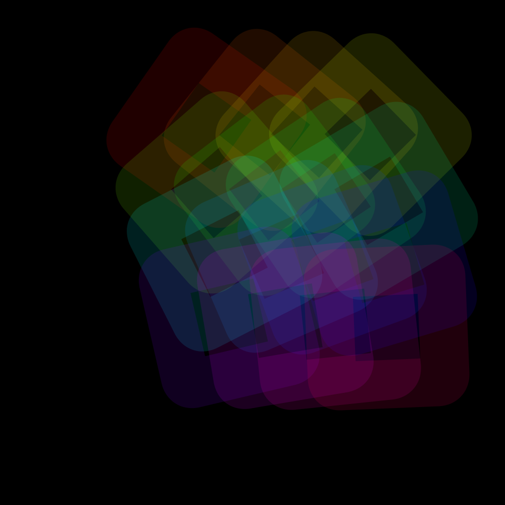
PG2_2_4_2
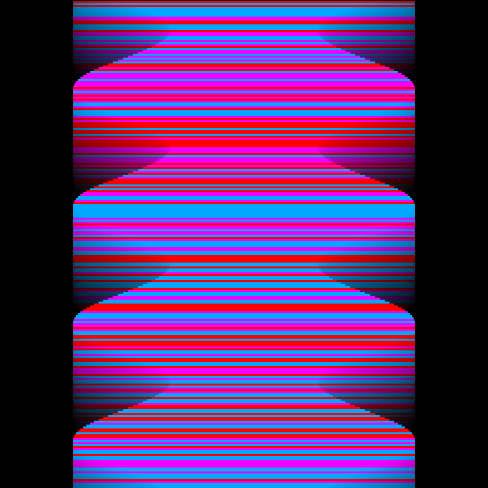
Maybe it would be better when the squares all have the same speed. When I changed that it was better but also less interesting. I also needed to adjust the color scheme because it was based on a distribution of 360 colors devided by eight. 360 Should be devided by sixteen because I have sixteen squares. And probably everything has to be closer together. Plus the outlines are made thicker. So it is an improvement on the previous program. But I still think it is too chaotic.
https://vimeo.com/251341291
PG2_2_5_1
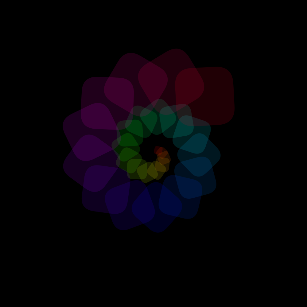
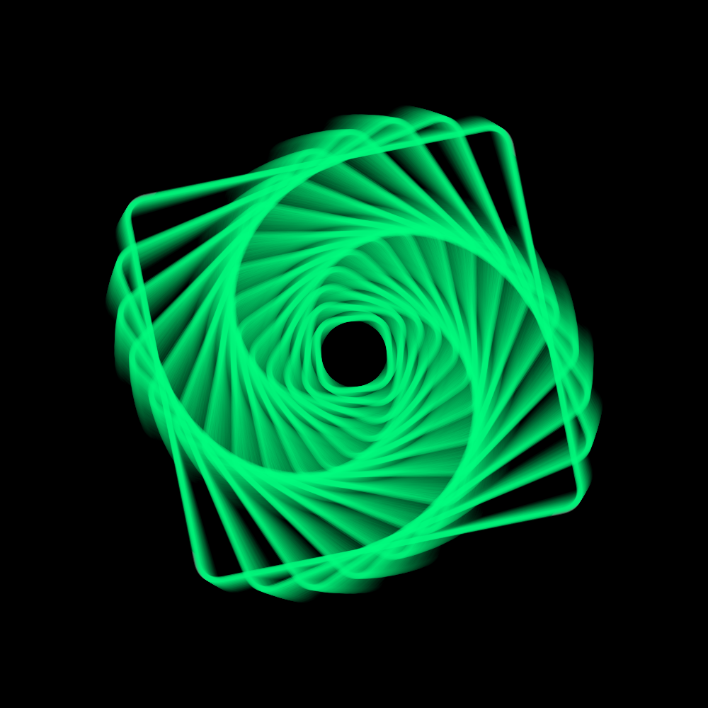
In this program the anchor point is moved to the middle. And that makes it suddenly less interesting. But not completely. There is an unexpected element in which all squares suddenly come under the same angle? No! Is not true! Yes! That is correct! A typical case of uncertain doubt. But wait: uncertainty is always connected with doubt. Is it?
https://vimeo.com/251341368
PG2_2_6_1
A continuation of the previous program. The anchorpoint has been moved to H.CENTER_LEFT.
https://vimeo.com/251341469
PG2_2_6_2
A continuation of the previous program. The anchorpoint has been moved to H.CENTER_TOP.
https://vimeo.com/251341534
PG2_2_6_3
A continuation of the previous program. The anchorpoint has been moved to H.CENTER_RIGHT.
https://vimeo.com/251341765
PG2_2_6_4
Another follow-up of the the previous program. The anchorpoint has been moved to H.CENTER_BOTOM. All previous animations are very similar to eachother. They do not really differ much. Would the differences increase when you omit H.CENTER?
https://vimeo.com/251341855
PG2_2_6_5
I made a variation with H.LEFT. The first thing I noticed was that the objects will fall outside the image display. I had to resize them slightly smaller.
https://vimeo.com/251341959
PG2_2_7_1
Another interesting possibility is to place the anchor point outside the rotated object.
https://vimeo.com/251342050
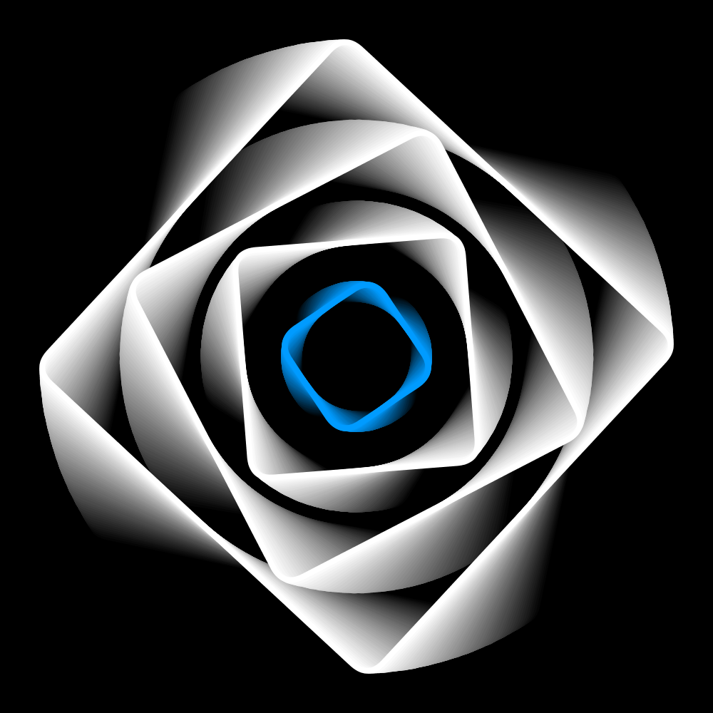
PG2_2_8_1
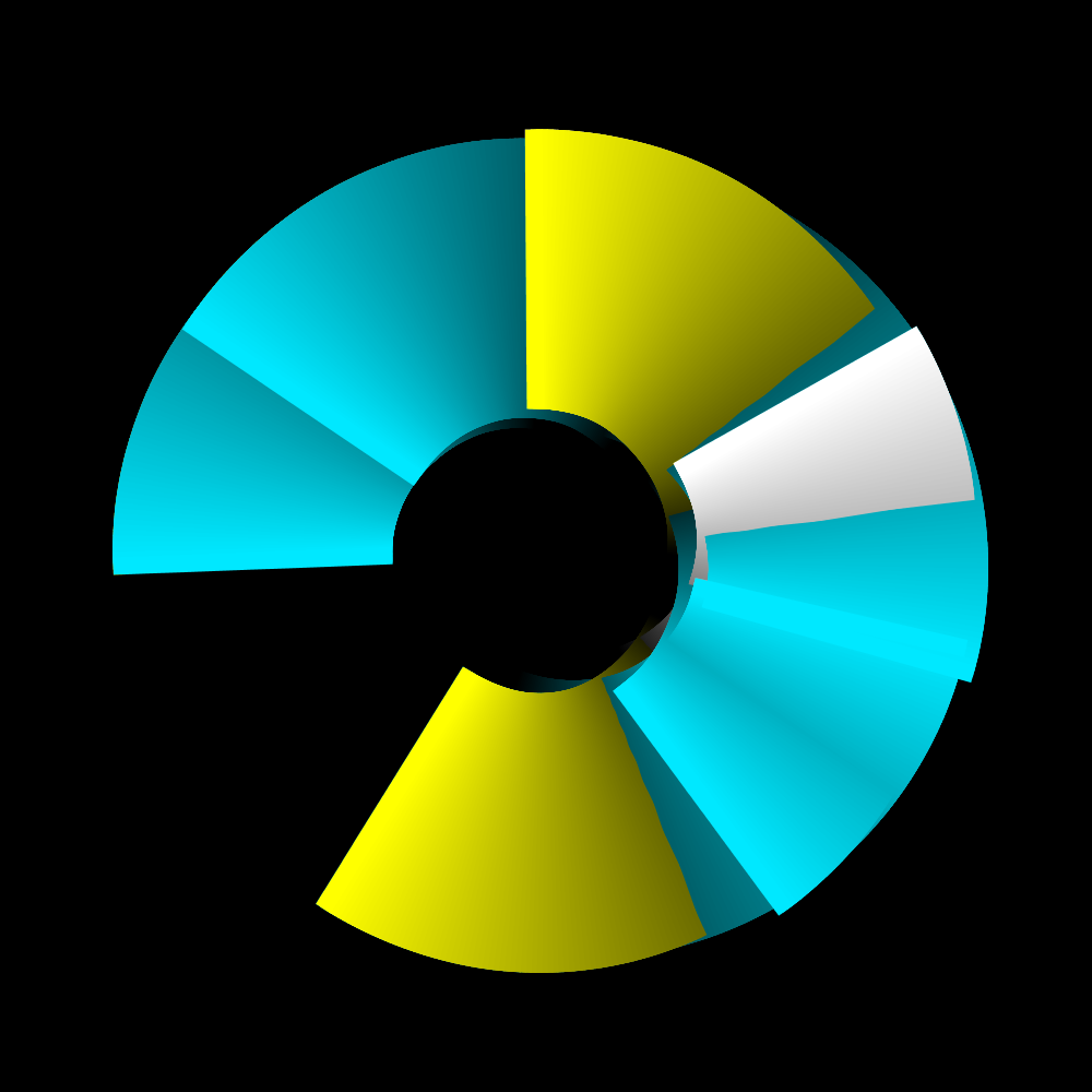
In principle, this animation is exactly the same as the previous one. What is different is that the squares are filled. The amount has been increased to twenty-six squares.
https://vimeo.com/251342141
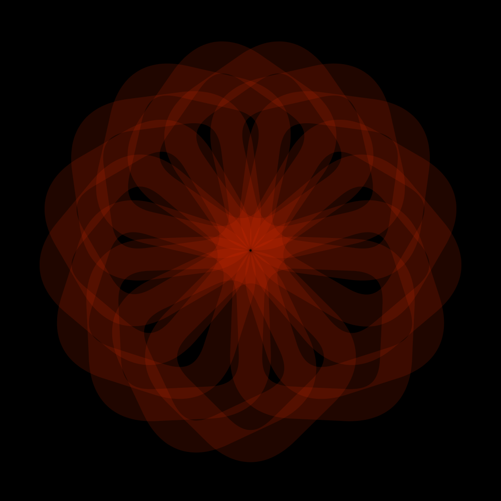
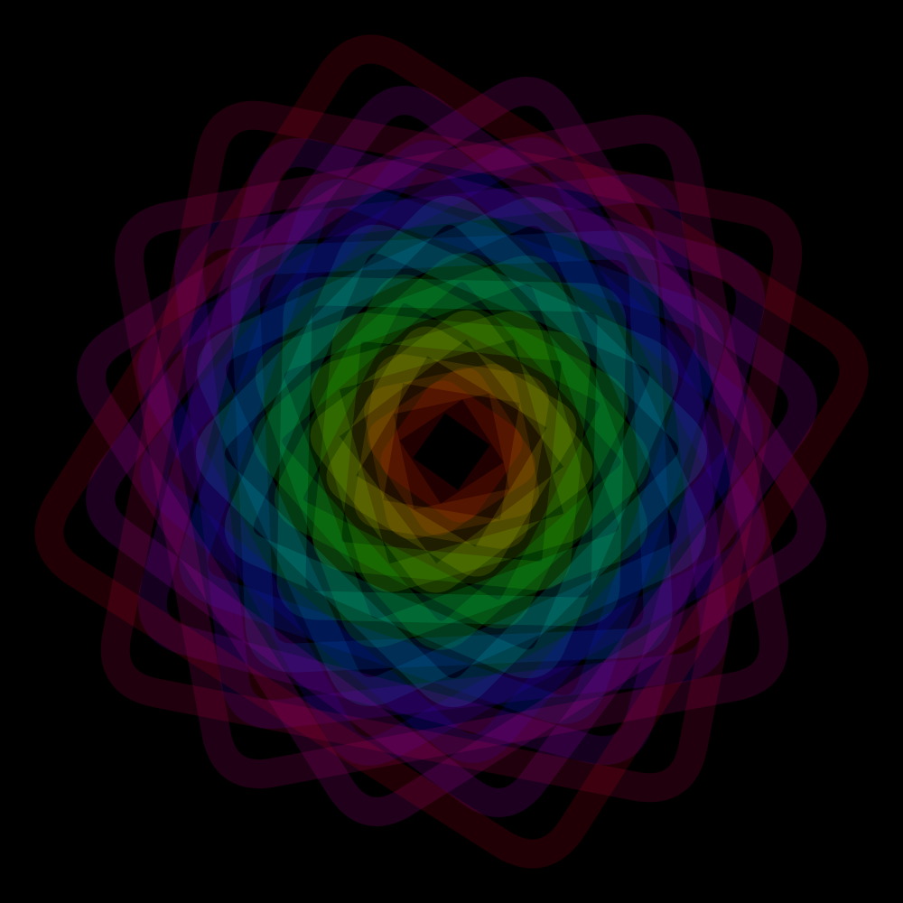
PG2_2_9_1
Here a new function is used: H.Oscillator. The animation is the same as the previous one but the image is enlarged and reduced with a certain frequency.
https://vimeo.com/251342233
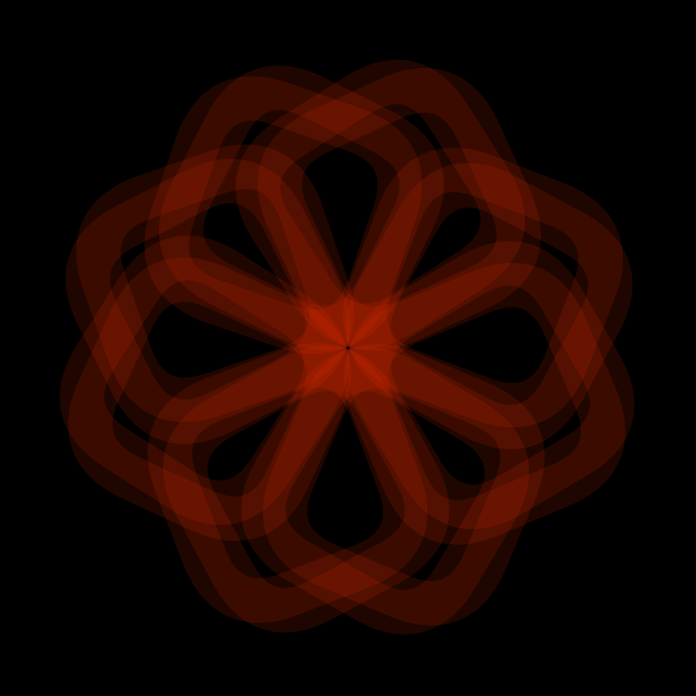
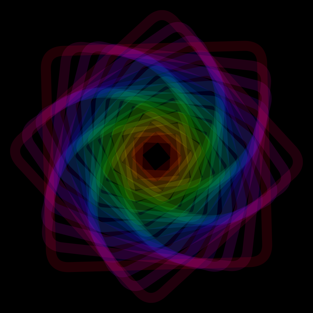
PG2_2_9_2
The frequency has doubled. And the range is from .3 to 3. In addition, half of the squares runs anti-clockwise. In this case, I have no problem with the animation running outside the display window.
https://vimeo.com/251342308
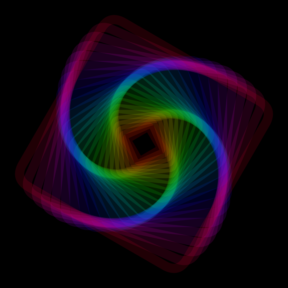
PG2_2_10_1
Eh ... cogwheels? No, thanks :) I surely believe that rotation is a possibility. But I will not go further with that. Instead, I continued with the squares and the H.Oscillator. Studying must remain fun.
https://vimeo.com/251342386
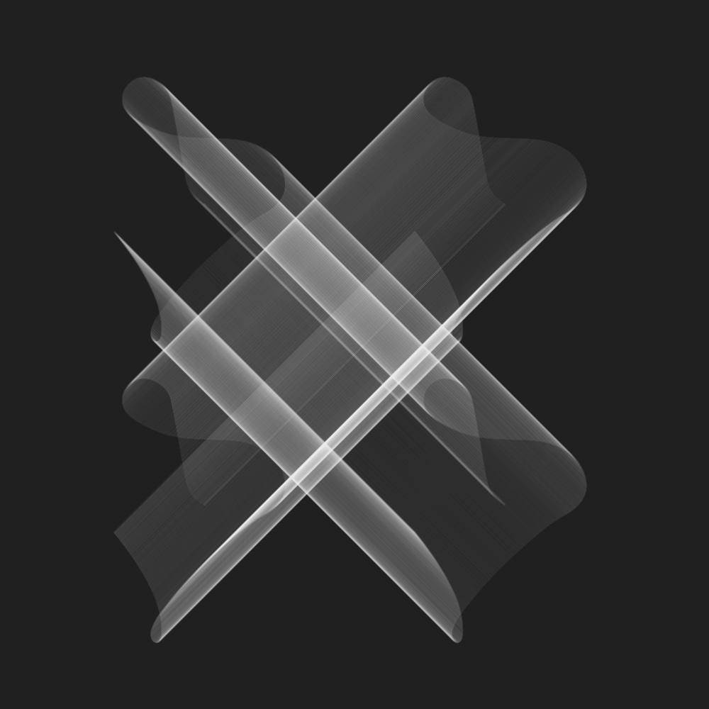
HCanvas
PG2_3_1_1
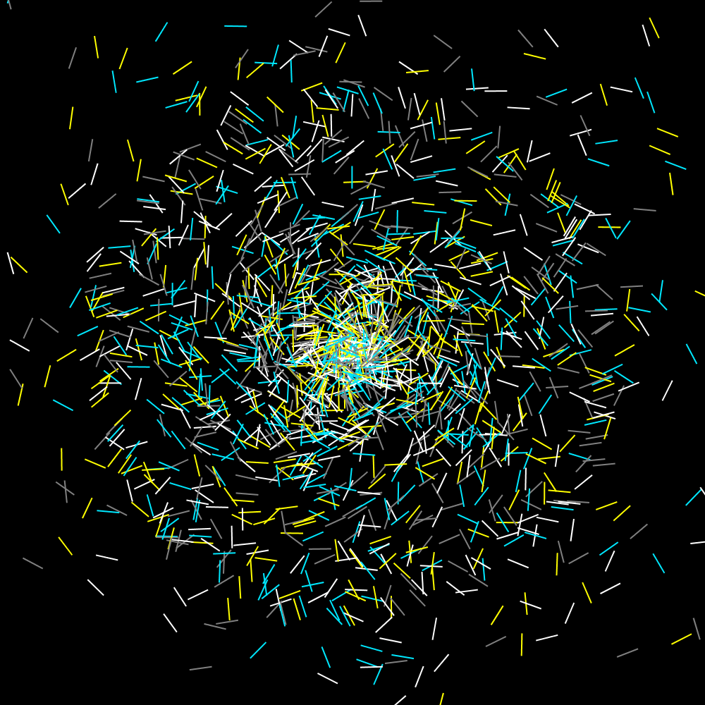
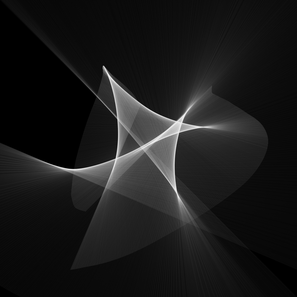
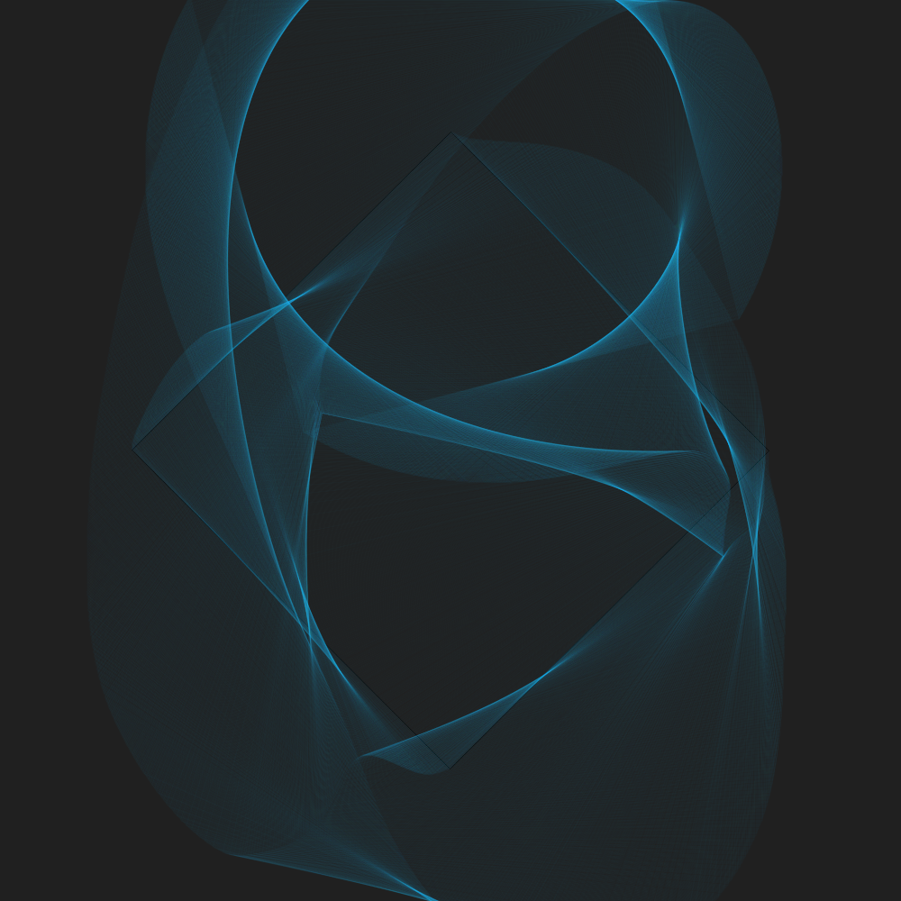
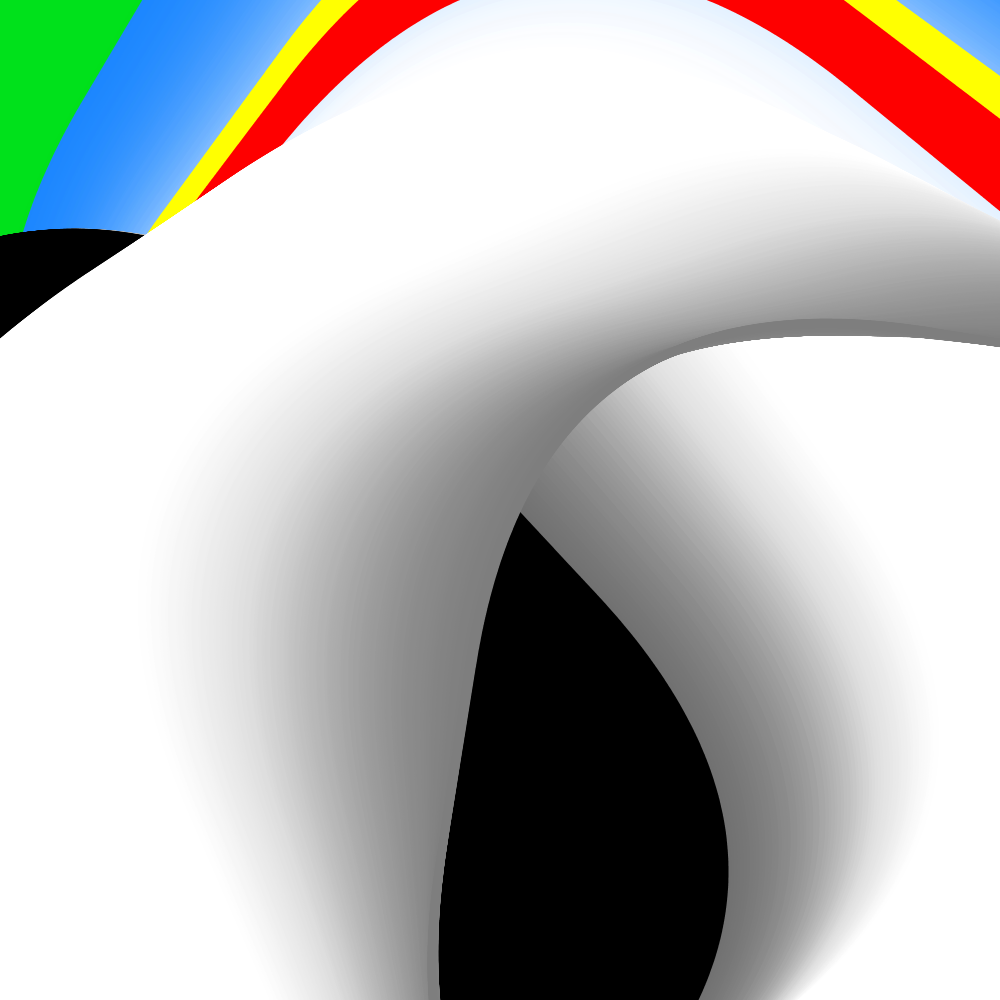
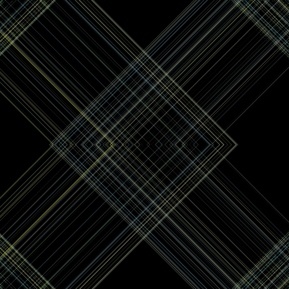
This is a well-known problem. When a shape or a filled object overwrites itself in a rotating animation several times, the animation becomes invisible. It then becomes a stationary form that still animates. See the original Joshua example. Over time you only see a filled circle. So the first thing I did is to increase the transparency of the object. But that does not help much. What does help a lot is increasing the transparency plus replacing the fill with an exteem thin stroke. In this case I use a red and a green rotating rectangle. And even on this simple theme endless variations can be made.
PG2_3_1_2
This is such a variation. As far as the animation is concerned, there is not much to do. But in this case it is more about the image as the end result.
PG2_3_1_3
Maybe it is interesting to try and see what happens with a number of counter-rotating rectangles. After a few minutes of rendering, this yields special structures.
PG2_3_1_4
Something else to try is to forget the animation. And concentrate on making the final image. In this way, interesting results can be achieved too.
PG2_3_2_1
There is a well-known Processing trick to make beautiful fade-outs in animations. In the beginning of the draw module you set the transparency of a plane that covers the entire display window as low as possible. The animation then leaves beautiful fade-outs. But this option has a disadvantage. The fade-out does not go all the way to the color of the background. You can solve that by using a shader. But in this animation I used eight squares, each running at different speed. In the background it renders a very dark green circle. That is the remnant (the residue) of the animation.
https://vimeo.com/album/4933671/video/252893684
PG2_3_2_2
Just by moving the anchor point you get different shape combinations. In this case the dark gray background is not visible because the image is refreshed very quickly.
https://vimeo.com/album/4933671/video/252894043
PG2_3_2_3
This is a deconstructive version of the previous program. I completely lost Joshua's original idea. The forms that arise are very interesting. But the trails remain in the background. In this case it is not a problem (as far as I am concerned).
https://vimeo.com/album/4933671/video/252894329
PG2_3_3_1
Intriguing! I get an interesting error message: ‘NoLights () is not available with this renderer.’ What should I think of that? Processing thinks it’s working in 3D? But... this chapter deals with the HCanvas function. This ensures that all annoying trails are solved in the background color. But I really do not use the 3D render mode. So what is it complaining about?
https://vimeo.com/album/4933671/video/252895110
PG2_3_3_2
I have made the fill black. But kept the strokes.
https://vimeo.com/album/4933671/video/252895341
PG2_3_3_3
To increase the feeling of depth, I have let the lines draw constantly slightly thicker lines.
https://vimeo.com/album/4933671/video/252895653
PG2_3_3_4
As a last variation, I have slightly changed the color scheme. Every second square becomes red. But that meant that the last drawn square became two pixels thick. And that gives ugly trails because that square rotates the fastest. But when you increase the thickness to eight pixels and the consecutive squares thickens two pixels, then the problem is solved.
https://vimeo.com/album/4933671/video/252896331
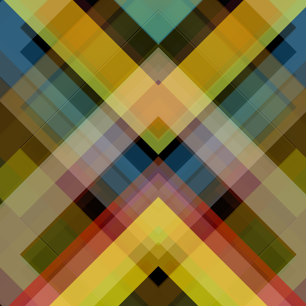
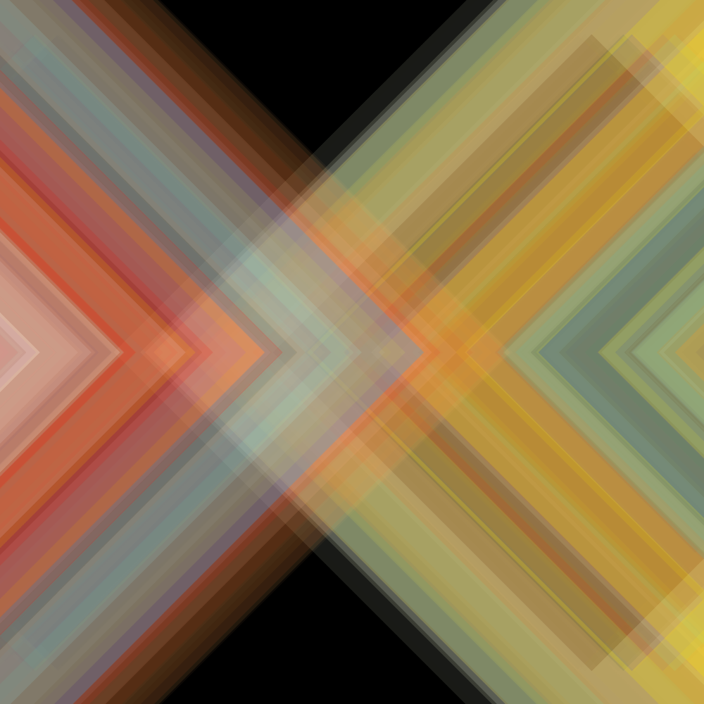
PG2_3_4_1
This is another example of the incorrect application of the fade-out principle. In this case, I kept the animation the same and only the color, the anchor and the rounding of the objects are changed.
https://vimeo.com/album/4933671/video/252897100
PG2_3_4_2
The anchor point has been moved. The squares are filled with black. This removes the fade. But at times the fade comes into play again. For example when the squares come apart from eachother. And that makes it interesting again.
https://vimeo.com/album/4933671/video/252897302
PG_3_4_3
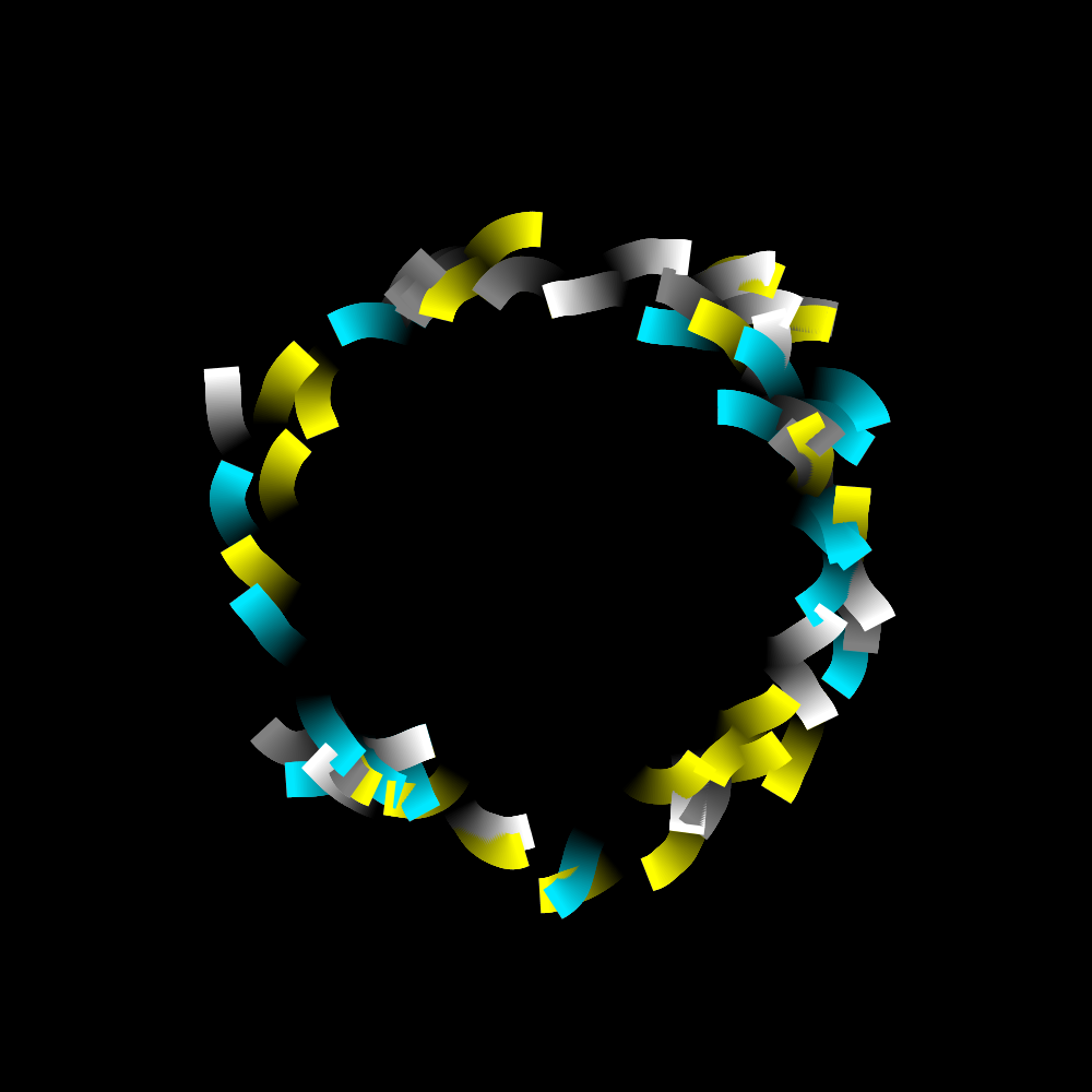
In principle, this animation is in line with Joshua's first animation. A circle formed by squares with rounded corners that chase or anticipate each other.
https://vimeo.com/album/4933671/video/252897521
PG2_3_5_1
Finally, I replaced the number of cubes from the previous program with rectangles of different lengths. Which again all rotate at different speeds. The thickness of the lines are thinned which makes it a bit more sophisticated. I do feel that I have deviated too much from Joshua's original. But on the other hand, we are in a learning situation. So when I have the chance to go for a free design then I have to take that opportunity.
https://vimeo.com/album/4933671/video/252897751
PG2_3_5_2
Made a number of small changes. The speed slightly increased. And adjusted the different lengths of the objects.
https://vimeo.com/album/4933671/video/252898096
PG2_3_5_3
Maybe not very original. But the object has some graceful movements (in the animated version).
https://vimeo.com/album/4933671/video/252898293
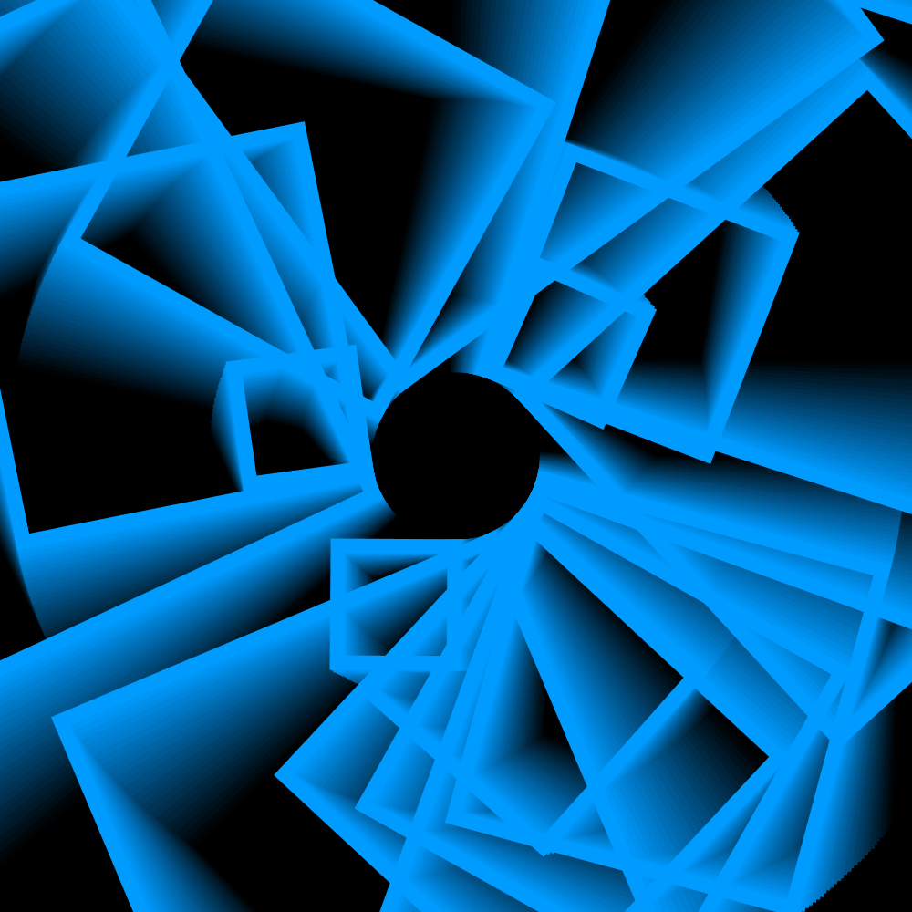
PG2_3_6_1
Since I have now sixteen squares available in the program, I think I will make a matrix of four by four squares. But because there are also color differences, it will probably be 32 squares. If I want to follow Joshua’s sketch. And I want to. So I first make the four by four matrix. After I had placed four squares it became clear to me that this was not the right track. I removed the achorAt (H.CENTER). Making the squares turn around a corner point. The color is the same everywhere. Maybe change that too in another version.
https://vimeo.com/album/4933671/video/252898542
PG2_3_6_2
Color adjusted. And the speed too. Plus the squares now turn against each other (clock and anti-clockwise). The fading effect is now better too.
https://vimeo.com/album/4933671/video/252898699
PG2_3_6_3
In this case there are three rectangles animating per group. This time they all turn in the same direction. I use three canvases (canvii). And the colors change gradually.
https://vimeo.com/album/4933671/video/252898912
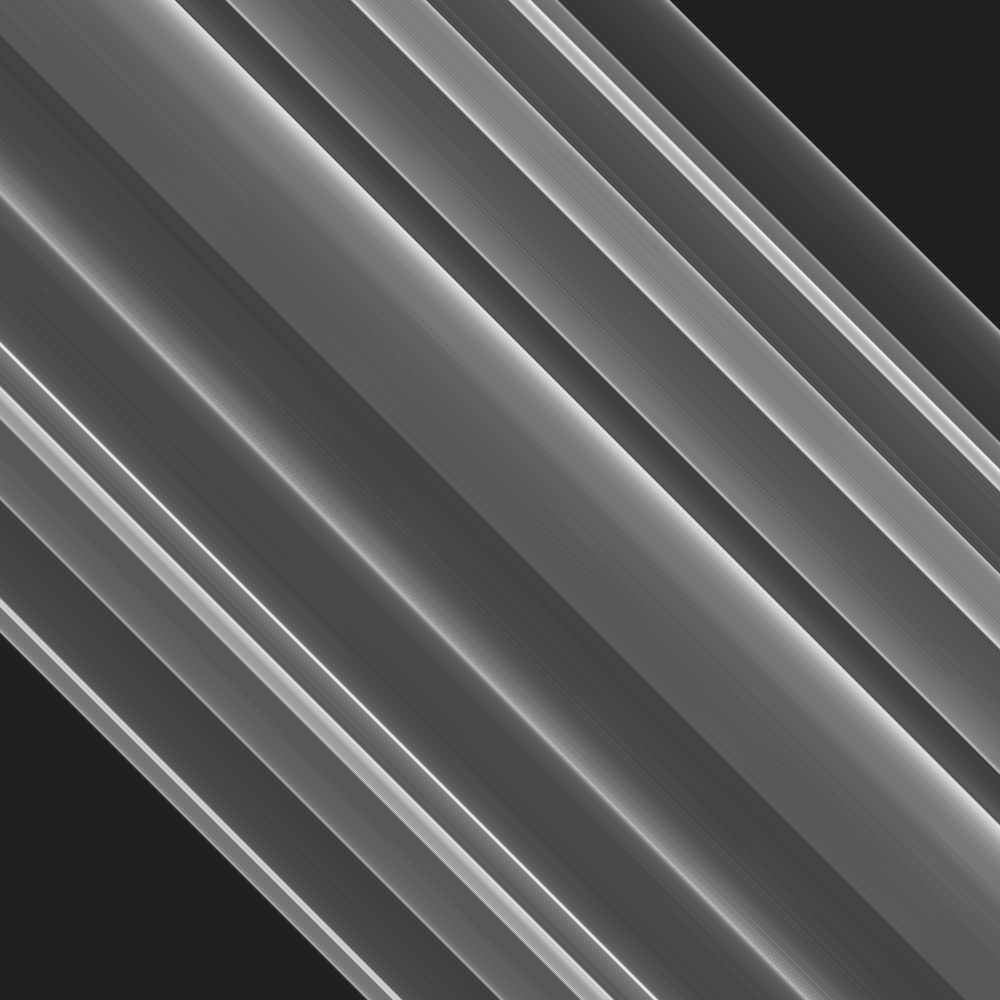
HFollow
PG2_4_1_1
In this section, all programs use the HFollow class. The starting point is Joshua’s first sketch which uses a square with rounded corners that moves to where your cursor is located. That does not actually produce beautiful images. You only see the square jump when you move the cursor. So the idea now is to change the program in such a way that it will produce interesting images. I start with a line. But there is no line function in HYPE? Ok ... then I use a rect of a certain length with a thickness of one pixel. Autoclear set to false. And the line is two thousand pixels long. That makes it an ideal tool for drawing.
PG2_4_1_2
I wondered if it was possible to use two rectangles (lines) that both are under a different angle. And that also seems to work. Strange enough, you can link HFollow to multiple objects. You do not need to initialize separate HFollow variables. I also have the idea that this part does not produce animations. It is rather an interactive drawing tool. And that drawing tool provides static images.
PG2_4_1_3
One rectangle omitted. HRotate is used to rotate a line at the cursor’s location. The longer the cursor stays fixed, the brighter the point will be.
PG2_4_2_1
This is the same program as the previous one but now the ease function has been used. I have set the it very low. At 0.005. This gives you very nice transitions which take quite a long time to render.
PG2_4_2_2
Again an extra line is applied here. The images that this program produces are much more regular than with PG2_4_1_1. I have also shortened the lines. This delivers wave movements in the image.
PG2_4_2_3
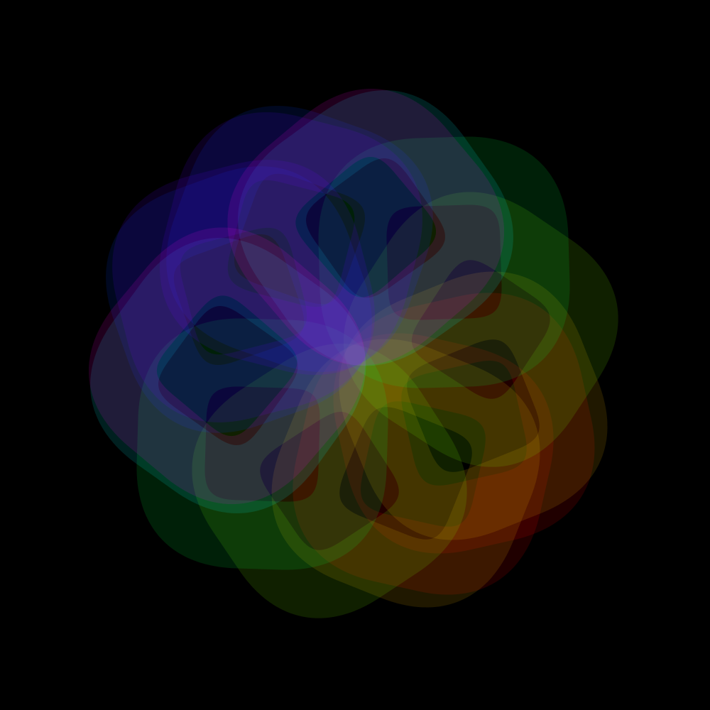
Rotation (HRotate) added. This produces flower-like patterns.
PG2_4_3_1
Again used the full rect. This gives you interesting cross-like images.
PG2_4_3_2
I replaced the rectangle with four circles.
PG2_4_3_3
Enlarged the circles. But the rest of the program is left the same.
PG2_4_4_1
And than I thought... what about using color? At this moment I have reduced the strokeweight to 0.5 pixels. That gives almost perfect gradients. Also applied the colorpool class.
PG2_4_4_2
In this program I have added HRotate. The square has been halved. And I brought the transparency down.
PG2_4_5_1
I have now found a possibility where I can use a very slow ease and spring which make very gradual gradients. Let’s see if it is possible to use multiple shapes with this. The shapes arise spontaneously. It depends on where you place your cursor.
PG2_4_5_2
I use a gray gradient and I also added a strip of red. I also used HRotate. Which rotates the square slowly.
PG2_4_6_1
A variation on the previous program in which HCanvas takes care of the fades. And that provides more depth in the image.
PG2_4_6_2
Even with a fade at 0 (zero) this program works fine and produces interesting images.
PG2_4_6_3
Added an extra yellow bar. HRotate is used. You could make hundreds of images with this. But I stop now.
PG2_4_6_4
Ok! A last one.
HTimer
PG2_5_1_1
The first program demonstrates the operation of HTimer. I did not find it necessary to make a variation here as you only get textual feedback in the console window. I assume that the intention is that you understand how the timer class works. Although I have HTimer settings on 1 during several upcoming programs.
PG2_5_2_1
I had some problems with making the square jump around the display window. It doesn’t give you nice images. So I have enlarged the square. This should give you interesting forms. HCanvas takes care of the fade-out. But I find the end result rather disappointing too. Well... that sometimes happens.
PG2_5_2_2
So I thought: suppose you put a large square with rounded edges on all four sides of the display window. And these squares move randomly in the width and height of the display window. Then the background automatically forms an internal shape. The same thing happens when you design a typeface. You not only look at the outside of the character. Also the inside shape is important. But the final shape became something else. I found the filled version rather boring. The outline version makes the image more interesting. Especially in the animation.
PG2_5_3_1
I removed a mistake in the program. There was a wrong rectangle displayed in the top left corner. After a while it disappeared (because of the fade function). But I have now solved it by setting all strokeWeights to 0 (zero that is). The stroke is only called in the HTimer code block. Furthermore, the color pool is in use. I find it rather strange that you have to call fill and size twice (once in the HRect block and once in the HTimer block). I have removed the rounding. That gives a much tighter impression.
PG2_5_3_2
Sometimes a variation is very easy to make. Just leave something out and shift something. But I am not convinced that I will remember this result for a long time.
PG2_5_4_1
I do not really know what the difference is between Joshua's third and fourth sketch. Ah... an HCanvas was applied. But I already used that in the previous program. So I just go on with it. Switched off two rectangles. The transparency increased to sixty-four and the strokeweight to hundred-sixty. And interval at fifty. Fading on nine. That produces cheerful animation.
PG2_5_4_2
A less successful version of the previous program (as far as I am concerned).
PG2_5_5_1
Time for something slightly more peaceful. I use only two objects. And they rotate around each other at two different random speeds.
https://vimeo.com/254683004
PG2_5_5_2
Actually, I was looking for a different variation but than this happened by accident. A happy accident?
PG2_5_5_3
Again something I was not looking for. Although I feel that I have seen these forms in some of my previous programs.
https://vimeo.com/254683263
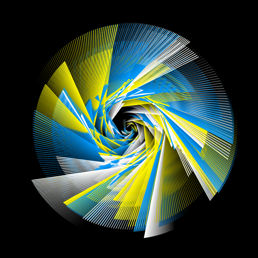
PG2_5_6_1
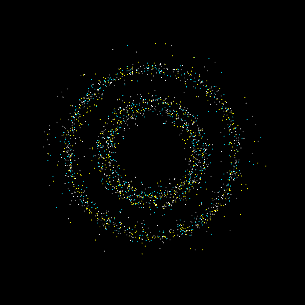
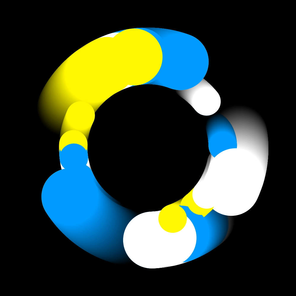
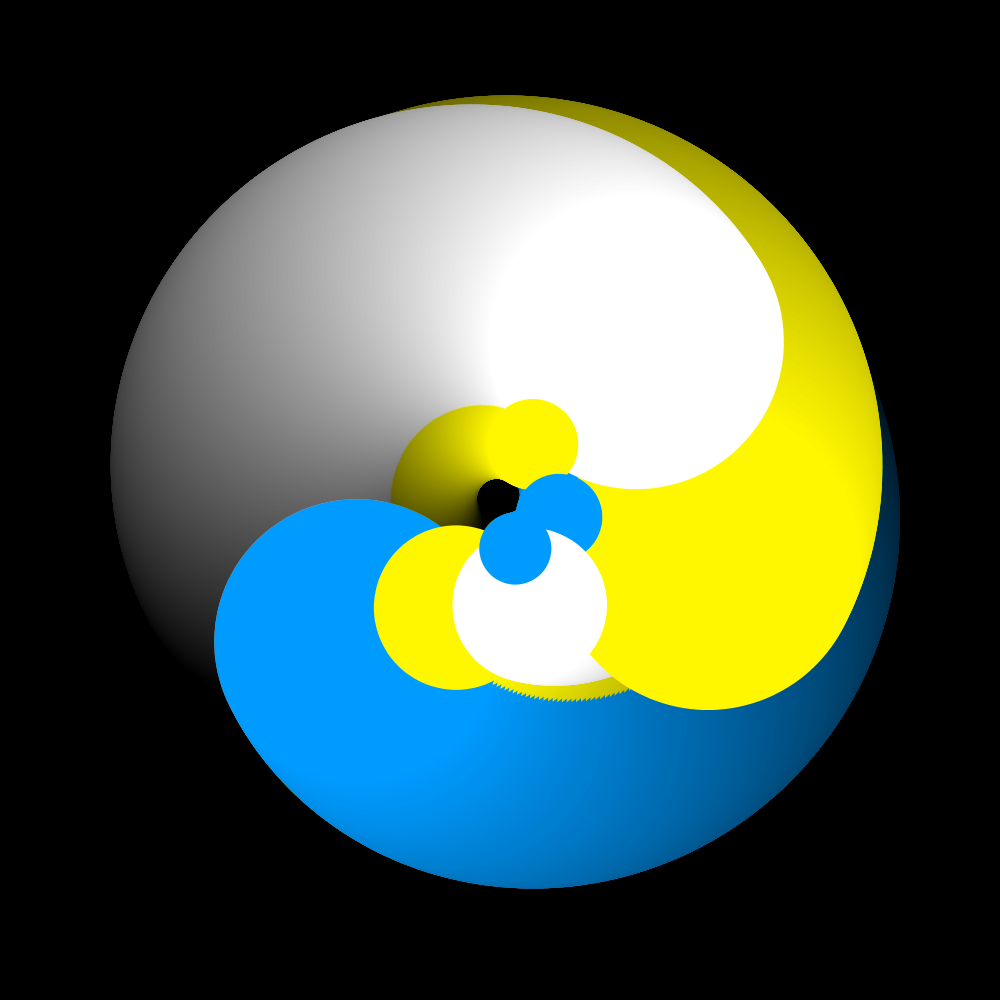
These are thirty-three rectangles that rotate around the center in different formats. The problem with this image is that sometimes very ugly trails arise when two colors directly overlap or cut each other. This can only be solved by making all rectangles the same color. That is why everything is one color: ‘blue’.
PG2_5_6_2
Perhaps these artifacts can be prevented when I integrate an extra HCanvas. But that was not the case. When you turn off the strokes and replace them with fills then the problem is partially solved. And when using circles the image almost no longer suffers from it.
https://vimeo.com/254683489
PG2_5_6_3
In this program I have used four colors: white, red, blue and yellow. By increasing the transparency you get a random mix of those colors. But that is of course quite obvious.
https://vimeo.com/254683814
PG2_5_6_4
I am somewhat anticipating the use of HOsscillator here. Which in the beginning was not a success. But after some fiddling at the settings I got this picture.
https://vimeo.com/254684218
PG2_5_7_1
This is the first official program that uses the HOscillator class. Hmmm ... I just replaced some code with the original code and this is amazing. Joshua was right, of course. HOscillator is a very strong addition of the HYPE Library. I wonder what else we will experience when we arrive at the real HOscillator chapter.
https://vimeo.com/254687083
PG2_5_7_2
A variant of the previous program where less use is made of frequencies.
PG2_5_7_2
A variant of the previous program where less use is made of frequencies.
https://vimeo.com/254687308
PG2_5_7_4
In this version the fade stands at two hundred and the frequency at one hundred twenty-eight. Nice that everything continues to move ‘naturally’.
https://vimeo.com/254687523
PG2_5_7_5
Replaced the circles with squares. The last ‘Reuters’ animation variant.
https://vimeo.com/254687732


HTween
PG2_6_1_1
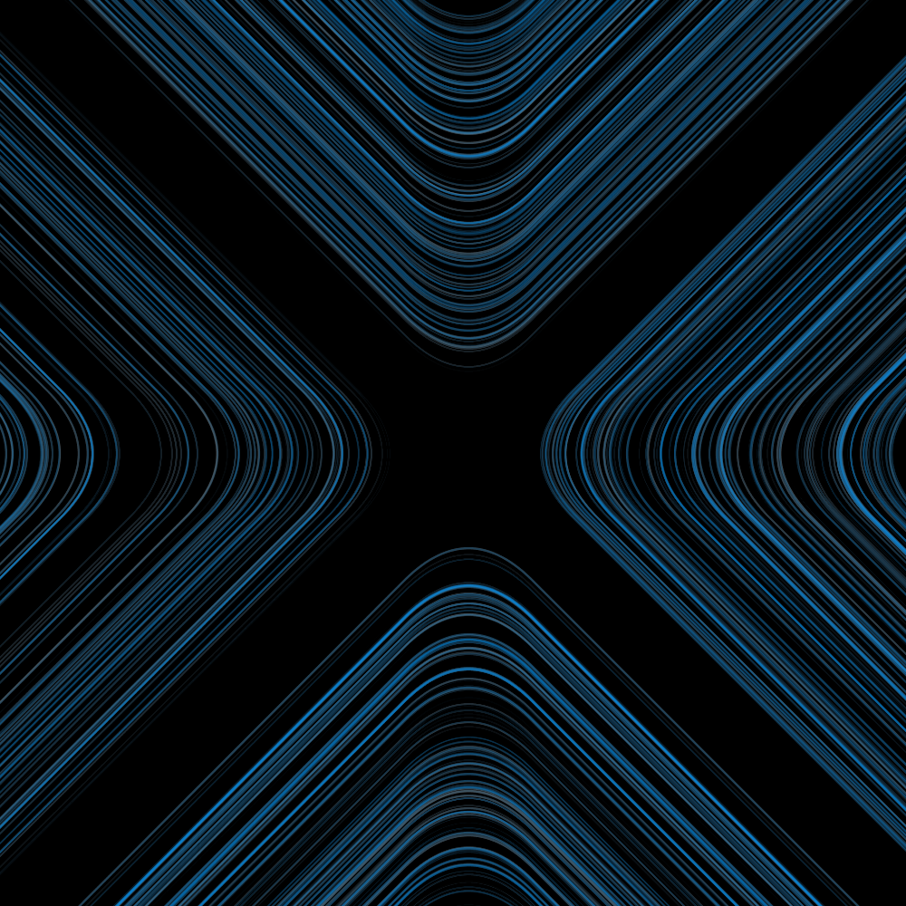
Instead of moving a square from left to right, I found it interesting to see if you could simulate a smooth movement with a number of lines. I started with squares. But that became rather rough. I then changed the squares into horizontal lines. But than I find the effect too minimal. The lines in the background make the image slightly firmer. But in this case not yet strong enough.
PG2_6_1_2
I work here with horizontal rectangles only. But I still think the effect is not refined enough. And the movement does not come out well yet. Probably the amount of bars must (at least) be doubled.
PG2_6_1_3
The strange thing is that you can remove the .loc from the rectangle block. The program functions the same. But the movement is still not optimal.
PG2_6_2_1
It took quite some time to find the correct ease and spring combination. If you work with one digit behind the decimal point, the movement is way too coarse. So I worked with three digits behind the decimal point.
PG2_6_2_2
This is the same program as the previous one. The only difference is that the column with colored lines is now placed in the middle. That seemed a bit more balanced (at least for this animation).
Animation: https://vimeo.com/album/4933671/video/257128452
PG2_6_3_1
An animation where the lines continue to jump between the left and right side of the display window. It has become quite an administrative matter. Although all spring and ease settings are the same for every line there is a lot to copy, paste and change in the program.
Animation: https://vimeo.com/album/4933671/video/257129170
PG2_6_4_1
A variation in which only tweens, eases and springs have been added.
PG2_6_5_1
This is the 3D version of the previous sketch. I have omitted the lines because these thin lines have a very poor image quality.
Animation: https://vimeo.com/album/4933671/video/257129630
PG2_6_6_1
This has become a fairly complex program. Especially when you want to move four objects instead of one object. I have spent too long on it and I am not satisfied with the end result. So I start again.
Animation: https://vimeo.com/album/4933671/video/257130028
PG2_6_6_2
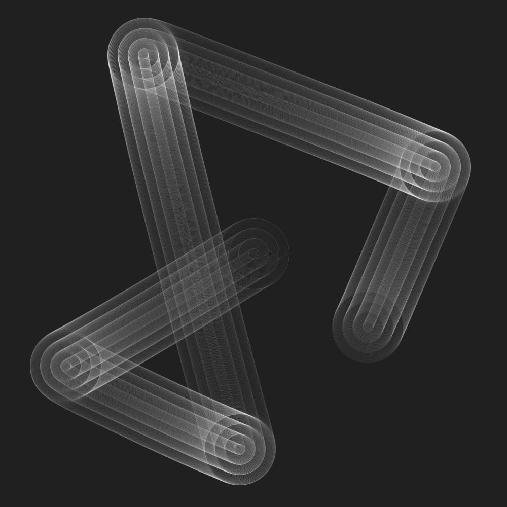
Instead of a horizontal movement, I started to make a vertical movement. That does not make it more interesting, but the movement may be more natural. At a certain moment the movement seemed ok. But there was no movement in it from A to B. So that is why I have created eight new locations. The disadvantage is that the inner form now leads to a swastika. The swastika is an ancient religious icon used in the Indian subcontinent, East Asia and Southeast Asia. In the Western world, it was historically a symbol of auspiciousness and good luck. After the 1930s, it became the main feature of Nazi symbolism as an emblem of Aryan race identity.
PG2_6_7_1
The objects are slightly longer and less thick in size. And I applied multiple colors.
PG2_6_8_1
Instead of two positions visited by an object, four positions are now visited. I have the impression that all animation should come from the corners. No idea why. But sometimes you have to find a point to start something. A day later, I'll just continued where Joshua stopped. I started with an object that visits four corner points. And I will get those background colors again via the PixelColorist.
Animation: https://vimeo.com/album/4933671/video/257130305
PG2_6_8_2
A variation of the previous program that I am less satisfied with. There are a number of areas that are have anomalies. And I do not yet know where those problems are caused by.
PG2_6_9_1
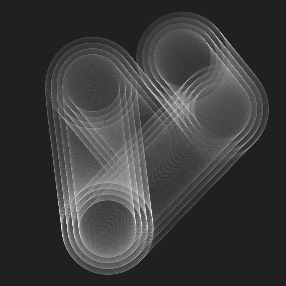
Replaced the square with circles. Shifted the coordinates of the vertices until a square emerged.
PG2_6_10_1
A few more circle tracks have been added. The colors are slightly adjusted. And the circles are laid further apart from each other.
PG2_6_11_1
HOscillator added. The same settings are used in every elliptical track. Strangely enough, the addition of the HOscillator makes everything very surprising. The unpredictability factor has also become much higher.
Animation: https://vimeo.com/album/4933671/video/257130507
PG2_6_12_1
Spheres added. This program uses 3D but I think it needs more fine tuning.
Animation: https://vimeo.com/album/4933671/video/257130692
PG2_6_13_1
Variation on the previous theme. But I do not think that the variation is large enough yet.
Animation: https://vimeo.com/album/4933671/video/257130893
PG2_6_13_2
A number of variations that are not going far enough. I should spend more time on this so that I also get rid of the basic form. But alas. I have to continue with this course also.
Animation: https://vimeo.com/album/4933671/video/257131115
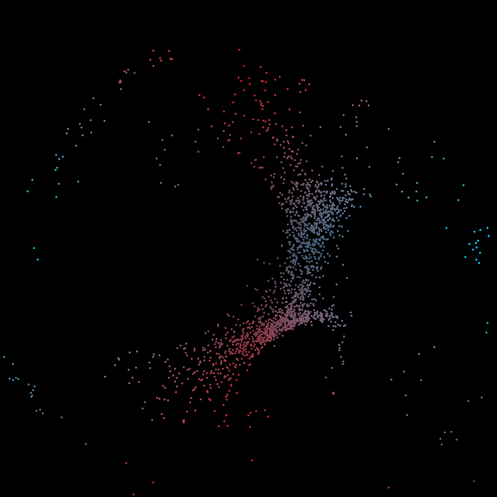
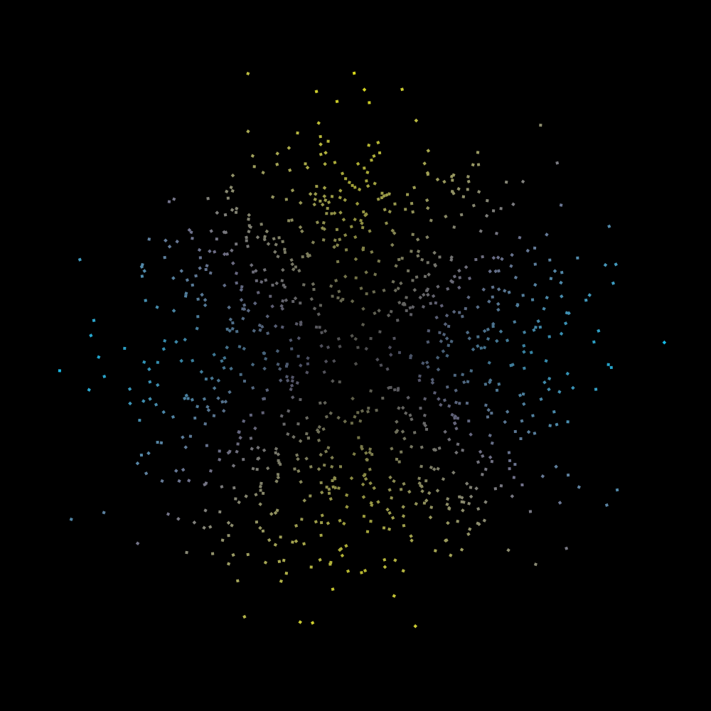
HSwarm
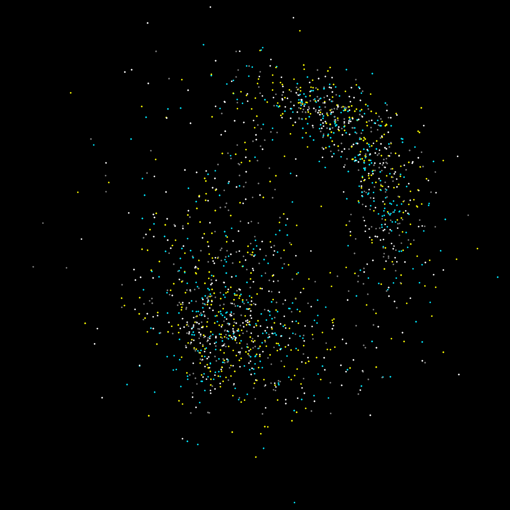
PG2_7_1_1
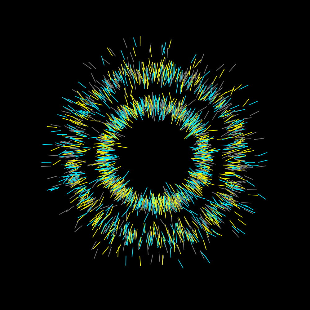
To begin with, I moved the creation point to the center of the display. And the amount of objects is increased to 2048. It is not entirely clear to me how swarming works. I have run this version for a while, but eventually circles are formed that become larger and smaller.
PG2_7_1_2
I suspect that the twitch function plays an important role in the creation of circles. So I went to the HYPE_processing manual and found the twitchRad function. I assume this is the radius of the twitch function. But nevertheless circles are still formed. But in the end I found a setting to prevent that. In the long run, the movement seems to work as an organism. I have run the program for half an hour and there is nothing left to see. Everything is gone. I ran the program again and it seems that the fireflies are driven out of the display window until nothing is visible.
PG2_7_1_3
It is remarkable that within such a disorganized system of dots you can create a kind of chaos that seems to be organized in some way or another. And it is completely unpredictable. Except for the fact that it eventually moves in circles.
Animation: https://vimeo.com/258590883
PG2_7_2_1
OK. Now the creation point rotates. But the ultimate behavior is reflected in the merging of circles.
Animation: https://vimeo.com/258591091
PG2_7_2_2
Enlarged all the shapes.
Animation: https://vimeo.com/258591219
PG2_7_2_3
Decreased the amount of objects.
Animation: https://vimeo.com/258591413
PG2_7_2_4
Incorporated the twitchRad function.
PG2_7_2_5
Sometimes it is also interesting to bring everything back to its essence. With only eight HDrawablePool members there are still special things to create.
Animation: https://vimeo.com/258591562
PG2_7_3_1
This shows that the twitch function is responsible for the common behavior. Circles continue to form but on a different scale.
PG2_7_3_2
The circles have now almost disappeared. But turnEase also has a big influence on the way everything moves.
PG2_7_3_3
A bit back to the basics. With again only eight DrawablePool members.
Animation: https://vimeo.com/258591737
PG2_7_3_4
The previous sketch gave me the idea to create several swarms. In this image I used two swarms (or swarmii), each with their own HCanvas.
PG2_7_4_1
Here the mouse position is the target. But strangely enough, the circles continue to organize themselves. After which they eventually break up into fragments.
PG2_7_4_2
I have replaced the mouse as a target by the center of the display. All lines now point (more or less) to the center. And actually the animation becomes more interesting the longer it runs.
PG2_7_4_3
A variation on the previous sketch. With horizontal rectangles.
PG2_7_5_1
I still find it remarkable that the structures continue to cluster in circular movements. Probably study the setting again.
PG2_7_5_2
The strange thing about this animation is that at a certain moment all points will move at the same time and in the same rhythm.
PG2_7_5_3
An even more nervous exaggeration of the previous sketch. The animation will change its behavior after about twenty seconds. Eventually there remain four circles that also no longer fall apart.
Animation: https://vimeo.com/258591878
PG2_7_6_1
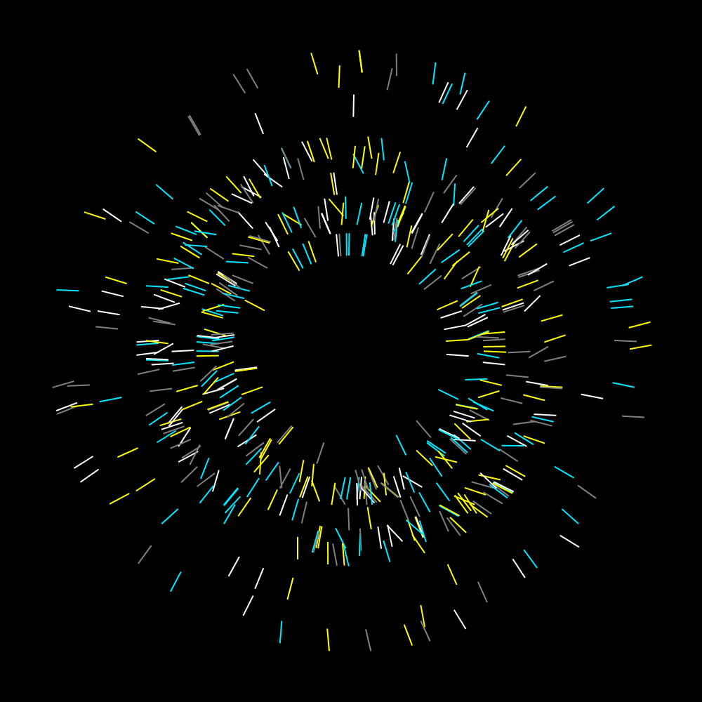
The mouse is the target. After that, countless lines are formed by points that are generated. There is a high alpha value used when writing those points.
PG2_7_6_2
All points start in the middle. From there, points are moving to where the cursor is at that moment. The process is very slow. But you get interesting images in this way. These images are not suitable for animation. Theres is not much happening and when something happens it is at a slow pace.
PG2_7_6_3
I changed the background picture here. That yields rather daunting but also intriguing images. HColorPixeler is a very strong influencer of form.
PG2_7_7_1
This is a variation on the previous program. But because there is a lot of movement, this program is suitable for animation.
Animation: https://vimeo.com/258592038
PG2_7_7_2
Here the dots have been replaced by rectangles. I also used the twitchRad function.
PG2_7_7_3
The background picture is changed. And made the objects a bit smaller. The disadvantage is that the objects leave a dark outline in the black part. I have no idea where this comes from and how to prevent it.
Animation: https://vimeo.com/258592171
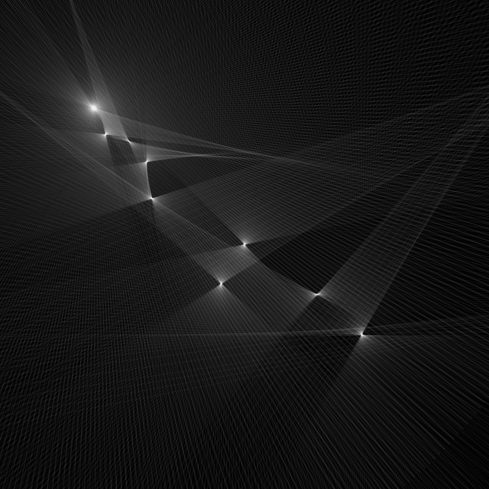
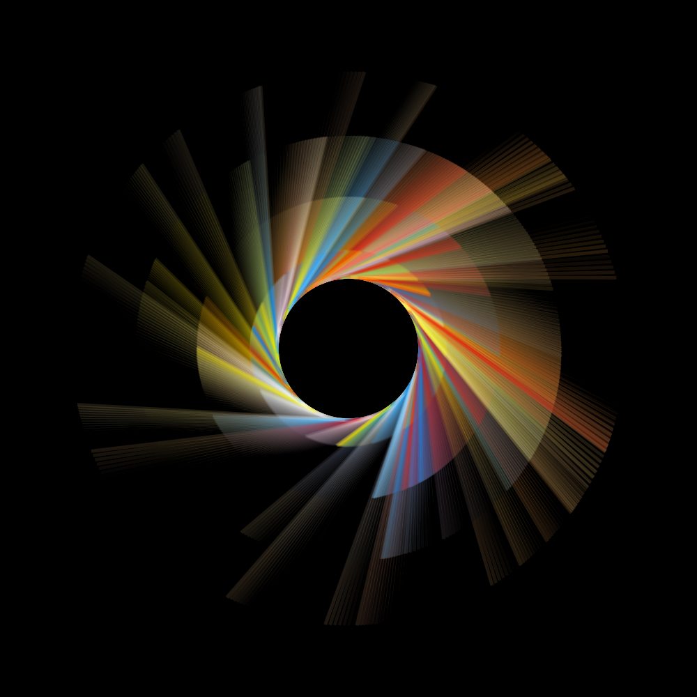
HOscillator
PG2_8_2_1
Joshua's first example is a starting point. But there was no animation in it and HOscillator has not yet been applied. So I skipped that first example and immediately started with the second example. There is a vertical movement in the original animation. I would rather make a horizontal movement of it. I also want a variable line width and other colors. No idea if this is the right direction. But it is a start.
PG2_8_3_1
This was not exactly what I had in mind. But it is better than what I had in mind. So I leave it that way.
PG2_8_4_1
Suddenly there is a very graceful wave movement on my display. I’m glad I have chosen a horizontal line pattern. This emphasizes the horizontal movement even better.
PG2_8_5_1
This is a continuation of the previous program. The line thickness and frequency of the wave movement is increased. Interesting that the lines continue to rotate in the same place. But the common line pattern seems to work together.
PG2_8_6_1
Increased the speed and frequency.
PG2_8_7_1
A cheerful Christmas tree. Here you can clearly see, compared to the previous sketches, that the lines remain locked at their vertical position.
PG2_8_8_1
Here the waveform is determined by a square.
PG2_8_9_1
This sketch uses a triangle as a waveform.
PG2_8_10_1
Waveform (H.SAW).
PG2_8_11_1
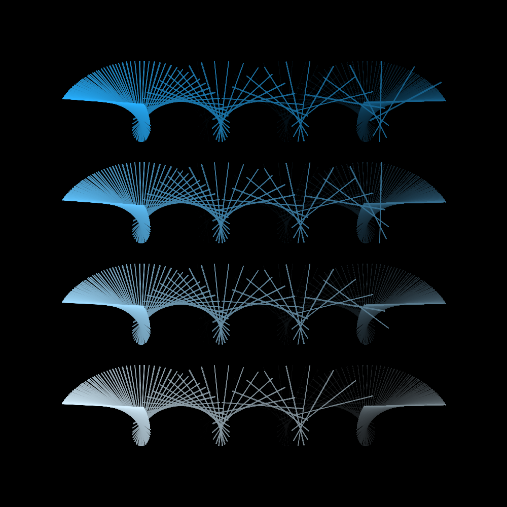
An animation in which rotation is an important factor. It is also special that the rotation of the center always rotates opposite the outside of the shape.
PG2_8_12_1
This is basically the same animation as the previous sketch. The center still rotates opposite the rotation direction of the outside. But now a canvas has been applied to get the beautiful transition between the object and the background.
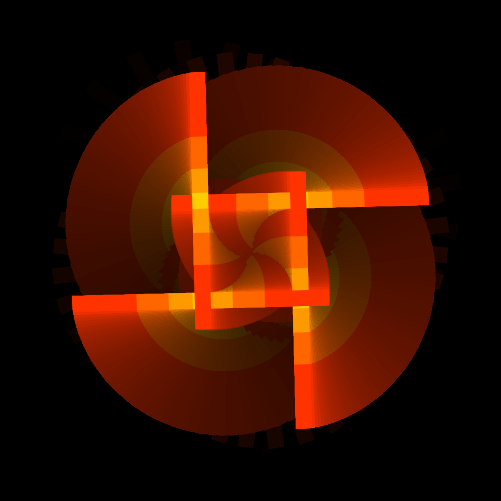
PG2_8_13_1
This animation is more like a screw movement. It is very graceful though.
PG2_8_14_1
This is a slightly more difficult animation to describe textually. It is not a screw movement and not a contrarian. It is a bit of everything and therefore unclear. I now have have four oscillators in use.
PG2_8_15_1
A slightly more complex movement than the previous one. And there are also nice lines in the fade-out. I still find it impressive that you can create such graceful animations with rectangles.
PG2_8_16_1
Hard to describe how this works. An oscillator is used for the rotation. One for the scale. One for the x-direction and one for the y-direction. But where that second movement comes from is not entirely clear to me. It probably has something to do with the settings of the frequency.
PG2_8_17_1
In this animation I have slightly increased the amount of objects. That makes the movement even more organic. By the way, I still get the ‘noLights () is not available with this renderer.’ error message.
PG2_8_18_1
The same animation as the previous program but the rectangle is now replaced by a star. It is a pity that the fade function only goes to 1. In this case I would have preferred 0.5 or maybe 0.1. But the method fade (int) in the type HCanvas is not applicable for the arguments (float).
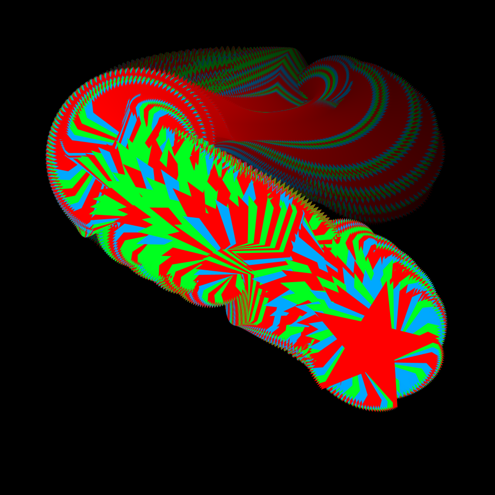
PG2_8_19_1
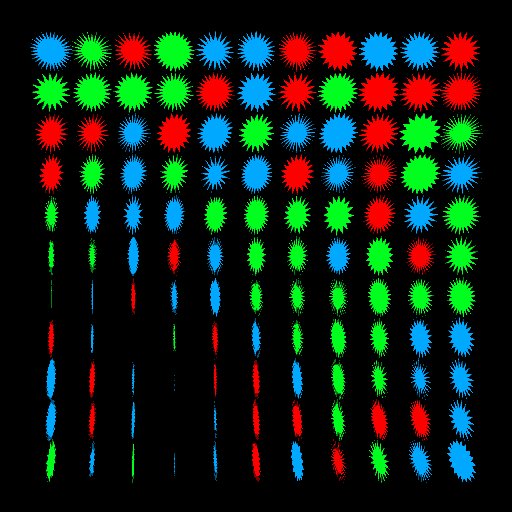
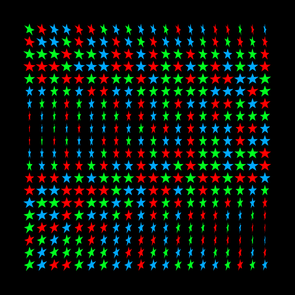
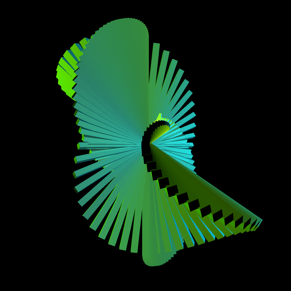
A grid of eleven by eleven stars that slowly rotate with successive frequencies.
PG2_8_19_2
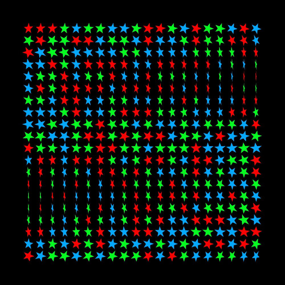
I have reduced the objects to one star-shape. The grid now consists of twenty stars horizontally and vertically. This makes the wave movement much clearer compared to the previous sketch.
PG2_8_19_3
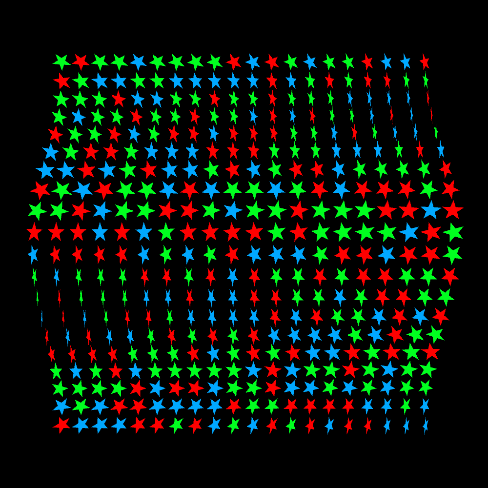
Same program as the previous one. But now there is also rotation in the z-direction.
PG2_8_19_4
Same program as the previous one. Now there is also rotation and positioning in the z-direction.
PG2_8_20_1
I used my old Cassini.svg file. I was planning to create a new svg file but in the end I found this one reasonably satisfactory.
PG2_8_21_1
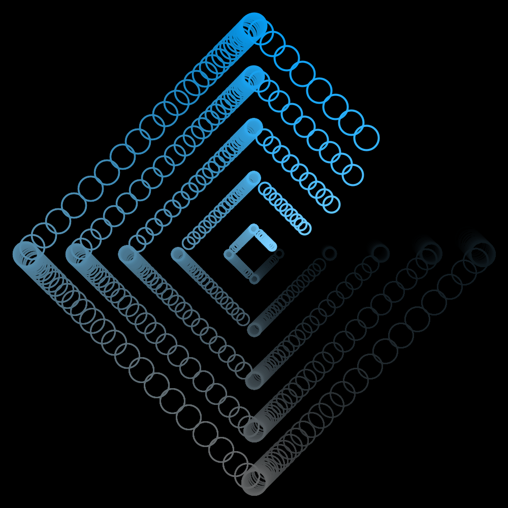
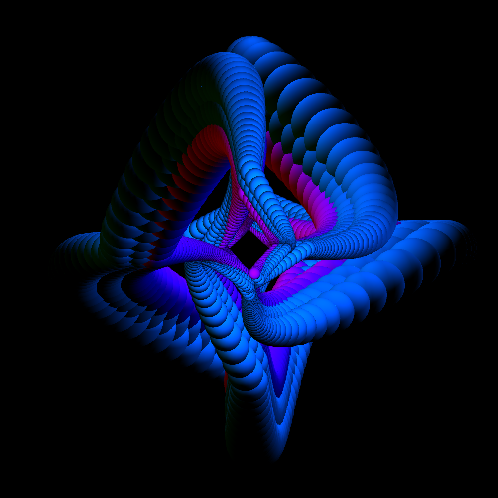
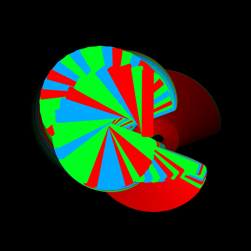
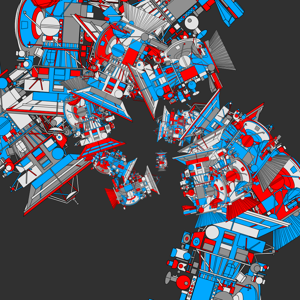
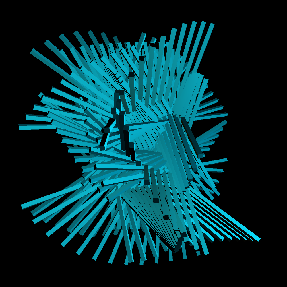
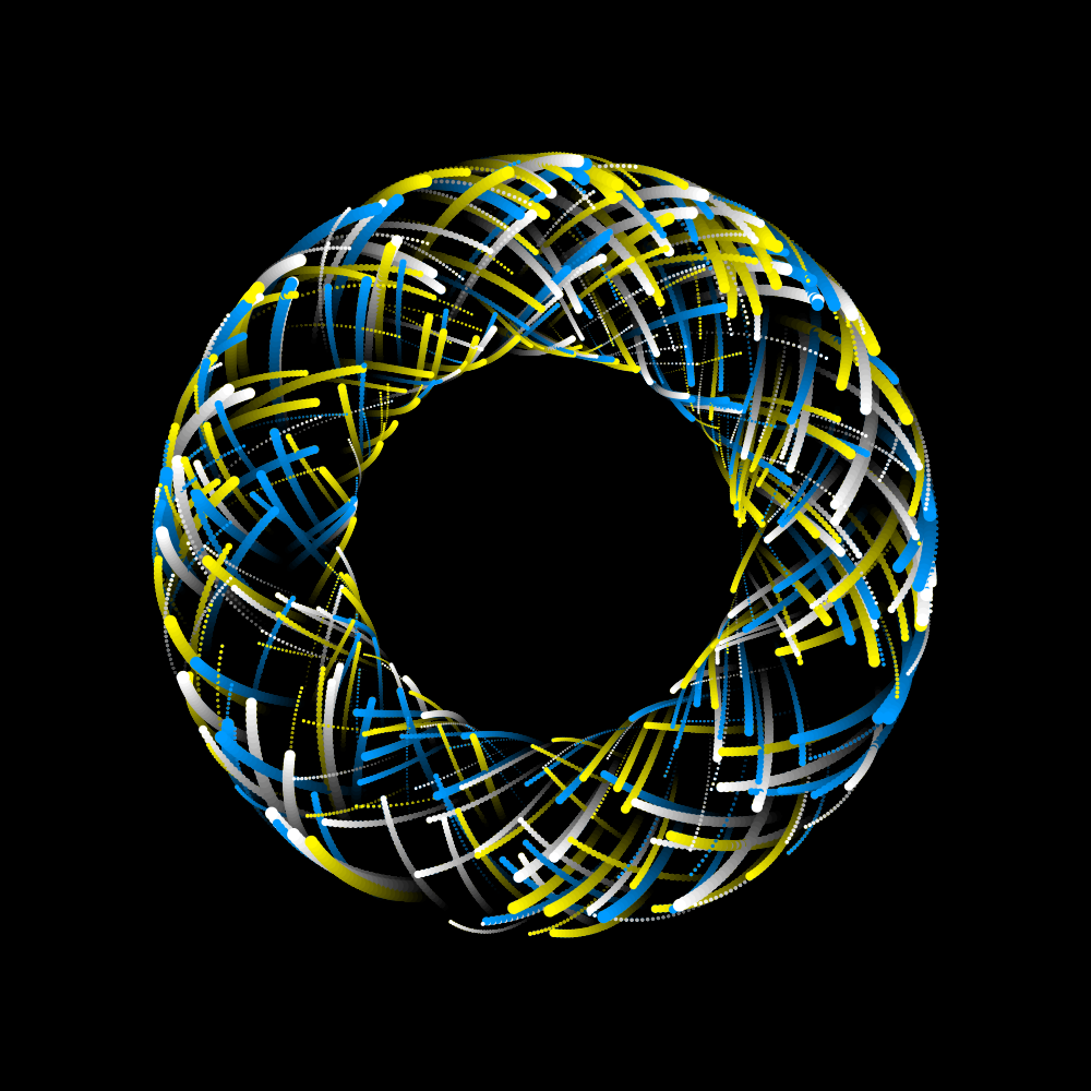
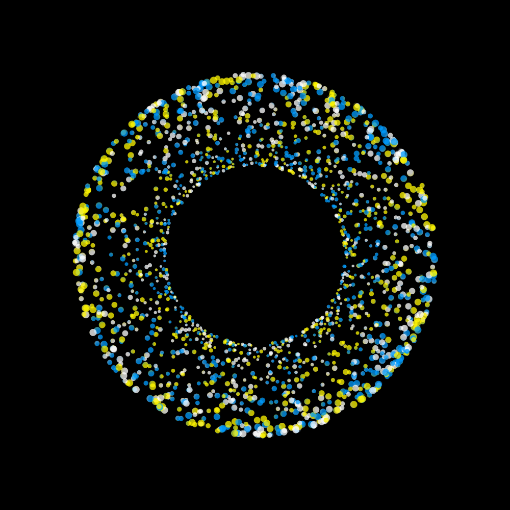
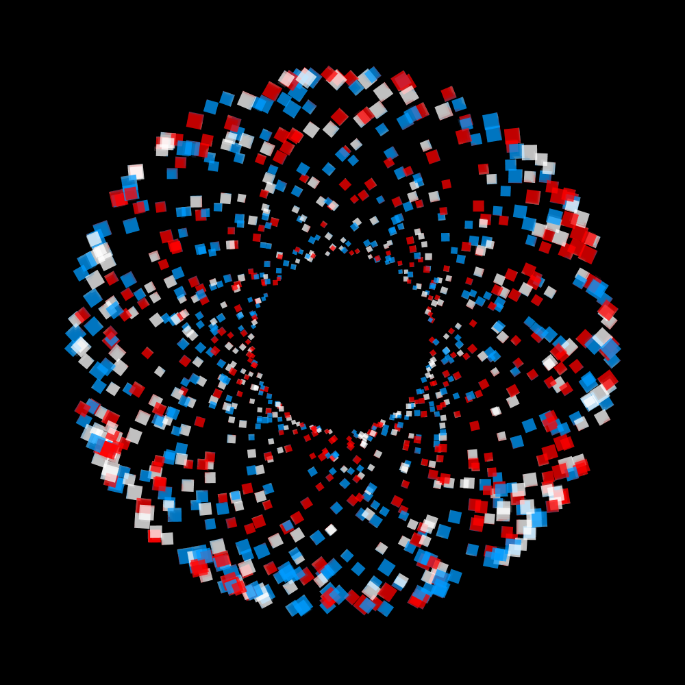
A 3D version with 192 extended cubes and three oscillators. Furthermore, a blue and a white light have been placed.
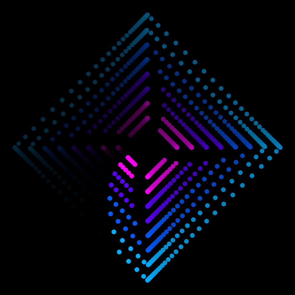
PG2_8_22_1
A slightly better organized version of the previous program.
PG2_8_23_1
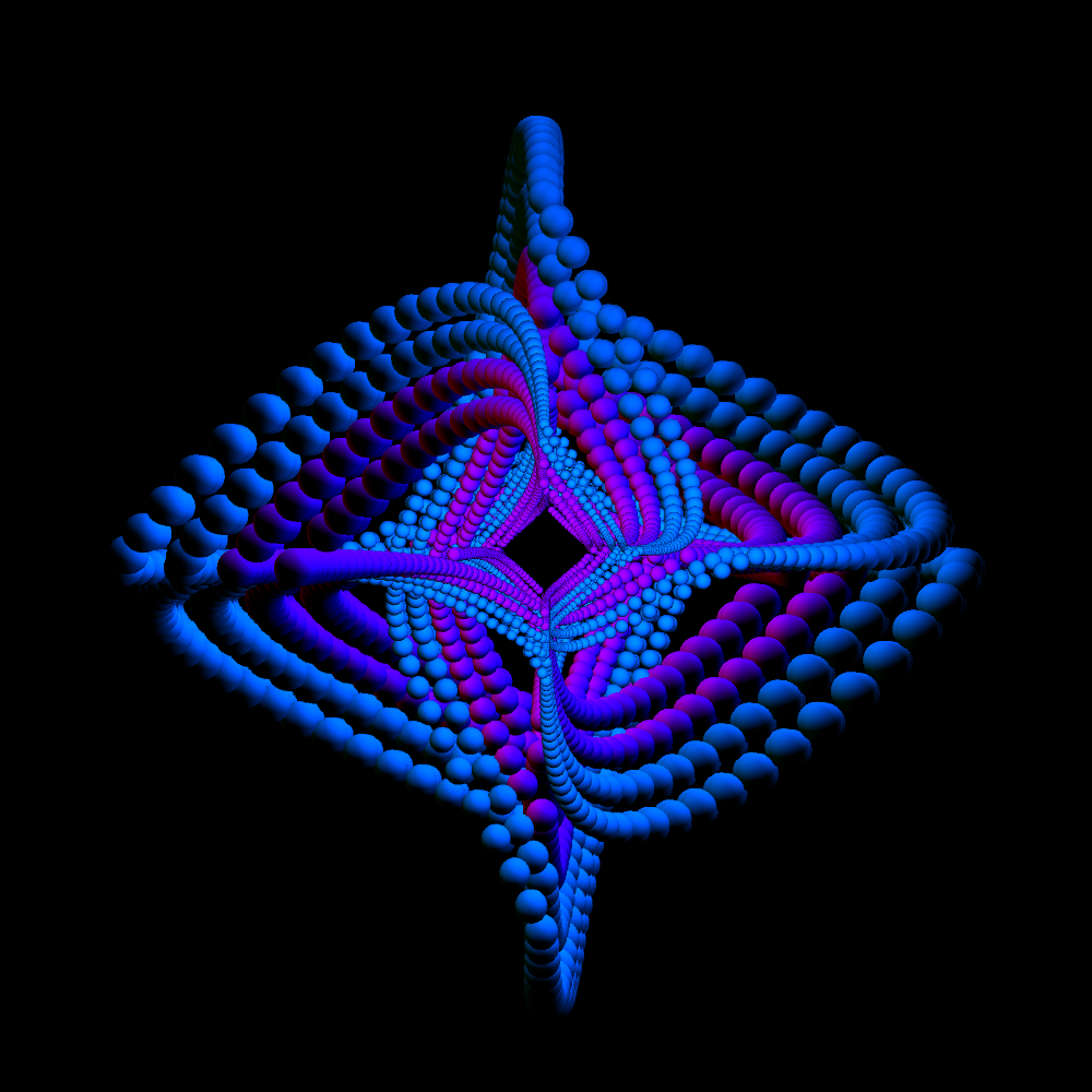
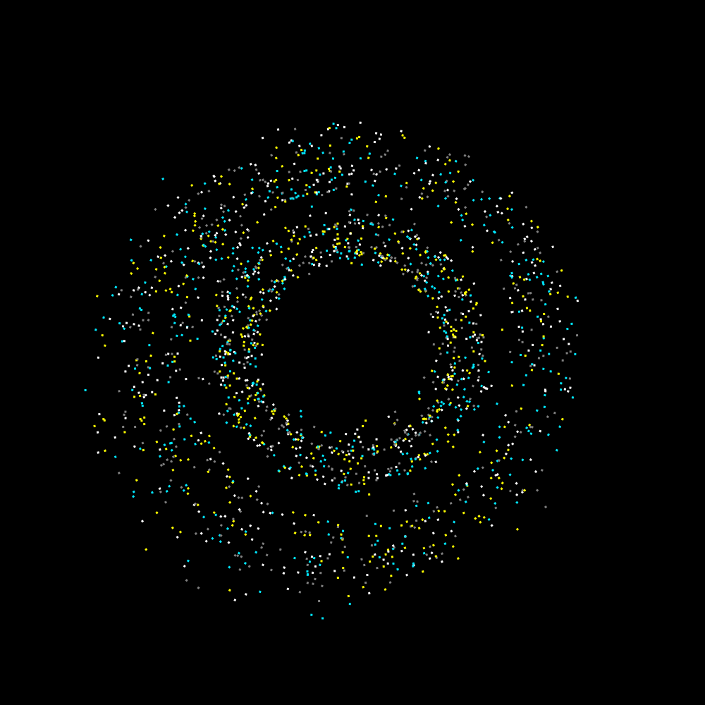
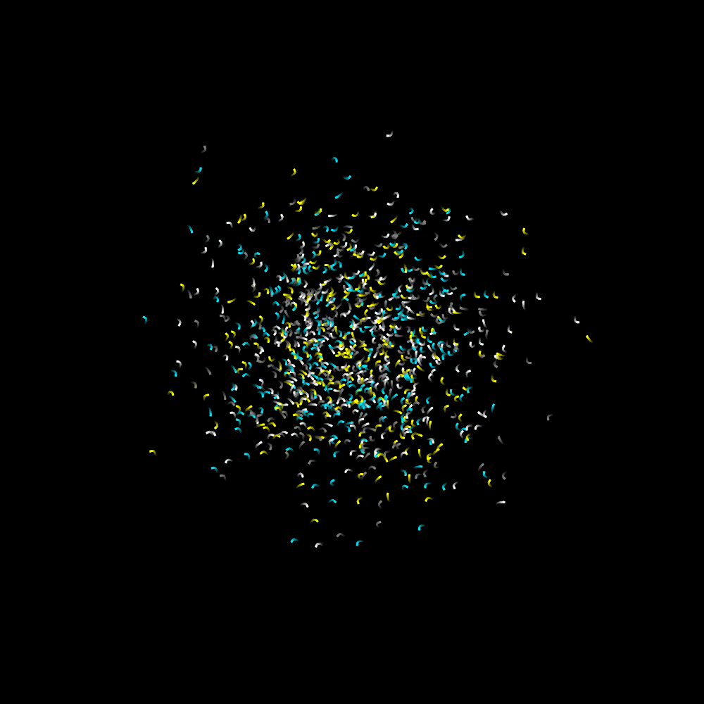
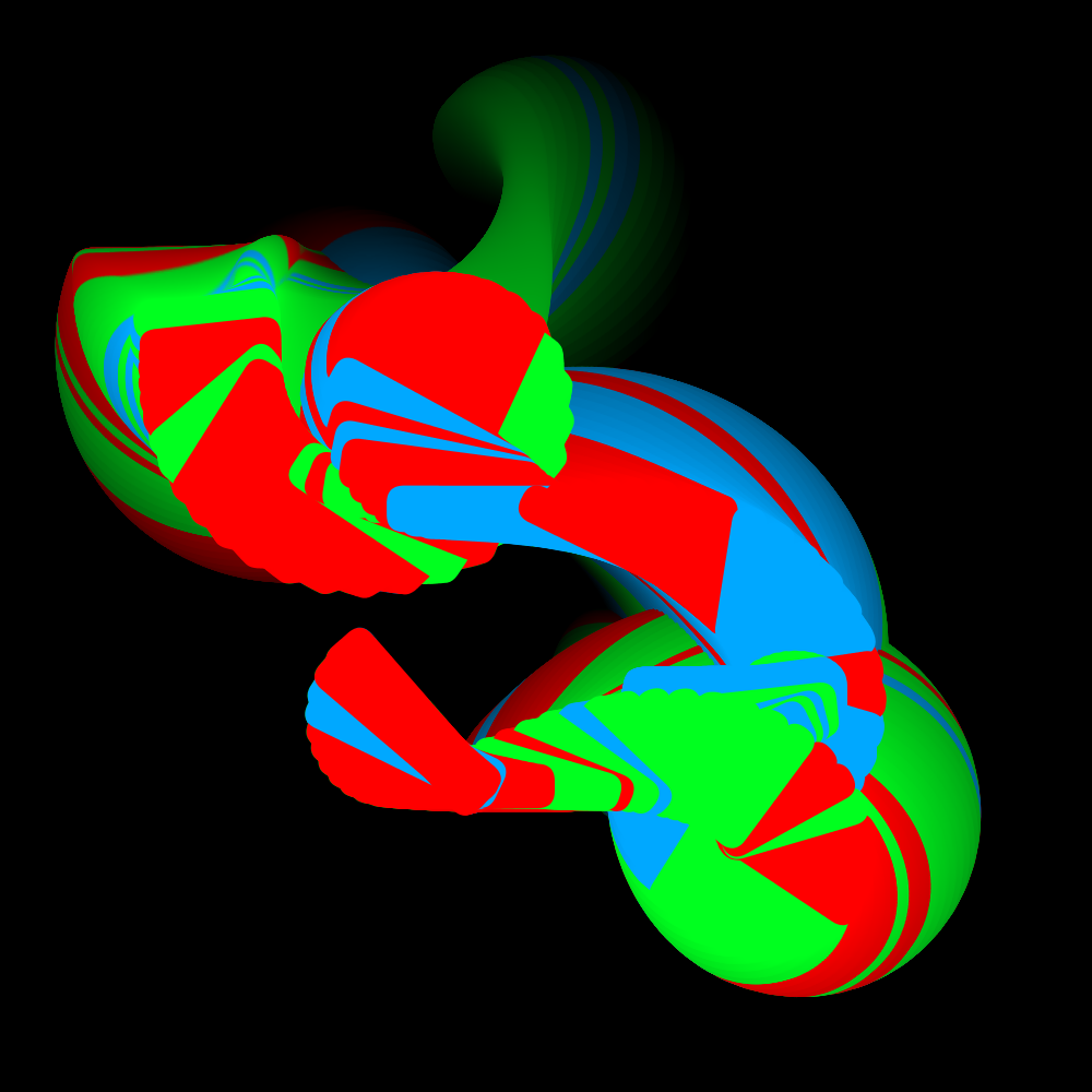
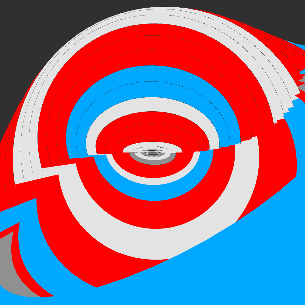
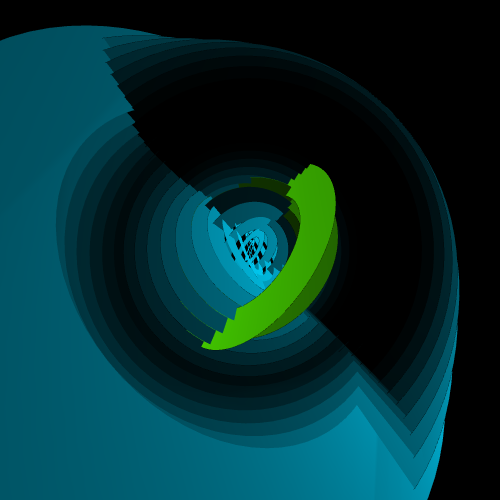
There is a problem with displaying the Cassini svg file. It seems that 3D interprets the file completely different. Only circles, squares and lines remain. I suspect that you must map the svg file on an object. Otherwise the 3D space knows not what to do with it. It works in 2D. So I'm going to use another svg file. For the time being I use the rings.svg from Joshua’s original program.
PG2_8_23_2
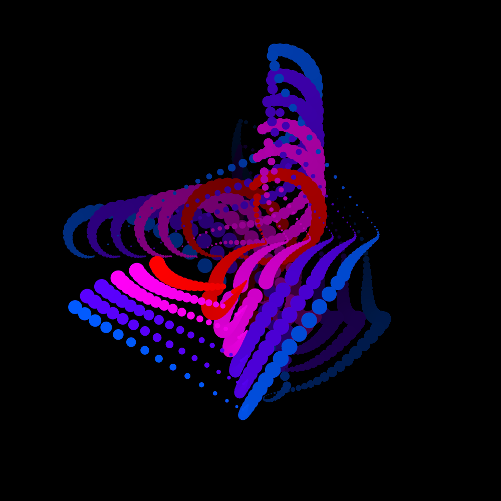
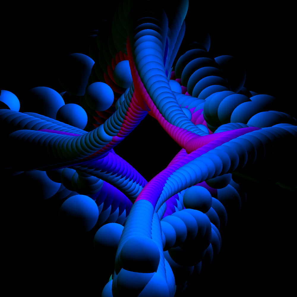
Although the previous program was also 3D, it did not use 3D lighting. This program does use 3D lights. The difference in light usage is clear.
I had to create a second project page. The people at Skillshare helped me with that. They think I used too much images to explain this project. Here is the link to PG2 | Part 2