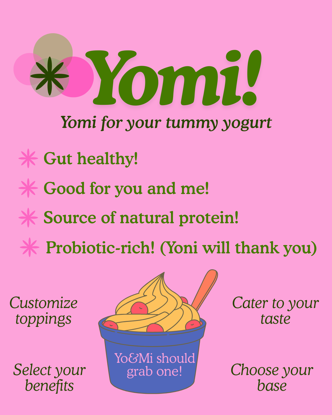
Yogurt Bar Poster
I tried to incorporate most things that were mentioned in the course:
Von Restorff Effect - Using extra pops of color in the graphic below to make the call to action stand out.
Shapes - Used various circles in the logo to emanate positivity & community. Added the flower shape to brand and help add a fun & 'natural' element.
Colors - Decided on green for a natural, healthy feel and pink to stimulate excitement and good energy.
Gestalt Theory - I tried to keep the elements in balance and quite symmetric, a section highlighting the benefits of the product and some additional information below.
Fonts - Opted using the same font throughout the whole design, for variety I used different styles + boldness and italics. The font is clean yet a bit quirky to make it seem interesting and fun, eye catching yet clean.
Would love to hear you opinion! Thank you (: