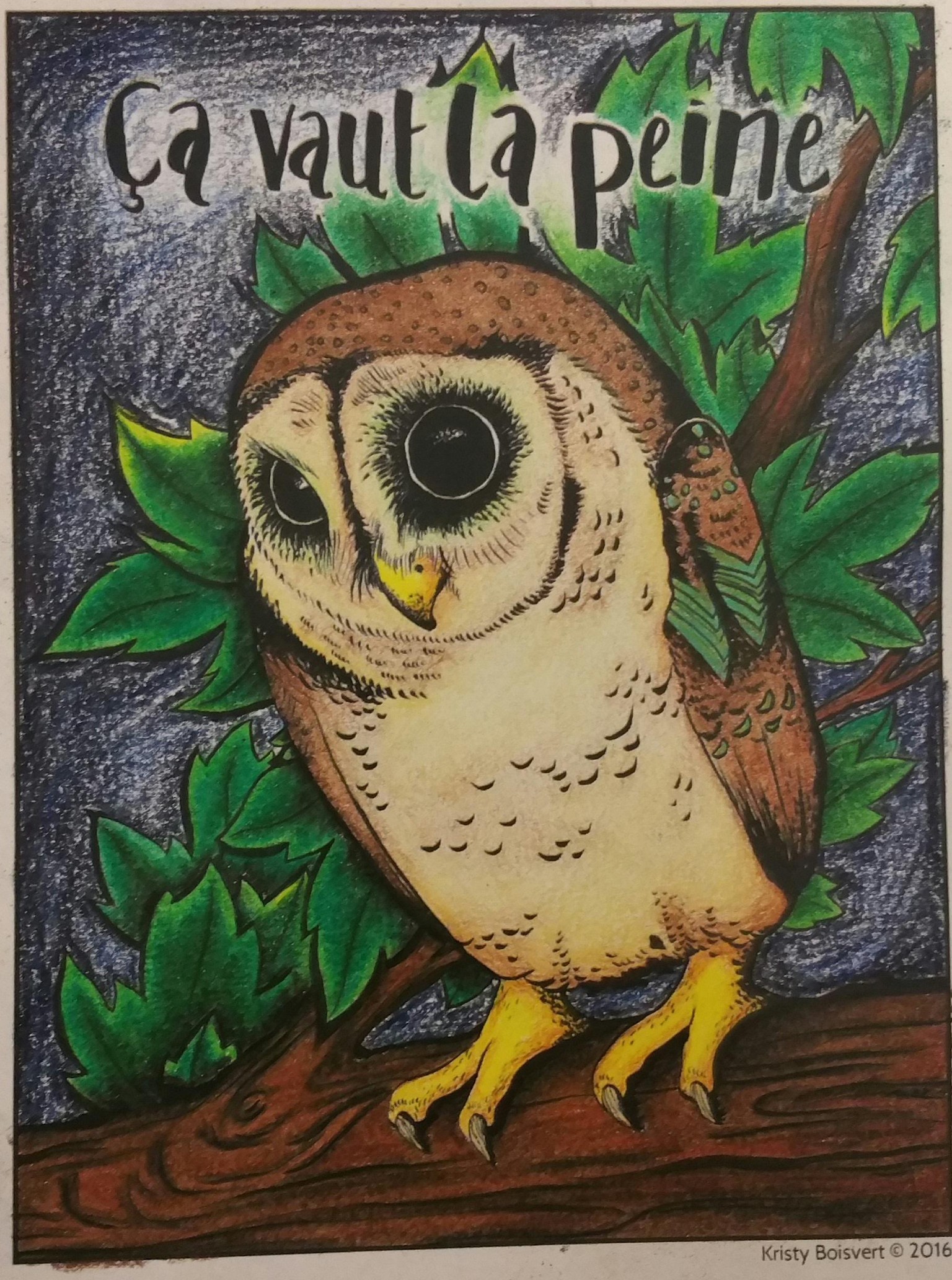
Worth the Effort
The alternative name for this project should be "excessive burnishing". I think I've burnished pretty much every part of this except the sky and the branches. Maybe I'm just bad at blending. But I really like the way everything looks so much smoother when burnished.
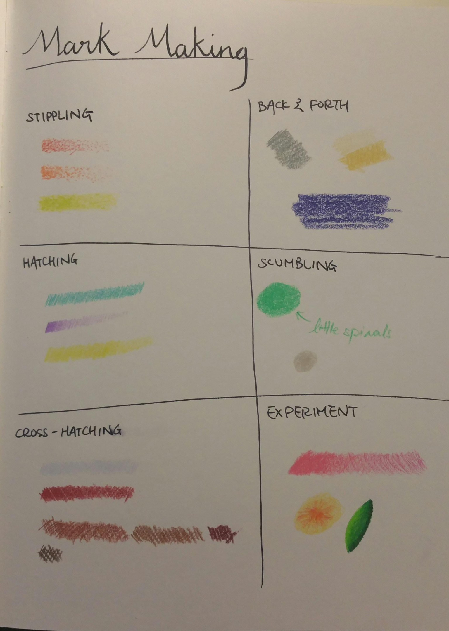
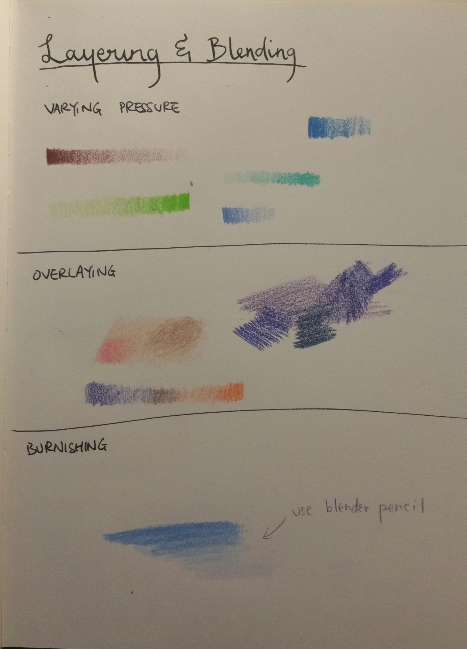
Started off with the exercises. I didn't use the handouts provided because I wanted to include the exercises in a new sketchbook I'm starting, so I copied the template into that instead.
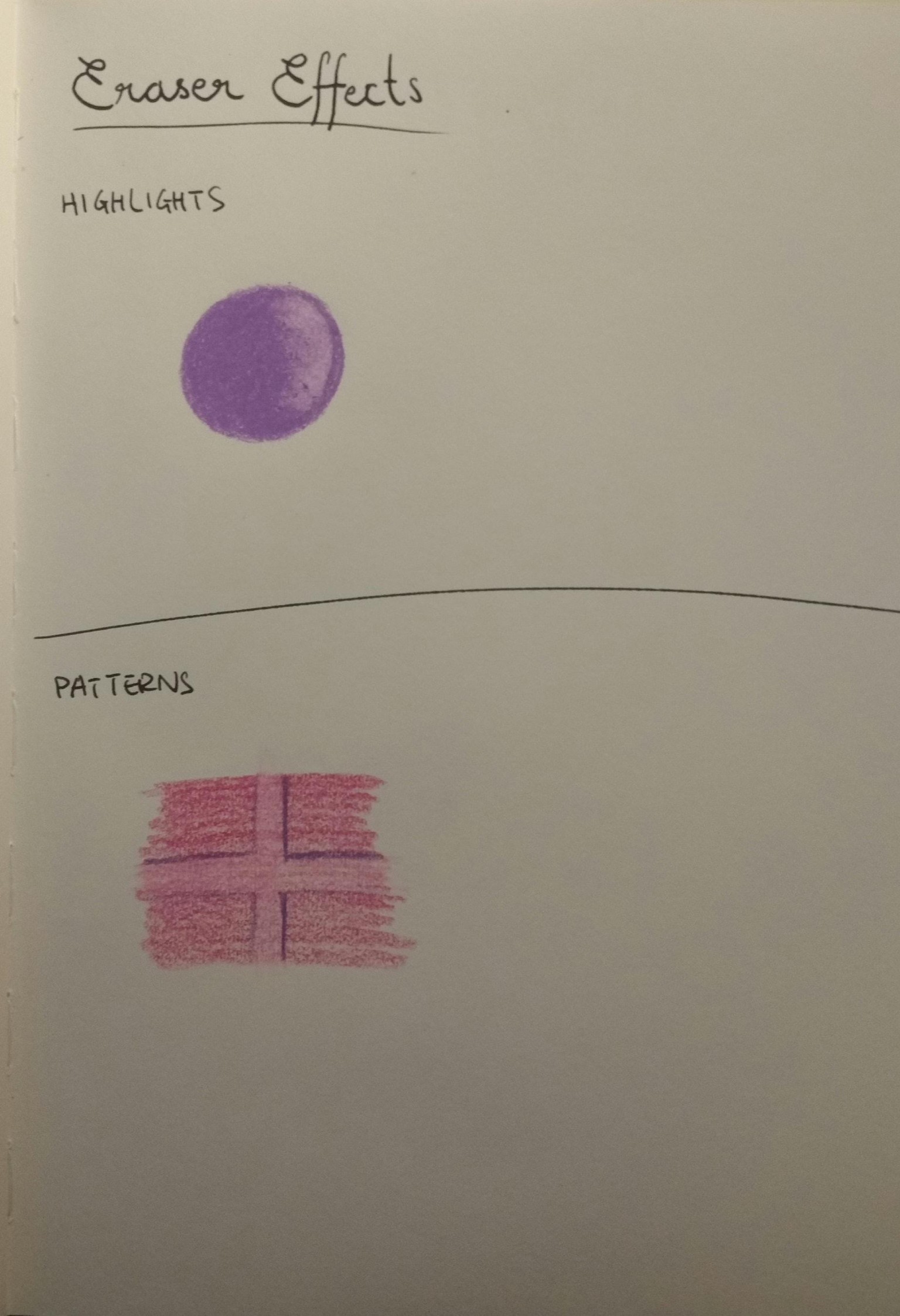
Not really a huge fan of using erasers. It seemed kinda hard to control, plus using a lighter touch for places I want highlighted seemed easier...
Moving on to the palette. I couldn't keep it to 5-6 colors (oops) but instead ended up with 11 colors. Although, if you count by groups of like colors there were only 4 - yellow, green, brown, and blue.
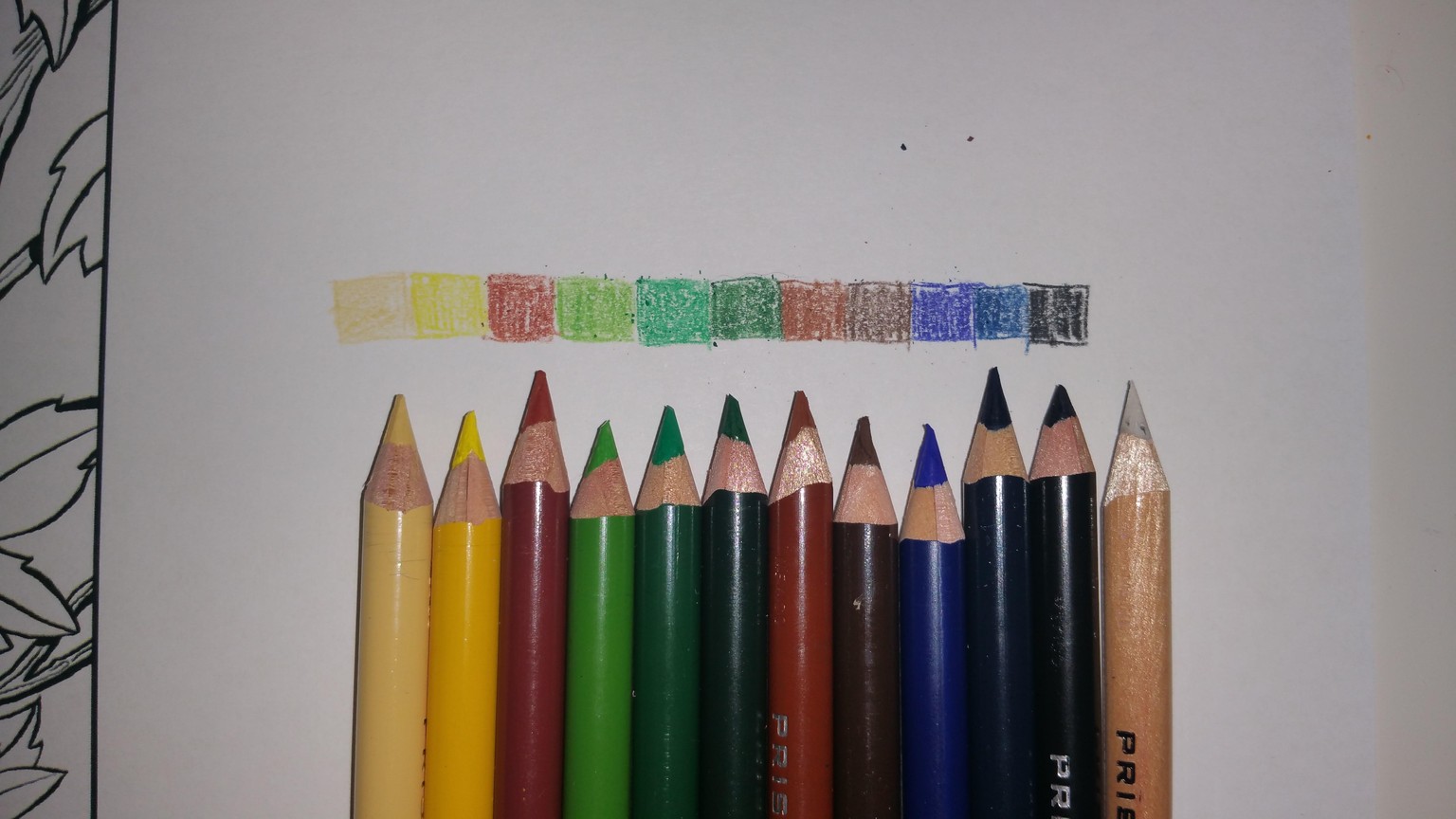
I also ended up adding a turquoise while coloring, and not using the blues I picked out (from a set of prismacolors), instead using two blues from a set of derwent inktense pencils. I was going to use a water brush to color the background, thus the ink pencils, but ended up liking the "unfinished" look of the background so just left it at that.