Various Contrast Studies
My project on Composition For Artists - Structure, Contrast and Depth.
Again - another very interesting presentation.
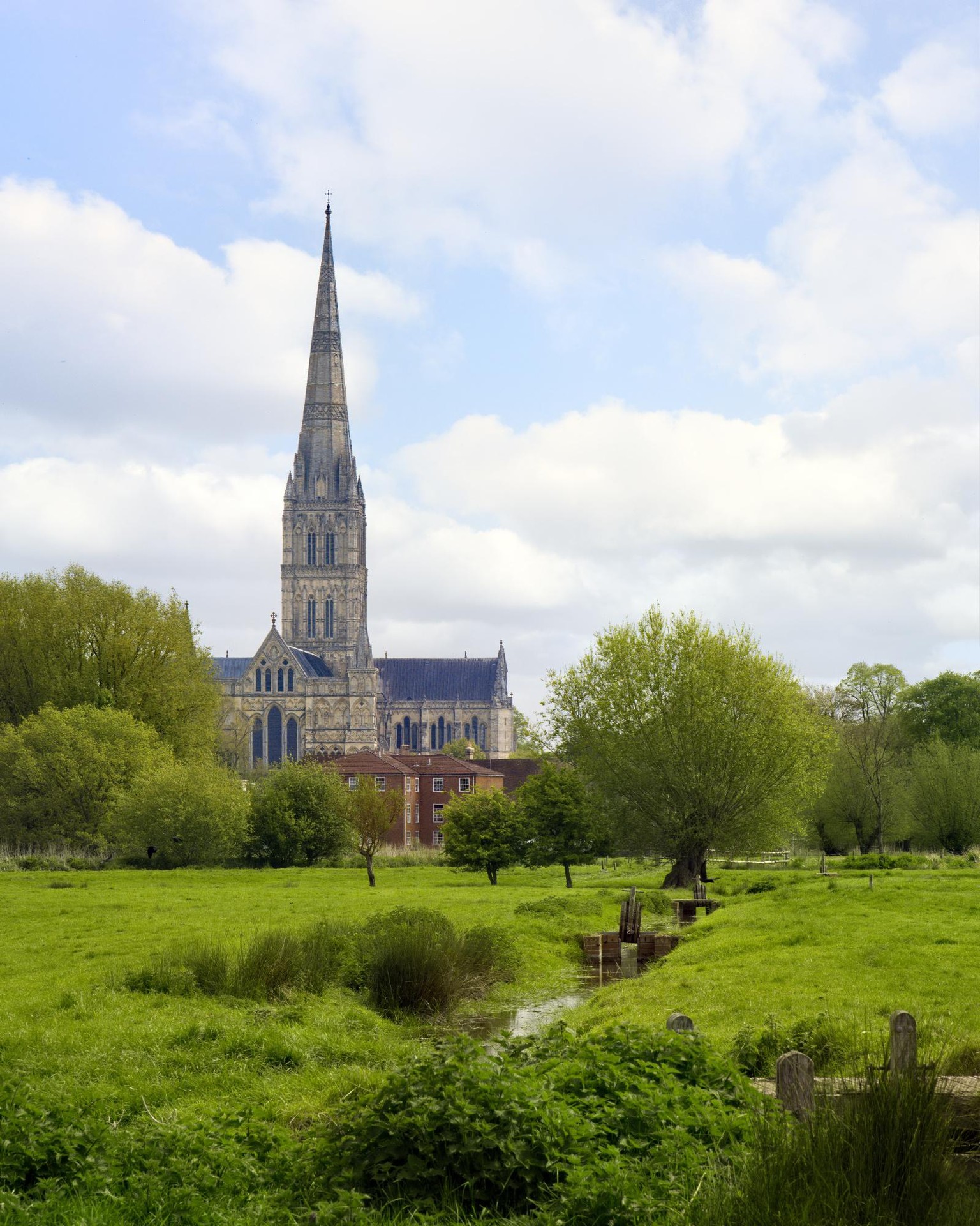
I had a picture of Salisbury Cathedral over the water meadows that I took on holidays earlier this year. Think Constable Painting....
Ive been meaning to do something with it for many weeks and I noticed it had some similarity to the course assignment picture - so why not give it a shot...
This is the picture 'as-is' apart from minor corrections. It was a bright early morning soft light soft of day and so there is not much contrast in the picture. Its a nice picture and Im pleased with it. Shame about the red brick in the mid ground though.
However, it all looks a bit mid-tone in black and white and there is little to differentiate the Cathedral from the surroundings apart from its shape and colour. I could just use colour to differentiate it in a typical 'impressionist' style, but I wanted to make it stand out from the crowd.
.
.
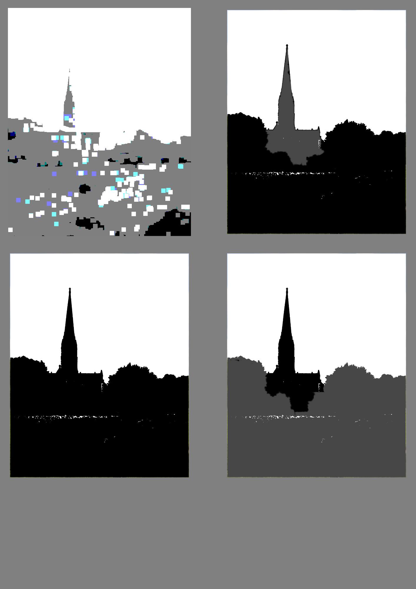
Here are the 'notan' studies:
The Cathedral is mainly defined by its outline shape I think.
Although it would be normal to have the distant building lighter, I though it stood out more as the darker shape - as the area of most contrast.
The black and white, blur and posterise filters used here in Affinity Photo.
.
.
Here are 3 variations from top left clockwise:
as-is
<> darker Cathedral and Gradation from the foreground
<> dark Cathedral
<> Dark Foreground
I added some burning to the top right to emphasise the stream direction towards the Cathedral and also to give the trees some form to separate them even more from the shape of the Cathedral. Nice varied selection of round shapes there.
I thought lower right looked like the Cathedral had been stuck on - it didnt seem to fit at all to my eyes
I quite like the result and feel the top right picture with the darker Cathedral, The burning along the stream patch to add more contrast there, the gradation from bottom to middle and top to middle bottom, is a lot stronger.
My wife agreed so must be right!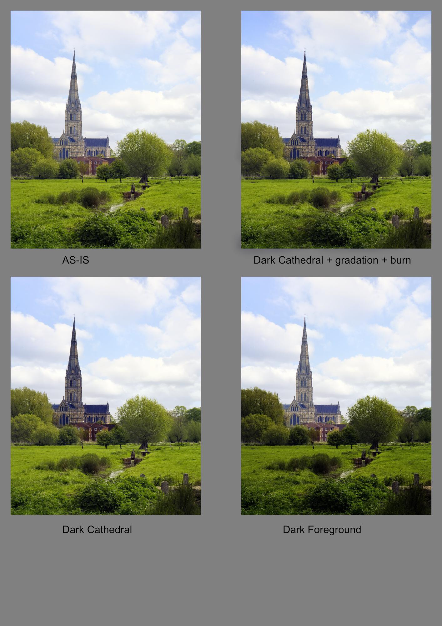
.
well I had better get on with the painting now :-)
Thanks.
.