Top 3 logos - student project
Top 3 logos - student project
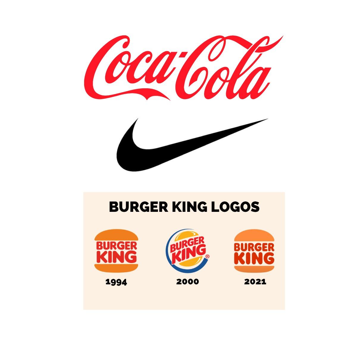
1. The Coca-Cola logo is very stylized, mainly because of its typography that forms the word “Coca-Cola”. I’m not a big fan of this letter stylization, however, with a good investment in marketing, it can promote greater dissemination and remembrance of the logo. It’s not a logo designed to be versatile, since, if it’s used in other places where it’s necessary to reduce the size, it won’t be visible. Therefore, the brand had to apply different concepts to the same logo to make it responsive.
2. The Nike logo is a good example of a brand that has no references. However, with a good investment in branding and marketing, they managed to position their brand in the market. It’s a simple, minimalist logo that’s easy to remember, having all the positive points for being easy to fit into any media and clothing without losing its true meaning and quality. A versatile logo with a lot of originality.
3. The evolution of the Burger King logo is quite interesting. They started with a logo that lacked personality and strategy, much like most companies when they first start. This then underwent a transformation where the burger became the logo, with the word “Burger King” in the middle. In 1999, they changed the logo, moving away from minimalism and adding more elements to the logo. However, in 2021, they returned to the concept of the 1994 logo and improved upon it. The result is a versatile and minimalist logo. One major issue I found is when they apply the logo to create the app, which does not carry the concept of the current logo.
Thank you very much professor, your knowledge has borne good fruits for your students.