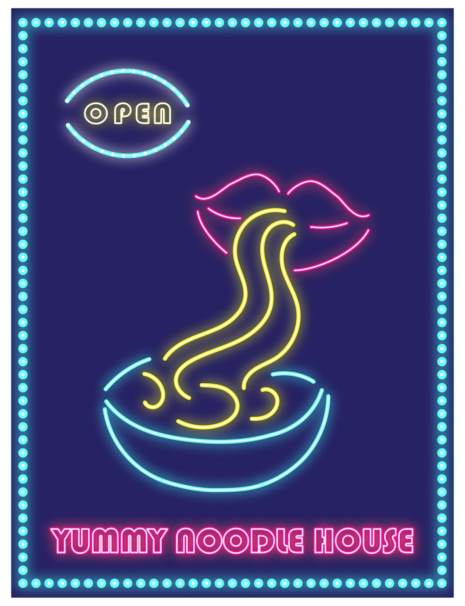
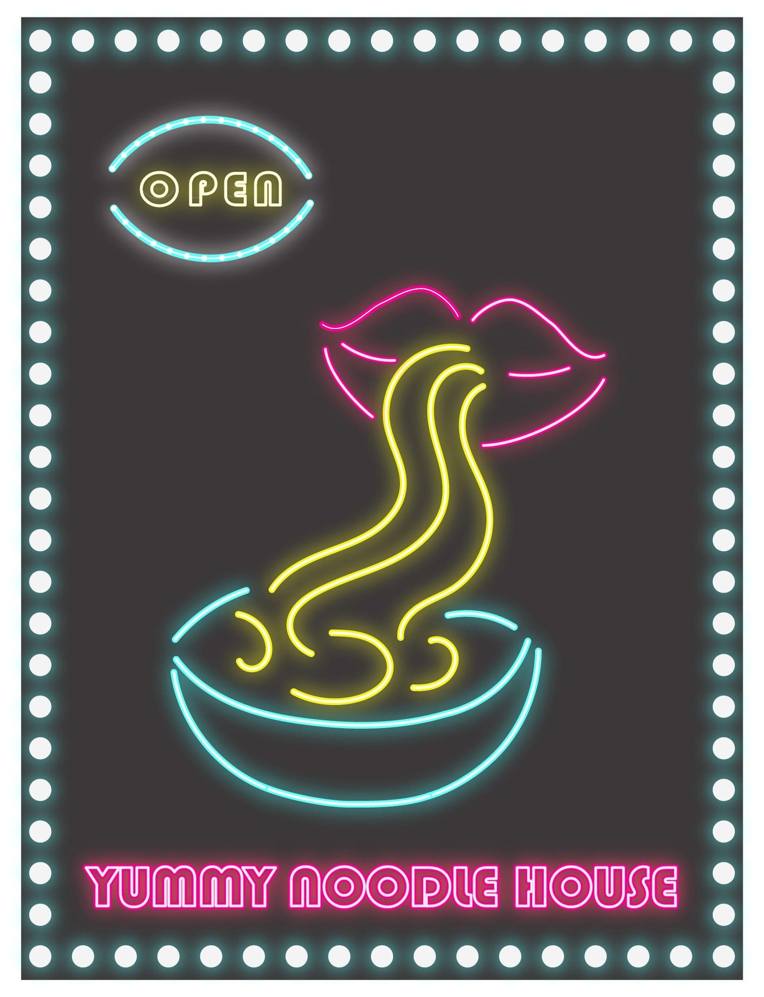
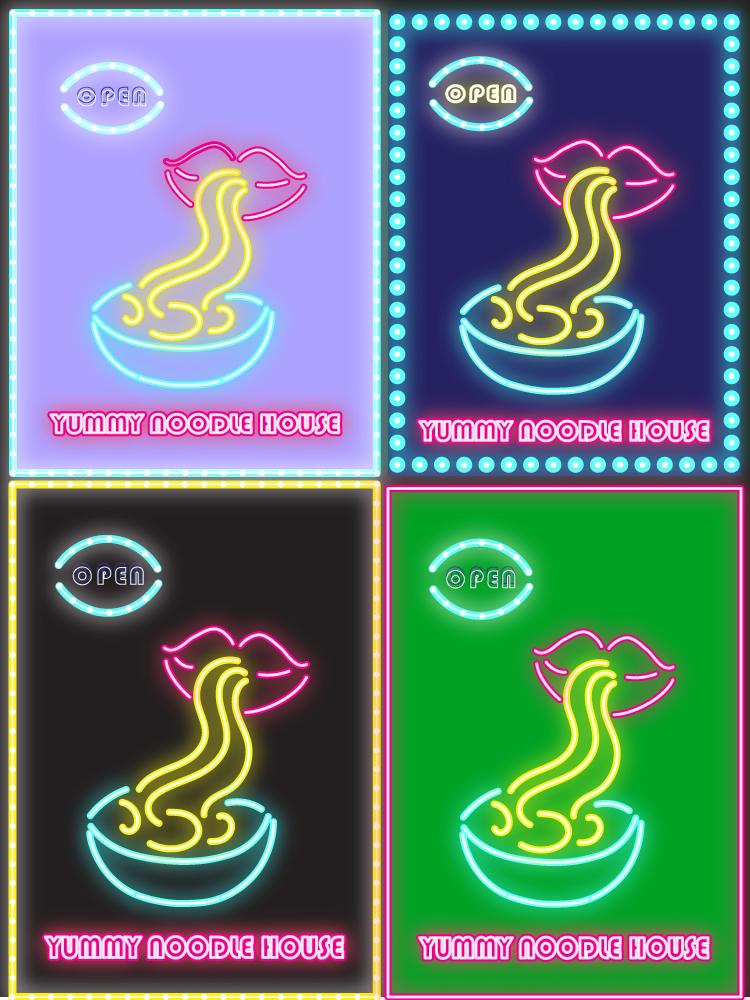
The Neon Noodles collection
That was a fun and a bit challenging class for me.
The challenging part was turning the text to a single line. I will try it again.
Instead of the blur effect I used the outer glow effect which includes blur inside the setting.
For the "Open" I expanded the font, deleted the layers I did not want and left only two: the front and the back which gave a sense of depth or sort of a wire behind (I do not know if you can see it... I think not)
I dashed/dotted a stroke to make it look like light bulbs in the frame and in the arches of the "open" sign.
Played with gradient background...though it is not in these examples and got hungry for noodles :)
Thanks!