The Art of Typography
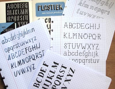
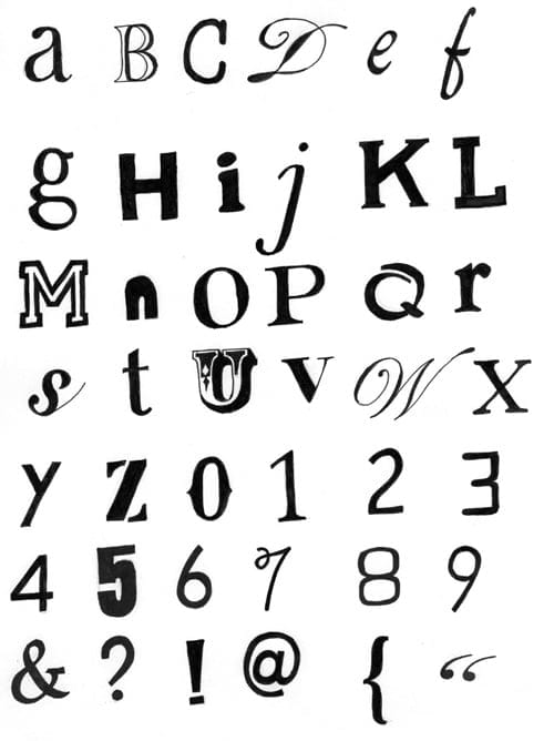
Trying to draw some fonts, I used a pretty olf book from my schooldays as a reference:
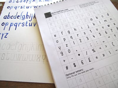
The font that I made on the website:
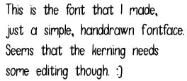
My own handdrawn type turned into a font:
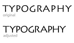
Practising kerning in Illustrator:
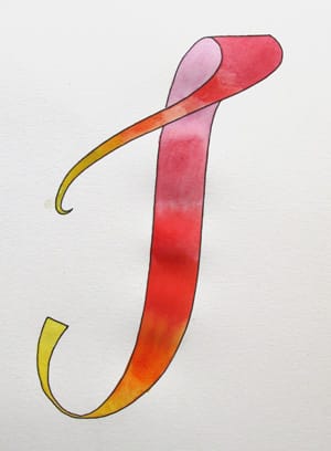
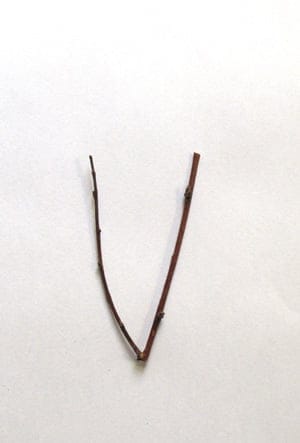
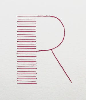
Here are my initials:: J handdrawn, outlines with marker, coloured in with watercolours. V: piece of tree, R: handdrawn, embroidered with DMC floss.
Here is the scan of the alphabeth. I did not use a ruler or anything, just copied by looking. And notcied that I slant a bit while drawing :) BTW, this exercise made me truly aware of the little small details that make a typeface!
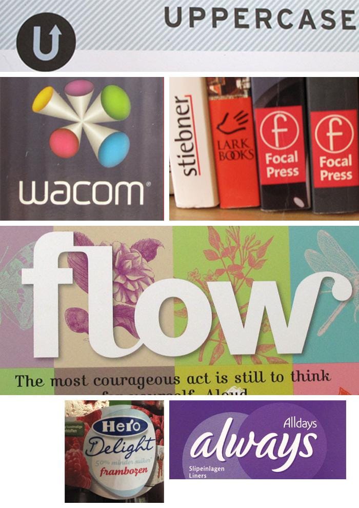
Some of the brands around my house:
Uppercase is one of my favorite magazine, but I find that I like the name only with the logo. Looks like the typeface has to be 'plain'?
Wacom: the brand of my favorite piece of hardware, my graphic tablet. I find the typeface sleek and modern. Fits the technology but remains very stylish (just like the look of the tablet).
Booktitles: I looked a lot at brands, but saw not much examples of wonderful use of typeface, but these publishers caught my eye. Very creative!
Flow: a Dutch magazine, the name really flows with this typeface and fits the style of the magazine. Though I would find the font normally a bit over the top, here it does work so well!
Hero: Dutch quality brand. The logo/type is quite old, but is so recognisable and 'steady'. Works for me
Always: feminine product and a very well chosen type :)
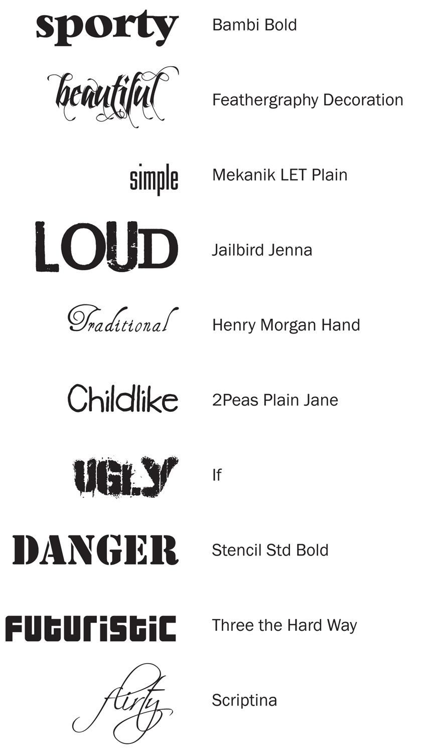
Here are some of my favorite fonts that I found and like:
These are my choices for the 10 words. I started in Illustrator and then browsed quite some pages with fonts on Dafont.com. Then decided that I wanted to use only the fonts installed allready on my computer.