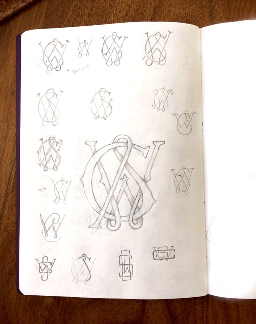
Personal Monogram
Thought I'd make an attempt at creating a monogram using my initials (SCW).
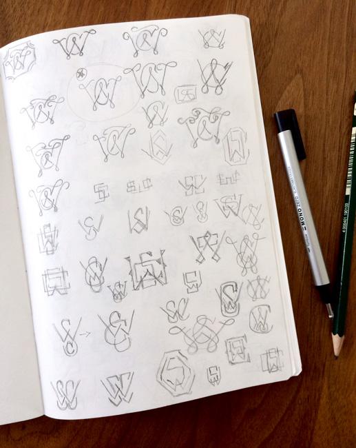
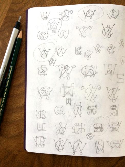
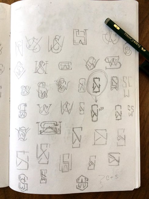
I sketched a lot over several days. I could not find a solution using a sans-like feel with thick lines - which I love.
With the S and C, I kept leaning back towards the sketches that had more curves to them - those felt less masculine.
I like that I was able to join the S and the C (my birth initials) and the W is separate but joined, my added "married" initial. I linger on the left "leg" of the S, does it work or does it make it less balanced?
I welcome any feedback! Thanks!
The finished monogram as of now.

The Monogram + Shadows

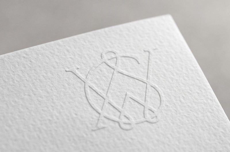
How it looks embossed in paper
The Sketches
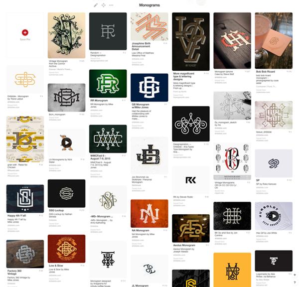
The Inspiration
Save
Save