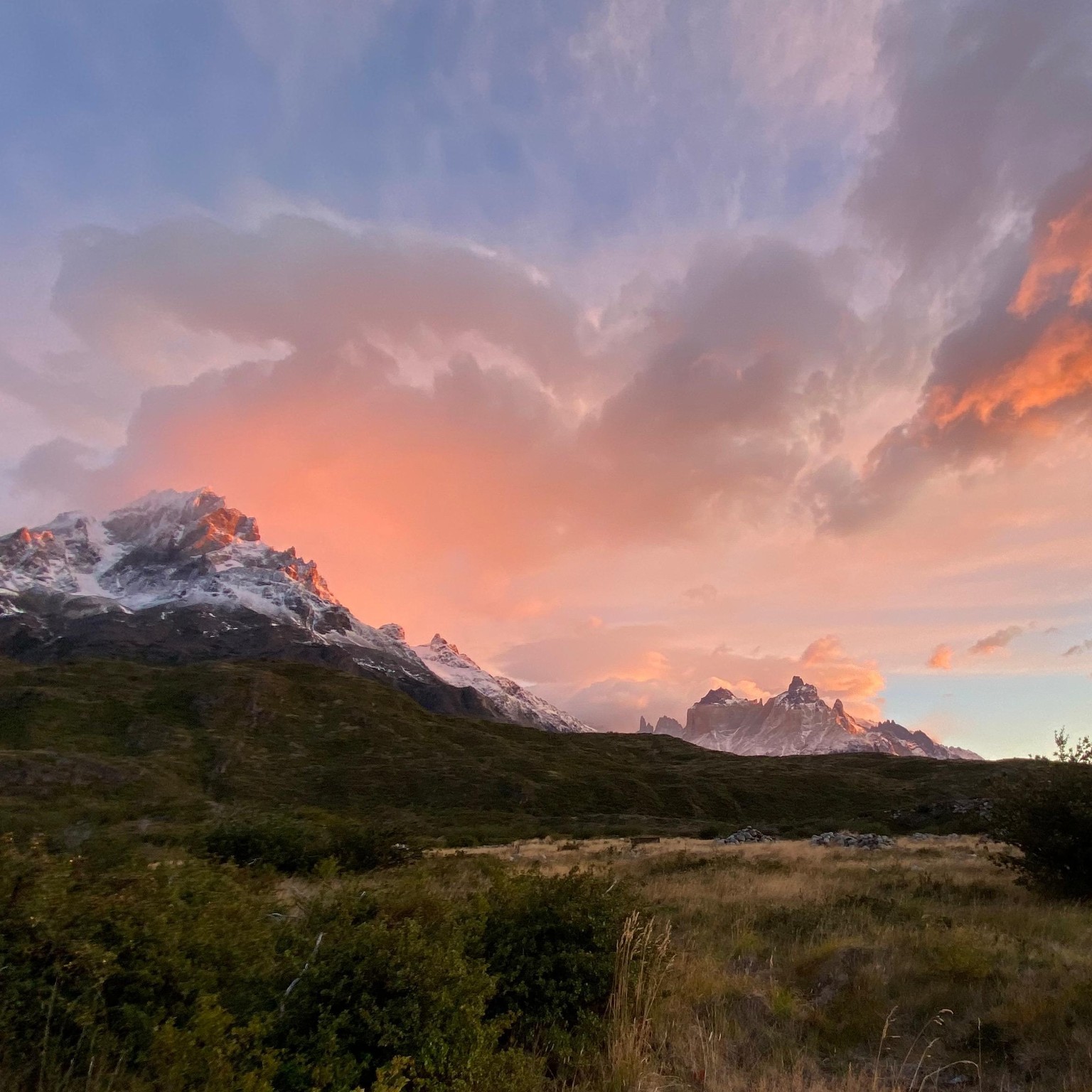
Patagonia
I hope this is okay to submit - I tried my own painting from a reference photo I took for this project, working with a bigger brush and looser style brush strokes. Would love a critique on this if it's possible! I am wondering if there's enough contrast (not too many middle values?) I've attached the reference as well.