Origin Logo
Hello! Here is my version of the Origin logo. I enjoyed the class and I would appreciate feedback, Thank you!
Below is part of my logo design process. I started by laying out the prompt and highlighting key phrases to direct my design. I then sketched some ideas before putting them in illustrator. I chose to make the O in Origin into a pictorial mark to help with scalability. 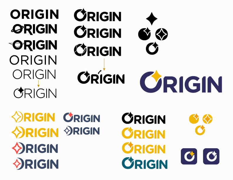
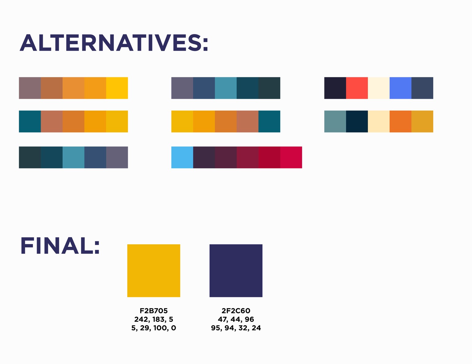
Below is my mood board, I used these images to help figure out my color palette.

I prefer to have options when it comes to colors. Here are various color palettes I made before I chose on yellow and purple.
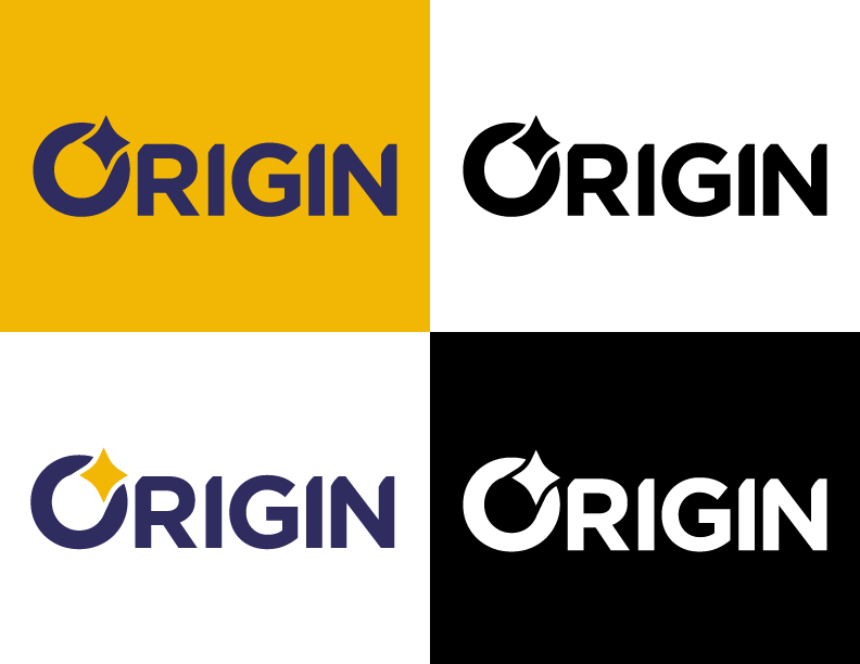
Here is the final logo. I chose a thicker sans serif font to give a more modern feeling. I also took the curve of the star and cut the corners on the letters to give a more unique and modern feeling. The typeface I used is Gotham Bold.
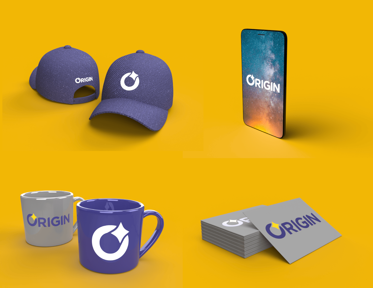
Below are a few mockups of the logo using dimension.