My Baroque Drawing Vol 1
My sketches, studies and drawings from the course.
Baroque Drawing Vol 1. Baudilio Perez.
Sharing my ups and downs and challenges along the way..
Making a start - with a sketch warm up:
It was a bit of an 'off' day all around really and my arm and pencils had different ideas of what to do - and this sketch started with the table in the wrong aspect and so all the shapes ended up slightly stretched and leaning. Sorted some of it out and moved on. Thought I would use some vertical hatching to block in the background. Feel like I've gone back to the beginning today. :-( Onwards and upwards.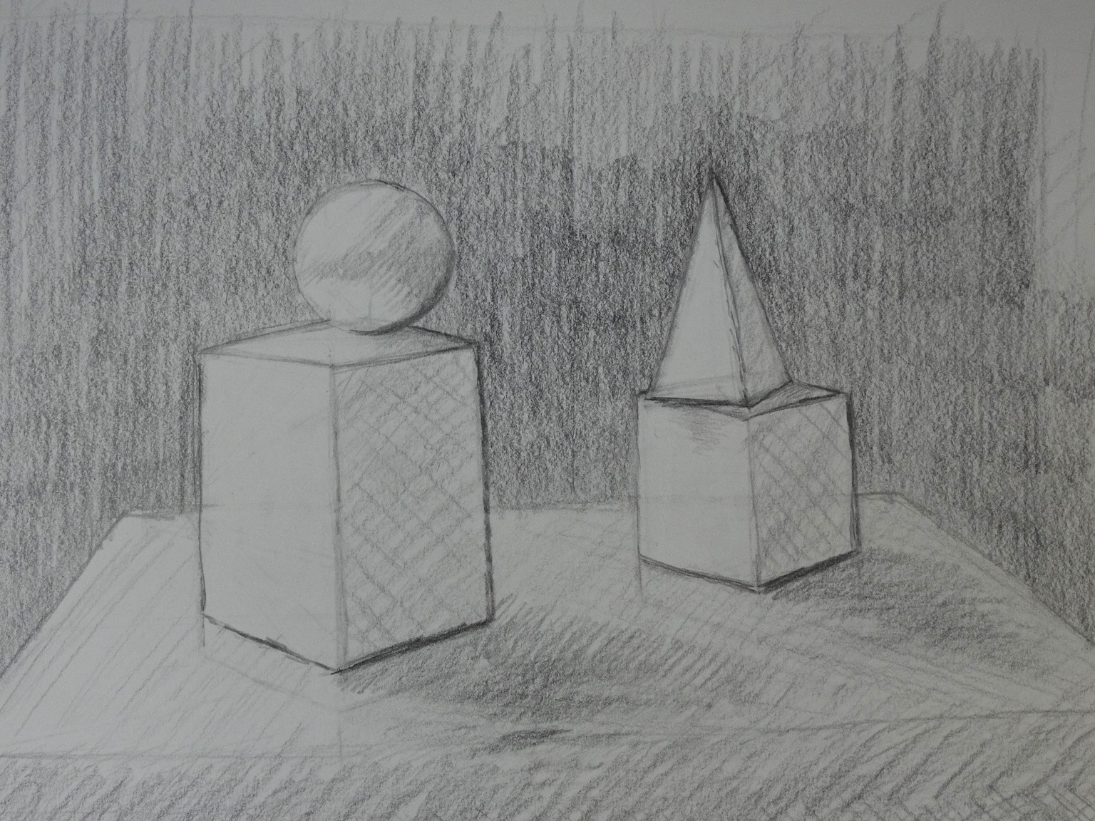
Another sketch with the bust in position. This one fared a little better I think.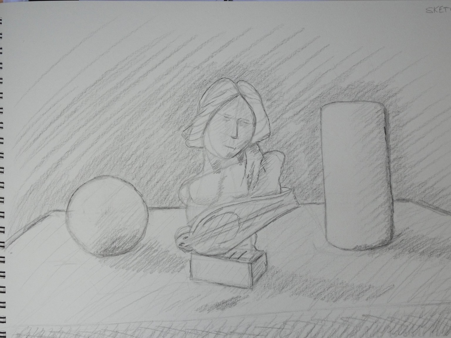
Making a start on building the bust on its own. Construction lines all over. A bit faint for the photo. I had to put the pencil in the picture as the camera needed something to focus on. A3 sketchbook.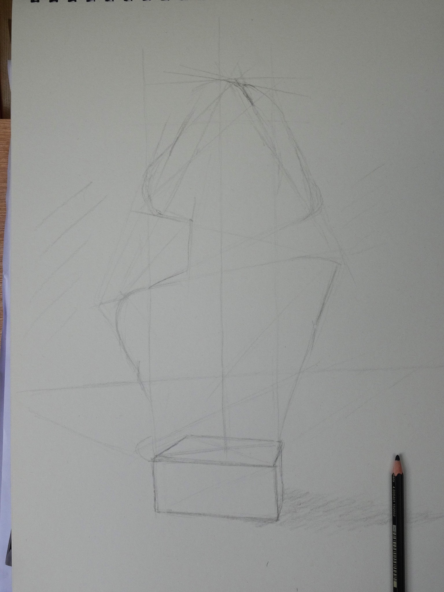
I think the relative proportions between the face and the base went a bit off somewhere here. A bit of a challenge when there are so few straight lines. :-)
I don't think I can blame the camera for that.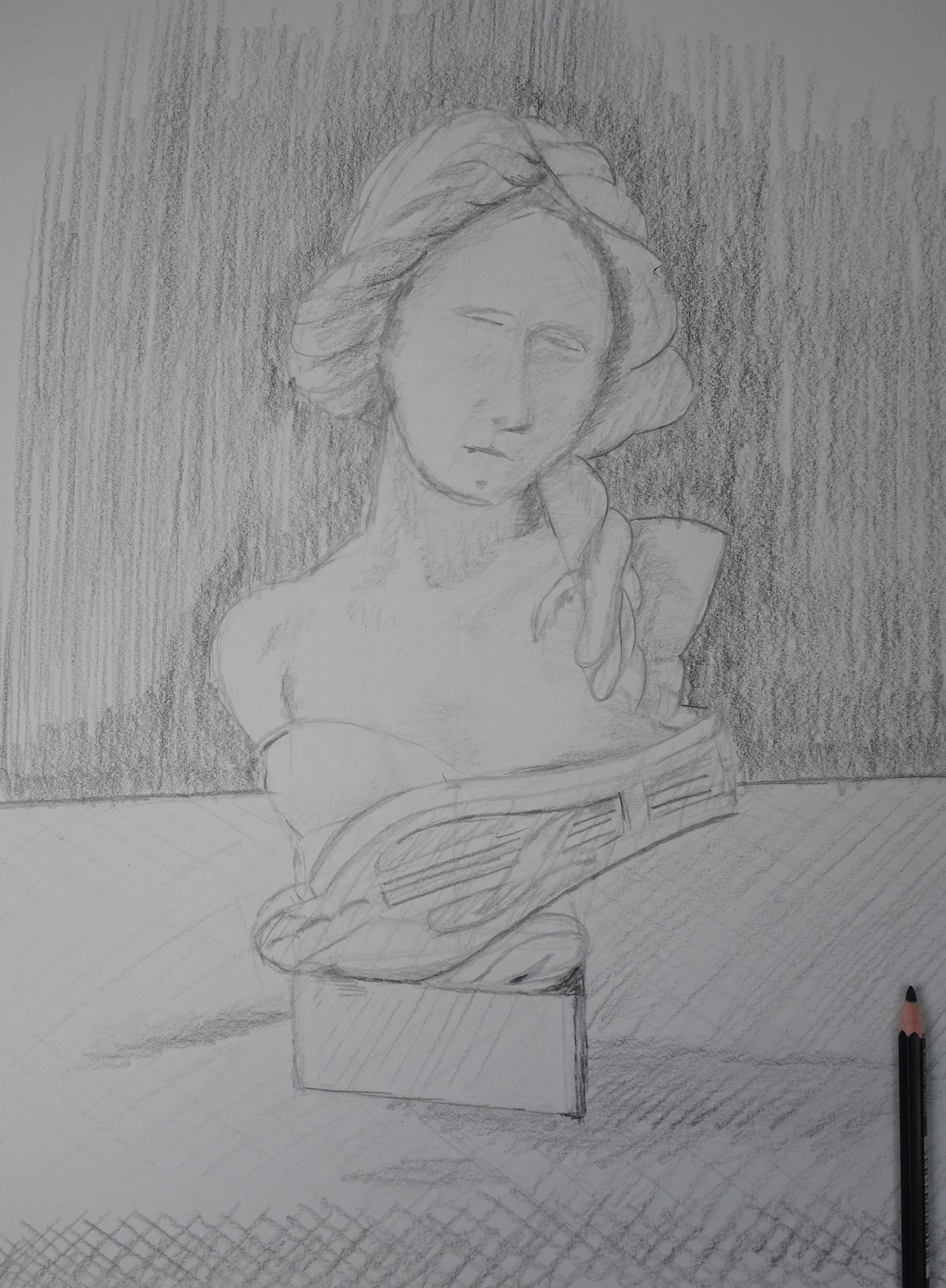
Building the Bust #2:
Having a pause before drafting the rest of the head.
There is a very prominent triangular shape on the base that I thought made a very useful initial reference point to start. I tilted my surface up more with this drawing (so the paper is more perpendicular to me) so it will hopefully not be as distorted as the previous.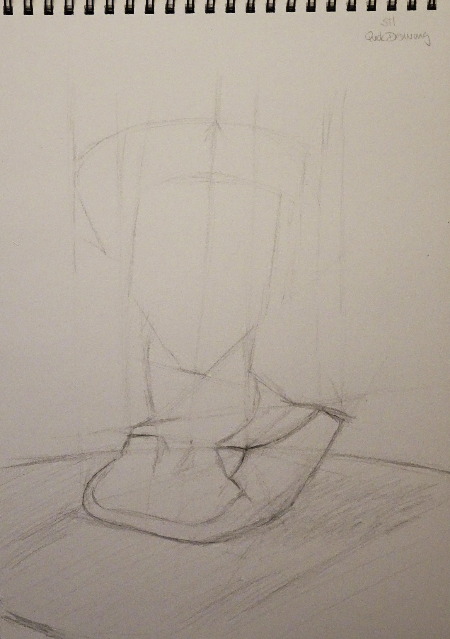
... at the end of session 11.
Bust #2 : Quick drawing. Or, no so quick in may case :-).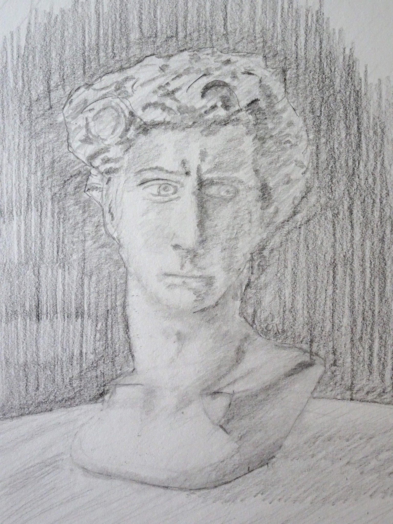
(Self) Portrait Exercise:
Finding the structure type of sketch.
I think I had better come back to this tomorrow. I have drawn the hat about 10 times, and Im still not happy with it. I think I will have to get a hat out of the wardrobe to see how it actually goes.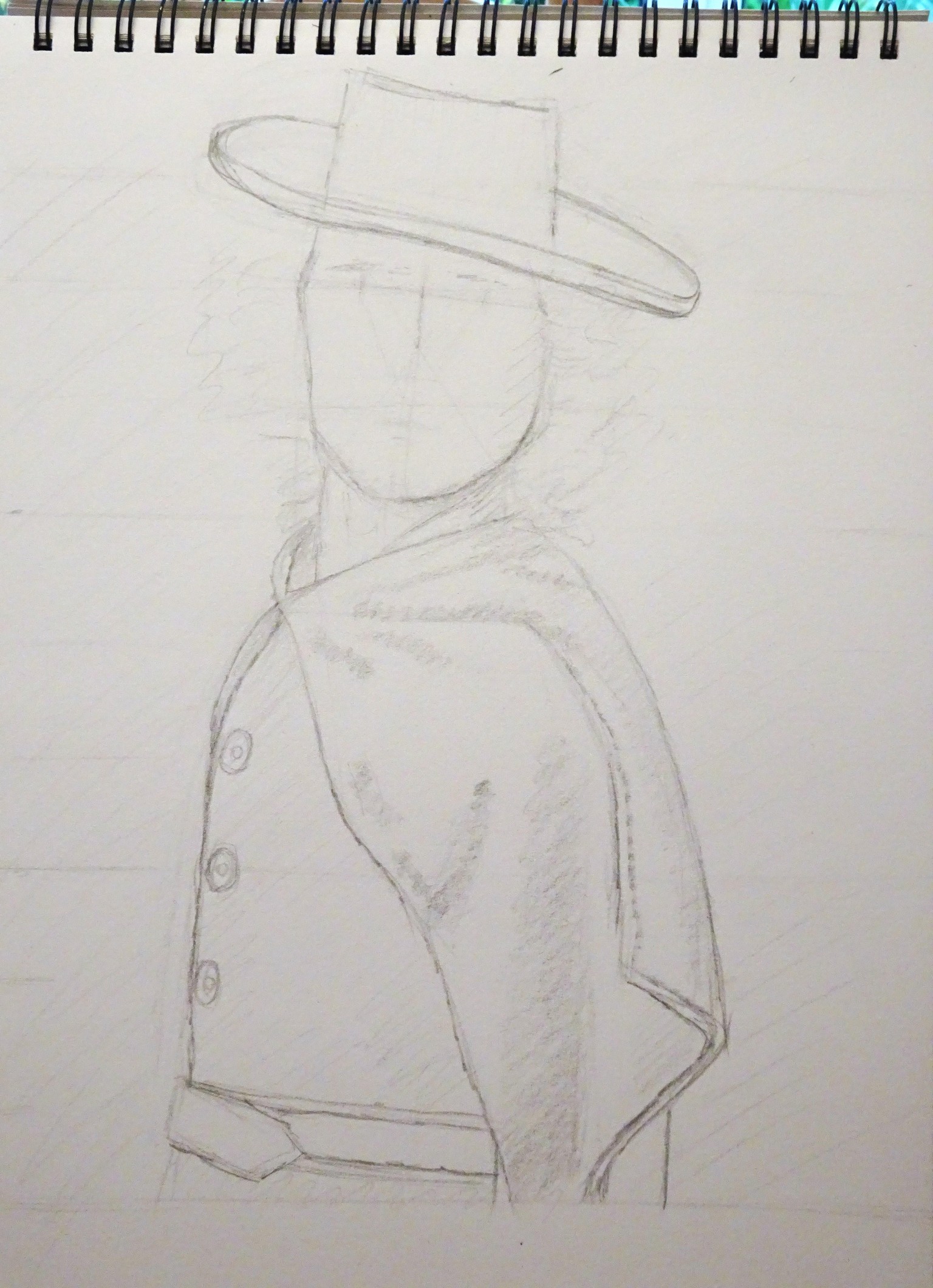
.
O watched part of the video again today and wondered if I had ben dreaming yesterday. The hat and cloak in particular.
Working on the face next - eyes and nose. Perhaps I ought to apologise now :-)
Somewhere in the middle of session 15.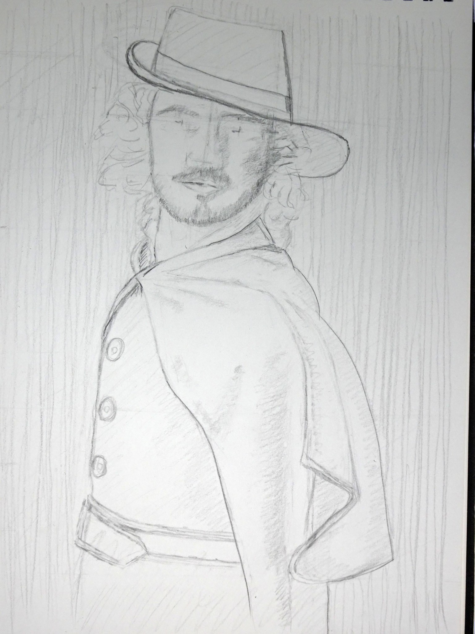
... a bit later...
Well I think the eyes and nose are in the right place. Eyes might be a bit large. I hoping its mostly values, shading and tidying up some details as I go now. I seriously need to practice the eyes, nose, mouth.
I hope its not too embarrassing so far Baudilio :-)
Ive just realised that the left side of the cloak (nearest) is pinned back over the shoulder. Hence the folds in the material. I might add a broach or pin there.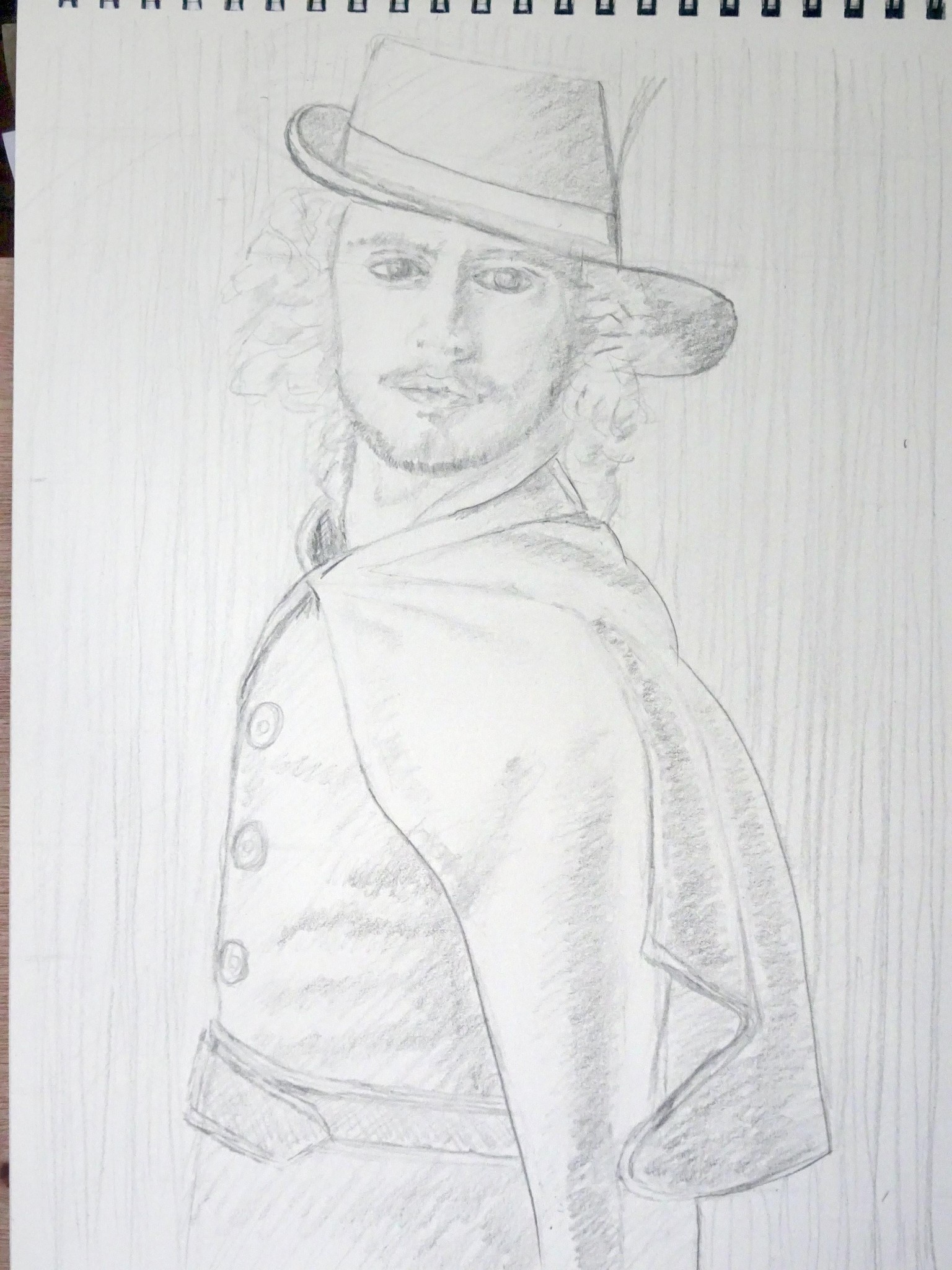
Final version of (self) portrait exercise:
Well I think that's about it for today. I have reached the point where I start to make it worse - ha ha. I hope its ok.
Ive just realised I missed out a whole section in sessions 16 and 17. I will re-watch the video now and see all the bits I could have done better or differently :-) .
I found the material folds and hat quite difficult to work out from a screen-grab of the video.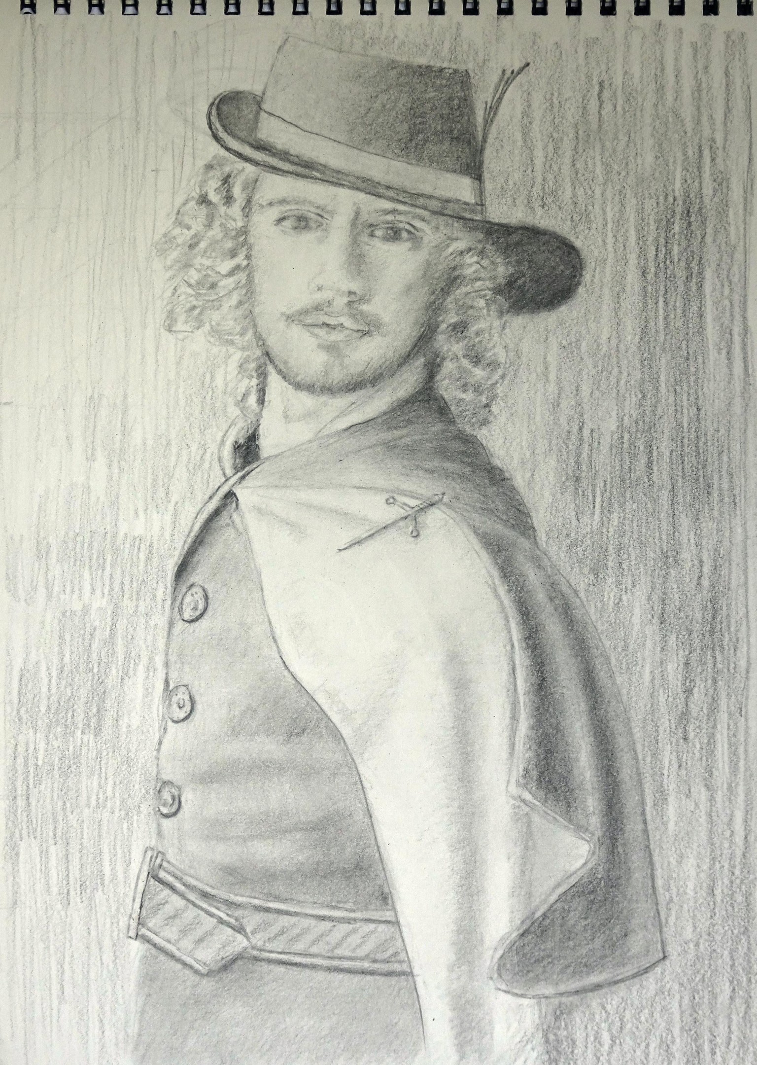
Thanks for the encouragement about the hat. :-)
I re-played sessions 16 and 17 again and made quite a few adjustments. I wasn't getting the dark values very dark even with a 14B pencil so I used a black pastel pencil to help there - much better contrast. Since I had the pastels out I thought I would experiment with the red pastel (Bruynzeel no 42) on the face. I think that worked quite well, but I had to very very light with it and it didn't like going over the to of the amount of graphite I had by this point in the shadows.
I left what I think is the inside of the cloak lighter to differentiate it from folded back outside.
Im not 100% happy with the nose, so rather than over-work on this drawing, I think I might take it separately for a study.
I wasn't sure about some of the outlining on the shadow side after working on that for a while and so I think this might be it. Quite a challenge.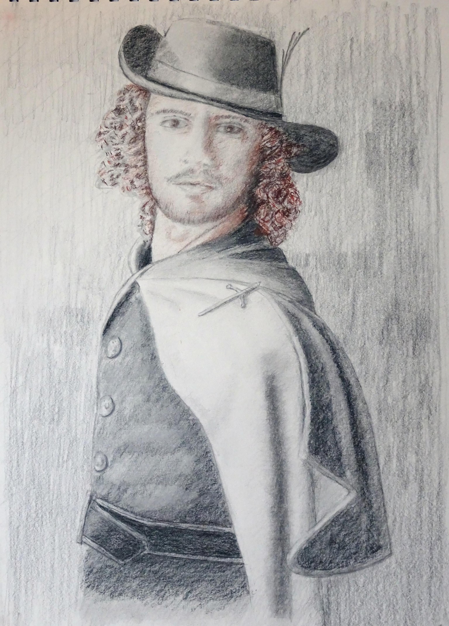
A drawing of Dorothea next I guess.
I'm wondering whether to change pencils and paper for that, or whether to include to red this time. Or, even go off-script into colour... mmmh.
Question:
Session 26, the chair & paper exercise seems a bit out of sequence coming at the end?
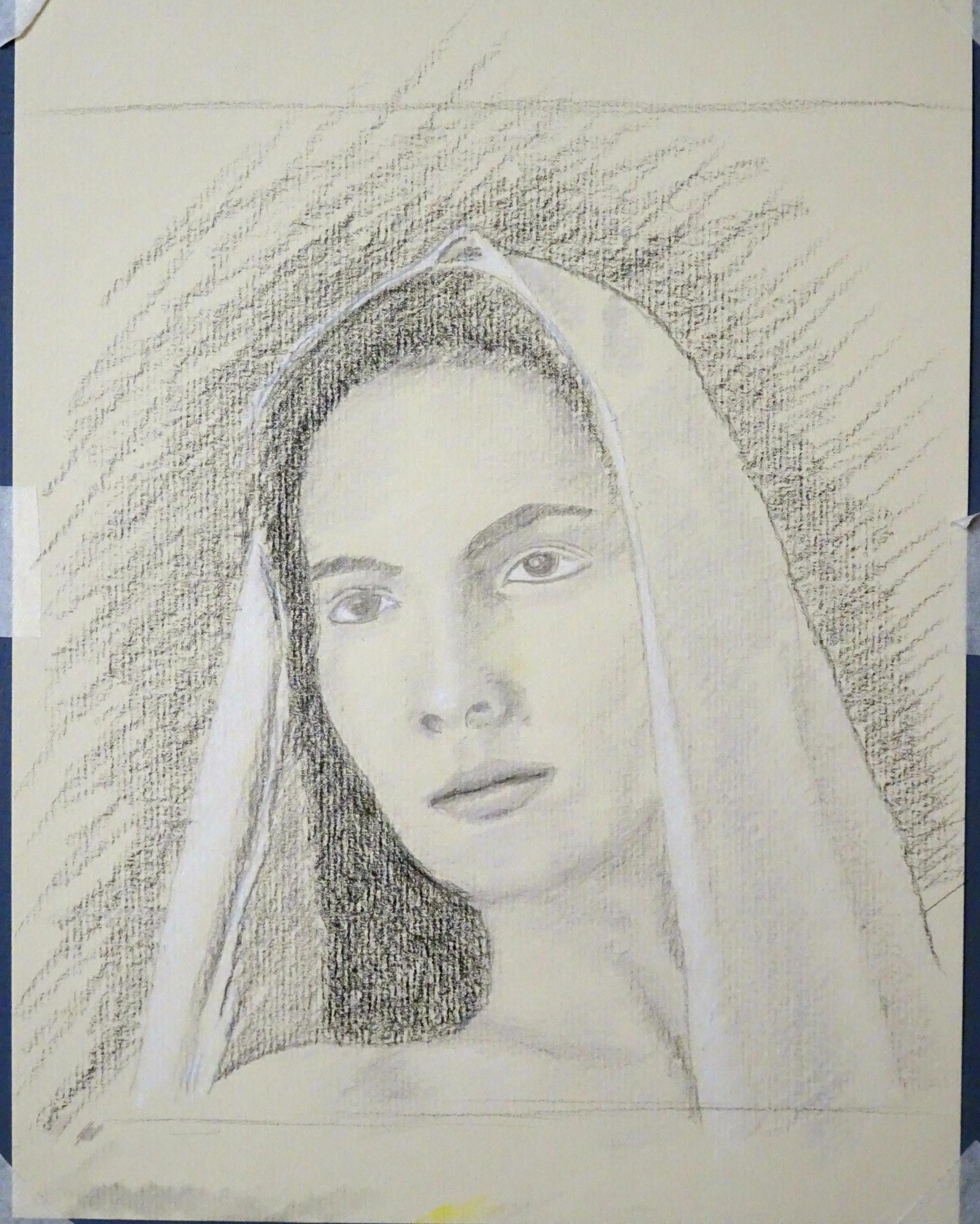
Quick Drawing Dorothea
I went back to session 11 about sketching and drawing today before returning to session 19.
I'm not sure what sort of story I am telling here, but a castle (Herstmonceau Castle - my photo), tree canopy and some water with some flowers (Clematis) seemed appropriate for the Baroque theme - although I realise this was outside the lesson.
I feel a bit happier with the range of values this time. I tried to simplify things by limiting myself to 6 grey colour pencils + black. The paper is pale cartridge paper. I found the face features a bit less time consuming this time. I also felt a lot happier about building up from the geometry. Some of the shadows are a bit angular, but that helped me find my way around. I would like to separate the hair from the shadow in the veil next time.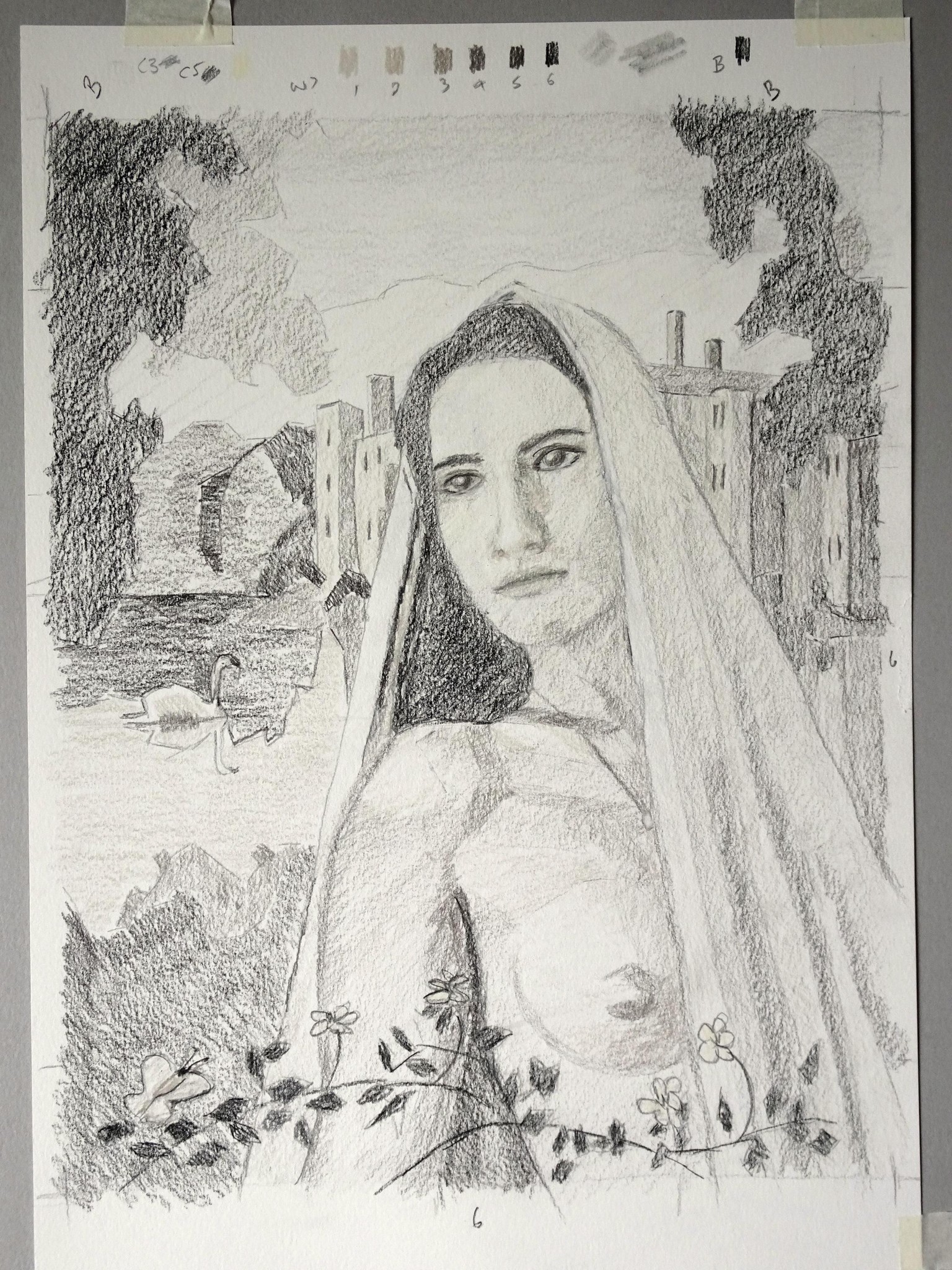
.
A better drawing - study of face features.
The face in the 'quick drawing' looked a bit rough and so I thought I would spend some time working on the shading and values on the face.
Wow - the slightest change in value or position and the whole face seems to change - very sensitive to adjustments. The eyes need a bit more work on this and I really am going to need to practice drawing noses :-/.
The toned paper works quite well.
.
currently doing some of the earlier lesson exercises on facial features, before continuing with this picture..
A slight diversion into earlier sessions to practice freehand drawing face features and body parts. I found noses the hardest: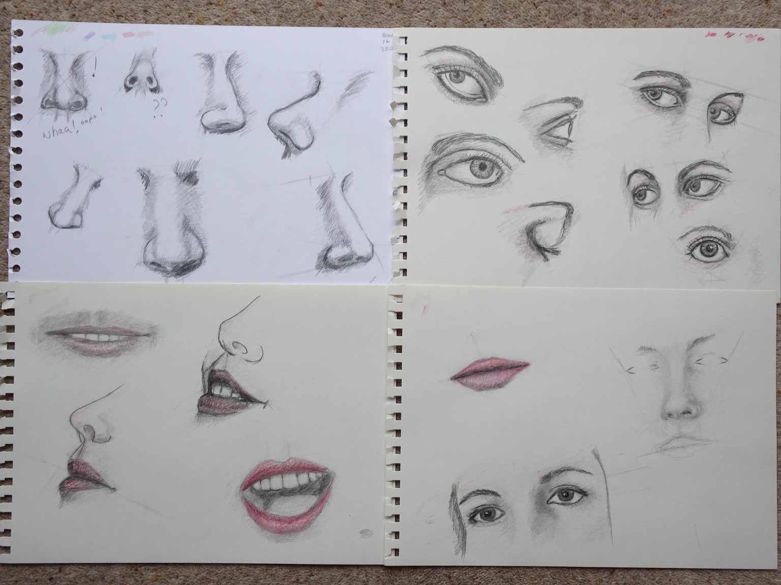
An update to the Dorothea face drawing on coloured paper. Mainly sharpening up some of the values and finishing the eyes. The differences dont show as much with the photo.
A bit more contouring shading would probably help. Some tweaking of the perspective might help too.
Funny how things seem to become more noticeable on the photo than the actual drawing - not sure why that is.
I think I wish to get on with the bigger drawing now.
Mmh - wondering if this might result in a mashup between Impressionism and Baroque - which might be interesting.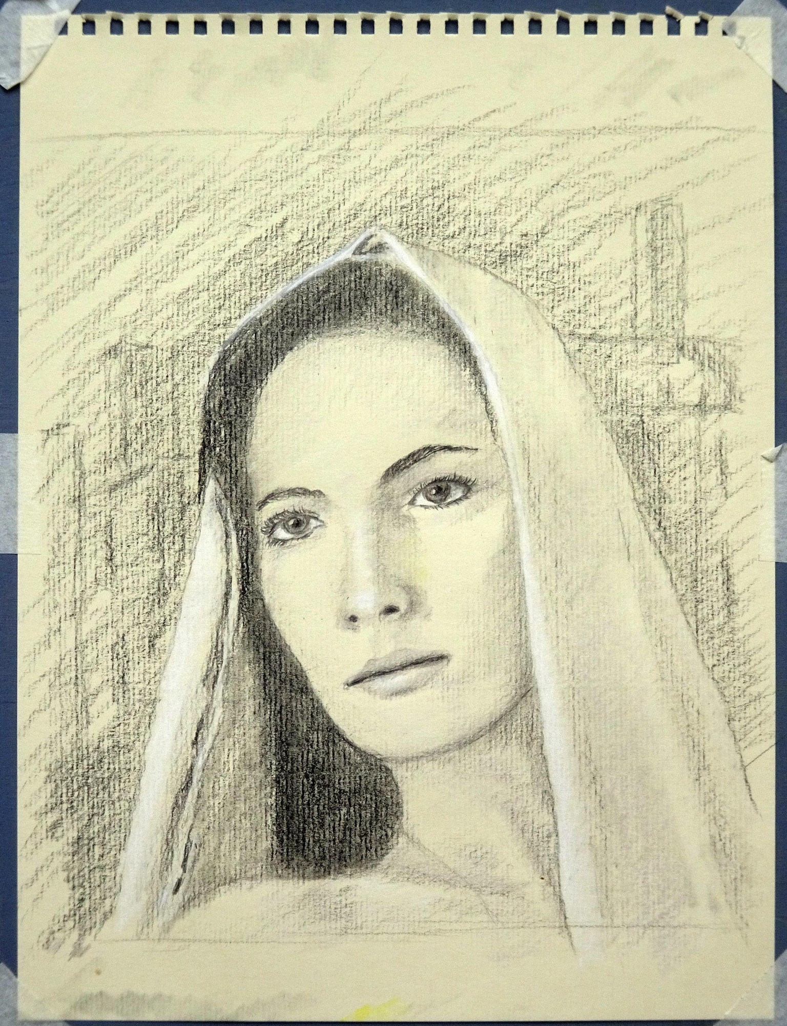
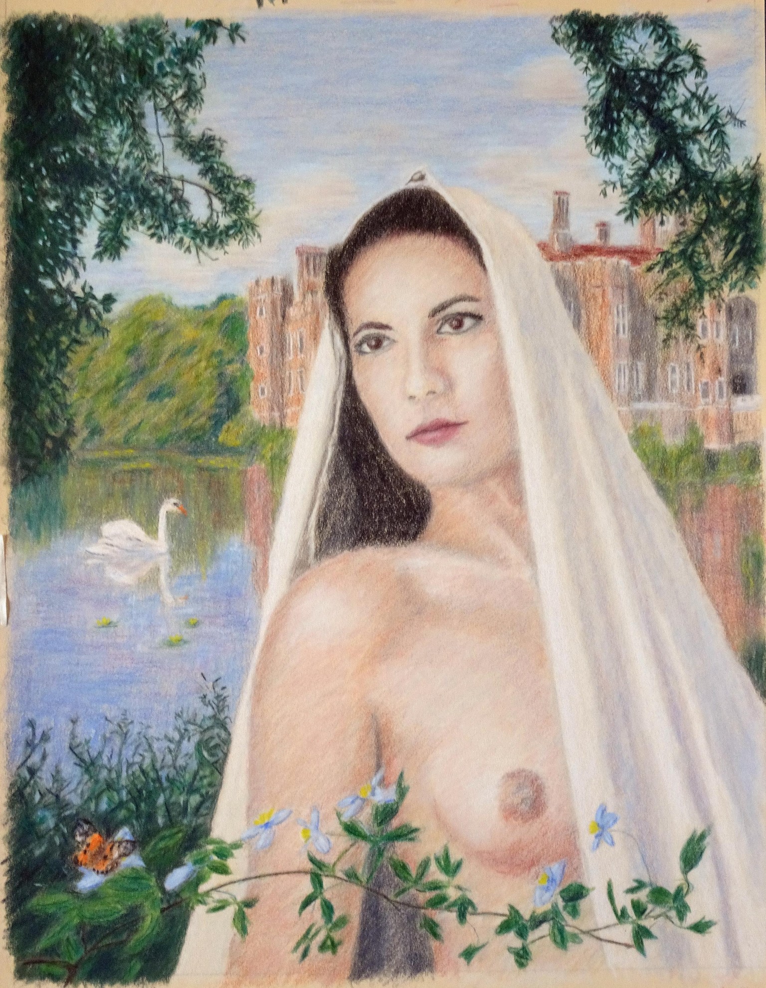
Well, this was a challenge. I wanted to pull in some background topics from some of Baudilio's other courses. The composite picture incudes some vegetation, a castle, still water, treess, and the course subject model, Dorothea.
There was an under-drawing in grey and the colour was then drawn on the top.
I hope it fits the Baroque theme a bit if not strictly adhering to the examples. As usual I learned a huge amount attempting a portrait and also a picture of this complexity. (I like a challenge).
A3 drawing on maize coloured pastelmat.
I'm sure there's plenty that Ive missed - so Ill watch session 25 again :-)
.
I came back to the previous picture after a week (now deleted so I could add some more text). I found that even quite subtle changes seemed to make a huge difference and had to work very slowly and methodically, checking after each slight adjustment:
- Darkened the background and added a very subtle blue tint so the figure was not lost in the castle (castle and face were very similar value before).
- slightly abstracted the background.
- tidied up the hair-line
- a bit more contouring on the face
- darkened the foreground vegetation
- tidied up eyes, nose and mouth
I noticed that there is a lot more contrast in the figure in the example. I didnt add too much more contrast to the figure here as I thought the background I added had enough contrast and I wanted to keep some separation/difference between the figure and background.
The pigment is now falling off the paper as I add anything more - so I guess thats about as much as I can do.
..
.
I think I would like need to do some more figure/face drawing practice - off-line - before tackling 2 and 3....?