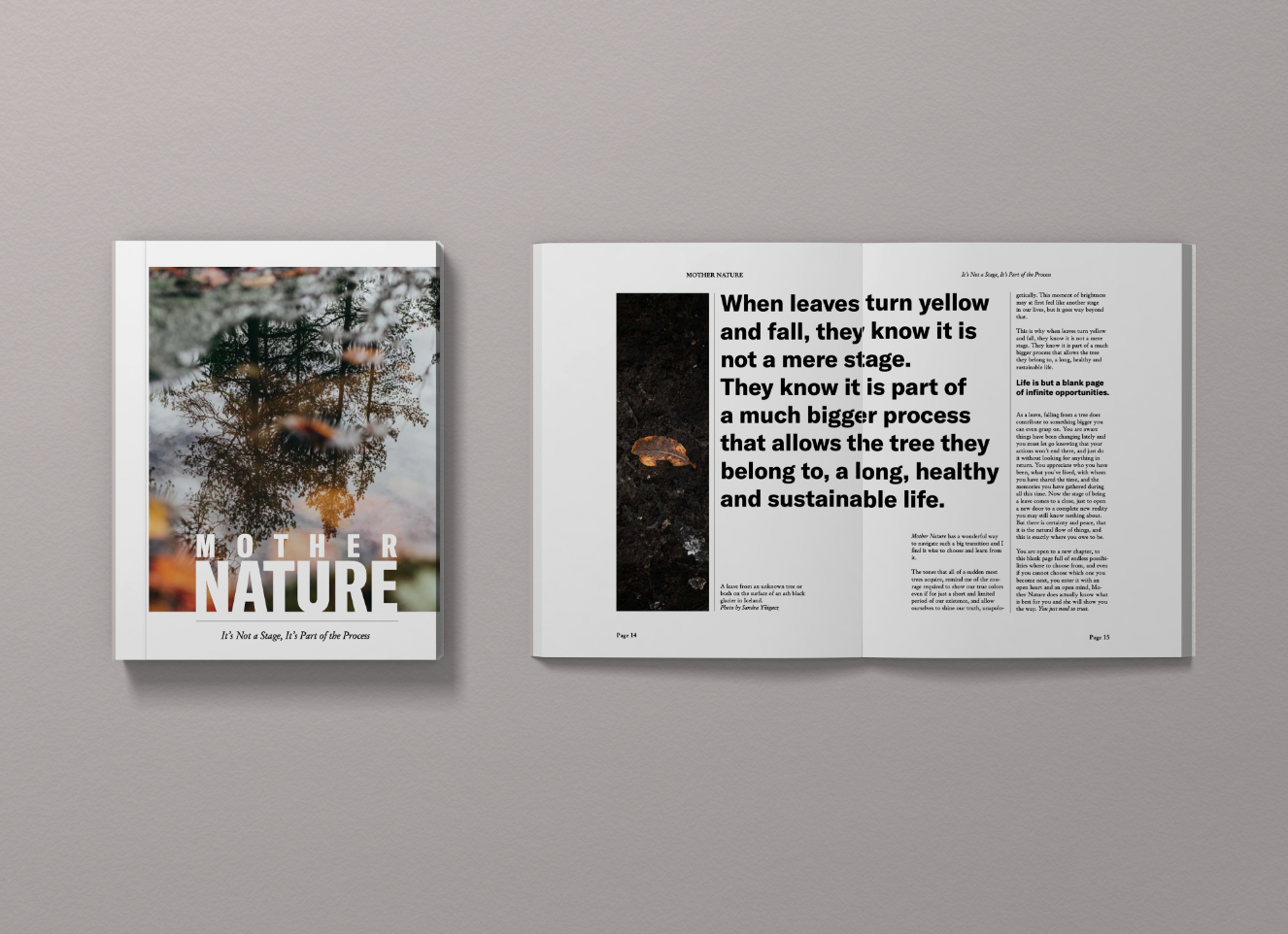
Mother Nature Magazine
This short yet jam-packed course of editing has open up a new way of approaching editorial design which up until now all I did was dread it.
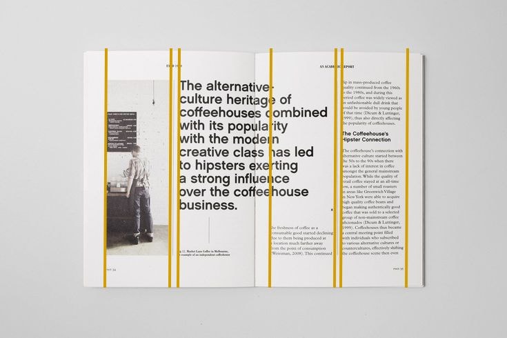
I chose the following layout as the one I wanted to mimic. I loved the amount of white / negative spaces and the sort of minimal yet bold aesthetic.
Despite not having much of an idea, I just drew a few lines where I sort of saw them and supposed they work just with a two column layout. And that's what I went for as well.
Even though I use Pinterest quite often for all my projects, I didn't create a mood board this time and instead used a mix of albums and my own content (written and photo). Though I can imagine making one in the near future for another project, I didn't find it necessary in this occasion.
The topic of choice couldn't be any other than Mother Nature and I just wrote the text myself as well. It might not be the best piece I've ever written, but it does the job.
I have had quite some fun with this project even though I am just a beginner and am looking forward to keep improving my skills, but yet again, this approach has happened to be the best for me. Thank you Steph so much for sharing your knowledge and experience with us. I cannot wait to keep playing around with InDesign, layouts and hopefully start my own project.
And this is the mockup result! (: