Monte Carlo simulation using R data visualizations
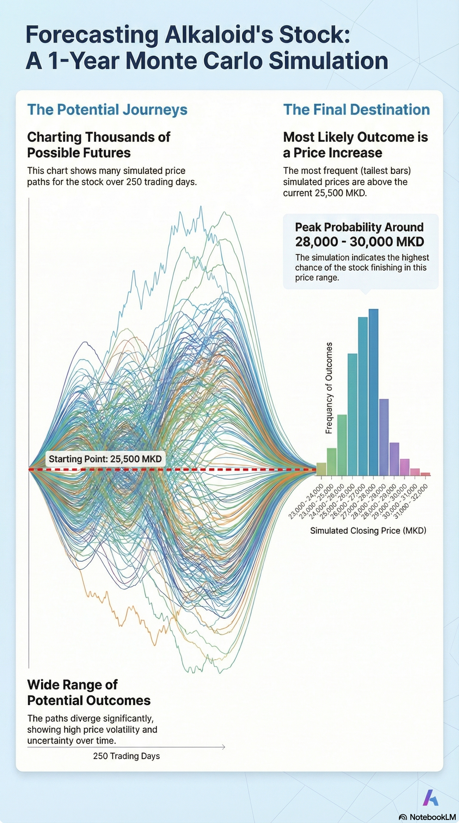
This project utilizes two distinct types of data visualizations to communicate the results of the Monte Carlo simulation:• Frequency Distribution (Histogram): Figure 1 uses a histogram to show the distribution of 1-year price outcomes. It visually demonstrates the "log-normal" shape of the data, highlighting that the majority of simulated results finish above the current price, creating a right-skewed tail that represents potential upside.• Time-Series Trajectories (Price Paths): Figure 2 displays a "spaghetti plot" of individual simulated price paths over 250 trading days. This visualization illustrates the day-to-day volatility and the diverging range of possibilities for the stock over time