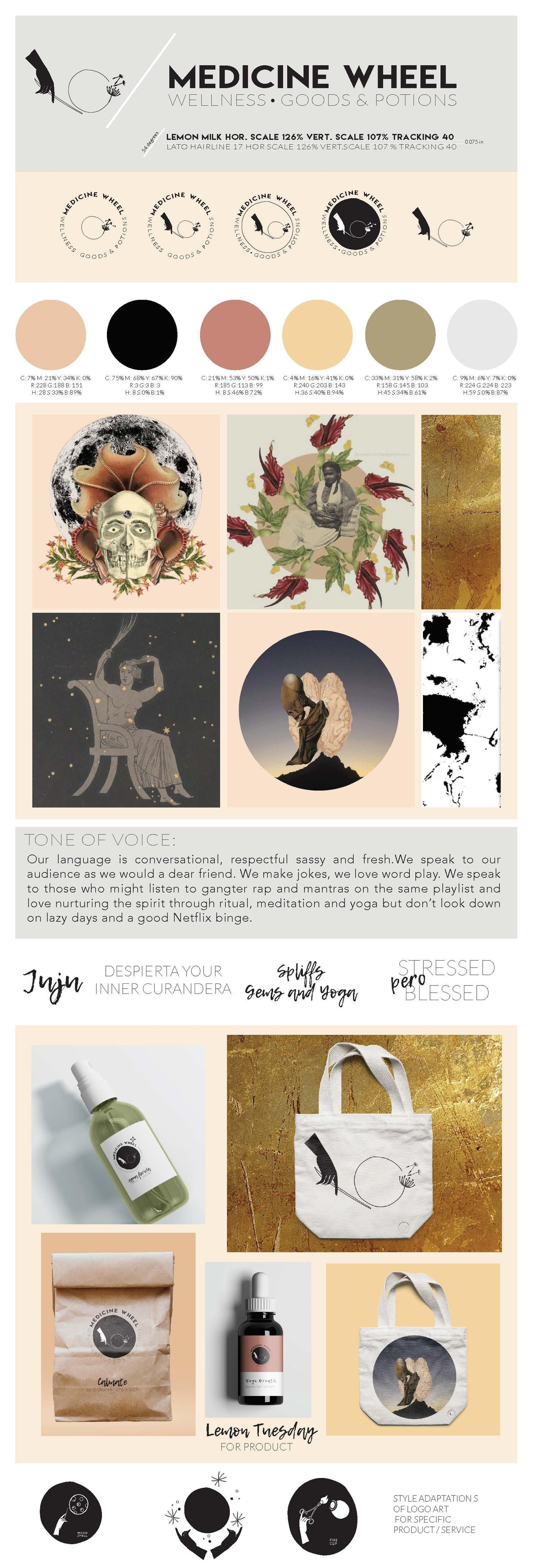
Medicine Wheel Wellness , Goods and Potions
I realize there are too many things that excite me. Too many to have a cohesive voice for social media ( nothing bad about being multifaceted in real life, people) I decided to rebrand my business in a professional way because playful sarcastic me, contemporary bruja me, and collage artist me, might be confusing to ritual crafter, nomadic curandera me ... in the eyes of instagram.
So I took this class to marry a bit of all of me in a cohesive way, chose a color scheme and hope to stick to it ... dug deep down and gathered a style that is as much ME as I can possibly hold static, thanks to this class. I decided to create a 1 long page document 8.5"x 25" rather than a booklet.
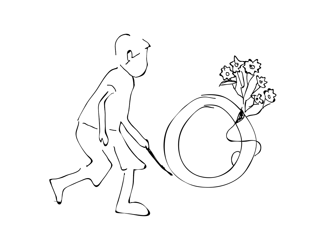
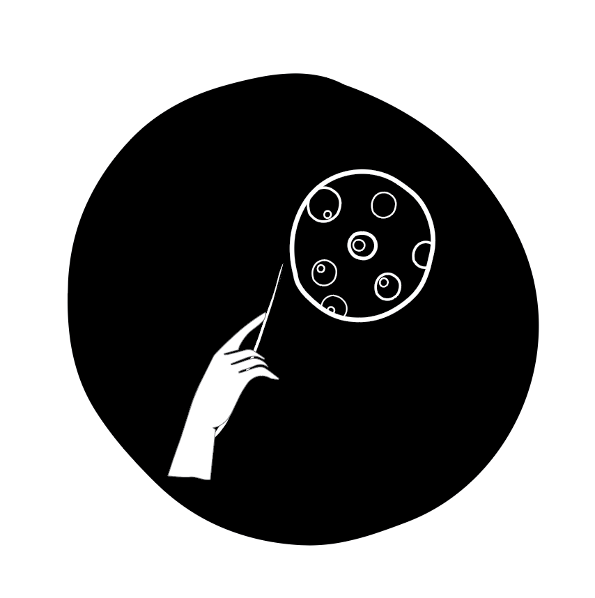
I was inspired by the wheel , the circle , the sacred hoop in native american culture, and most essentially, the wheel and stick game kids used to play, and still play in small towns and countryside. I cannot draw AT ALL .. so i vagely traced a pictured on lined paper on my screen and began to visually subtract as much as I could from the image to get down to the essentials ... which I didn't have clear at the time.
I wanted a human, a stick, a plant medicine ( originally tobacco blossom), something that alluded to migration, and a circle or wheel.
After 2 hours or so the original idea became more clear for the main logo with a hand, a stick ( which can also be a magic wand), the wheel, and a dandelion which is both a migrating plant and a natural herbal medicine.
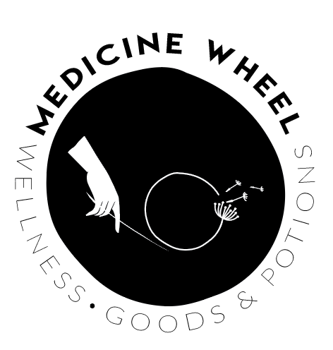
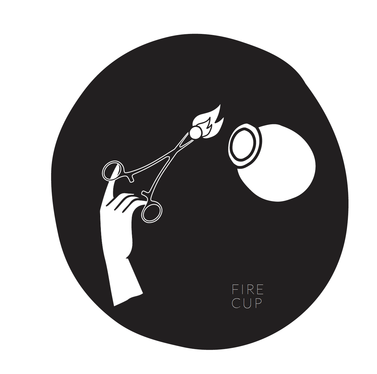
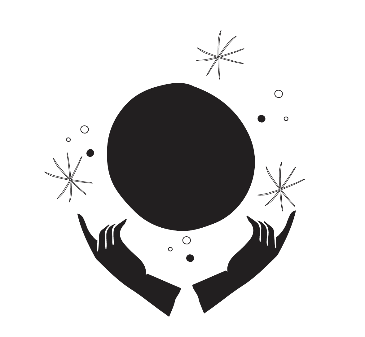
This logo has a few variation and quickly inspired more visual representations for 2 other services/ products
I look forward to apply my branding guide soon when I restart my instagram account (@medicinewheelapothecary) from scratch and integrate the new digs to the website (www.suomfrancis.org)