Logo Research
Exploring logos of various styles.
1) Circular, Badge or Seal Logos (Emblems)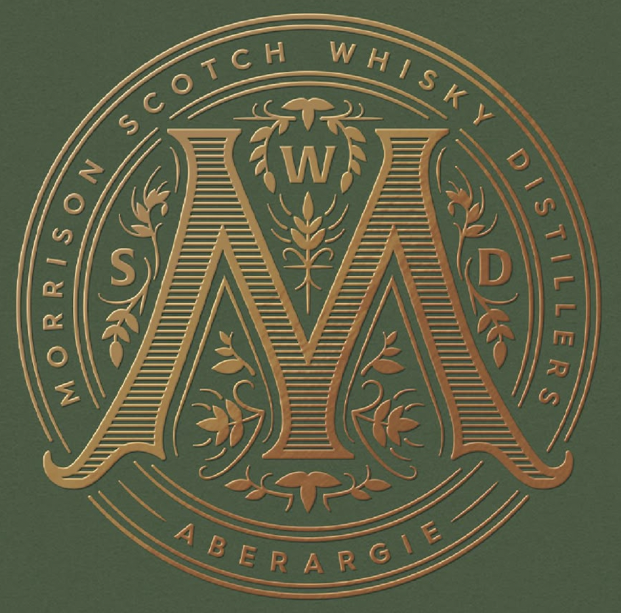
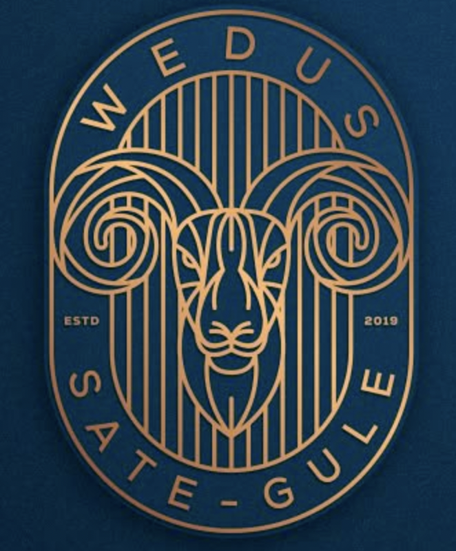
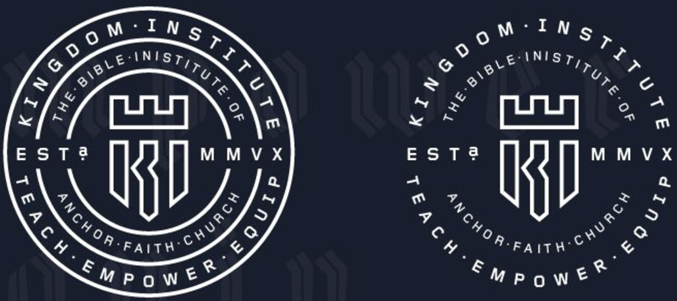
I chose these logos due to how efficient they are at meeting traditional principle with modern aesthetic. Each one can be scaled down by isolating the icon within each emblem and still be recognizable.
2)Type Only or Logotype Logo (Wordmarks)
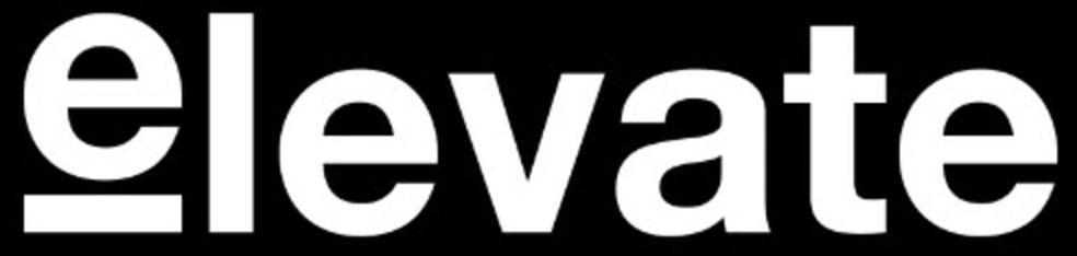
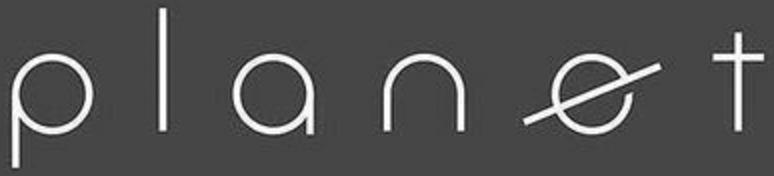
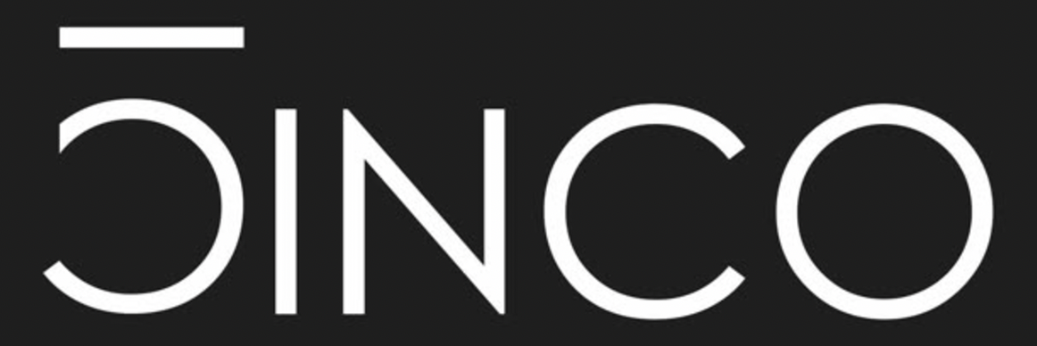
I found these wordmarks intriguing due to their simplicity, balance, and their innovative methods of bringing attention to their meanings. The "planet" wordmark is my favorite.
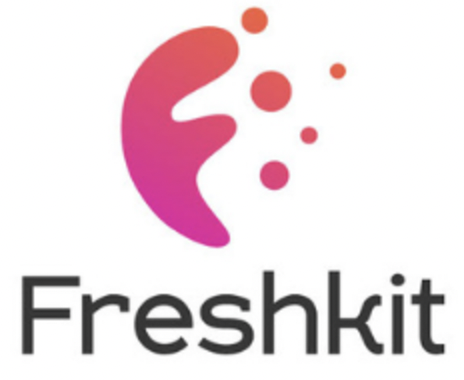
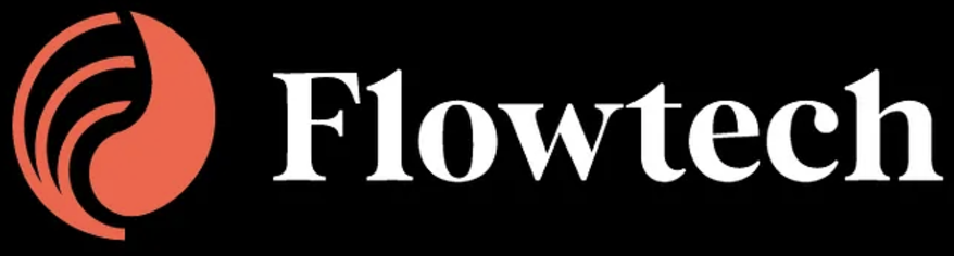
3) A Combination Mark (Both symbol and type)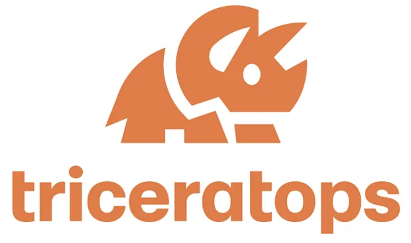

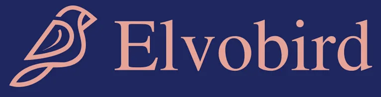
I thought that each of these logos presented unity, proper balance, color, and spacing. They aren't overly complicated and their icons sync perfectly with their names.
4) Abstract Logo
I felt that these logos, although maybe not the best representations, were all questionable enough to be considered "abstract". Unlike the last set of logos, these icons leave a bit more to the imagination. I don't like the tech nodes on the "Trading" logo. It feels completely unnecessary and throws off the balance by cluttering that area of the icon which is already where the eye is led.
5) Mascot Logo 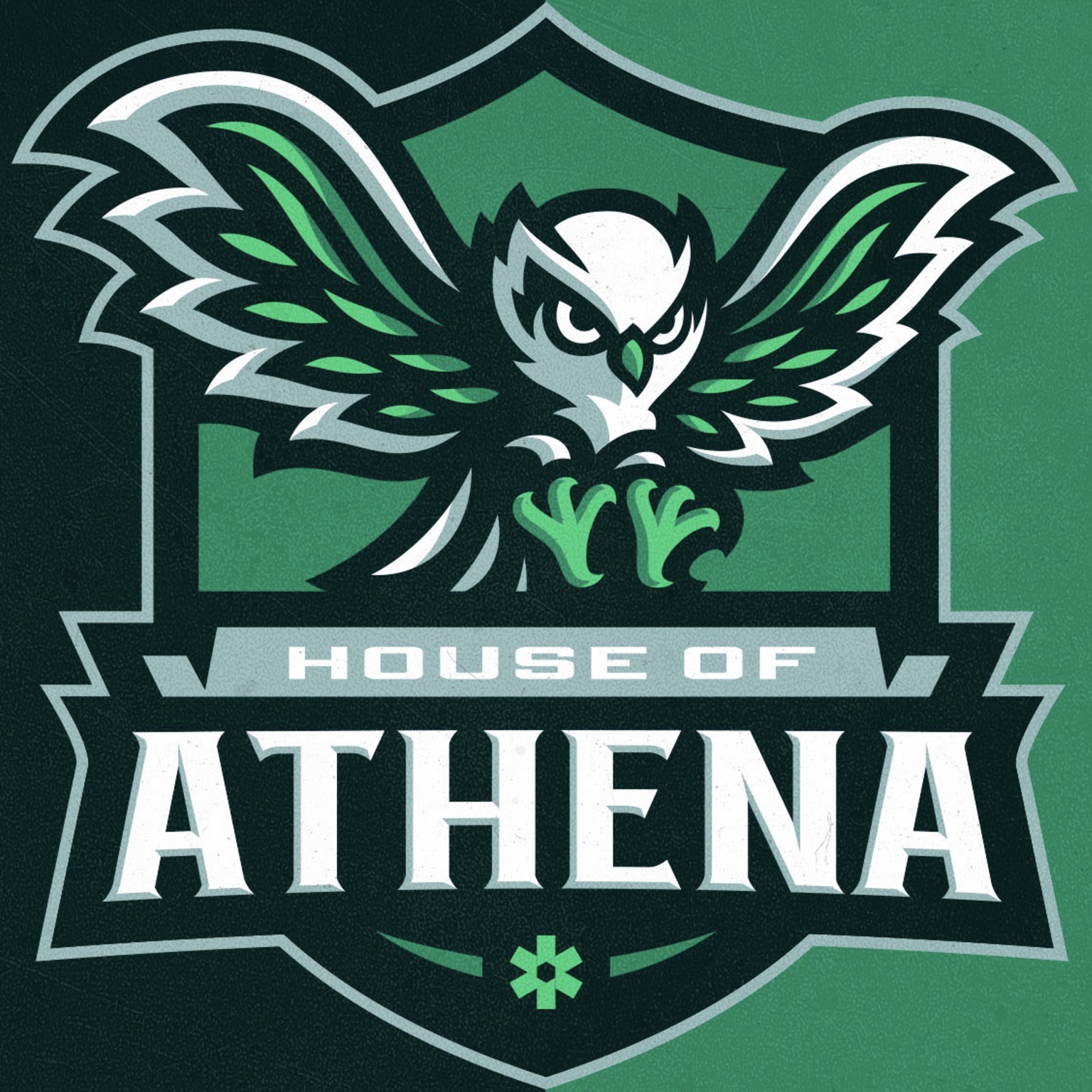
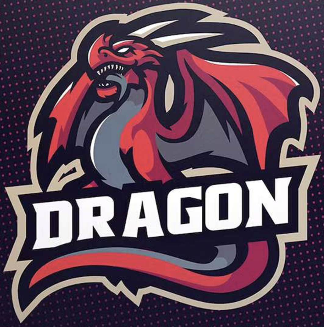
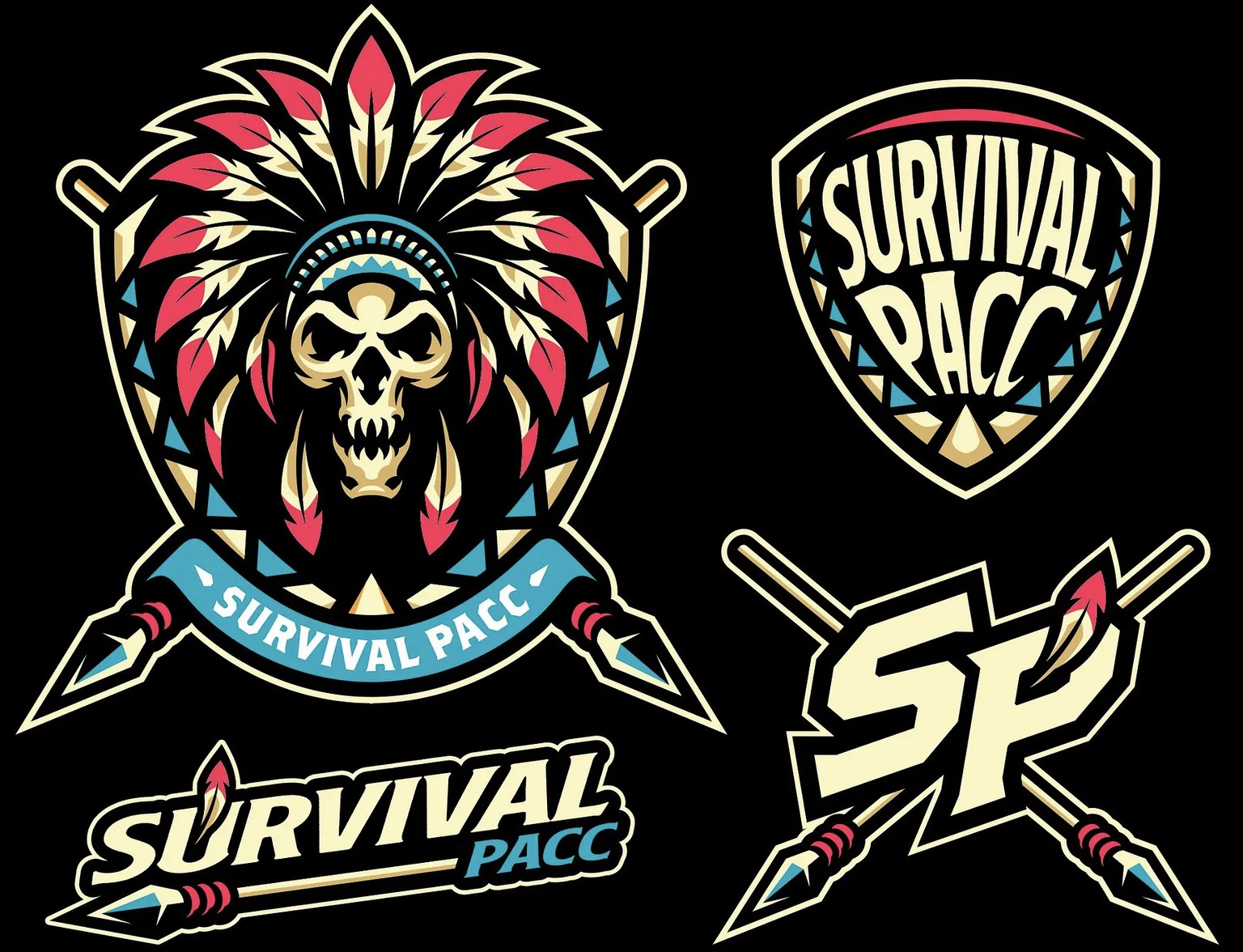
I have personally never designed a mascot logo, but they look fun. Each one of these logos is tremendously versatile, offering multiple aspects of themselves as potential logo variations that provide strong brand recognition even when separated from the whole.
6) Monogram Logo
 These logos are each iconic in their own rights. Immediately recognizable to everyone, simple, and well balanced with color and shape.