Limited palette illustration
Thank you Tom for this fun and enriching class! I love my limited palette.
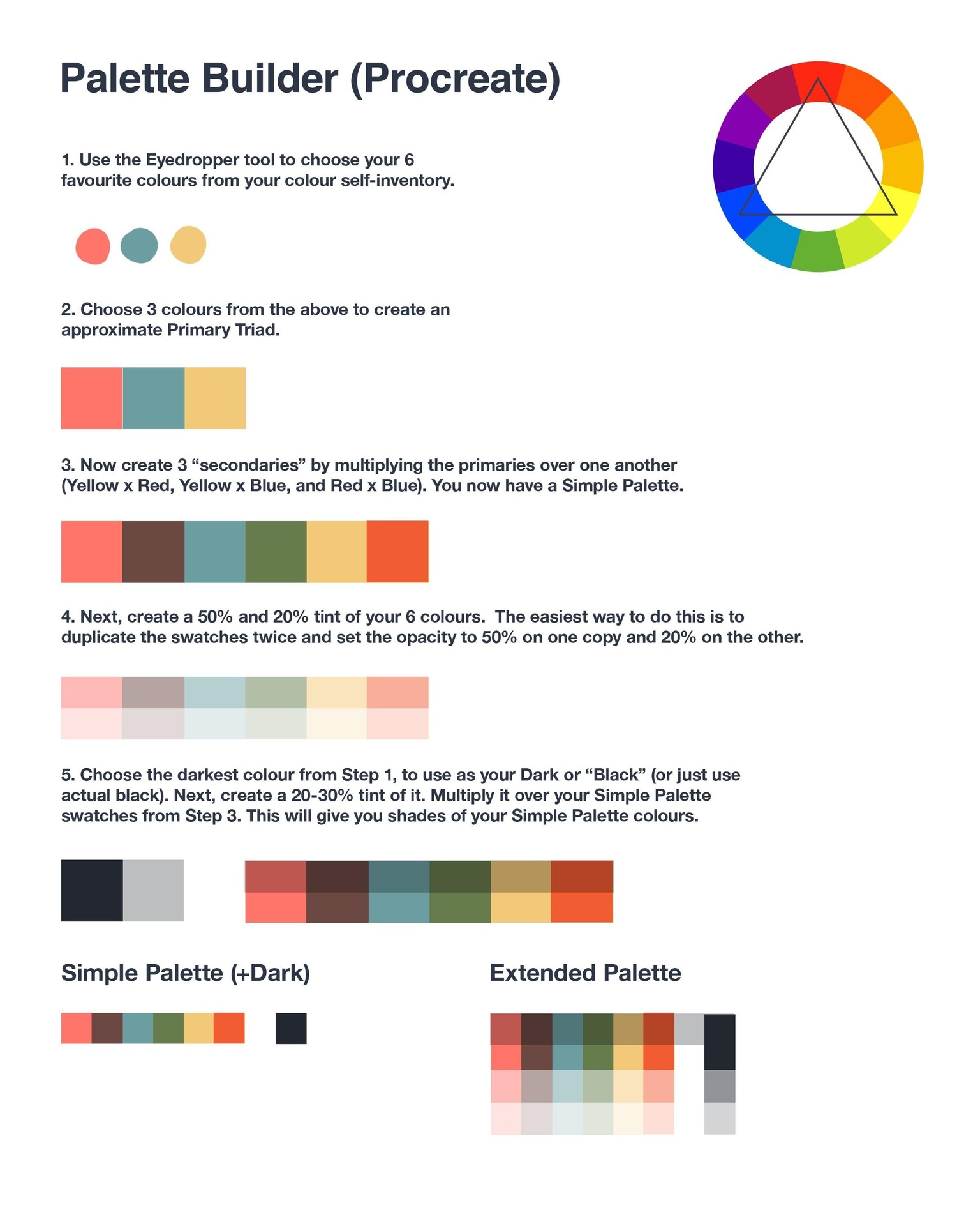
My palette is based off of a salmon pink, a light golden yellow, and a teal.
 PROJECT - PART 1
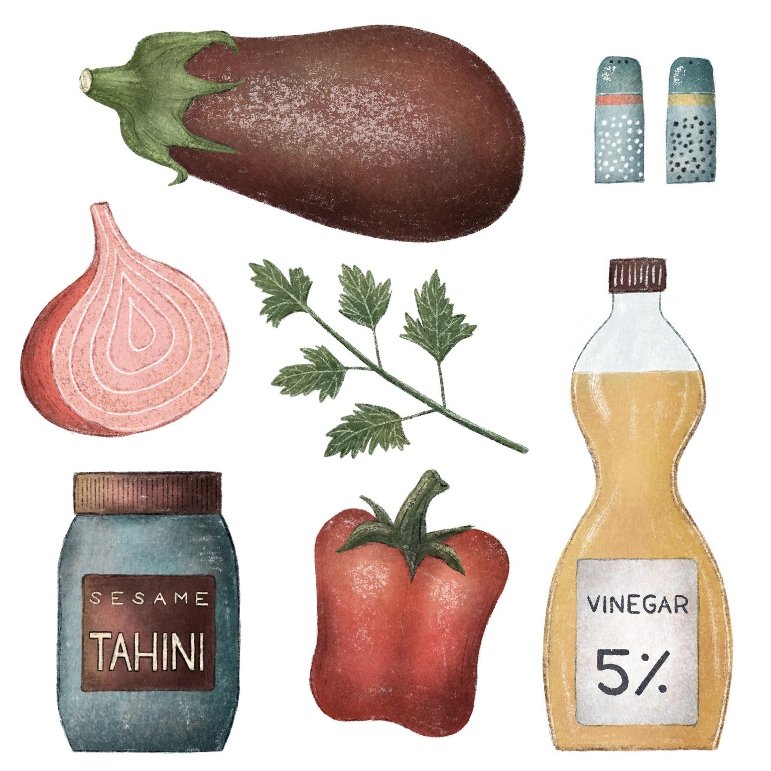
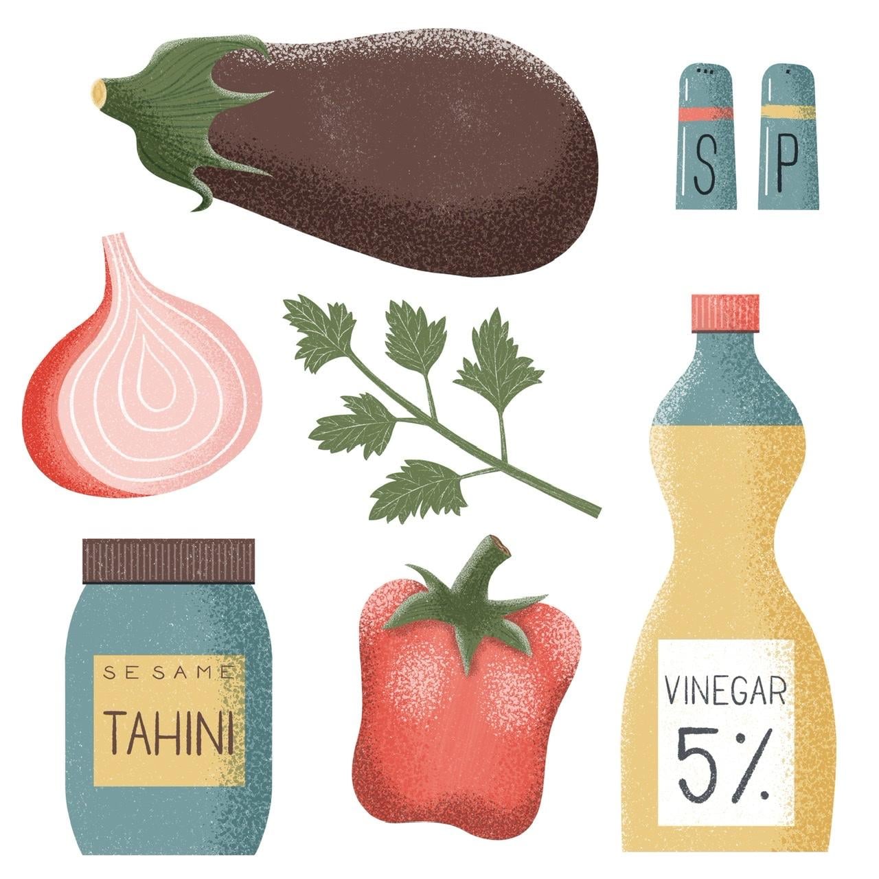
For the flat spread, I chose to illustrate the ingredients of an eggplant salad I often make.
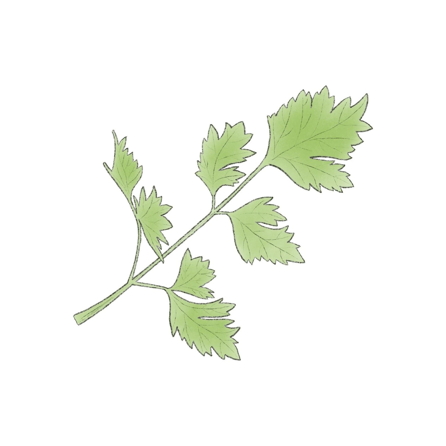
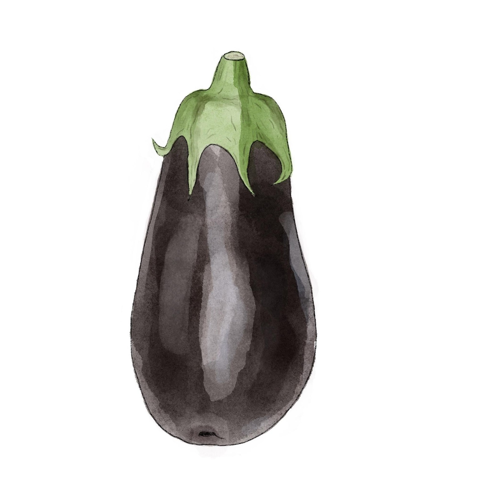
First I drew study sketches of parsley and eggplant:
 And here’s the full spread. It might not seem based off of a limited palette, and I did move the shades/tints around a bit, but I didn’t move the hues. I love how I didn’t have to wing it to choose a green, a yellow, a blue, a brown, a dark blue. It made the work faster and more decisive. And it was rarely limiting in any way.
I don’t think I ever used the orange though! My least favorite colors are orange and purple. I could probably remove the orange from the palette.
Here’s another flatter version. It was just as easy to work with my limited palette.
PROJECT - PART 2
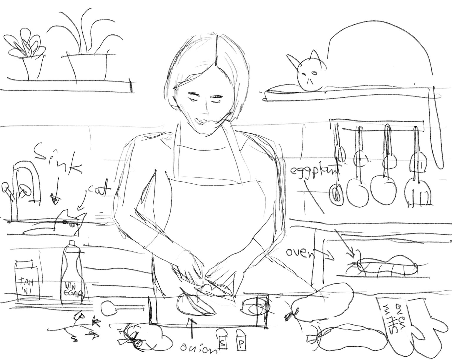
First Rough Sketch
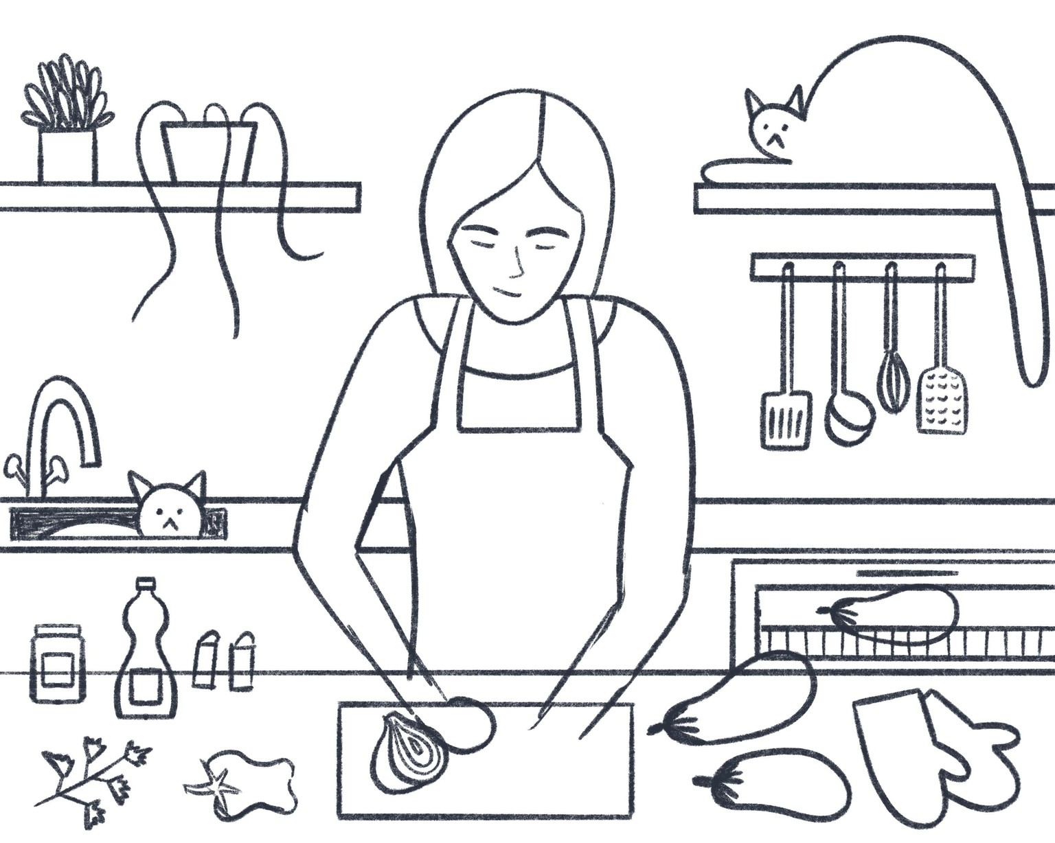
Second Iteration
I went back to O-Mode sketching for the hanging utensils, then drew them from memory in the second sketch. I have to go back to O-Mode for hands cutting an onion :)
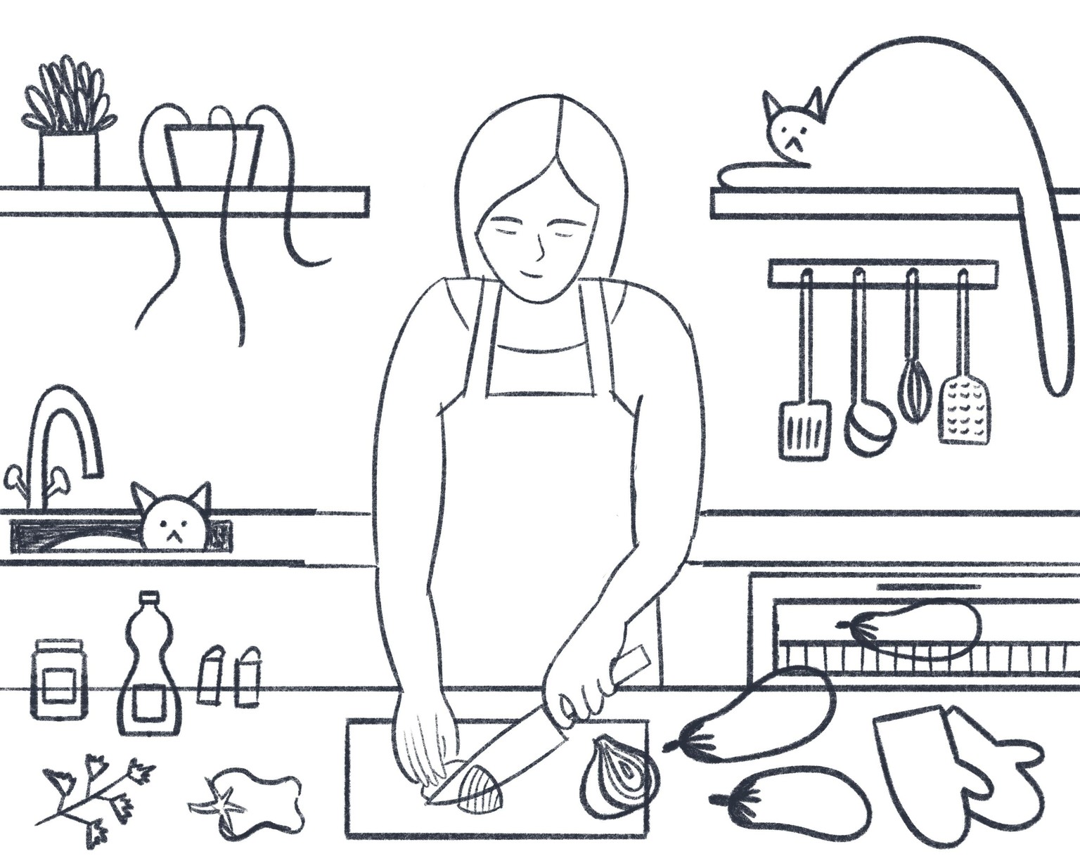
Third Iteration
Only added the hands
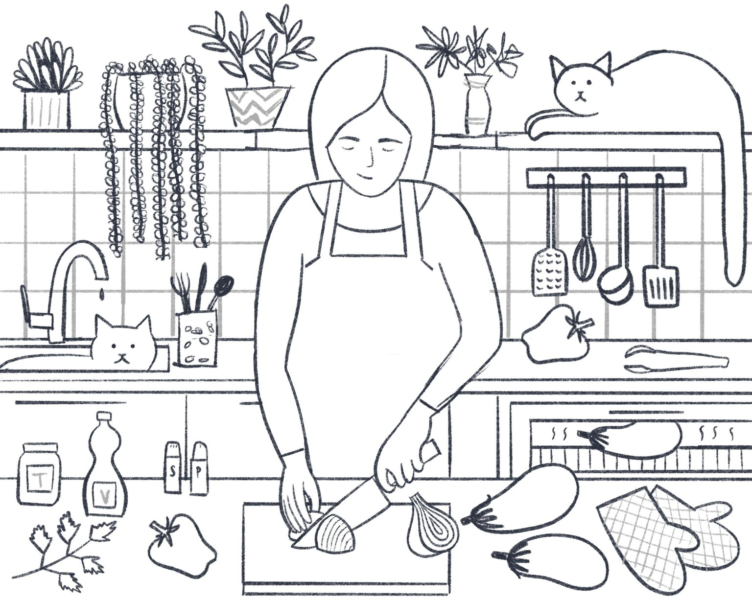
Fourth Iteration
Pretty much done, but I wanted to go over it one last time.
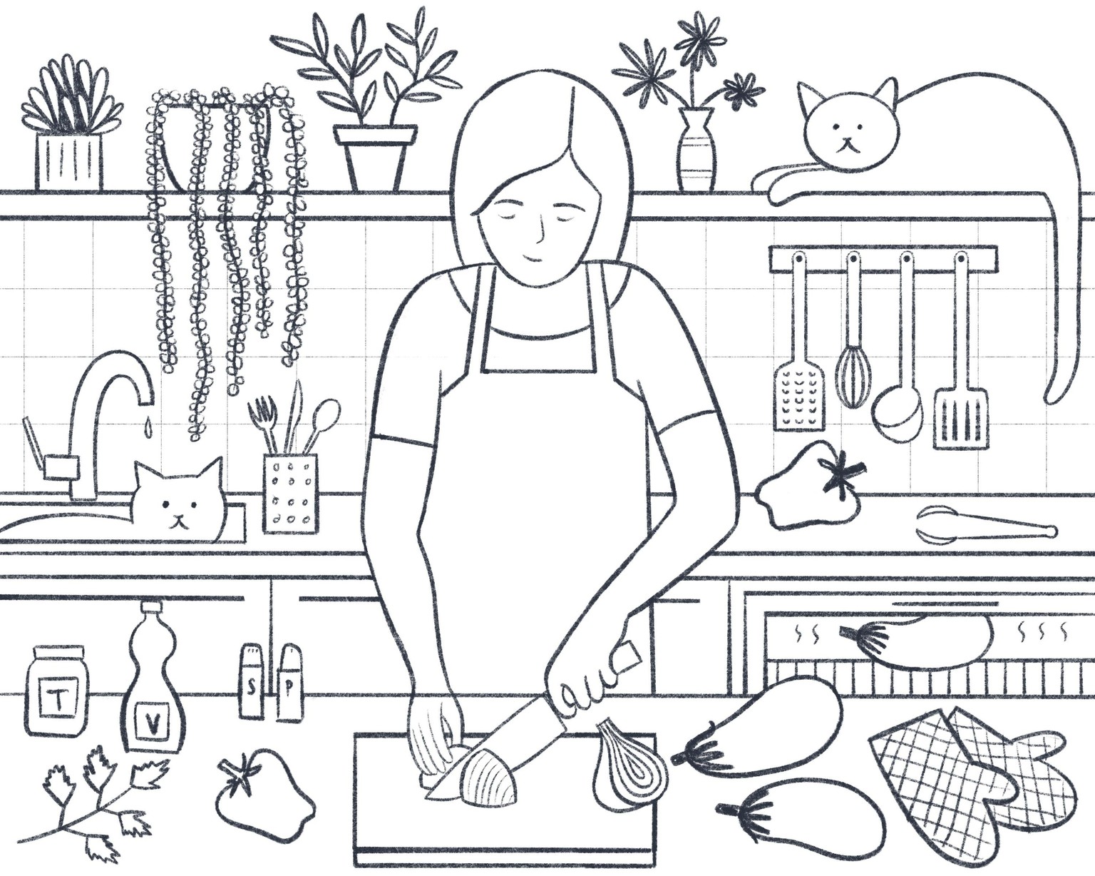
Final Sketch
I'm glad I went over the previous sketch one last time as I ended up changing and refining some small details. Now the coloring stage will be easier.
Completed Illustration
It was so easy to use the limited palette! A complete game changer. I'm quite happy with the illustration :) I couldn't have done it without your classes, Tom. Thank you!
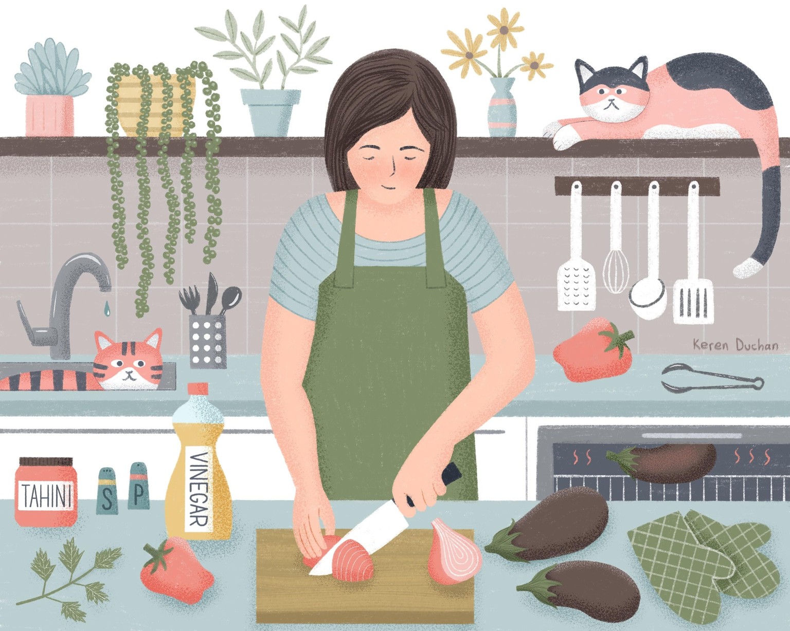
I don't like working with hard outlines and flat color - I've outlined every shape using the 6B pencil and colored it in "by hand" using the same brush. Somehow when I use color drop I feel it's too digital and I feel stuck on how to proceed.
The textured outline is easier to smooth out as well. When I try to make smooth flowing lines using the monoline brush, it's much harder not to get any kinks in the line, even when using a high streamline value. I understand now why Tom works with vector masks in Photoshop. So much easier to adjust and readjust the shapes that way.
I want to give other techniques a try. Both a more painterly approach with more color and texture variation in each shape, and perhaps more shading and looser lines, as well as a cleaner approach with shapes defined by hard vector masks. I am happy with the style I executed as well, although it is more time consuming to color in shapes "by hand".
And I definitely plan to stick to my limited palette of five colors (I removed the orange, I don't like orange) and a dark blue and white, plus shades and tints. There was no point where I felt it hindered my work - quite the opposite.